
CorrectionThe error was not on the original map published by USA Today on November 9, 2000. The one and only place where the error was introduced was in the three legends in the bar chart at the top of the map that was published on page 15 of the paper version of the Spring 2001 ArcNews. Esri sincerely regrets the resulting confusion this error may have caused. We do, however, truly appreciate the numerous readers (who are clearly eagle-eyed and passionate about maps!) who took the time to e-mail, phone, and write us about the problem. Should you require further information, please contact Tom Miller, ArcNews Editor. |
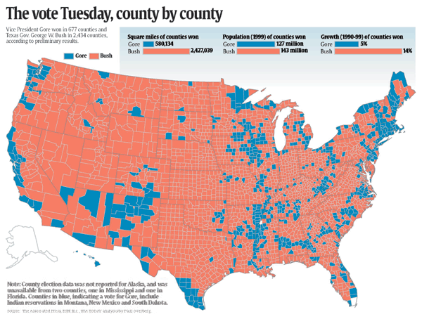
MapShop, ArcView Used as News Analysis ToolUSA Today Uses GIS for Election MappingThe election of the President of the United States is one of the most important stories the media covers, and it only happens once every four years. The 2000 election story will undoubtedly prove to be one of the most profound stories in U.S. political history. But just what was the story? And how was it conveyed to readers? For USA Today, mapping election data not only helped to tell the story of the election, but it actually helped reporters uncover the story behind the vote count and present it to readers. Led by database editor Paul Overberg, USA Today mapped out the electoral college results for its more than two million readers using MapShop (see "The Associated Press Develops MapShop"), bringing the latest computer mapping technology into the newsroom for election analysis and presentation. In addition, USA Today used ArcView GIS for mapping, county by county, the election methods used for tallying votes. The use of GIS to map the historic 2000 election provided a new paradigm for using GIS in covering and reporting election results. And USA Today's historic Bush/Gore county-by-county map illustration would be used on many of the network news programs as well as such wide-ranging media as MSNBC's Imus in the Morning, Live with Regis, CNBC news, and The Rush Limbaugh Show Web site. USA Today has been using GIS since 1990 and used ArcView GIS to map the 1996 presidential race. While already effective in creating data-rich, visually compelling maps, USA Today recently became a MapShop beta tester and utilized the joint Esri/Associated Press online mapping system to more quickly and easily generate the 2000 election results. How did it work? Via the Web, data was uploaded into the MapShop database and made available to the newspapers that were beta sites across the country. Newspapers were able to point, click and, after a few keystrokes, generate an accurate, high-quality map of the Tuesday, November 7 count, county by county and state by state. The Map Was the StoryThe results revealed a startling truth, that a traditional demographic divide exists between rural and urban areas, with the vast rural heartland, depicted in red on the map, almost all going to Bush, and with coastal and major urban centers, depicted in blue, predominantly going to Gore. Better than any statistic, the map gave a visually compelling illustration as to just how striking this divide is in the country. With the voter tallies up to the point just prior to the running of the story on November 9, roughly 70 percent of the urban vote went to Gore and 20 percent of the vote went to Bush. In rural and small-town areas, six out of 10 votes went to Bush. While the statistics were riveting, the map gave an all-too-clear depiction of a country evenly and staunchly divided. |
|
|
"Everyone could see a pattern in the map, and everyone was already talking about how this pattern showed two nations drawn up in distinct areas of the country where there was a stark contrast," says Overberg. "It drove home the point about urban versus rural." Mapping the 2000 Presidential Election MethodsThe initial election maps were a success. Overberg then showed political reporters at USA Today a map of election methods, using data compiled by Kimball Brace at Election Data Services, Inc., an Esri Business Partner, and suggested the idea of running a map-based story on the diverse techniques used. The idea was picked up quickly and enthusiastically. A map of the different voter techniques revealed a surprisingly broad assortment of different methods including optical scan, punch card, lever machine, paper, electronic, mixed, and data vote. Here, again, the map was the story. On November 14, USA Today ran a story, titled "Think Election Was a Mess? Look at System," that depicted election methods by county across the United States and showed how these methods vary across the country. The infamous punch card system, the second-most popular behind optical scan, represented almost 20 percent of the counties in the United States. "To have a seven-color palette for the map was terrific," says Overberg. "It showed that each state had many different techniques and different socioeconomic patterns. Making the map was a simple process. The time saved was enormous and the message unmistakable." Both stories used GIS for information integration, analysis, and visualization. They also demonstrated a growing trend in the newspaper industry of utilizing GIS tools in the newsroom. Factors such as improved usability and lower costs for hardware, software, and data availability are making it easier for newspapers to use GIS, which is a good idea for another big reason: Census 2000. With the power of GIS, journalists will be able to slice, dice, and translate Census 2000 data for readers like never before. For more information, contact Paul Overberg, database editor, USA Today (e-mail: poverberg@usatoday.com). |