A great map unlocks value for the reader and makes data understandable by showing what the map’s author intended to communicate. Maps are particularly good at unlocking valuable information that is otherwise buried in the data.
They are representations of the interpreted past, present reality, or predicted futures. When we look at a map, we are looking at a representation of reality, not reality itself. Our maps are a subjective view of reality based on data. There’s bias in the data. There’s bias in how the data was summarized. There’s bias in how that data is expressed on the map. Even the colors and shapes on the map introduce additional bias. Whatever truth lies in the data can get lost in this noise, simply because we get intimidated by the subject matter or the software tools (or both). It does not need to be that way.
It’s All about Presentation
One reasonable but not so useful reaction to all this potential bias is to “just publish the data” on the map. You can recognize these maps very easily. You look at them, you see some kind of pattern on the map, but you’re not sure what you’re looking at or how it relates to you.
Think of your map the way you think about your resumé. Viewed one way, a resumé is merely a collection of facts about you such as your name, address, phone, current position, past experience, education, and interests. The facts are one thing, but the presentation is everything. It’s not just about how the resumé looks, it’s about how it is organized. The successful resumé presents the facts in an attractive manner, made relevant to the reader by the context of the position being sought.
Great maps work the same way. They answer specific questions in a context understood by both the mapmaker and the audience. Who creates that shared context? You do. That’s why dumping your data onto a map doesn’t work: you haven’t set the context or expectations on the reader as to what can be learned from that data.
Many thematic maps are made with minimal regard to what the outcome might look like. We obtain the data and make it mappable. We let the GIS software choose how it is classified and symbolized. We deliver the resultant map to the intended audience, and … nothing. You can almost see the audience thinking, so what?
The data expert blames the mapmaker for not understanding the data. The mapmaker blames the data and says, “The map just shows what the data says.” However, the audience just moves on because it found little value in the map. How do we unearth the value in the data and reliably produce meaningful thematic maps? Is it a technical process, or something else?
Three Essential Elements
Like building a fire, three things are essential for making a great thematic map: the data that provides fuel to the story, a way to map it that gives it air, and the spark of an interesting storyline to bring it all alive. What’s the intended message of the map and how can we deliver that message as an information product? What’s the map reader’s first visual impression? What happens when the reader touches the map?
There is a lot of subjectivity at play, even if you don’t consciously add any of your own. Subjectivity is infrequently discussed in technical workshops and training classes because it makes sense that we must understand how the software and data work at a technical level before we can introduce subjective decisions about how to represent the data most effectively on a map.
Certainly, basic technical knowledge of the software is helpful. These days, I spend equal time working with desktop software like ArcMap and online mapping software like ArcGIS Online as well as working with developers in their languages of choice (such as JavaScript, HTML5). I find that I can accomplish something effective in each of these, so I’m able to focus on what best serves my audience’s needs. The tools and APIs I’m attracted to are the ones that allow me as a map author to iterate quickly.
Building a Great Thematic Map
Sometimes we have a great idea for a map, but the data just doesn’t support it. Other times, we have a ton of data, and it’s mappable, but we put it on the map and are unsure what it says. Or, worse, we infer a pattern that does not exist in reality, a situation that might not be intentional but is still unfortunate.
Sometimes you’re handed the data and told to make a map out of it. Other times, you’re asked to find data to support a particular story or to find data to support a particular map. No matter where you start, you’ll adjust each of the three elements several times before arriving at a great thematic map suited to its story.
When building a thematic map, I look at the data, then talk to people, and look at the data again. I constantly ask myself: does this match the story they’re telling me, or do I need to make some changes? I’ve made maps that revealed patterns beyond the expectations of the data experts. And I’ve also made maps that clearly did not support the story (which can be a tricky conversation to have with the map requestor). And that’s why I enjoy maps. It’s a subjective activity that finds balance through iteration and interactions with smart people.
Beyond the Defaults
To get there, we must go beyond just pushing buttons in the mapping software and publishing whatever the GIS chooses. All maps start with a database of features and their attributes. The story emerges when we look at the data critically and choose what to show on the map in clear and concise visual terms.
For me, it all starts the moment the data arrives. A great story idea is nice, but until the data arrives, there’s little to do. Opening that attribute table is like unwrapping a present. It’s a moment of truth. Either the attributes needed are there or they are not.
Attribute field aliases help everyone understand cryptic field names. An attributed field displayed as Total Population 2014 is more understandable than a field name such as TOTPOPCY. Some data formats are good about sharing field aliases, while others provide no field aliases. Field aliases help everyone from the data provider to the mapmaker to the application developer, and—most important—the reader.
When you first touch the data, apply easily understood, plain language aliases. Anyone who encounters the data in a database, map service online, or in an app will inherit those aliases and better understand the data. Once the attribute table is open, decide where the most valuable data for your map might be found. Look for a numeric attribute field whose values might tell an interesting story. Numeric values are either counts (e.g., total population) or some kind of normalized value (an average, a median, a percent, an index, or a rate). The normalized values usually contain the most valuable information because they compare things—a fundamental human need.
When staring at the attribute table, you may be confronted with the harsh reality that what is interesting may not be obvious in the data. That’s why it’s called data rather than information. You have to spend some time with the data to learn how it was collected and processed so you can figure out how much you can trust it.
Telling the Story behind the Data
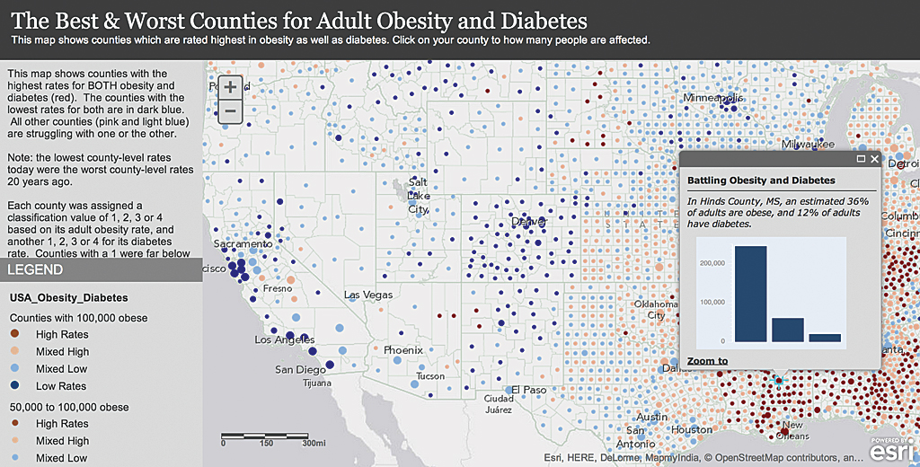
Looking at the interactive map in Figure 1 that compares the rates of obesity and diabetes in US counties, it is apparent that Los Angeles County has a far lower obesity rate than Hinds County in rural Mississippi. It’s also useful to realize that Los Angeles County has 1.5 million obese adults, while Hinds County has only 62,000. Rather than try to cram all that information into the map’s symbology, the mapmaker made that information available in pop-ups so the reader can touch the map to get more detail. The map attracts the eye and communicates one aspect of the data clearly, which becomes a window into more information about the subject.
The data used was obtained from the United States Centers for Disease Control and Prevention (CDC). The story behind it inspired us to unlock the data in different ways. Adult obesity and diabetes are thought to be correlated. Consequently, an increase in the number of adults diagnosed with obesity means that a similar increase in the number of adults diagnosed with diabetes can be expected. To public health officials, these two diagnoses are related and subjects of concern.
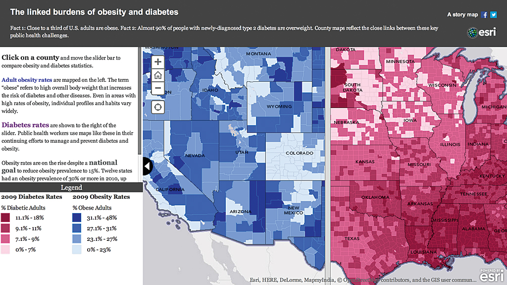
The data contained counts of obese adults, counts of diabetics, and total population. We first made a map depicting the percent of obese adults in the population. Then we made another map (Figure 2) depicting the percent of diabetic adults in the population. The Esri Story Map app chosen implements the Swipe tool so the user could go back and forth over a given county or area and get a visual comparison of rates of both diagnoses. Swipe interactivity allows the user to find patterns from two traditional polygon choropleth maps.
As a data person, I always look for ways to reduce the information to a single measure. Knowing that these two conditions are related, I wondered which counties have both high obesity rates and high diabetes rates. I added a field and calculated a combined rate for both conditions based on each county’s rates compared to the national average. The dot map in Figure 2 gives an immediate impression of where rates are highest and lowest by county. Given that context, the reader immediately sees regional trends that are otherwise somewhat buried in the two polygon choropleth maps.
How Do You Create Context?
I consistently find that people who make thematic maps come in two types: those who are comfortable putting the data into a specific, subjective context and those who are not. After having made tens of thousands of thematic maps over the years, I find that maps grounded in a specific context are consistently well received.
It is helpful to assume most people don’t know what your data is or how it can help them. Their lives and experiences are their frame of reference. Your job is to relate your map to them, not the other way around. To do this, you need to speak their language. Readers may not know exactly what adult obesity means, so tell them. They certainly won’t know what percentage of all adults are obese. By explicitly telling the reader the national rate of adult obesity, you provide a frame of reference. If your entire map is anchored around that value, you’ve created a reference point that you and they can understand. You’ve created a comparison—you told them what the national value is, and the map shows how each county compares to that.
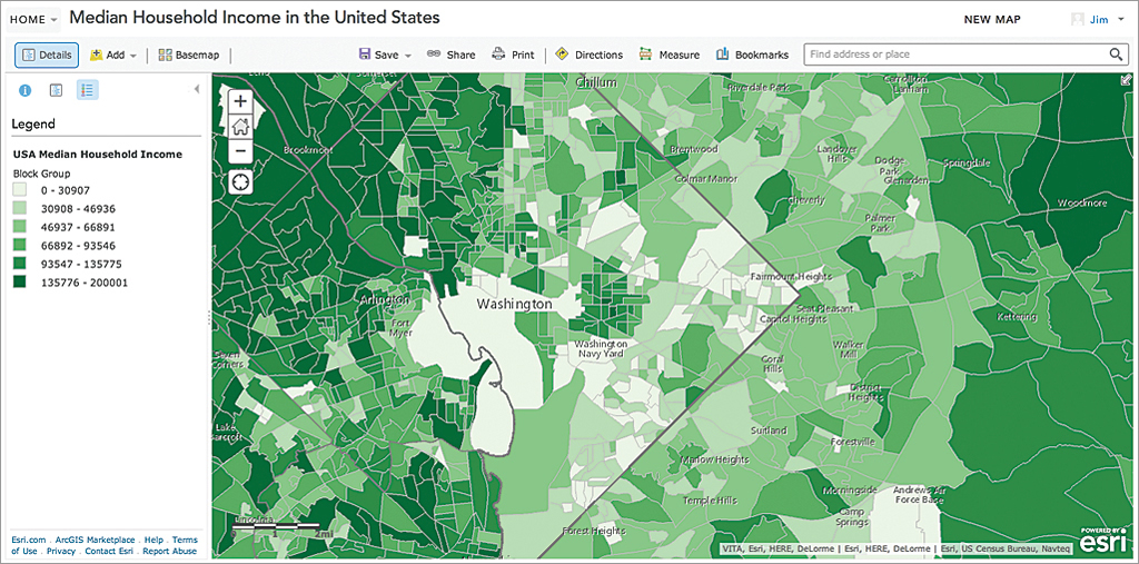
The next example uses US household income data. The Median Household Income in the United States map in Figure 3 is an example of the “data dump” approach. We let the software choose the default Natural Breaks classification, applied a default color ramp in shades of green, and accepted the somewhat obtuse precision of default break points. All we know from this map is some areas are richer than others—something we already knew. The map is not grounded in anything, so I can’t really see patterns showing where things are better or worse. The map is true to its own internal logic, but that’s the point. This is not a map a person can add to their frame of reference.
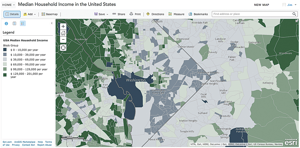
Figure 4 shows the same data in a different map. We know that some areas in our community are rich, some are poor, and there’s a lot of variety in between. Exactly how we define those terms numerically is the challenge because everyone has their own frame of reference.
This map taps into a frame of reference we use when trying to understand unfamiliar numbers associated with a subject. We want to know what’s normal and what’s not. This map uses standard deviations around the mean to help focus the data. The legend uses values rounded up to better reflect the precision we use when talking about household income. By making these choices, we tell the story in a way that the reader can relate to their own experiences.
This example anchors the map using the US median household income of $46,533. Areas with close to this income level (i.e., within 1 standard deviation of the mean or SD) are shown in a neutral color. Areas with average income levels more than 1 SD are shown in green. Areas more than 2 SD are shown in dark green. Simliarly, areas with lower incomes are shown in shades of blue. The basemap itself is very muted. It contributes no additional colors that might confuse the reader. Rounding break points to the nearest thousand improves readability. Note how the polygons’ outline colors are matched to the fill colors, instead of using the default (and visually fatiguing) black outline.
Now it is readily apparent which areas are at, above, and below the national average. Could we use another “anchor” point? Absolutely. You could anchor this map against a state average, the average of a selection of states, an inflation-adjusted average from the previous decade, or let the user choose an anchor point.
An amazing thing happens when you force yourself to anchor your map in a meaningful way. The color symbology reveals patterns more clearly. When applying colors to classifications, first decide what to de-emphasize. If you de-emphasize the normal category first by using a neutral color such as gray, white, or a very muted color, you create more room (color-wise) for the other classifications. The median household income example has a diverging color pattern that uses green for higher than normal income and blue for lower than normal incomes.
Making Great Maps
Why does this work? Your audience probably has no idea what your data is, how reliable it is, or how it relates to them. Even authoritative data sources can have data issues (which you must understand and address in the map). Defining the map around an anchor point, you provide a common point of discussion and understanding with the audience, rather than hoping they understand your map classifications and find a detectable pattern in your color ramps.
What’s the difference in the maps shown in Figures 3 and 4? It’s the same source data, the same software running on the same hardware, the same audience, the same need for answers. The difference is that the data was presented in a way that enhances comparison by anchoring it mathematically during classification and visually when applying color to the map.
This is not simply a data/classification task. Your choices have clearly expressed meaning because you used words your audience can relate to. Great maps don’t use jargon that the audience won’t understand. Great maps reach out to the map reader in a clear, understandable way so that the reader can easily explain the map to others.
This is an information design activity more than anything else. The data is there, the software is there, the audience has its needs. While there is always a valid use case for just publishing data (e.g., for an audience that has a need to explore and query that data), the true value of the data is always better expressed in a discrete, understandable representation on the map.
That’s where you come in.
About the author