Hillshading Alternatives
New Tools Produce Classic Cartographic Effects
By Patrick J. Kennelly, Montana Bureau of Mines and Geology,
and A. Jon Kimerling, Oregon State University

| Hillshading Alternatives By Patrick J. Kennelly, Montana Bureau of Mines and Geology,
| |
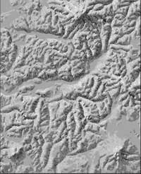
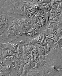
| Editor's note: The authors present three alternatives to hillshading--illuminated contours, hachures, and point symbols--for portraying topography. These methods combine classical cartographic techniques with GIS software for greater visual impact. Hillshading represents terrain with variations of tone that give a three-dimensional effect. In the past, creating hillshade maps was a painstaking and time-consuming cartographic art form. The mapmaker used a topographic contour map as a framework and added subtle differences in shading using pencil, charcoal, or airbrush. Today, hillshading a digital elevation model (DEM) can be performed in one automated step using ArcInfo with the ArcGrid module or ArcView GIS and the ArcView Spatial Analyst extension.
The hillshading method used by Esri software assumes that the surface to be rendered is a matte reflector. The hillshading effect on a matte surface, also known as a Lambertian or ideal diffuse surface, can be approximated by viewing a crumpled piece of nonglossy white paper under indirect lighting. Variations in brightness on the paper are a function of the illumination direction and the orientation of the surface of the paper. Applying similar shades of gray to a map based on an obliquely illuminated topographic surface renders terrain with a three-dimensional appearance, without the crumpling. Brightness values are calculated based on the angle at which a light
source hits a surface. With Esri software, a direction of illumination
is selected by its azimuth (declination) and altitude (inclination), defining
an illumination vector in three dimensions. If this illumination vector
is perpendicular to a surface, the surface is shown as white; if the illumination
vector is parallel to a surface, the surface is shown as black. Surfaces
viewed at all other angles receive graduated shades of gray. The shades
of gray are a function of the cosine of the angle Automated hillshading has greatly increased the use of topographic bases on maps. Examples of maps with hillshading are everywhere from geopolitical maps in newspapers to trail maps in park kiosks. This exponential increase in the number of maps with hillshading has certainly helped users to gain a three-dimensional perspective on the world. At the same time, the abundance of such maps offers a challenge for the GIS professional hoping to create a topographical representation that stands out from the crowd. This article describes methods for representing topography by automating historical cartographic techniques and outlines the general procedures used for creating these maps with Esri software. Note that none of these methods will produce topographical representations as detailed as a hillshading map. The methods suggested here vary tones by drawing points or lines in black, white, or gray and offer stylish alternatives to the hillshading maps that have become so prevalent. Illuminated ContoursA striking alternative to traditional hillshading was popularized by a Japanese cartographer, Kitiro Tanaka. He employed this technique in a map of a rugged volcanic region of Kyushu, Japan, published in 1950. Tanaka referred to his technique as the relief contour method, although it is typically referred to as the illuminated contour or Tanaka method. In his hand-drafted maps, Tanaka began with a background of medium gray and drew white contours on illuminated topography and black contours on nonilluminated or shaded topography, assuming lighting from the northwest. In addition, using a calligraphic drawing technique, Tanaka varied contour thickness with the cosine of the angle between the compass direction of illumination (azimuth) and a vector oriented in the aspect direction. He attempted to match tonal variations predicted with the theory of hillshading to tonal variations of black and white contours on a gray background with this simple drafting method.
The illuminated contour method described here modifies and automates Tanaka's method. Contour thickness is based not on vectors in the aspect and the illumination directions but on the surface normal vector and the illumination vector. This angle
HachuresHachures have been used to represent topography for hundreds of years. Hachures are fine lines generally drawn in the direction of steepest topographic gradient, also known as the aspect direction. Although thicker hachures indicate steeper slopes, hachure density remains constant throughout the map area except in areas of gentle slope.
In low relief areas, hachures are not drawn as they do a poor job of representing topography. In 1799, the Austrian military topographer Johann Georg Lehmann was the first to establish rules for systematically representing terrain with hachures. During this period, the adoption of copper engraving techniques allowed reproduction of very detailed hachure maps. The Dufour maps, published by the Swiss Federal Office of Topography between 1845 and 1865, are beautiful examples of shaded hachure maps that enhance the three-dimensional effect by simulating illumination from the northwest. The automated hachure technique described in this article uses black and white arrows on gray and layer-tinted backgrounds to create an effect similar to the illuminated contour method. Unidirectional arrows provided explicit information on the aspect direction allowing, for example, differentiation between southwest and northeast oriented hachures. The ability of Esri software to orient these arrows at one degree intervals of aspect resulted in an extremely accurate hachure map. The thickness and size of arrows are based on slope. This method keeps hachure density constant throughout the map area. The figure to the upper left shows the same area shown in previous figures on a gray background, with gray. Pass your mouse over the image to see this hachure map with a layer-tinted backgrounds. The general procedure used to create these hachure maps was
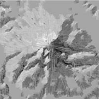
Point SymbolsCartographic applications have been developed that use point symbols for hillshading. The dot method devised by the German cartographer Max Eckert in 1921 creates the illusion of hillshading with vertical illumination using dots of graduated size. Critics argued that this method only approximated detailed hillshading over an area. However, with modern GIS technology, interesting point and text designs can create a hillshading effect within the overall map design.
Point symbols of constant size with graduated shades of gray create a hillshading effect. The repetitive text and point symbol pattern is both a logo and the method of hillshading. The rendering appears smoothedly hillshading map at a distance, but passing the cursor over the image zooms in the view and the MBMG logo used for the hillshading effect is obvious. The general procedure used to create these point symbol maps was
ConclusionThese alternatives to hillshading, derived from earlier cartography techniques using GIS software, render topography in novel ways. For more information, please contact Resources in PrintImhof, E. Cartographic Relief Presentation. Walter de Gruyter: Berlin and New York, 1982. Kennelly, P. and A. J. Kimerling. "Modifications of Tanaka's Illuminated Contour Method," Kennelly, P. and A. J. Kimerling. "Desktop Hachure Maps from Digital Elevation Models," Robinson, A.H., J.L. Morrison, P.C. Muehrcke, A.J. Kimerling, and S.C. Guptill. Tanaka, K. "The Relief Contour Method of Representing Topography on Maps," About the AuthorsPatrick Kennelly is the GIS manager at the Montana Bureau of Mines and Geology, a department of Montana Tech, a part of the University of Montana. He holds a doctorate in geography from Oregon State University, a master's degree in geophysics from the University of Arizona, and a bachelor's degree in geology from Allegheny College. Jon Kimerling is a professor of geography at Oregon State University. He holds a doctorate in geography/cartography from the University of Wisconsin, Madison. |
 (
(