July - September 2002
July - September 2002 |
||||||||
|
|
||||||||
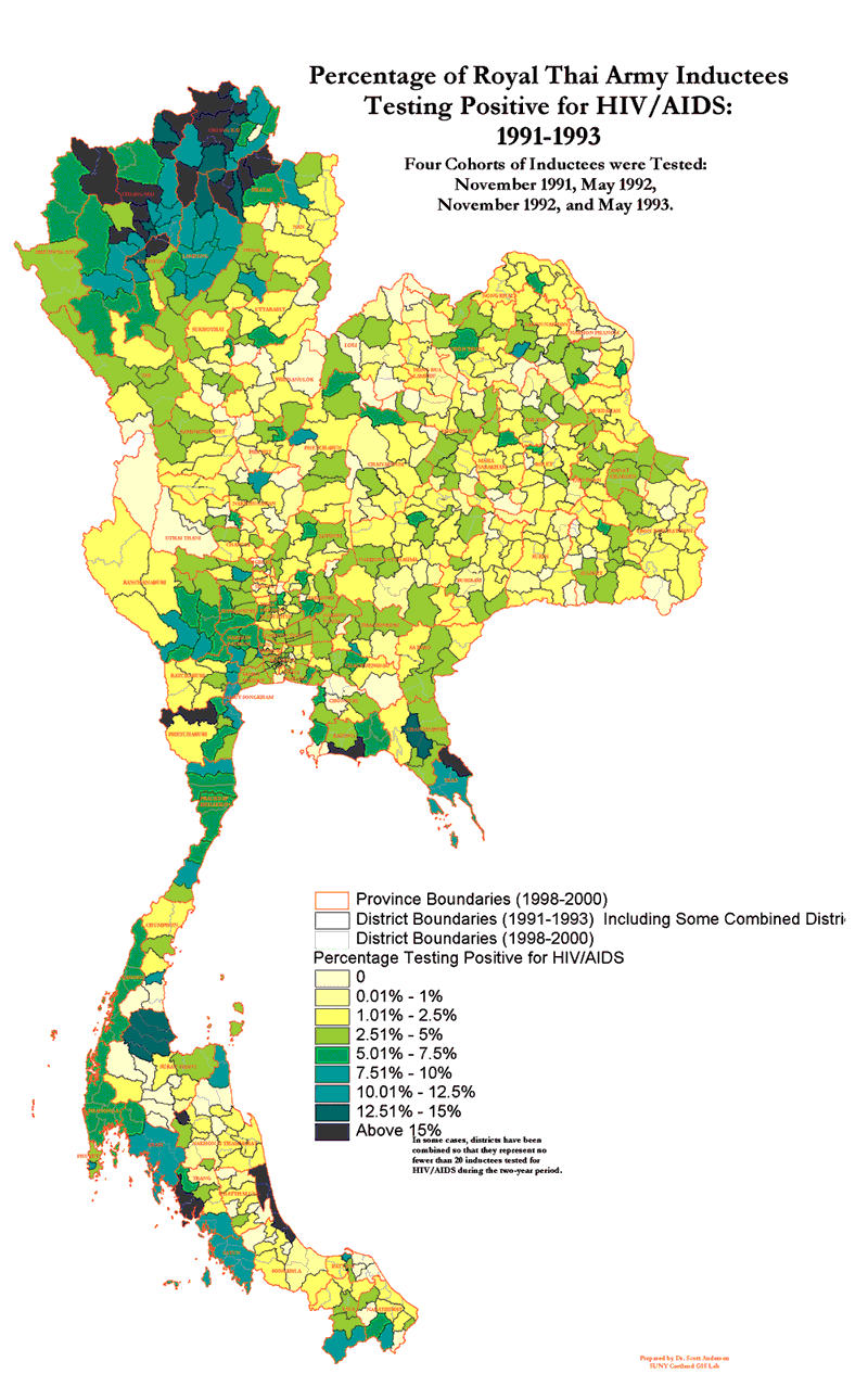
The GIS Lab at SUNY, Cortland, is primarily a teaching facility. Initially, Anderson was interested in the project primarily for its teaching applications. He soon had several advanced students performing the manipulations necessary to bring this data into an ArcView 3.2 project. His students converted the Excel tables into dBASE files, joined these files to shapefiles of the Thai provinces, and created and saved a common legend (.avl) file for each of nine annual maps. These maps were assembled in a single layout for printing. The result was a very dramatic set of maps that demonstrated the rise and decline of prevalence rates over the study period. However, because the number of Thai provinces was limited (73 provinces in 1991 and 76 in 1999), the maps provided only a coarse representation of the geography of this epidemic. Furthermore, province-level maps using the same data had already been published in several medical journals. Seeking a Finer-Grained AnalysisAnderson recognized that GIS could provide little new insight into the geography of the HIV/AIDS epidemic in Thailand unless the data could be made available for analysis at a finer level. Sharing this insight with Brown and Torugsa set in motion a chain of events that intensified and improved their collaboration. Torugsa set her staff to work revising data tables on each induction site for each of the 16 induction periods so district-level data could be mapped showing numbers of inductees tested, numbers testing positive for HIV-1, and percentage testing positive for the period from November 1991 through May 2000. Fixing Flaws in the DataBecause there are more than 900 districts in Thailand, this was not an easy task. It took Torugsa's staff of six several months to complete the revisions. During the process, several flaws in the original project became apparent. The first problem related to the time periods being mapped. The May and November cohorts [i.e., groups of inductees] came from different regions of the country. Any map of annual data that did not include both cohorts was geographically skewed. Because the RTA began its preinduction testing in November 1991 and did not conduct tests in November of 1993 and May of 1994, there were only six annual periods with complete and reliable data. Fortunately, the solution to this problem was fairly straightforward. Anderson collapsed the data across years so the November cohort of one year was combined with the May cohort of the next. This resulted in eight annual periods with reliable data. By joining these new data tables to a province shapefile obtained from the Thai Environmental Institute, Anderson was able to create a set of dramatic maps providing a more fine-grained portrayal of the geography of the AIDS epidemic in Thailand. Especially informative was a layout that contained eight choropleth maps showing changes in the percentage of inductees testing positive for HIV-1 by district over time. A dot density map that represented each positively testing inductee with a color-coded single dot was even more powerful. Dealing with Insufficient nsIn August of 2001, Anderson flew to Bangkok to present these maps to AFRIMS personnel and conduct further consultations. At this time, Anderson, Brown, and Torugsa, along with other AFRIMS staff, agreed that another flaw in the project data needed to be addressed.
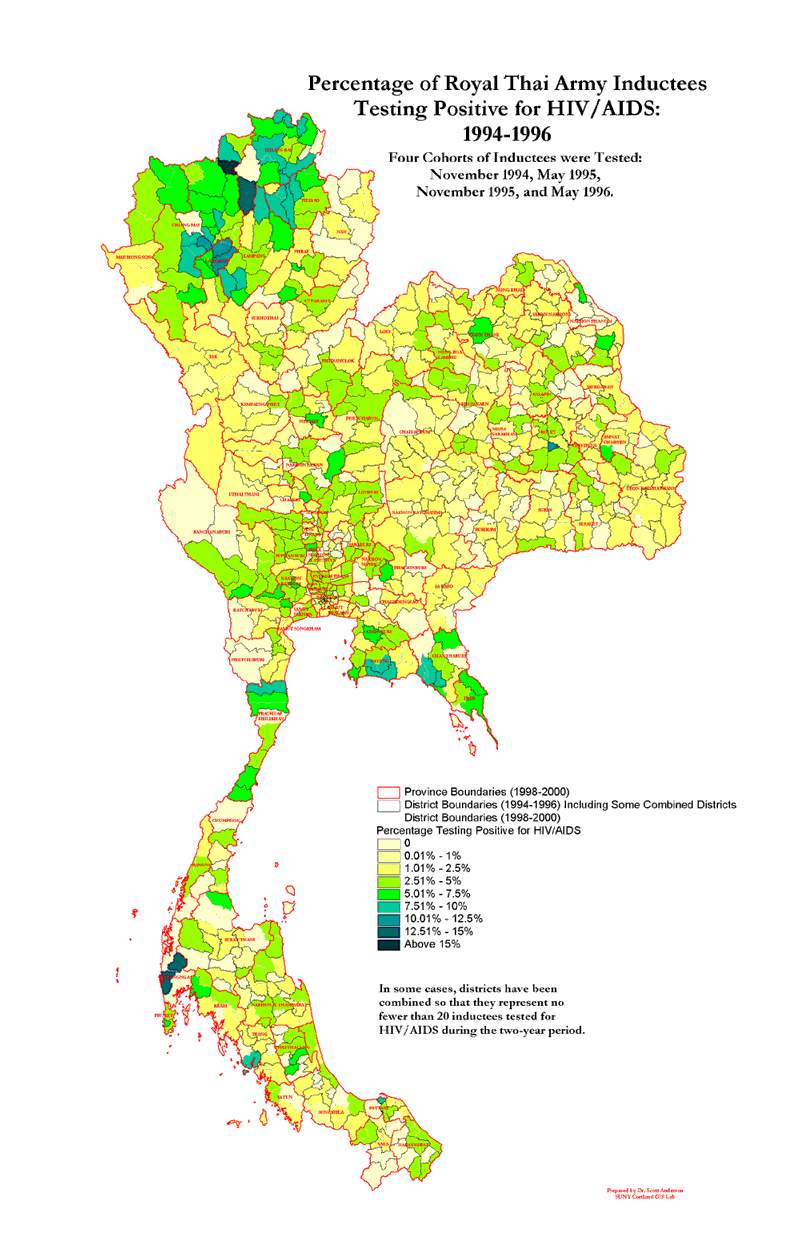
In many districts, so few young men were tested during a 12-month period that the percentage positive yielded outliers based on insufficient numbers (or ns). For example, one district might be assigned a zero incidence rate because only five men were tested and none tested positive, while another district might indicate a disturbingly high incidence rate because only five were tested, but one tested positive. The collaborators agreed on a two-stage strategy to address this problem. First, they agreed to combine the data into four two-year periods for each district. Each period used data from four cohorts from May and November so the district ns would be higher. After consultation with an AFRIMS medical statistician, they also agreed to join contiguous districts together, when necessary, so that no district mapped during any of the four periods had fewer than 20 ns. Back in Cortland, Anderson collapsed the data into time periods that encompassed four cohorts each. This involved little more than calculating data into new fields. However, joining contiguous districts required a more complex set of procedures. Anderson's first challenge was to develop a protocol for determining which districts to combine. The second challenge was to figure out how to do it. A Protocol for Joining DistrictsAfter consulting with AFRIMS staff via e-mail, Anderson developed a set of priorities for combining districts. The protocol he developed used the following logic in sequence to determine which adjacent districts to combine with low n districts.
Coding and Dissolving Districts TogetherOnce the districts that would be joined were identified, the actual process was simple. Anderson used the dissolve function supplied by the Geoprocessing extension for ArcView 3.x. After adding a new field containing code numbers for all Thai districts, he changed the code number for each low n district to the code number of the district to which it would be joined. He dissolved these districts together, and the resulting shapefile contained no low n districts. After this process was completed for each of the four time periods, Anderson produced a set of maps that showed the most accurate and fine-grained detail available to date on the geography of the HIV/AIDS epidemic in Thailand. An Ongoing ProcessThe SUNY Cortland/AFRIMS collaboration continues. Torugsa has assigned an AFRIMS staff member, Major Panpaka Supakalin, the task of bringing GIS methodologies in-house. Her unit has acquired ArcView 8.1. Brown, Torugsa, and Anderson continue discussing ways to improve their work, and Anderson is now redrawing the Thai district-level shapefiles to correct a number of inaccuracies. This collaboration, based on a personal relationship, has resulted in a permanent transfer of technology and has ensured that GIS methodologies will play an increasingly important role in the fight against one of humankind's most feared epidemics. For more information on this project, contact Scott Anderson, Geography Department/GIS Lab |