Learn More about Events in the News Using ArcGIS Online and ArcGIS Living Atlas of the World
In early May 2021, Colonial Pipeline was the victim of a ransomware attack that hobbled its services. The company’s pipeline stretches 5,500 miles from Texas to New Jersey and supplies an estimated 45 percent of the fuel for the East Coast. The cyberattack, which the FBI blamed on a group called Darkside, left gas scarce, prices spiking, and consumers engaged in panic buying.
ArcGIS Living Atlas of the World includes authoritative live feeds and other content that helps you learn more about current events such as the pipeline cyberattack and infrastructure in the United States. Follow these steps to make your pipeline map in a minute (or less), using Living Atlas content and filters to focus on the Colonial Pipeline.
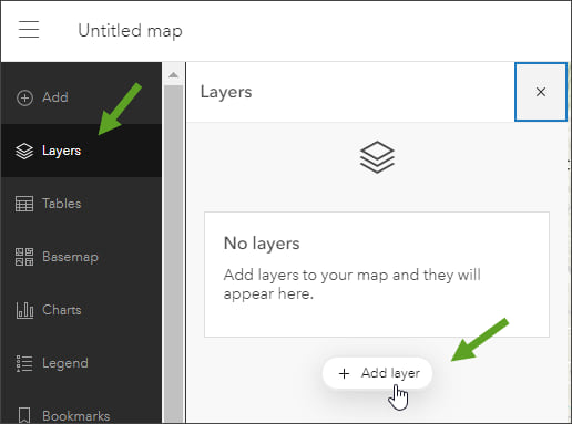
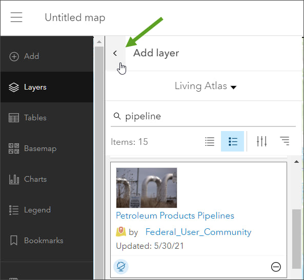
Step 1: Sign in to your ArcGIS account and open a blank map in the new Map Viewer. The Layers tab should be selected, as shown below. Click Add layer.
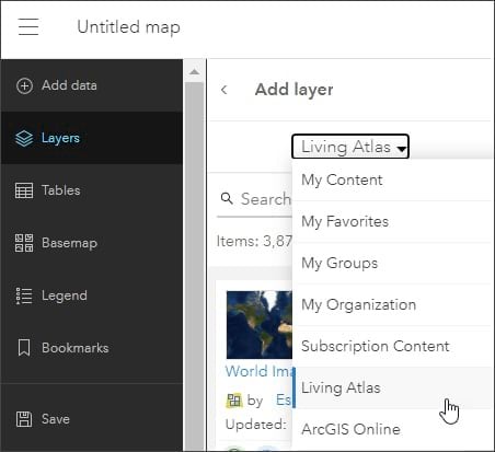
Step 2: Choose Living Atlas from the Add layer drop-down list.
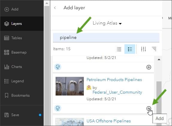
Step 3: Type pipeline in the search box, and click Enter to locate Petroleum Products Pipelines. Click (+) to add it to the map.
Note: To learn more about any layer, click the layer title to View item details.
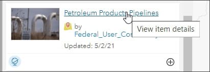
From the Petroleum Products Pipelines item details, you will see that the layer is a feature layer from the Energy Information Association (EIA). The layer publishes pipeline information for major petroleum pipelines in the United States, including pipelines that carry refined petroleum products—gasoline, jet fuel, home heating oil, and diesel fuel.
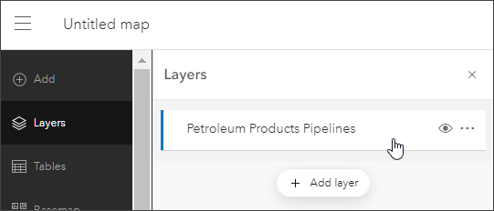
Step 4: Click the left arrow at the top of the Add layer panel to return to the map contents.
Step 5: Ensure that the Petroleum Products Pipelines layer is selected. If you are authoring a new map, this step won’t be necessary, and the layer should already be selected. If you are adding the layer to an existing map, click the layer to select it. The selected layer displays a blue highlight bar on the left.
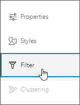
Step 6: In the Properties panel on the right, click Filter.
Step 7: Click Add expression to add a new filter.
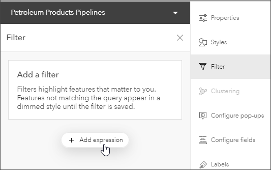
Step 8: Construct an expression using the attribute Opername and select COLONIALPIPELINE CO from the drop-down list of field values. The expression is Opername is COLONIALPIPELINE CO.
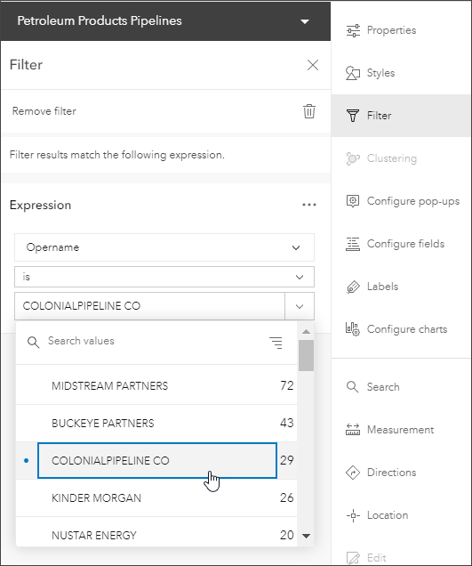
Step 9: Click Save when finished.

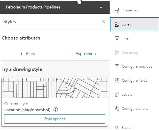
Step 10: Your map is finished, but you can adjust the layer style to your liking. In the Properties panel on the right, click Styles.
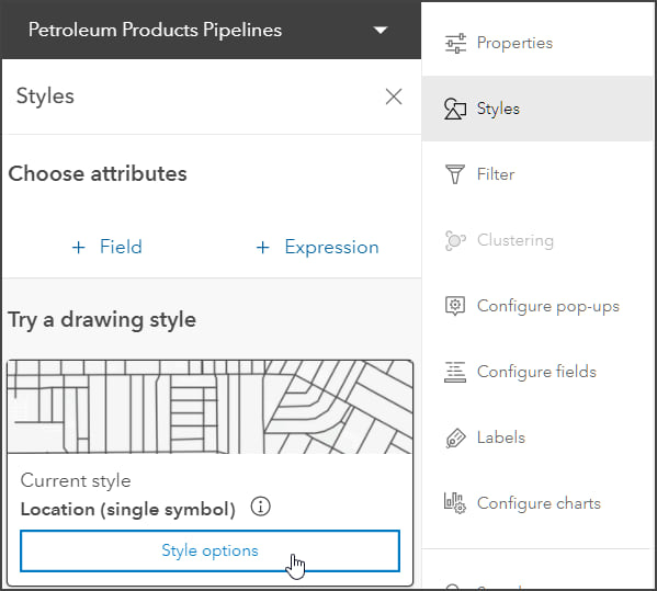
Step 11: Click Style options.
Step 12: Click the pencil to edit the style.
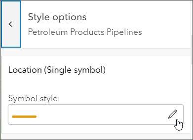
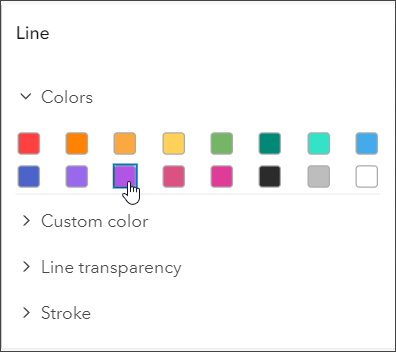
Step 13: Select a color you like. In this example, purple has been chosen as the line color.
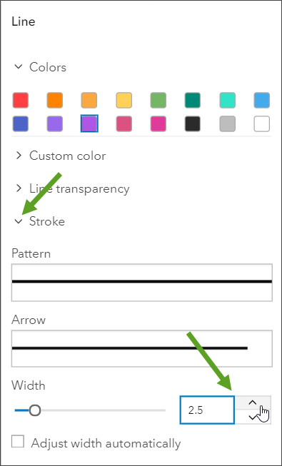
Step 14: Adjust the line width. Click Stroke to open the options and set the width and optionally review other settings. In this example, a width of 2.5 has been selected.
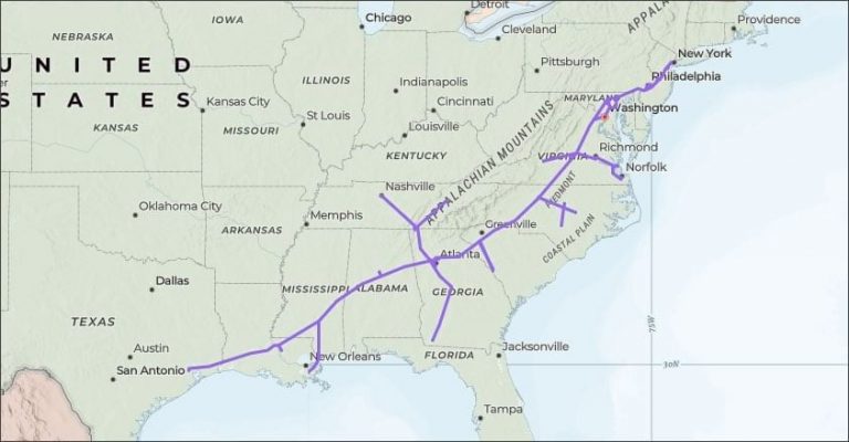
Experiment with colors, line width, different basemaps, and other settings until you get the desired results. In the map shown below, the basemap is the Charted Territories basemap, and the Colonial Pipeline is shown in purple with a line width of 2.
You can quickly create an application showcasing your map using any of the instant apps or configurable app templates.
For more information, see the following: