")
Geodesign is a method which tightly couples the creation of proposals for change with impact simulations informed by geographic contexts and systems thinking, and normally supported by digital technology.
—Michael Flaxman and Stephen Ervin, 2010
Geodesign is an invented word, and a very useful term to describe a collaborative activity that is not the exclusive territory of any design profession, geographic science or information technology. Each participant must know and be able to contribute something that the others cannot or do not . . . yet during the process, no one need lose his or her professional, scientific or personal identity.
—Adapted from C. Steinitz, 2012, A Framework for Geodesign, Preface
My first contact with computing occurred in early 1965 at a lunch at the Harvard-Massachusetts Institute of Technology (MIT) Joint Center for Urban Studies, where I was a graduate student fellow. By chance, I was seated next to Howard Fisher, who was visiting Harvard while considering a move from the Northwestern Technology Institute (now Northwestern University) to the Harvard Graduate School of Design. Fisher, an architect, had invented the Synagraphic Mapping System—SYMAP—in 1963. SYMAP was the first automated computer mapping system that included spatial-analytic capabilities applied to spatially distributed data. It was based on line-printer technology. Its principal technical innovations for graphics were to enable the typeface ball on the printer to be stopped and a series of overprinting commands to be invoked, which then created a gray scale (figure 1). SYMAP had not yet been applied to a substantive problem.
 and Contour map.")
I immediately seized upon the relationship between the capabilities that Fisher described to me and the needs of my doctoral thesis on the perceptual geography of central Boston. With Fisher as my tutor, I gave SYMAP its first applied test. I was trying to explain why some parts of central Boston were included in Kevin Lynch’s book Image of the City and some were not. I acquired data and mapped and analyzed it (figure 2), including via a graphic spreadsheet-type program, which I had to invent.
Partly because of this work, I obtained my first appointment at the Harvard University Graduate School of Design in 1965 as an assistant research professor and as an initial appointee to the then-new Laboratory for Computer Graphics. The Laboratory for Computer Graphics was established in 1965 with a grant of $294,000 from the Ford Foundation’s Department of Public Affairs and various smaller contributions from and to the Graduate School of Design. Under Fisher’s direction, the laboratory assembled a group of bright, energetic, and experiment-minded people, including urban planner Allan Schmidt, water engineer and economist Peter Rogers, and architect Allen Bernholtz.
The laboratory’s research was basically of two types. The first was investigation into the analysis and computer-graphic representation of spatially and temporally distributed data and was built largely upon Fisher’s SYMAP, which became in its time the world’s most widely used computer mapping program. In a very short time, we developed several innovative methods of high-speed electronic digital computer mapping and new techniques for data analysis and graphic display. These made full and efficient use of the accuracy, speed, and cost of the computers of the time.
")
The second type was research in spatial analysis, mainly related to city and regional planning, landscape architecture, and architecture, with emphasis on the roles of computers in programming, design, evaluation, and simulation. For example, Frank Rens and his team were developing SYMVU, which was programmed to control the view angle and distance of plotted 3D data by enabling rotation of 3D volumes. This was a key step both for animation and for geographically focused global representations.
My assigned role in the lab was to represent landscape architecture and urban and regional planning. However, my personal experience at MIT in thinking about regional change as a designed process with Lynch and Lloyd Rodwin clearly led me to see (and perhaps foresee) computing as providing essential tools and methods for design (figure 3).
My first teaching assignment was in fall 1966 in a multidisciplinary collaborative studio, sponsored by the Conservation Foundation, that focused on future regional development and conservation of the Delmarva Peninsula (Delaware and parts of Maryland and Virginia). In this study, I and a small group of students chose not to use the then-common hand-drawn overlay methods being used by the rest of the class but rather to prepare computer programs in FORTRAN and use SYMAP to make and visualize a series of evaluation models for the future land uses under consideration. A design was made that was visually informed by the resultant maps (figures 4A and B).
")
To my knowledge, the Delmarva study was the first application of GIS-modeled evaluation to making a design for a large geographic region. It is worth noting that this earliest GIS work was accomplished using Hollerith cards and the line printer to make paper maps in black and white. My first regional-scale GIS map was based on hand-encoded data to a grid base measuring 2 miles by 2 miles. It cost $35 (in 1965 dollars) for computing time on a $2 million IBM machine, the only accessible computer at Harvard. A registered user was only allowed one computer use a day. How happy I was to produce my first basemap, finally, after 30 days of effort.
Yet even in this first study, some rather sophisticated analytic steps were undertaken. These included a gravity model; various terrain-related analyses; the effect of one map pattern on another; and overlain data maps combined via quantitatively weighted indexes, such as the relative attractiveness for vegetable or grain agriculture. I cannot overstate the importance of the initial academic decision of Charles Harris, then chairman of the Department of Landscape Architecture, to support me to introduce GIS-based computing in a design-oriented studio rather than in a specialized “technical/computer” course. This would prove crucial to the future development of GIS at Harvard as a set of methods for design.
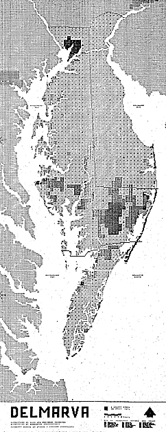
 and 4B. Data was combined using quantitatively weighted indexes to evaluate relative attractiveness for vegetable (top) and grain agriculture. (Courtesy of C. Steinitz.)")
In 1967, Rogers and I organized and taught an experimental multidisciplinary studio on the future of the southwestern sector of the Boston metropolitan region. The intent was to model the often-seen conflicts between the environmental vulnerability of the regional landscape and its attractiveness for development. We were also making a regional design for better managing the region’s sprawling urban expansion. My initial diagram for this study was made in early 1967 and is shown in figure 5. Note that it begins with an understanding of decision processes. It distinguishes between land-use demands and evaluations of their locational attractiveness and site resources and evaluations of their vulnerabilities. It assesses risk and impacts and proposes generating plans with the rules of a simulation model. It is organized in the same sequence now outlined in the second iteration of the framework in my 2012 book A Framework for Geodesign (although we didn’t call our work that at that time).
The entire flow of information for the study was designed by Rogers and me before any “work” was begun (figure 6). The study area was a rapidly changing suburban area. There was no digital data, so the students organized a GIS from air photo interpretation based on a 1-kilometer grid. (Remember, this was 1967.) Our students were also involved in all phases of the detailed specification, implementation, and uses of the models.
Ten process-related models were organized and linked, sharing what was then state-of-the-art GIS and programming software. Change was based on a demographic model that forecast population growth in different social classes and was allocated in 5-year increments for a period of 25 years. These created demand for new locations to accommodate industry, three residential types, recreation and open space, and commercial/institutional centers. This new land-use pattern then required new transport services. Four purposely different types of impacts were selected for assessment: local politics, local finances, visual quality, and water pollution. If these were deemed unacceptable by the students representing the decision makers, several feedback paths would result in redesign toward an improved land-use pattern for that stage. If the impacts were satisfactory, the set of models would then be used to simulate the next 5-year stage.
The evaluation of attractiveness or vulnerability for each land use in the future was based on a regression model of the locational criteria for that land use in the present. Computer-made maps, such as the following evaluations of locational attractiveness for low-, medium-, and high-income housing, were made by SYMAP.
While we were certainly aware of computer-based allocation models at that time, we deliberately had our students conduct the change model (the phase that changed the geography of the region) by hand so that they would be as personally engaged as possible in the process. They made the allocations based on a smaller 250-meter grid, guided by the computer-generated evaluation maps.
These unit-areas of change were represented by color-coded cards for the land use to be allocated. The population model established the demand for each land-use type in a time stage, and then student teams, each representing different land uses, engaged in the physical and verbal process of competing for the most attractive locations, much in the way that an agent-based change model would function. They first simulated a future trend through the several time stages.
The students then assessed the consequences of the trend changes with the several impact models. These impacts were visualized by overlaying colored pins and notes on the causal changes. The students then interpreted the impacts and decided whether changes in the trend’s land-use pattern of any stage were required. Lastly, they re-allocated the changes by design, producing results measured to be environmentally superior and meeting the criteria for development (figure 7). This Boston study was published in 1970 as A Systems Analysis Model of Urbanization and Change: An Experiment in Interdisciplinary Education (MIT Press).
")
Also in 1967, our research group, which included landscape architects Richard Toth, Tim Murray, and Douglas Way and engineer-economist Rogers, began a series of GIS-based studies that related various ways of making and comparing designs for large and environmentally vulnerable geographic areas with complicated programmatic needs. The Honey Hill study, named after its location in New Hampshire, was sponsored by the US Army Corps of Engineers. It involved a large proposed flood control reservoir and a new state park. GIS-based evaluation models were made of the attractiveness of this large area for recreation and other uses and of the vulnerability of the site’s natural systems to harmful impacts. Each member of the research team then proposed a design for the new lake and park facilities, in summer and winter (figure 8). In addition, Rogers used a linear programming algorithm to produce a fiscally optimal plan.
These alternatives were all compared in yet another model, which simulated several levels of population demand and user movement to the area’s facilities based on varied assumptions regarding number of persons and patterns of activity preference. Overcrowding and movement to second-choice locations or activities and capital and maintenance costs for the design alternatives were among the comparative impacts. Each design went through three iterations of assessment and redesign. The optimizing program performed best, and my design came in fourth.
 and Carl Steinitz at the Laboratory for Computer Graphics, Graduate School of Design, Harvard University, in 1967. Photographs of the process of working were taken only rarely, unfortunately.")
This study provided important insights into the potential power of using GIS to link different model types and ways of designing to make better plans. This experience would shape our work for many years and, in my own case, to the present time. This research concept was the inspiration for a series of studies focusing on the Boston region in the late 1960s, as well as a major research program supported by the United States National Science Foundation in the early 1970s, which integrated GIS methods with sectoral models of the processes of urbanization and change.
Two additional early experiments may be of interest. In 1968, I designed a series of programs that automated the process of placing a series of prepackaged visual simulation forms for trees, houses, etc., on a raster terrain model and a land-cover map (figure 9). This program set then allowed one to specify the location and azimuth for a view or sequence (based on the work of Rens), and a pen plotter would painstakingly draw a series of perspectives in that GIS-generated landscape. The system was configured so that changes in the GIS terrain or land-cover map would automatically trigger changes in the landscape view. This technique was successful as an experiment but inefficient and uneconomical. It took several years before we efficiently linked GIS to automated allocation and animated visualization.
 and improved growth (bottom three images). Lower right: Dust jacket of A Systems Analysis Model of Urbanization and Change, 1971.")
Also in 1968, and having made several experiments placing and visualizing a designed pattern of land uses on terrain, I had a series of discussions with architect Eric Teicholz about different ways in which rules could be established for the making of the designs themselves. We decided to make a series of experimental designs, which were rule based. There would be a street system and a pond, each with minimum setbacks; parking access within a minimum distance to every house; three housing types with prespecified locations for connections; and trees, which were allocated along roadways or near houses but could only be located on soil. The experiments varied the number of houses among the three types and the number and roles of trees. Figure 10 shows the first experimental rule-based design.
In retrospect, I would divide these earliest years of GIS and its applications into three stages. In the middle 1960s, we used computers and computer graphics to do things we already knew how to do using noncomputer technologies. We acquired data and encoded it and produced maps. The analytic capabilities of the time were primitive, typically limited to applied studies on landscape classifications, sieve maps, or overlay combinations, all of which could have been accomplished with hand-drawn methods. Spatial and statistical analyses were difficult; professional acceptance was low, and public cynicism was high regarding analyses and the resultant graphics produced by computers.

The second stage, in the later 1960s, emphasized substantially more sophisticated GIS analyses: the merging of mapping and statistical techniques, the introduction of more sophisticated spatial analysis methods, and the introduction of graphic displays more diverse than two-dimensional maps. A strong research effort in theoretical geography was organized and directed by William Warntz and related to the theory of surfaces, the macrogeography of social and economic phenomena and central place theory.
During the third stage in the early 1970s, the laboratory saw important interaction with other disciplines and professions, particularly the scientific and engineering professions. We had the self-criticism that recognized the need for more predictable analysis and for better models. The view throughout this third stage was that information could and should influence design decisions. A critical professional role would be to organize that information, have it available and adaptable to questions, and thus provide decision makers with information relevant to decisions at hand. The focus on aiding decisions rather than making decisions increased both public and professional interest and acceptance.
I ended my direct affiliation with the laboratory in this period. By then, we had developed, demonstrated, and occasionally linked and used computer software to fully support a variety of design processes. We had collaboratively applied these to significant studies of real, large, and complex places . . . the stuff of geodesign.
")
The laboratory continued to grow in size and influence under the further directorships of Warntz and Schmidt. The later 1970s to the mid-1980s may be characterized by the introduction of smaller and far less expensive computers, more user-friendly programs incorporating commands in common English or the ability to point a computer cursor, more easily acquired data, and a proliferation of analytic and graphics capabilities. These advances resulted in an increased potential for decentralized and networked computer use and in increased freedom from predefined analysis and planning approaches. However, the need—and responsibility—for selecting wisely from a much larger set of technical and methodological options also increased in this period. We saw in the universities and then in the professions the first computer-comfortable generation of students. Professional acceptance broadened, and computer use was no longer regarded as something special.
")
The Harvard Laboratory for Computer Graphics and Spatial Analysis ceased to exist—for many complex reasons—in 1981. By then, 165 people had served on the laboratory staff at one time or another. Much of the credit for the lab’s diverse accomplishments should go to Fisher, who died in 1974 and who was a remarkable person of uncommon energy and foresight. The many individuals linked to the lab and their ideas, computer programs, demonstrations, publications, and especially students were significant contributors to the development of today’s GIS and many of its applications, including geodesign.
About the Author
Carl Steinitz is the Alexander and Victoria Wiley Professor of Landscape Architecture and Planning, Emeritus, at the Graduate School of Design, Harvard University, and Honorary Visiting Professor, Centre for Advanced Spatial Analysis, University College London. In 1966, Steinitz received his PhD degree in city and regional planning, with a major in urban design, from MIT. He also holds a master of architecture degree from MIT and a bachelor of architecture degree from Cornell University. He is principal author of Alternative Futures for Changing Landscapes (Island Press, 2003) and author of A Framework for Geodesign (Esri Press, 2012).
For more information, contact Carl Steinitz.