
When warm temperatures rise above average levels, especially for several days or weeks in a row, the consequences can be dire. In September 2022, a 10-day heat wave in California brought temperatures of 109 degrees Fahrenheit to Long Beach and 116 degrees to Sacramento, killing 395 people, according to state health officials.
“Extreme heat kills more people than any other climate hazard combined—more than wildfire, more than hurricanes,” said Walker Wieland, environmental program manager for California’s Office of Environmental Health Hazard Assessment (OEHHA). “But extreme heat doesn’t have eye-catching graphics or images to make people aware of its dangers.”

During extreme heat events, more people get sick, and some die. Yet, according to Wieland, public awareness of extreme heat’s dangers—and what to do when it strikes—remains low.
“A lot of people just think, ‘I’m going to tough it out. I’ve felt heat like this in the past, so I’m just going to continue with all my planned activities for the day,’” he said. “But that can have really dangerous and sometimes deadly consequences.”
To help people across California prepare for and stay safe during extreme heat events, Wieland and his team developed CalHeatScore, a first-of-its-kind system that ranks heat risk on a scale from 0 to 4 at the ZIP code level. The online tool, built in ArcGIS Experience Builder, includes a map that divides the state into ZIP codes and shades each one a color ranging from light gray (low risk) to deep red (severe risk), depending on forecasted heat impacts for the current week. A tab displays cooling centers, such as libraries and community centers where people can access air conditioning and hydration. The tool also provides information on why each area has its heat ranking, along with profiles of the population’s age ranges, race and ethnicity breakdowns, access to health insurance, number of outdoor workers, and more.
“The tool is unique in its granularity,” said Dr. Amy Gilson, OEHHA’s deputy director for external and legislative affairs. “Getting down to the ZIP code level is key in California because we have a lot of microclimates. It’s also integrated with public health data, so CalHeatScore is well-positioned for individuals and local decision-makers to use.”

“We’re trying to make it as easy as possible for people to get a sense of what heat conditions and risks are like,” Wieland added.
How CalHeatScore Works
CalHeatScore, which launched at the end of 2024 and ramped up as temperatures began rising this May, was inspired by existing warning systems, such as those for hurricanes and tropical storms. The team wanted the system to communicate different risk levels without being overwhelming, so it adopted the 0–4 ranking system to convey low, mild, moderate, high, and severe heat risks.
To get weather and forecast data, the team relies on the National Oceanic and Atmospheric Administration’s National Digital Forecast Database, which uses data from regional Weather Forecast Offices and satellites to provide forecasts and weather models for the entire United States, broken down into a 2.5-kilometer grid. CalHeatScore then compares this weather data to historical climate conditions across the state to determine whether temperatures are below, at, or above average.
Crucially, CalHeatScore also analyzes emergency department visit data and compares those numbers with average climate conditions. This helps form statistical relationships between climate conditions and health impacts. When temperature forecasts rise, CalHeatScore reports expected increases in emergency department visits, serving as a measure for community health risk. With this information, CalHeatScore can model when temperatures in specific areas may become too hot for people to tolerate.
-
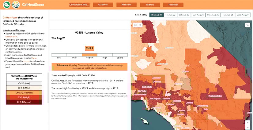
On the same day, two nearby areas, such as Lucerne Valley and Twentynine Palms, could have different heat risk ratings.
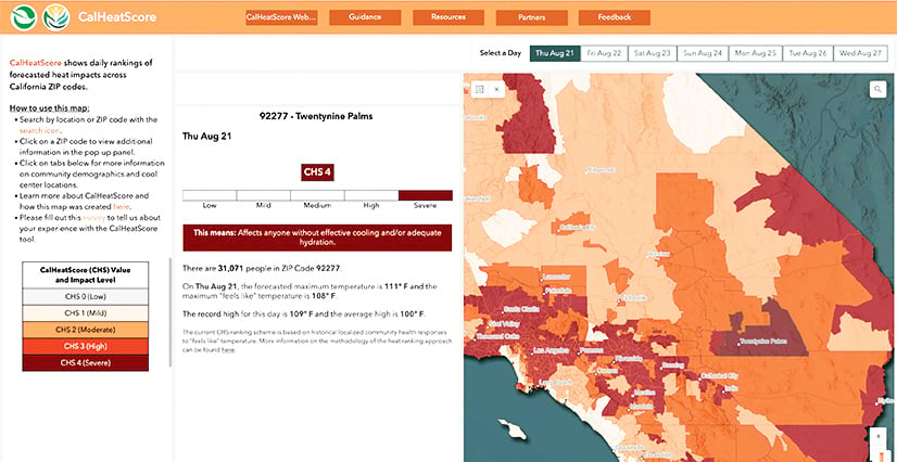
“This combination of fine-scale climate and weather information along with emergency department data allows us to tell more granular stories of heat and health for every community across the state,” said Wieland.
For example, in Redlands—a valley community known for being hot and dry—it could be 95 degrees. If that aligns with the average temperature for that time of year, and emergency room visits don’t spike at that temperature, CalHeatScore would give Redlands ZIP codes a risk level of 0 (low) or 1 (mild). But on the same day in Forest Falls—a mountain community less than 20 miles away from Redlands—it could be 82 degrees. If the data shows that the average temperature around this time is usually lower, and emergency room visits increase when it’s 82 degrees outside, Forest Falls could receive a risk level of 3 (high) or 4 (severe).
To help people know what to do during extreme heat events, Wieland and his team work with local community organizations to share details about cooling centers. CalHeatScore, available in English and Spanish, also contains information on signs of heat illness and how to stay cool.
“CalHeatScore is a tool that Californians can use to understand heat risk, plan ahead, and keep themselves and their loved ones safe from extreme heat,” said Wieland.
How it works is all the data—the weather forecasts acquired every 24 hours, the historical climate data, and the emergency department visitation rates—is pulled together in Python. The Python script runs at midnight and 5:00 a.m. every day, calculating the increased risk of emergency department visits for each ZIP code. That value is then translated into CalHeatScore’s 0–4 ranking system, with 0 meaning there is no risk for the ZIP code and 4 meaning there is an expected 100 percent (or more) increase in emergency department visitation rates.

This information is updated in ArcGIS Pro as a feature layer, which is automatically pushed to ArcGIS Online. The feature layer sits in a stylized web map and is displayed alongside other data, including a map of cooling centers and dashboards that show population information, such as vulnerable groups in each ZIP code. All this is made available to the public online via Experience Builder.
“With Experience Builder, we’re able to design and put out straightforward messaging, like information about workers’ rights and recognizing the signs of heat-related illness,” said Wieland. “Experience Builder allows us to add educational materials to our scientific data and makes it easy to adjust how we present that information.”
Making the Tool More Granular
Wieland and his team are still in the early stages of creating CalHeatScore and are committed to developing it transparently, alongside local community organizations.
, how many are outdoor workers (32%), and how many are linguistically isolated (46%). The map highlights heat score levels for various areas.")
“There are so many new directions that we could go to make this tool more comprehensive, more characteristic of on-the-ground or lived experiences, and more customized by building it in partnership with state and local government and community organizations,” Wieland said.
One idea the team wants to pursue is making CalHeatScore interoperable with other systems, including mobile apps, by developing application program interfaces (APIs).
“Having a tool that communicates risks for heat is so much more valuable to have on your phone than just having it on your desktop,” he said. “One of the key benefits that you could potentially get using a mobile app is notifications.”
The idea is to allow users to build a profile in CalHeatScore, where they could input their demographic information, health status, occupation, and more. Then the system could send them customized notifications based on who they are, where they are, and the day’s conditions.
“If you’re an older adult who works outside for a living, for example, the inherent risks of you becoming ill from extreme heat are higher than those of a young individual working indoors who has no pre-existing conditions,” Wieland explained. “If the system knows that you have an increased sensitivity to heat, it could provide you with more targeted messaging. So if it’s 82 degrees, and you’re a young, healthy individual, maybe the score you receive for that day is 0. But if you’re 75 years old, have asthma, and are working outside, maybe you receive a higher rating.”

Another idea is to overlay the CalHeatScore data with air quality index and smoke plume data to better understand how air pollution and particulates affect public health during extreme heat. The team is also developing a data download portal where users can access historical CalHeatScore data for their own research. By next summer, the team hopes to increase the spatial resolution of its heat data—by considering urban heat island effects and localized rural heat, especially in agricultural areas—and expand the heat-related health issues that the tool addresses to include long-term impacts and mortality data.
“Once we come into heat season in 2026, we’re hoping to release an updated version of the tool that has a higher spatial resolution and a more comprehensive picture of what this relationship between heat and health looks like,” Wieland said.
To ensure that the tool is accurate for users everywhere, the team will continue to work with other state agencies, county and city governments, and local community organizations. It also welcomes ideas from California residents and the GIS community on how to improve CalHeatScore.
“We’ll continue building on the tool to make sure it’s based on people’s experience on the ground,” Gilson said.
For more information about CalHeatScore or to get in touch with the team, email Wieland at walker.wieland@oehha.ca.gov.