Maps distill diverse and complex data into useful information. But there are limits to what map readers can see and understand. With ever more data available, mapmakers have to make a series of choices to ensure that the maps they produce resonate correctly for many different users.
They have to define the purpose of the map and determine its audience. They need to acquire data that meets that purpose and create a design that effectively communicates the intended message(s). They must determine a production method that supports the expected design outcome. And, ultimately, they need to share the finished map with the designated audience.
While this all seems pretty straightforward, mapmakers have to make decisions and navigate complexity at each step of the process. A cartographer’s skill, therefore, is called on at every phase.

For this short column, let’s focus on how we use data to make a map. By definition, maps are a generalization of more detailed information. Making sense of data and using it in meaningful ways, then, requires generalization techniques. How well these techniques are applied impacts how users understand the resultant maps.
While there isn’t a single process for generalizing data, the overarching guideline is that mapmakers need to decide what is important and should be emphasized. When cartographers first encounter data, they usually acquire knowledge about it by doing more research or speaking to specialists. That helps them classify and organize it—a precursor to doing further generalization.
According to Cartographic Design and Production by John Keates, cartographers use the concepts of data selection (what is included), simplification (the level of detail), and combination (arranging similar data together) to limit the amount of information that’s perceived in graphic form. At some point, applying generalization concepts leads to exaggerating and/or displacing some things. This is unavoidable, and it’s okay.
Cartographers use different tools to generalize data, and the processes they choose, along with how they apply them, impact the results. Many times, they test and review some of their choices to see what works best.
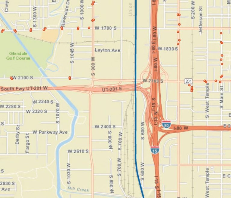
If the purpose of a map is to highlight a city’s road network, and a railroad runs parallel to one of the main roads, it might be necessary to displace one or both of these features at smaller map scales. Assuming that the railroad is important, since it shows a different transportation feature or could be used as a visible landmark, which of the two features should be moved? Going back to the purpose of the map, if the primary objective is to focus on roads, the cartographer may choose to leave the road in its correct position and move the railroad slightly but far away enough so that users can detect both features while still giving visual preference to the road. This is such a simple example, yet it calls on the mapmaker to make several decisions.
Determining which map production techniques to use is another choice that cartographers have to make when it comes to generalizing data. If the final map is static (e.g., being presented on paper or as a PDF), where the content and scale don’t change, then cartographers have more control over which generalization concepts to apply. For other forms of mapping, however—such as electronic maps used for navigation—the content changes, so what is emphasized needs to adapt according to the circumstances. Thus, data generalization becomes much more complex.
For navigating while driving, the road and its label, plus navigation instructions, are probably of greatest initial interest. But when an event such as an accident is added to the map via crowdsourcing, the map view generally needs to change to emphasize where the accident is and how it affects the planned route. What the driver sees on the map display—and hears via auditory cues, if that is part of the navigation platform—should help him or her navigate around the accident without hindering the primary function of driving. So mapmakers have to make difficult decisions about what data to generalize and what to keep on the map and in the driving instructions. Focusing on the map’s intended use and purpose helps with figuring this out.

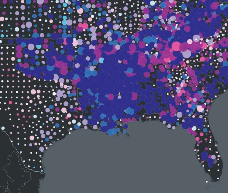
Deciding what kinds of value-based data need to be generalized for a map can also be challenging. Dot density maps typically display qualitative information alongside location (i.e., whether or not something exists in that place). Think of a map that shows population distribution: each dot indicates a set value, as well as that value’s location. Cartographers use map scale and other visual factors to determine the value the dots should display (1,000 people or 10,000 people, for example). To accurately represent more people than the value of the dot allows, additional dots must be added to the map. But the location of each dot can’t be in the exact same geographic location or it would look like there was only one dot on the map. The mapmaker must displace a few dots to ensure that all the dots fit on the map and reflect the total number of people in each location. Of course, this is only one technique of many that cartographers might consider employing to solve this spatial puzzle. I will also say that caution should be applied so that displaced dots don’t appear in areas of low or no population, like in water.
The increasing amounts of geographic data available today, especially with big data and an abundance of crowdsourcing technology and projects, provide seemingly endless opportunities to produce interesting maps. Practicing sound data generalization—by organizing the available data, selecting the most appropriate data to use, simplifying the overall picture the data presents, and combining data that’s similar—enables cartographers to help others gain a better understanding of an increasingly complex, data-rich environment.


