“Make it accessible.” Gulp.
It was 2016, and the State of Minnesota was ramping up its digital accessibility efforts. Maps were on the list of products that needed an accessibility makeover, but just how to tackle this problem remained elusive. Standards such as Section 508—the US General Services Administration’s IT accessibility program—and the Web Content Accessibility Guidelines (WCAG) didn’t include detailed, map-specific information. Online resources were scarce, too. And any presentations about maps only had general solutions—for example, to use alt text for images.
So staff members did what any good government agency does when presented with a problem: they formed a committee. It started small but quickly grew into a statewide team of accessibility experts and mapping professionals who all came from diverse backgrounds. Called the Maps Community of Practice (MCOP), the team focused on creating practical guidance for making accessible maps.

The result was an online map accessibility resource center. Launched in 2019, the website is filled with a growing number of guidance documents, quick tips, implementation tools, and additional web content to help anyone create an accessible map.
Why Accessibility?
Accessibility is crucial for making maps that everyone can use. It means taking proactive steps to remove potential barriers for people of varying abilities.
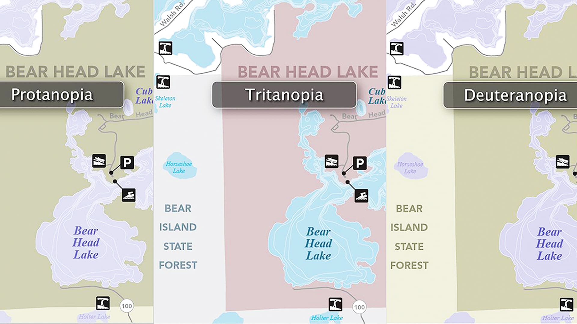
For example, high-contrast colors are important for those with color vision deficiency. Placing space around an object makes it easier for people with low vision to distinguish it. And alternative text, or alt text, helps people who use assistive technology, such as screen readers, to envisage photos, illustrations, maps, graphics, and other visuals.
The beauty of accessibility is that it assists people of all abilities. Who doesn’t appreciate a well-designed map with clear labels and a strong visual hierarchy?
What Makes a Map Accessible
Choosing the right design elements to make a map accessible can be challenging, especially when wading into this space for the first time. That’s why the MCOP came up with a series of top four tips for designing accessible maps.
For Map Design in General
Well-designed maps use fonts, colors, symbols, and more to help people navigate or share complex information in simple and easy-to-understand formats. Here’s how to make these choices more accessible:
- Fonts
The minimum font size for printed labels should be 6 point, and the minimum font size for explanatory text should be 12 point. - Colors
Use a color checker, such as Color Oracle, to confirm how accessible certain colors are to people with varied vision abilities. Select colors with high contrast to make important information stand out. The MCOP’s Map Design Guide includes color palette options. - Symbology
Use colors and symbols that people associate with what’s being represented. For example, blue should symbolize water, not land. Imitate the real world whenever possible. - Labels
Labels should be consistent and easy to read. Make their orientation and placement uniform. Never let labels overlap.
Check out more resources for designing accessible maps, including style downloads for Esri and Adobe software.

For Static Maps
Static digital maps are stand-alone graphics, such as JPGs or PDFs, that are not typically interactive. They serve as useful guides for visual and textual information. Here’s how these maps can be accessible to digital readers and visually impaired audiences:
- Design for accessibility.
Use descriptive text for the map’s title, captions, alt text, links, and body text to convey the map’s main messages. These elements should all work together to tell a story. Imagine you’re writing a report but don’t have the images yet and need to show a rough draft to stakeholders. What text would you use to fill in the gaps? - Enable human contact.
Provide general contact information that is easy to find, and ensure that someone will be available to answer questions. - Export usable formats.
Export flattened PDFs (without layers) with as few attributes as possible. Otherwise, items could disappear when adding accessibility tags to the PDF. Alternatively, export maps as images and insert them in a document in a program like Microsoft Word or Adobe InDesign that allows users to apply accessibility elements such as headings, alt text, and metadata. - Tag maps.
To aid assistive technology in reading and structuring static content, maps need to be tagged. Tag everything in a map as one figure or image. Add alt text to the map that complements other textual elements. Tag unique identifiers, like titles and captions, as text. For elements that are present only for visual appeal, tag them as background or artifacts.
The MCOP’s Accessibility Guide for Static Digital Maps, has additional details about how to make static maps more accessible. Also take a look at further information, such as how to tag maps using Adobe Acrobat.
For Interactive Web Maps
Interactive web maps allow users to interact with maps using a mouse, keyboard, touch screen, voice commands, and other tools. Users can select areas of interest, enter coordinates, and toggle layers on and off. They can typically zoom in and out and pan around the map while data changes dynamically. Here’s how to simplify the accessibility requirements for this:

- Define the map’s purpose.
Focus on delivering key messages when designing an interactive web map. The content drives the accessibility requirements, so make the main points clear and simple. - Use native HTML.
Where possible, use native HTML when coding elements. Only use Accessible Rich Internet Applications (ARIA) when needed, as it can complicate things unnecessarily. For example, when making a button, use <button> instead of div role=”button”. - Ensure full keyboard control.
Support a user interface (UI) that can be controlled using only the keyboard. This ensures that any user can access all the elements in a web map. - Test early and often.
Perform both automated and manual accessibility tests to help evaluate how accessible a web map’s content is.
For additional information on making interactive web maps more accessible, see the MCOP’s Accessibility Guide for Interactive Web Maps and visit the Interactive Web Maps web page.
What’s Next
Going forward, the MCOP remains focused on providing easy-to-understand information and tools to help people make better, more readable maps. Some of its current and future projects include putting together guidance for building dashboards and interactive maps and working in ArcGIS Pro. The group also wants to continue coming up with new techniques and tools for changing technology, share more of its resources, and develop training videos.
Maps that are accessible ensure that whole audiences can fully utilize the products that mapmakers have taken so much time and care to create. Hopefully these free resources from the MCOP can help other people and organizations in their own journeys toward making accessible maps.
All information and tools produced by the MCOP are available on the Minnesota IT Services Map Accessibility web page. For more information, email the Minnesota IT Services Office of Accessibility at MNITAccessibility@state.mn.us.
