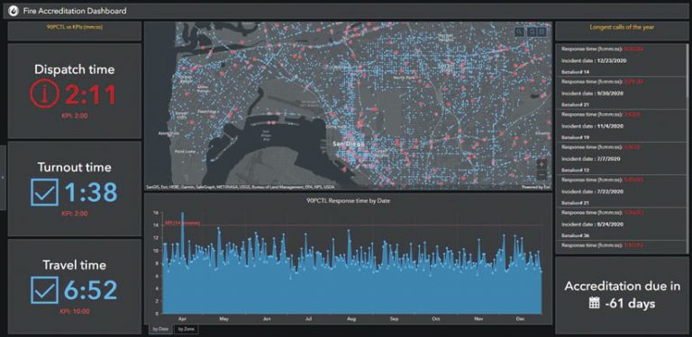
Dashboards—with their interactive visual elements, including maps, charts, and gauges—fundamentally change the way we explore information. They make data consumption easy and convenient.
The last year and a half has seen an exponential increase in the number of dashboards being created and shared. An array of industries is putting dashboards to good use, from emergency organizations coordinating disaster responses to public safety agencies monitoring events.

When the COVID-19 pandemic hit in early 2020 and organizations, including local governments, universities, and national and international health agencies, were clamoring for dashboards, Esri introduced a version of ArcGIS Dashboards that was built on ArcGIS API 4.x for JavaScript. The underlying technology in Dashboards needed an upgrade to provide better performance for dashboards that had gone viral, enhanced features to fit growing use cases, and refreshed designs that could meet various new user requirements.
After extensive testing and feedback from beta users, the product is now out of beta and available for general use. This updated version of ArcGIS Dashboards, which has a number of new capabilities and enhancements for dashboard authors, is now the default experience for all organizational users when they access dashboards.
Better Performance and Improved Usability
The new Dashboards is robust, built on powerful technology that can support several workflows, including those for mission-critical projects. Maps can now load more features, and those features load faster. Additionally, Dashboards can incorporate maps that make use of many valuable capabilities in the new Map Viewer, such as dot density mapping, layer blending, and group layers. These features ensure that dashboards perform as expected and that maps are tailored to convey the most relevant information to particular audiences.
The new version of Dashboards also brings improved usability. Users can employ a wider range of data sources within a dashboard and its elements, including feature collections and CSV web layers. In addition, Dashboards now has summary statistics for percentiles within the Indicator, Gauge, and Serial Chart elements. This is crucial for supporting the specific metrics that disaster response and emergency management agencies require.
Other enhancements to Dashboards include the ability to use ArcGIS Arcade for advanced formatting. Dashboard authors can compose Arcade expressions to apply conditional formatting to both the List and Indicator elements in their dashboards. This new level of customization alters how data points are rendered to fit a theme, workflow, or goal.
Additional Customization Options
Two additional capabilities—selection-based display and data expressions—enable dashboard authors to further customize how they present data to their audiences.
For dashboards that include a lot of data, it’s sometimes difficult to ensure that users are getting the information they need. In these cases, dashboards need more context.

Over the years, dashboard authors have found creative ways of guiding users’ interactions with their dashboards. To help authors fine-tune what their users see, the new ArcGIS Dashboards includes the ability to configure element displays so that they’re based on a user’s selections. This selection-based display allows authors to set conditions or dependencies for when and how data is presented on a dashboard. Having dashboard elements display data only when necessary makes dashboards easier to read and allows authors to create products that have a specific focus and only show relevant data.
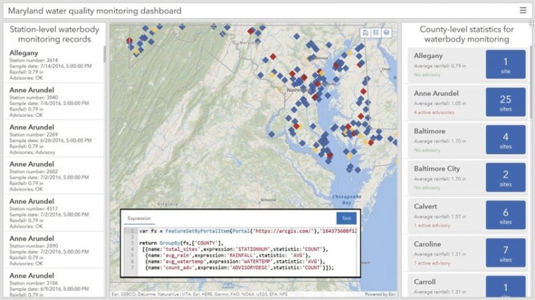
The new ArcGIS Dashboards also introduces data expressions—a way to structure data so it presents insightful visualizations to a targeted audience. With this capability, dashboard authors can leverage the data they have access to and return a feature set that powers one (or more) data-driven element and makes it interactive. For example, an organization collecting raw data on water quality across its state might want to show summary statistics to its audience, but what is being collected is many individual observations. A single data expression can bring these individual observations together, calculate a variety of statistics, and present insight about the data as a whole.
Data expressions are useful for a variety of purposes, such as when data needs restructuring, when a specific summary statistic is missing, or to calculate metrics from values across columns within one source or from multiple sources. Typically, it can be challenging for users to make such small data refinements, especially when they don’t own the dataset. But using data expressions makes this easier, enabling dashboard authors to structure data in a way that can help communicate a story more effectively.
Try the New ArcGIS Dashboards
The new enhancements built into ArcGIS Dashboards make it easier to effectively convey information in an intuitive and interactive manner. Experienced dashboard authors will recognize a user interface similar to the one they were using before, and new users can get up and running quickly, thanks to the app’s straightforward user experience.
There are numerous resources available to help anyone get started using ArcGIS Dashboards.

