Maps speak—not with words, but with form, color, and proportion. A well-designed map does more than locate; it persuades, explains, and reveals.
A map’s visual rhetoric guides the eye toward meaning, much like a poem leads the reader through rhythm and line, or an actor bends silence into emotion. To design a powerful map is not merely to depict geography—it is to craft an argument about the world.
In the professional realm of cartography, urban planning, data visualization, and geospatial analysis, design is often treated as an afterthought—something to clean up the output after the real analytical work is done. Yet design is analysis, performed through composition rather than computation. The decisions a mapmaker makes about color gradients, typographic hierarchy, symbol density, and projection are not decorative, they are interpretive. They determine what the viewer understands, remembers, and feels.
The Map as a Poem
If we compare a map to a poem, design becomes its meter and metaphor. Both the poet and the cartographer face a paradox: how to compress infinite complexity into a finite frame. The poet must choose each word carefully, leaving space for suggestion. The cartographer must choose each visual element deliberately, balancing inclusion with omission. The strength of both forms lies in what they leave unsaid.
A poem’s power often emerges from its structure—the line breaks, rhythm, and white space. Similarly, the rhythm of a map lies in its composition—the flow between dense and open areas and the pacing of visual attention. A cluttered map, like a poem with no punctuation, confuses. A sparse map, like a haiku, invites reflection.
Consider a topographic map of a mountain range. The delicate contour lines are visual enjambments, linking one elevation to the next in a steady visual rhythm. The reader ascends through the landscape much as a reader of verse climbs through metaphor and cadence.
Maps and poems also share the capacity for emotional resonance. A poem can make us feel the loneliness of a winter night; a map can make us feel the immensity of an ocean. The design choices—color palette, texture, and typeface—serve as tone and diction. A map drawn in deep indigo and ochre whispers differently than one in sharp reds and metallic blues.
The Map as Art
The boundary between cartography and art has always been porous. Renaissance maps adorned with cherubs and sea monsters were paintings as much as they were navigational tools. Contemporary artists—from Piet Mondrian to Anselm Kiefer—have used maps as metaphors for exploration, memory, and power. What unites those artists is an understanding that maps are aesthetic objects that frame perception.

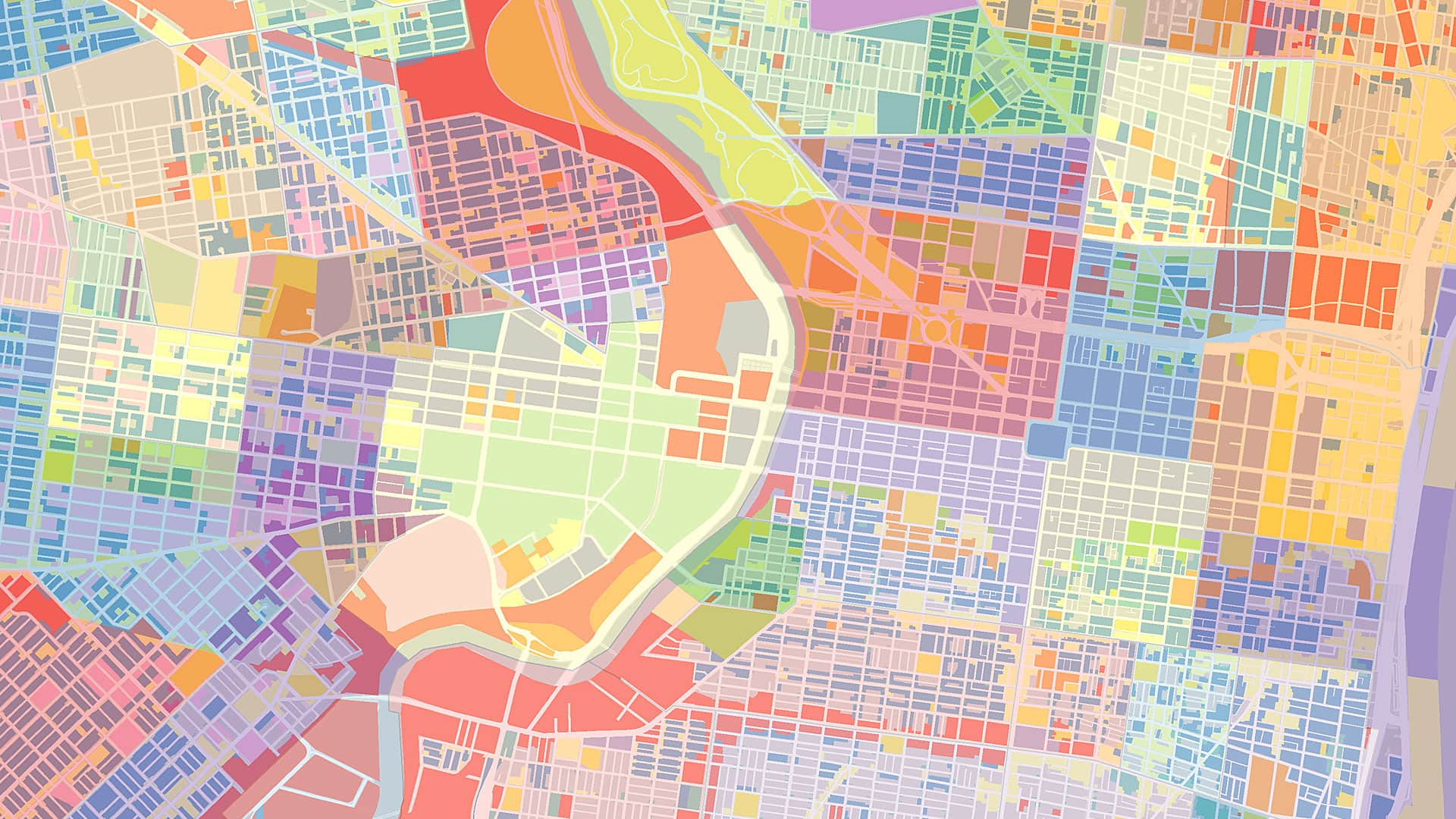
Good map design borrows from the painter’s toolkit: composition, contrast, balance, and light. The painter studies how color harmonies evoke emotion; the cartographer studies how hues convey data. A heat map of population density, for instance, draws on the same psychological principles of color that painters use to evoke tension or calm. A gradient from pale yellow to crimson doesn’t merely show numbers—it dramatizes them.
Design also defines focus. In art, the viewer’s eye is guided toward a focal point. In cartography, visual hierarchy directs attention to what matters most—an outbreak cluster or a navigational route. The designer decides which story the map will tell, just as a painter decides which form will dominate the canvas. Every layer, symbol, and label participates in this choreography of attention.
The greatest maps, like great works of art, achieve clarity through restraint. They know when to stop. This requires aesthetic judgment—balancing legibility with elegance and precision with persuasion. Good design disciplines emotion without erasing it.
The Map as Performance
A map, like a play, unfolds in time. The audience—the map reader—moves through it, scene by scene. A dynamic web map that lets users zoom and filter is a performance. Even static maps perform: They anticipate the reader’s gaze and choreograph it across the page.
Think of an actor interpreting a script. The words are fixed, but their meaning depends on gesture, tone, and pacing. Similarly, the data behind a map is fixed—the coordinates, the statistics, and the shapefiles—but its meaning depends on how the designer performs it visually. The same dataset can look urgent or tranquil, optimistic or tragic, depending on the staging. A pandemic map shaded in reds provokes anxiety, whereas the same map shaded in muted blues encourages contemplation.
In this sense, cartographic design is a rhetorical act, a performance aimed at persuasion. The designer must ask, “What am I trying to make the viewer think or feel?” Is the map a call to action, a neutral report, or a lament? Even neutrality is a performance choice: It conveys authority and distance just as a monotone delivery might in theater.
The Rhetoric of Design
Rhetoric, the ancient art of persuasion, offers a useful lens for understanding map design. Aristotle identified three appeals: ethos (credibility), logos (logic), and pathos (emotion). A powerful map integrates all three.
- Ethos: A map’s authority is derived from its precision and consistency. Clean typography, coherent color logic, and accurate spatial relationships establish trust. Without design discipline, even accurate data looks dubious.
- Logos: The logical structure of a map—its legend, scale, and layers—provides the reasoning. How clearly does the design communicate patterns, relationships, and causes? A well-designed map allows the viewer to infer meaning intuitively.
- Pathos: Emotional engagement transforms comprehension into conviction. Through color temperature, texture, or contrast, design can evoke empathy, urgency, or wonder. Pathos does not undermine accuracy—it animates it.
Rhetorical design acknowledges that maps, like speeches, are not neutral—they argue a point. A choropleth showing income inequality, for example, may use stark contrasts to dramatize disparity. That contrast is a rhetorical device akin to alliteration in speech or crescendo in a play. The cartographer, like the orator, must wield it responsibly.
The Ethics of Beauty
Powerful maps persuade because they are beautiful, and that beauty carries ethical weight. A beautiful map can expose injustice or disguise it, clarify reality or obscure it. When beauty serves truth, it deepens understanding. When it serves manipulation, it deceives. The ethical cartographer recognizes design’s double-edged power.
In professional practice, this means being transparent about sources, scales, and simplifications. It also means designing with empathy for the map’s subjects. Communities aren’t data points, and landscapes aren’t voids. To map is to represent others—sometimes without their consent. The design should reflect that responsibility, balancing clarity with sensitivity.
Beauty, in this context, is not decoration; it is care—the care taken to represent information accurately and evocatively. The best maps, like the best poems and performances, achieve a kind of moral elegance: They make complexity legible without arrogance and evoke emotions without coercion.
Designing to Think
Design in cartography is not about making maps look better; it’s about making them think better. Design is the bridge between data and meaning, measurement and imagination. It shapes how knowledge enters the mind and moves the heart.
A powerful map, like a powerful poem, doesn’t simply inform—it transforms. It changes how we see space and, therefore, how we inhabit it. The next time you design a map, think of yourself as the poet and the performer, the artist and the rhetorician. Your tools are grids and gradients rather than syllables or gestures—but your purpose is the same: to move the human mind toward insight.
For in the end, every map is an act of storytelling. And every great story—in words or in lines—is made not by the information it contains but by the design that gives it life.