As experienced map users, we probably don’t always realize that not everyone can enjoy the beauty and usefulness of maps. And there might be several reasons why.
On one hand, people could be visually impaired, ranging from total blindness to color blindness. Any problems they encounter when trying to read maps stem from the human visual system. On the other hand, someone could have trouble with map literacy. This could mean that the person is missing key map-reading skills. Or it might be a reflection of the mapmaker’s limitations.
The International Cartographic Association (ICA) is doing its best to address each of these difficulties in myriad ways. Here’s how.
To approach the first issue, ICA has a Commission on Maps and Graphics for Blind and Partially Sighted People. Its purpose is to exchange and disseminate information on how to best design and produce mapping technologies and graphics for persons with visual impairments. The commission, chaired by Alejandra Coll Escanilla, recently published a book called Methodological Guidance: Teaching and Learning Space Through Touch. Written in conjunction with colleagues—several of whom are blind themselves—at the Organization of American States’ Pan-American Institute of Geography and History (PAIGH) and Escanilla’s Tactile Cartography Center at the Metropolitan University of Technology (UTEM) in Santiago, Chile, the book seeks to help cartographers make tactile map products that are useful to anyone with visual impairments.
When it comes to less severe sight issues like color blindness, mapmakers can help by avoiding certain color combinations, such as red and green, when designing maps. ICA’s Commission on Cognitive Issues in Geographic Information Visualization studies matters like this, researching specifically how people use maps in different contexts. The commission’s objective is to produce a human-centered cartographic theory and practice based on sound empirical findings.
Map literacy can be defined as the ability to understand and use maps in daily life, both for work and at home. As one can imagine, there are different levels of map literacy—or illiteracy, if you like. Map illiterates vary in their map-reading abilities, and their comprehension usually depends on what type of map they are looking at and what they are trying to accomplish by reading a map.


To help someone improve his or her map literacy, it might be useful to come up with specific map-reading exercises that focus on individual skills—like, when navigating, having the map reader orient the map to link the mental exercise of reading it with what’s happening in the real world. If we are aware of the person’s particular map-reading problem, it might be worthwhile to adapt a map’s design to the map reader’s skill level.
ICA’s Commission on Use, User and Usability Issues is instrumental in coming up with solutions to these types of quandaries. One of the many ways that it approaches map literacy problems is by organizing training workshops about cartographic usability for professionals who are not necessarily mapping specialists but who frequently use and make maps, such as planners and geologists.
Map readers really get into trouble when maps are badly designed. When this is the case, map-reading skills don’t help very much. And I am afraid this happens quite often, especially with thematic maps.
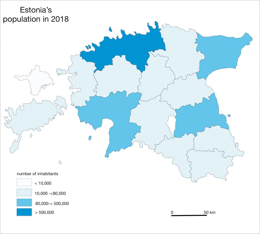
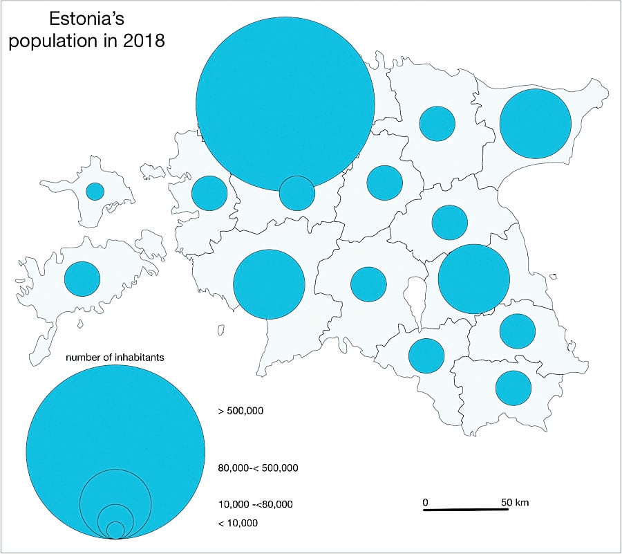
Mapmakers who are responsible for badly designed maps are likely unaware of basic cartographic guidelines (although some maps are produced poorly on purpose to manipulate how certain issues are perceived—using the color green to illustrate a heavily polluted area to make it appear safer, for example). Most problems arise either when the characteristics of the data, such as whether it is qualitative or quantitative, are not well understood or when the wrong symbololgy is used to represent data on a map. It can be confusing, for example, when a choropleth map is used to represent absolute numbers or when different quantities are displayed using colors.
Sometimes errors like these are rooted in badly chosen software defaults. Other times they are caused by the layout or cosmetics of a map—when an abundance of colors or symbols are mixed together, for instance, causing visual confusion.
The only positive element of coming across mapmaker errors like these is that I have a lot of exam materials for my students, who should be able to judge the quality of a map. But if mapmakers would like to avoid map design blunders, they might want to consider participating in the activities put on by ICA’s Commission on Map Design.
Most of the problems that render maps useless to certain segments of the population have proven solutions. And for the ones that don’t, ICA has dedicated commissions to try to address those issues in an international context.


