Jupyter Notebook has become incredibly popular among data scientists and general users of Python and R. While the Jupyter framework is liberal and lets you be creative, it would benefit you, your team, and your readers if you define a structure and follow it. Based on my experience as developer evangelist and the author of public-facing notebooks for the last three years, I share in this article the patterns I recommend for writing data science samples using Jupyter Notebook.
Use Headings and Markdown Lavishly
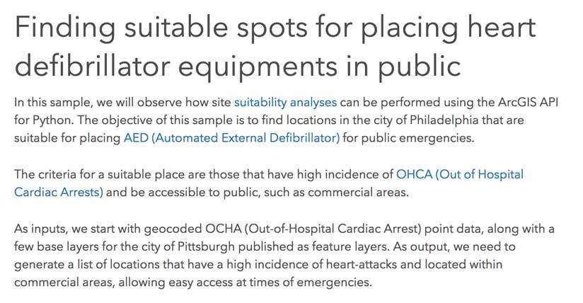
Start your notebook with Heading level 1 and give it a title. Follow with a narrative explaining what the notebook aims to do, where the data is sourced, and what the user can expect.
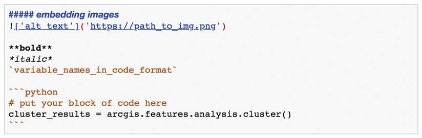
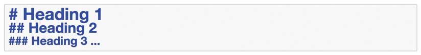
Break down your notebook into smaller parts and use Heading levels 2, 3, 4, and so on for the hierarchy of topics and sub-topics. A notebook should ideally have just one Heading level 1, under which multiple Heading levels of 2, 3, 4, and so on are nested. To enhance your notebook, embed images and use different typography such as bold or italic, or insert code to enliven text.
Use LaTeX for Equations
LaTeX is a document preparation system that uses the TeX macro language. A cheat sheet from the New York University website is linked to the online version of this article. Insert LaTeX equations inline within two dollar signs $…$.
Break Longer Segments of Code into Multiple Cells
Try to keep your code cells as short as possible. Break them up by adding markdown cells in between and add explanatory text. A cell for a single line of code is too short. A cell with more than 15 lines of code is too long.
Plot Profusely
Matplotlib, a Python 2D plotting library, is great, but check out higher-level plotting libraries such as Seaborn Pandas.DataFrame.plot() before you settle for Matplotlib. Use plt.tight_layout() to autosize your plots to fit the notebook. Use subplots when you want to show a grid of plots. And finally, ensure that your plots have a legend, title, axes names, and discernible symbols.
Coding Standards for Your Python Snippets
For variable and function names, use underscores to separate words—in other words, snake_name_your_variables—instead of separating words with cases or camelCasingYourVariables. The exception is class names, which should use camel casing and start with the capital case.
Do all imports at the top of the notebook. This way, the reader knows what libraries are used and can ensure that their environment is ready.
Name variables so that they don’t clobber built-ins. For instance, call your map object map1 and map2 instead of map, which will hide built-in map() function. Don’t call variables as dict or list, which will hide built-in data structures with the same names.
For enhanced performance, use the Spatially Enabled DataFrame (available since version 1.5 of ArcGIS API for Python) in place of SpatialDataFrame objects.
Use Round Numbers for Display Purposes
Quickly round your DataFrames during display by calling the DataFrame_obj.round() method. For instance: usa_house_scaled.describe().round(3) will display numeric columns in your DataFrame rounded to three decimal digits.
Be Explicit about Uncommon Libraries
It is generally a good practice to import all your dependencies at the beginning of your script. However, in the notebook medium, you might prefer to import them as and when necessary to better explain your work. This is especially true if you import a lot of dependencies at the function level. If you use a library that is not shipped with base anaconda, then the user must run installation steps and relaunch the notebook. Make this explicit at the beginning of the notebook.
Structure of Your Data Science Notebook
By and large, use headings to structure your notebook as you would a paper for a scientific journal.
Heading 1: Title
Cover the narrative or abstract and include a TOC.
Heading 2: Get data
Import libraries and search for and get required datasets.
Heading 2: Exploratory data analysis
Use maps and charts lavishly to show different aspects of the data.
Heading 2: Feature engineering
Use pandas and other libraries to prepare your data for training. After each significant transformation, show previews of your data by printing the first three or five records of your DataFrame.
Heading 2: Analysis
Perform analysis and build and train models.
Heading 3: Evaluation
Evaluate model and note if assumptions are met by using both charts and metrics. Run predictions, evaluate results using both charts and metrics. Use more than one metric for evaluation.
Heading 2: Act on the analysis
Persist the results, either by writing to disk or publishing them to the web. Elucidate with maps and charts as applicable. If you built a prediction model, publish it as a web tool (REST API). If you built an explanatory notebook, publish it as an article or report.
Heading 2: Conclusion
Summarize your work by starting from your problem statement, moving to the approach you followed, and describing the results you obtained.
About the author