In the past year, Esri has added powerful, innovative, and easy-to-use graphic drawing functionality to the ArcGIS API for JavaScript. Now you can easily create effective data visualizations on the map with a few lines of code. This article will walk you through some of the visualization capabilities in the ArcGIS API for JavaScript.
Prerequisites
Before doing this tutorial, you should know how to create a sample map application. If you haven’t done this before, see the tutorial on GitHub. You should also know how to publish a feature service hosted on ArcGIS.com or using ArcGIS for Server. If you are not familiar with this process, see the ArcGIS help file.
Getting Started
This tutorial uses samples located on GitHub. Access this repository to obtain the code and view the live samples referenced in this article.
Add Data as a Feature Layer to a Map
You can create a feature layer with the service URL and add that layer to your map as shown in Listing 1. A feature layer has default drawing properties, which are used to render your data layer on the map.
Style Data with a Simple Renderer
Renderers determine how a feature layer is drawn on a map. When data was added as a feature layer to a map, the default drawing properties were used to draw the feature layer. However, you are not limited to defaults when representing your data. The ArcGIS API for JavaScript provides different renderers you can implement from the client side so you can create the most effective visualizations for your data.
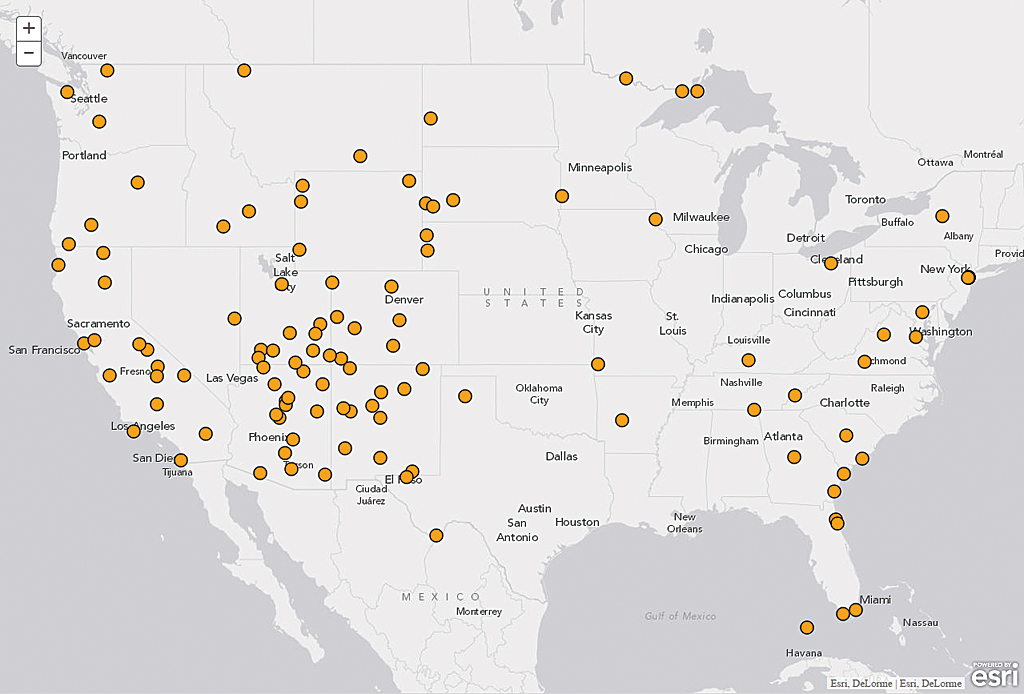
A good way to determine which renderer to use is to ask yourself what is the purpose of the map. This example uses the National Park Statistics 2013 Feature Layer. To help decide which renderer to use, you could ask questions such as, where in the US are the national parks located? or what type of feature does this layer display? The simple renderer is good for data that answers where questions because it draws all features with the same symbol. (See basic_use_renderer under esri/visualization-js on GitHub for links to code and a live sample.)
To use the simple renderer, first create a symbol. A simple marker symbol is suitable for this point data. For line and polygon geometry types, other symbols are available. See the Symbolizing graphics with renderers topic in JavaScript API SDK for more information.
Then we pass this symbol info a simple renderer instance and apply this renderer on the layer.
You can use this approach to make a simple web map application for visualizating your data.
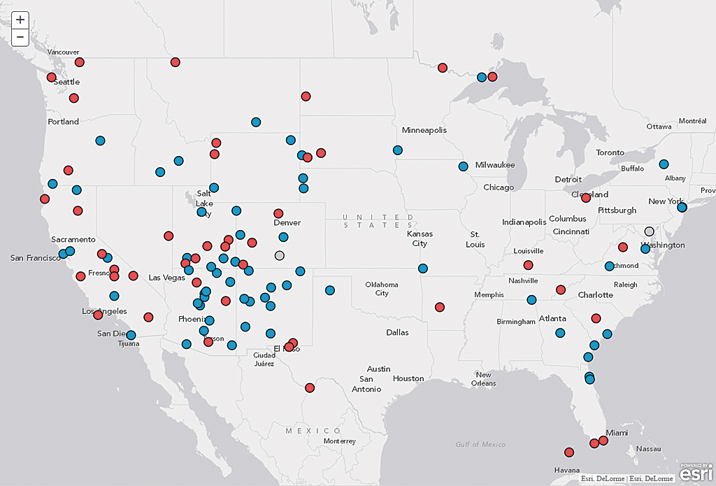
Using the Unique Value Renderer
If your map needs to communicate more than just the location of a feature, you can use other visualization techniques. The Unique Value Renderer is good for answering what questions.
The Unique Value Renderer looks at an attribute field in your layer and provides a symbol for each unique value in that field. Again using the National Park Statistics 2013 Feature Layer with the Unique Value Renderer creates a map with each feature displayed by type (i.e., national park, national monument).
Creating a Unique Value Renderer is very similar to creating a Simple Renderer. The key difference is that you must pass an extra argument, a field name, to the UniqueValueRenderer constructor. The value of the field chosen will determine which symbol is used for each feature on the map. The sample uses the field Type, and the symbol object above is the default symbol for the data. (See the unique_simple folder under esri/visualization-js on GitHub for links to the code and a live sample.)
Define Symbols for Unique Values
The purpose of a map that answers what questions is to clearly show features on the map that are logically grouped by a common characteristic that is designated by a unique value in a field. To do this, create symbols that relate to the subject but are different enough from one another that patterns can emerge on the map. Defining symbols is an iterative process. Try a symbol, evaluate its effectiveness, then modify it if necessary. Listing 4 shows how to specify a unique symbol for each unique value in the Type field. The addValue() method is used to pass each value with its unique symbol.
It might not be necessary (or desirable) to provide unique symbols for all values in a field. Because your audience will have difficulty distinguishing more than 10 colors, it is best to only add symbols for the top few categories and place all other categories into a group called Others, which will automatically get the default symbol defined in the UniqueValueRenderer constructor. (See the unique_simple folder under esri/visualization-js on GitHub to view the completed sample.)
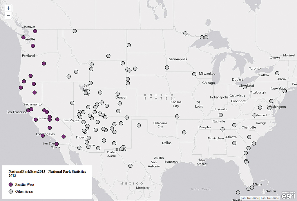
Convert Raw Data to Predefined Categories On the Fly
Having a field with too many unique values will make it difficult to create good visualization based on that field. One nice trick you can use with the Unique Value Renderer is to convert raw data to a few predefined categories on the fly on the client side. Converting raw values on the fly saves you the step of having to add a field to the data and calculate it, which may be something you don’t want to do or cannot do.
In this example, instead of taking raw values in the Address field of the National Park Statistics 2013 Feature Layer, you can group data in a few categories such as Pacific West and Great Plains based on the state name in the address. This magic starts with the creation of the renderer.
For the second parameter in the renderer, instead of passing the field name, which is a string, you provide a function that converts values in that field. This function gives you access to every graphic in the layer. Each graphic object contains all properties you need to show on the map (geometry, attributes). Based on the Address field, you can convert the address into two categories: Pacific West and Other Areas. You use graphic.attributes [‘Address’] to access this field. If an address contains the state abbreviation CA, OR, or WA, it is categorized as Pacific West.
After creating the renderer, you will need to provide symbols for these new categories:
Using a function with the Unique Value Renderer allows you to visualize not only the raw data in your feature layer but also new information calculated from your raw values. See the unique_conversion under esri/visualization-js on GitHub to look at the finalized application.
About the author