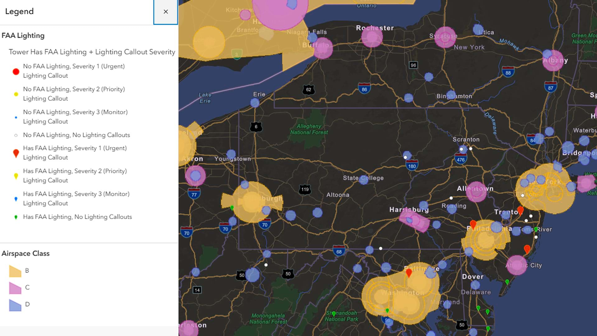
An estimated 350 million people in the world have some form of color vision deficiency (CVD). That’s roughly one in 12 men and one in 200 women. Statistically speaking, the average person knows at least 25 people who are color-blind. Map designers who consider factors like these can more effectively ensure their maps are not only accessible to all, but also easier to read and interpret. A good place to start is with the following question:
How can we make our maps readable for those who have some form of color blindness?
When recognizing the impact that color can have in your maps, especially those created in ArcGIS Pro, it’s vital to first understand the different types of color blindness.
People with deuteranopia are unable to perceive green light. Deuteranomaly is a reduced sensitivity to green light. Deuteranopia and deuteranomaly are the most common forms of color blindness.
People with deuteranopia are more likely to confuse:
- Mid-reds with mid-greens
- Blue-greens with grays and mid-pinks
- Bright greens with yellows
- Pale pinks with light grays
- Mid-reds with mid-browns
- Light blues with lilac
Less common types of color blindness include protanopia and protanomaly, the inability to perceive red light and a reduced sensitivity to red light, respectively.
People with protanopia are more likely to confuse:
- Black with many shades of red
- Dark brown with dark green, dark orange, and dark red
- Some blues with some reds, purples, and dark pinks
- Mid-greens with some oranges
Rarer still are tritanopia and tritanomaly, an inability to perceive blue light and a reduced sensitivity to blue light.
People with tritanopia are more likely to confuse:
- Light blues with grays
- Dark purples with black
- Mid-greens with blues
- Oranges with reds
Achromatopsia is one other rare type of color blindness and refers to the inability to perceive color at all. People with achromatopsia see only shades of gray.
Although it is important to take into account all forms of CVD when designing a map, we will focus primarily on readability for the most common types of color blindness—deuteranopia and protanopia.
Before we start talking about color-blind readability, it’s also worth taking a step back to cover some color basics.
Hue refers to the wavelength our eye perceives. This term is often used interchangeably with color.
Value refers to the shade of a color. A lower value represents a darker color, and a value of zero is black. Value increases in the lightness or whiteness of the color.
Saturation refers to the intensity or purity of the color. An intense color is more saturated, and a dull color is less saturated and looks grayer.
Getting Colorful in ArcGIS Pro
Let’s look at the color swatches available in ArcGIS Pro. When you view the same colors through a filter that replicates how the swatches look to someone with deuteranopia or protanopia, you can see how the colors differ.
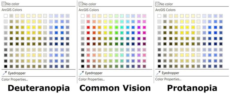
To choose the colors that work best for readability, first divide this color swatch into three main categories:
- reds/oranges
- yellows/greens
- blues/purples
This is a good starting point, but I recommend that you check your final colors with an emulator. Emulators allow you to use a lens to see how your map will look to others.
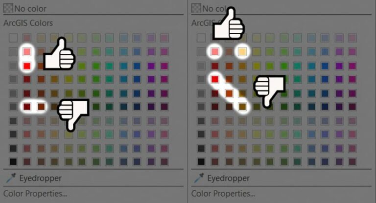
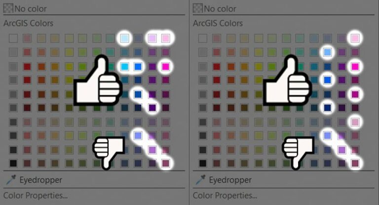
To pick colors in the columns of red hues, go down the column (vertically) when choosing colors that are next to each other. Don’t choose colors that are side-by-side in the same row (horizontally), as they are more difficult to distinguish.
In the orange column, choose one orange and one red in the same row. Be cautious when choosing colors diagonally in the reds and oranges. Some of these may appear to be the same color to someone with color-blind readability issues.
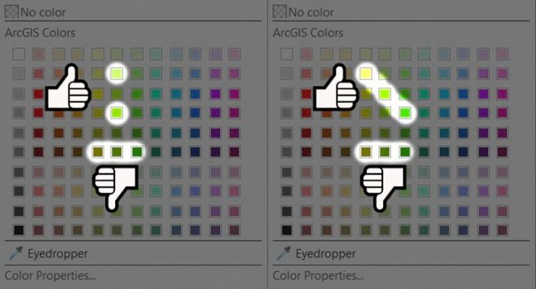
When it comes to yellows and greens, it’s best to stick to a similar pattern. Don’t choose colors that are side-by-side in the same row. If you choose colors in the same column, skip every other value, or choose two to three colors that are diagonal.
With blues and purples, choose three of the four colors in one row, typically skipping one hue in the two center columns. Choose two to three colors that are diagonal to each other. If you choose all four that are diagonal, you may find two colors that are too similar. If you choose colors in a column, skip every other value.
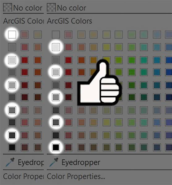
When working with the gray scale, skip every other value, no matter who is viewing the map. Even those who have no issues seeing color will have issues distinguishing between a 10-percent gray and a 20-percent gray.
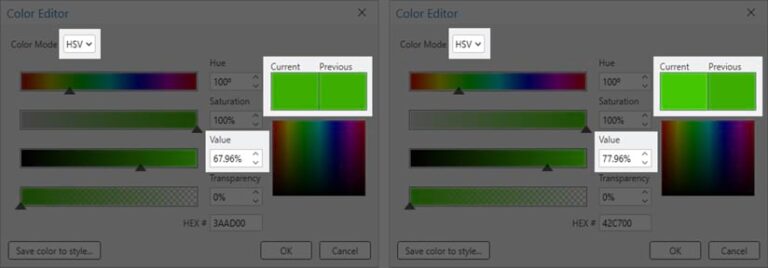
This can also be applied to custom colors. You can create custom colors in the Color Properties menu. If a color almost works, you can distinguish the color more by increasing or decreasing the value by 10 percent from another color that looks similar. Working with the saturation is another way to distinguish between similar colors.
In the Color Properties, switch from the RGB (red, green, blue) color model to the HSV (hue, saturation, value) color model to access the ability to change the value of a color, which can help make it more visually distinct.
More than Just Color
Fills, point symbols, line weights, and other styles can help make your maps more understandable as well.
On this hiking trail map, you can see that hue might not be the most helpful variable to distinguish between features.
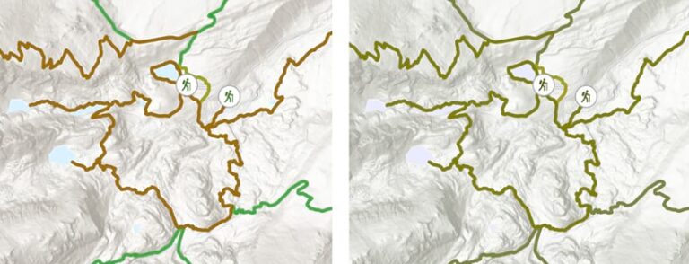
Although two of the lines might appear nearly the same color, you can use a dashed effect on the line to distinguish them, as seen in the second map.
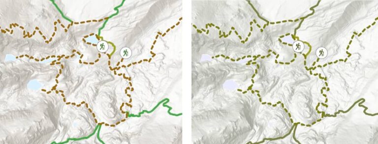
When you use the color tips outlined earlier to choose different hues or vary the values, you can use both hue and shape to help make the distinction between features even clearer.

If this seems like a lot of work, there’s an easier way to achieve the same effect.
In ArcGIS Pro 2.3 and beyond, a color ramp called Cividis allows you to use colors that were predesigned to be readable for those with some form of color blindness.
To choose a color ramp, click on Show Names and find the Cividis color ramp.
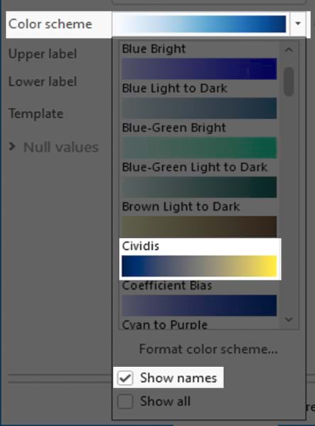
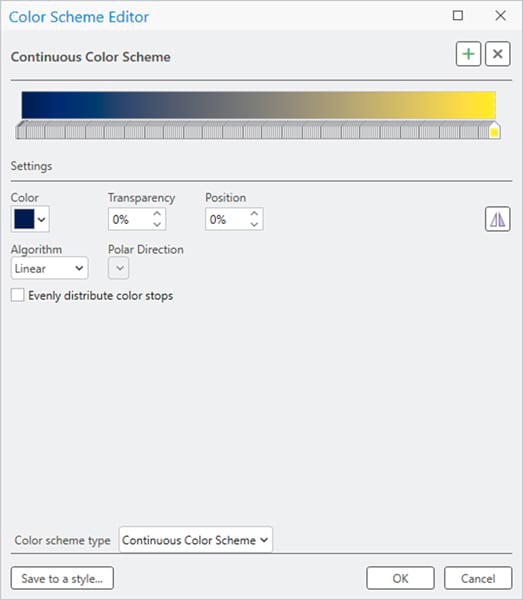
Additionally, you can choose colors from this ramp by selecting Format Color Scheme; this is where you can reverse the color ramp. You can also select any color in this scheme and save it as a Style to save and share your symbols, colors, color schemes, label placements, and layout items.
You can use the Color Scheme Editor to change the color ramp or pull individual colors.
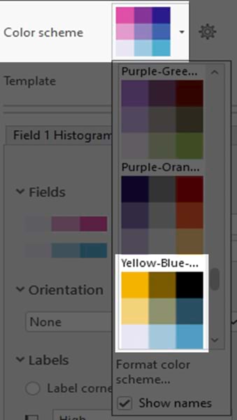
If working with bivariate or trivariate symbology, a color-blind readability symbology option, called the Yellow-Blue-Black 3×3 color scheme, is also an option. Bivariate colors symbology shows the quantitative relationship between two variables in a feature layer. This type of symbology uses bivariate color schemes to visually compare, emphasize, or delineate values. Similar to graduated colors symbology, each variable is classified, and each class is assigned a color.
The ColorBrewer 2.0 website is another invaluable resource you can use to choose colors for color-blind readability. From here, input RGB or Hex color codes (values that tell the display how much color to show) directly in the Color Properties in ArcGIS Pro.
The Final Test
In order to test that these concepts and changes work, the final step is to use an emulator. In ArcGIS Pro 3.0 and beyond, this is called the Color Vision Simulator.
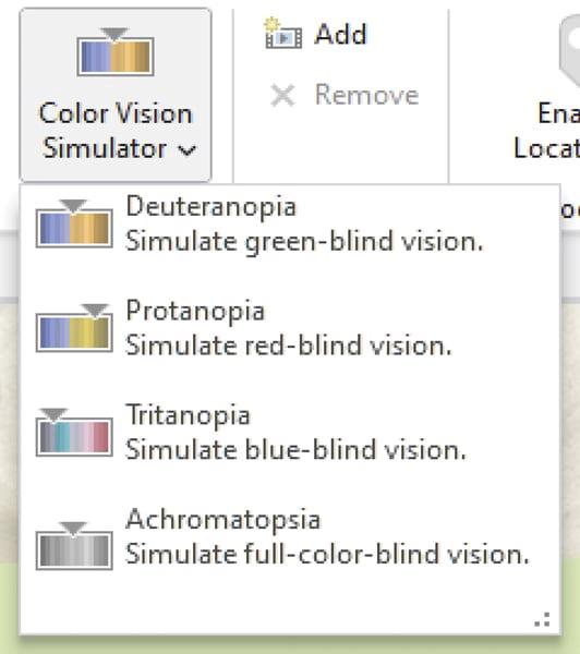
This will show what your map looks like to those who have deuteranopia, protanopia, tritanopia, or achromatopsia. You can access it in the View tab and check your map through three filters. Adjust your colors on the fly and see the changes.

