Most of us have spent time hunting for a house to rent or buy. Whether you realized it or not, a lot of the factors you considered were heavily influenced by location.
This article shows how the data wrangling capabilities of the scientific computing tools for Python and the geospatial data visualization and analysis capabilities of the ArcGIS platform can be used to build a model that generates a shortlist of houses in Portland, Oregon, that fit the needs and desires of a house hunter.
Why do this, you ask? There are real estate websites that promise to do the same thing. I hope that by the end of this article, you will be able to answer that question yourself.
The process I used is extensively illustrated in a Jupyter Notebook, available on GitHub. Open it, examine it, and follow along when reading this article. This example was originally created for a Portland GeoDev talk.
Data Collection
Housing data, collected from a popular real estate website, came in a few CSV files of different sizes. Data was read using pandas as DataFrame objects. These DataFrames form the bedrock of both spatial and attribute analyses. The CSV files were merged to obtain an initial list of about 4,200 properties that were for sale.
Data Cleaning: Missing Value Imputation
An initial and critical step in any data analysis and machine learning project is wrangling and cleaning of the data. In this case, the data suffers from duplicates, illegal characters in column names, and outliers.
Pandas makes it extremely easy to sanitize tabular data. (See Listing 1.) Different strategies were used to impute for missing values. Centrality measures, such as mean and median, were used to impute for missing values in LOT SIZE, PRICE PER SQ FT, and SQ FT columns, whereas frequency measures like mode were used for columns such as ZIP. Rows that had missing values in critical columns such as BEDS, BATHS, PRICE, YEAR BUILT, LATITUDE and LONGITUDE were dropped, as there was no reliable way of salvaging these records. After removing these records, 3,652 properties were available for analysis.
Removing Outliers
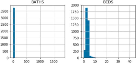
Outliers in real estate data can be caused by many things such as erroneous data formats, bad default values, and typographical errors during data entry. Histograms of numeric columns can show the presence of these outliers.
In the first two histograms in Figure 1, it appears that all houses have the same number of beds and baths. This is simply not true and a sign that a small number of high values (outliers) are skewing the distribution.
There are different approaches to filtering outliers. A popular one is a 6 sigma filter, which removes values that are greater than 3 standard deviations from the mean. This filter assumes that the data follows a normal distribution and uses mean as the measure of centrality. However, when data suffers heavily from outliers, as in this case, the mean can get distorted.
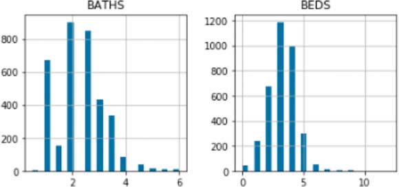
An Inter Quartile Range (IQR) filter uses median, which is a more robust measure of centrality. It can filter out outliers that are at a set distance from the median in a more reliable fashion. After removing outliers using the IQR filter, the distribution of numeric columns looks much healthier.
Exploratory Data Analysis
Pandas provides an efficient API to explore the statistical distribution of the numeric columns. To explore the spatial distribution of this dataset, use the ArcGIS API for Python.
The GeoAccessor and GeoSeriesAccessor classes add spatial capabilities to pandas DataFrame objects. Any regular DataFrame object with location columns can be transformed into a Spatially Enabled DataFrame using these classes.
Similar to plotting a statistical chart out of a DataFrame object, a spatial plot using an interactive map widget can be plotted out of a Spatially Enabled DataFrame. Renderers such as heat maps can be applied to quickly visualize the density of the listings.
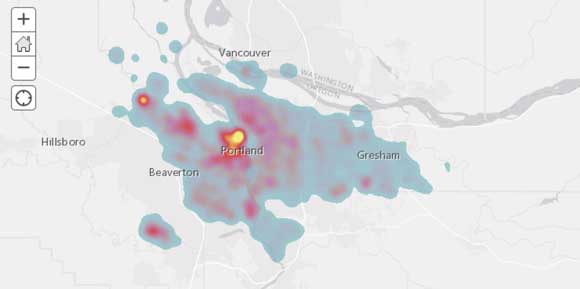
Plotting a Spatially Enabled DataFrame with a heat map renderer shows the presence of hot spots. The ArcGIS API for Python comes with an assortment of sophisticated renderers that help visualize the spatial variation in columns such as PROPERTY PRICE, AGE, or SQUARE FOOTAGE. Combining maps with statistical plots yields deeper insights and investigates general assumptions.
Running an Initial Shortlist
The rules in Listing 2, based on the houses’ intrinsic features, were used to build a shortlist.
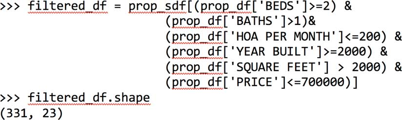
The shortlist reduces the number of eligible properties from 3,624 to 331. When plotted on a map, these properties are spread across the city of Portland. Histograms of the remaining 331 show that most have four beds and the majority are skewed toward the upper end of the price spectrum.
Quantifying Access
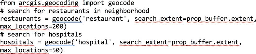
When buying a house, you are looking for proximity to services such as groceries, pharmacies, urgent care facilities, and parks. The geocoding module of the ArcGIS API for Python can be used to search for such facilities within a specified distance around a house, as shown in Listing 3.
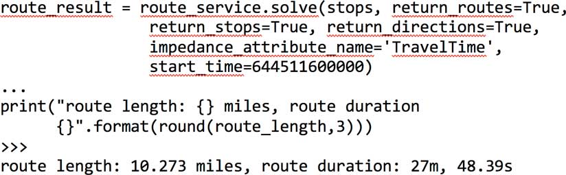
Another important consideration is the time it takes to commute to work or school. The network module of the ArcGIS API for Python provides tools to compute driving directions and trip duration based on historic traffic information. The snippet in Listing 4 calculates the directions between a house and the Esri Portland R&D office and the time required on a typical Monday morning at 8:00 a.m. You could add multiple stops you make as part of your commute. This information can be turned into a pandas DataFrame and visualized as a table or a bar chart. Thus, houses can be compared against one another based on access to neighborhood facilities.
Access comparisons were run in batch mode against each of the 331 shortlisted properties. Different neighborhood facilities were added as new columns to the dataset. The count of the number of facilities a property has access to (within a specified distance) was added as the column value. If many facilities of the same kind are near a property, they all compete for the same market, keeping prices down and improving service. These houses are more attractive than the rest.
Based on the histogram, many of the 331 houses are near many different services, and the Portland market appears to perform really well when it comes to commute duration and commute length. Through these spatial enrichment steps, you can now consider these location-based attributes in addition to intrinsic property features such as the number of beds, baths, and square footage.
Scoring Properties
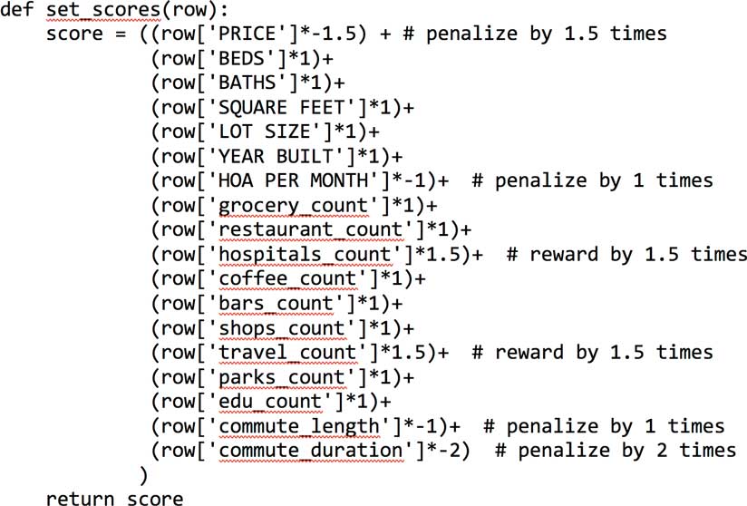
Evaluating houses is a deeply personal process. Different buyers look for different characteristics in a house. Not all aspects are considered equally, so assigning different weights for features will let you arrive at a weighted sum (a score) for each house. The higher the score, the more desirable a house is to you.
Listing 5 is a scoring function that reflects the relative importance of each feature in a house. Desirable attributes are weighted positively, while undesirable attributes are weighted negatively.
Scaling Your Data
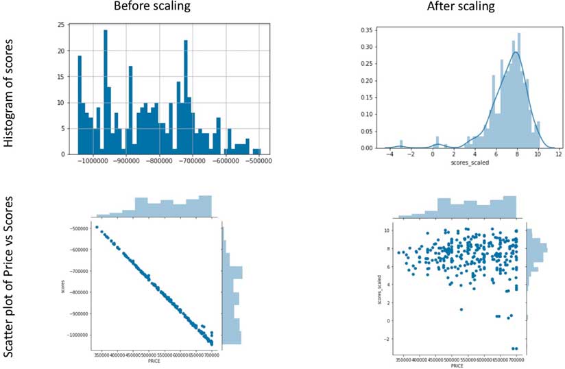
While a scoring function can be extremely handy in comparing the features of shortlisted houses, when applied directly (without any scaling), it returns a set of scores that are heavily influenced by a small number of attributes that have numerically large values. For instance, an attribute such as property price tends to be a large number (hundreds of thousands) compared to the number of bedrooms (which will likely be less than 10). Without scaling, property price will dominate the score beyond its allotted weight. Scores computed without scaling appear extremely correlated with the property price variable. While property price is an important consideration for most buyers, it cannot be the only criteria that determines a property’s rank.
To rectify this and compute a new set of scores, all numerical columns were scaled to a uniform range of 0–1 using the MinMaxScaler function from scikit-learn library. In Figure 4, the histogram and scatterplot on the right-hand side show the results of scaling: the scores appear normally distributed, and the scatter between property price and scores shows only a weak correlation.
Ranking Properties
Once the properties were scored, they were sorted in descending order and assigned a rank, creating a refined shortlist of homes that could be visited. In this example, the top 50 houses are spread across the city of Portland without any strong spatial clustering. Property prices, on the other hand, appear in clusters.
Most houses in the top 50 list have two baths, four beds (although the shortlist criteria was a minimum of two beds), are under 2,500 square feet, and were built in the last four years. Most houses have good access to a large number of services. Most are within 10 miles of the Esri downtown office and can be reached by a 25-minute commute.
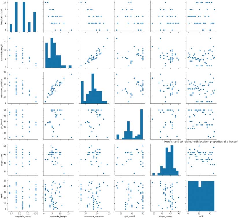
The scaling function ensured that there is no single feature that dominates a property’s score beyond its allotted weight. However, there may be some features that tend to correlate with scores. To visualize this, the pairplot() function from the seaborn library is used to produce a scatterplot of each variable against each other as shown in Figure 5.
Scatterplots of Rank vs. Spatial Features
In the scatter grid, there is randomness and stratification in the rank variable, except (understandably) between commute_duration and commute_length. In a scatter grid showing rank and various intrinsic features of the properties, the scatter between rank and property price is quite random, meaning it is possible to buy a house with a higher rank for a lower than average price. The scatter between rank and square footage shows an interesting “U” shape, meaning that as property size increases, rank gets better, but after a certain point, it gets worse.
Building a Housing Recommendation Engine
So far, the dataset was feature engineered with intrinsic and spatial attributes. Weights for different features were explicitly defined so properties could be scored and ranked. In reality, the decision-making process for buyers, although logical, is less calculated and a bit fuzzier. Buyers are likely to be content with certain shortcomings (e.g., fewer bedrooms) if they are highly impressed with some other characteristic (e.g., larger square footage). If buyers simply favor some houses and blacklist others, you could let a machine learning model infer their preferences.
Since it is difficult to collect this kind of training data for a large number of properties, a mock dataset was synthesized using the top 50 houses as the favorite group and the remaining 281 as the blacklisted group. This data was fed to a machine learning logistic regression model.
As this model learns from the training data, it attempts to assign weights to each predictor variable (intrinsic and spatial features) and predict whether that house will be preferred by a buyer. As a new property hits the market, this model can predict whether a buyer would like it and present only relevant results.
Listing 6 shows the accuracy of this model on this dataset. Precision refers to the model’s ability to correctly identify whether a given property is a favorite or not. Recall refers to its ability to identify all favorites in the test set. The f1-score computes the harmonic mean of precision and recall to provide a combined score of the model’s accuracy.
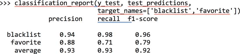
The training data used in this case study is small by today’s standards and is imbalanced because there are fewer properties that are favorites compared to blacklists (50 vs. 281). Yet the model performs appreciably well with high f1-scores for eliminating properties that are likely to be on the blacklist.
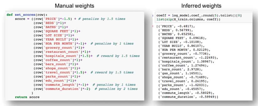
The weights assigned by the regression model are shown on the right side of Figure 6. Based on the training data, the model learned the relative importance of each feature. When compared to the manually assigned weights shown on the left side of Figure 6, the logistic regression model has only mildly penalized property price, commute length, and duration. It has weighted features such as lot size, number of grocery stores, shops, parks, and educational institutions negatively and the rest positively. Features such as hospital counts, coffee shops, bars, and gas stations received a higher weight than when weight was assigned manually.
Conclusion
The type of recommendation engine built in this study is called content-based filtering because it uses only intrinsic and spatial features engineered for prediction. This type of recommendation needs a training set that would be too large to generate manually.
In practice, another type of recommendation engine—community-based filtering—is employed. It uses the features engineered for the properties, combined with favorite and blacklist data, to find similarity between a large number of buyers. It then pools the training set from similar buyers to create a large training set.
In this case study, the input dataset was spatially enriched with information about access to different facilities. This can be extended further by engineering socioeconomic features such as age, income, education level, and a host of other parameters using the geoenrichment module of the ArcGIS API for Python. Authoritative data shared by local governments under an open data initiative could also be incorporated. For this example, useful spatial layers from the city of Portland’s open data site could be used to further enrich this dataset.
This article and its accompanying Jupyter Notebook demonstrate how data science and machine learning can be employed. Although buying a home is a personal process, many decisions are heavily influenced by location. Python libraries, such as pandas, can be used for visualization and statistical analysis, and libraries, such as the ArcGIS API for Python, can be used for spatial analysis. You can take the methods demonstrated in this article, apply them to another real estate market, and build a recommendation engine of your own.
About the author