You can limit the feature layers available from ArcGIS Living Atlas of the World to just the features you need for your analysis by using filters.
Many feature layers in ArcGIS Living Atlas of the World contain features for a larger region than you need for your analysis. Content items are added to Living Atlas every day. These items may have data for all tracts, counties, schools, hospitals, or parks in the United States, but you may only need to work with features in your immediate area. By applying filters to these national layers, you can work with a subset of these features.
Limit Features with a Filter
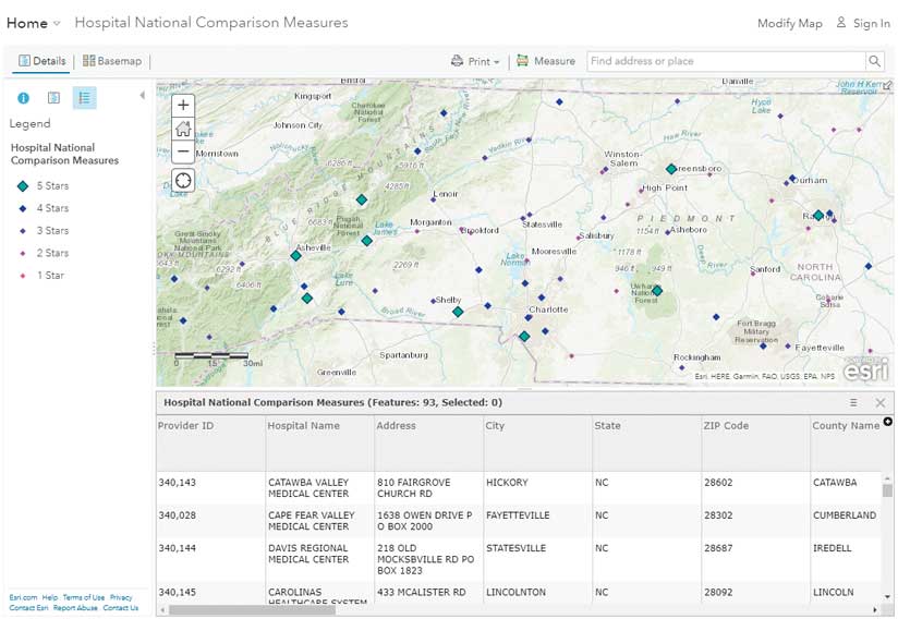
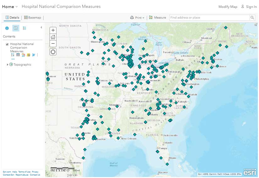
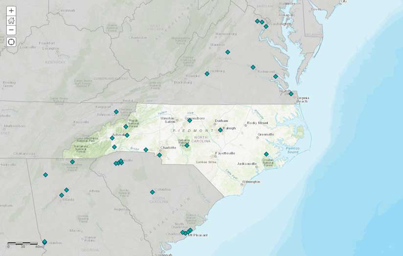
For example, the Hospital National Comparison Measures feature layer in Living Atlas contains 4,798 Medicare-certified hospitals across the United States. If you are examining health care access for Medicare beneficiaries in North Carolina, you will only be interested in the hospitals in that state.
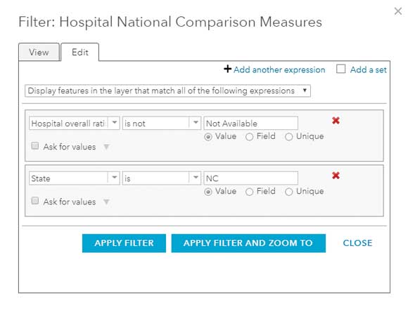
According to this layer’s item details page, a filter is applied so that only hospitals with a valid overall quality rating (i.e., hospitals with a quality rating of between one and five stars) will be displayed. Any hospitals without an overall rating (i.e., hospitals with a rating Not Available) are filtered out.
To display only North Carolina hospitals, a second filter will need to be added.
- Open the filter and click Add Another Expression.
- Create the expression State is ‘NC’
- Make sure “all of the following expressions” is chosen in the top drop-down list, rather than “any of the following expressions.”
- Apply the filter, and you will see only the hospitals within North Carolina with a valid quality ranking on the map and in the attribute table. Selecting “all of the following expressions” produces features that satisfy both quality and location criteria.
- You can change and add to existing filters for your purposes. If you want to find out who is near a 5-star hospital, adjust the filter so that the first expression is no longer Hospital overall rating is not Not Available but Hospital overall rating is 5. Because the overall quality rating is a string field (it contains Not Available values), you will see string expressions in the drop-down (as is, is not, starts with, ends with, contains, does not contain, is blank, is not blank). If this were a numeric field, you would see options applicable to numeric fields (less than, is greater than, is at least, is at most, is between, is not between). Date fields would give you different choices such as before, after, in the last day, week, month, and five days.
There are radio buttons underneath the third drop-down list labeled Value, Field, or Unique.
- If you have a specific value you’d like to filter on, choose Value.
- If you’d like to compare the value in one field to the value in another field for each record, choose the Field option.
- If you’d like to see all the unique values in the field that you’re filtering on, choose the Unique option.
For this filter, you could manually type in a value when the radio button is set to Value, or you could select from all the unique values available by setting the radio button to Unique. Either way works.
After clicking APPLY FILTER AND ZOOM TO, the map displays only the 10 hospitals in North Carolina that have an overall quality rating of 5 stars. Make a copy of this layer with the new filter applied, rename it North Carolina 5-Star Hospitals, and save it in My Content. You could use this new layer to create drive-time areas or buffers to use the ArcGIS GeoEnrichment Service, or another type of analysis. You could repeat this process to create layers for 4-star hospitals or 3-star hospitals in North Carolina. The filter allows you to work with only the features that you need.
More Control with Nested Filters
If you want even more customization, use nested filters. Grouping multiple filter expressions into sets allows for a bit more complexity in defining your subset. Say, instead of showing the 5-star hospitals in the state of North Carolina, you want to show the 5-star hospitals in neighboring states as well. It’s possible that these out-of-state hospitals serve people in North Carolina who live close to state lines.
In the filter dialog box, click Add a set, and then add multiple expressions by clicking on the + sign in the new set of expressions. Because these hospitals are in only one state, this time you would select “Any of the following expressions in this set are true” rather than “All of the following expressions in this set are true.” When you have added all your desired sets of expressions, click the View tab at the top to see your final filter.
Applying a Filter to Highlight an Area
If you are displaying all the hospitals in the surrounding states, you might want to focus your map clearly on North Carolina. You can do this by adding the USA States (Generalized) layer from Living Atlas. This is a basic layer containing state boundaries and some basic population fields. To focus your map on North Carolina, you can add a filter displaying all other states and then symbolize this layer in a transparent gray. This will make everything that is not North Carolina fade into the background.
Filtering Improves Your Maps and Simplifies Your Workflows
Filtering is often a great first step in making maps more focused and defining inputs to geoprocessing and spatial analysis. Using filters in ArcGIS Online is a simple way to create a new layer that is a selection based on attributes. By applying filters, you can subset a national dataset in a Living Atlas layer to just the state, city, county, or school district that you need. You can also filter by attribute fields that are not geography based (such as hospital rating in this example) to map only the types of features you need.
Learn even more about filters by reading the ArcGIS Online help topic called Apply Filters. Read the ArcGIS Blog (esri.com/arcgis-blog) to learn the latest information about Esri technology.