Media Tell Data-Driven Stories with Maps
Online media outlets in the Netherlands, including BNR Nieuwsradio, Trouw, and Dagblad van het Noorden, illustrate news stories using maps created with Esri technology, turning data into meaningful information that helps readers get a clearer and deeper perspective of events and issues.
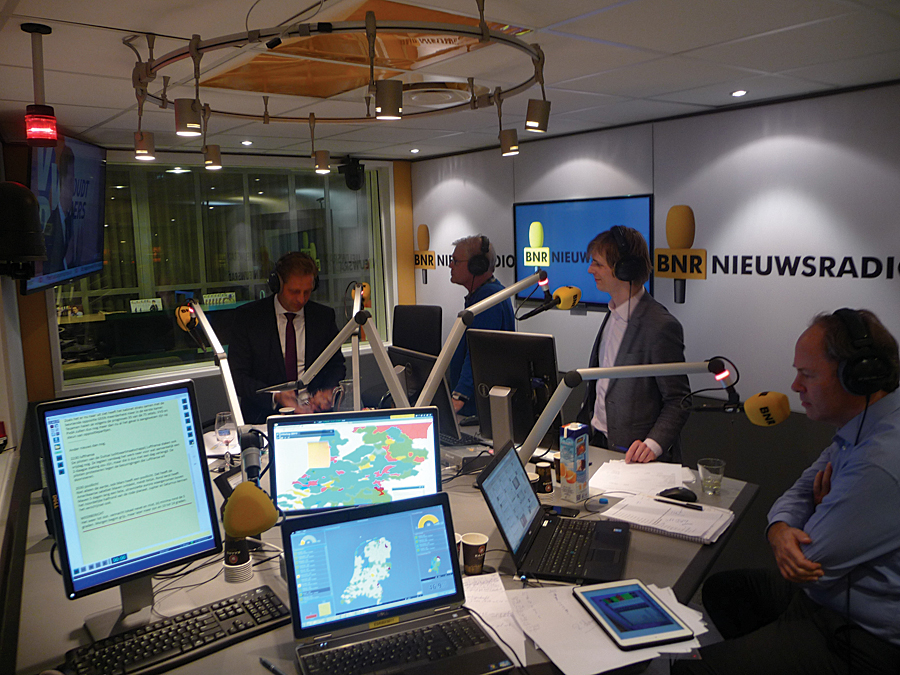
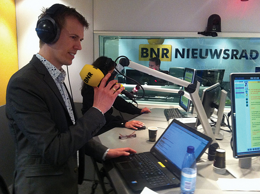
Esri Nederland B.V., Esri’s distributor in the Netherlands, works closely with BNR Nieuwsradio, a radio station and online publication that covers economic, political, sports, and technology news, to analyze and visualize data and then produce maps for BNR Nieuwsradio’s website. For example, data was mapped for stories about the provincial elections in the Netherlands, European Parliament elections, the Ebola virus crisis in Africa, bird flu outbreaks in the Netherlands, and 2014 World Cup Soccer matches in Brazil. Staff from Esri Nederland occasionally provide commentary about what the maps show during radio broadcasts.
According to Harmen van Doorn, a communications specialist at Esri Nederland, the Dutch media is discovering that maps offer a great way to communicate information to readers and viewers. Though the company provides maps to the media for important news stories, journalists have the opportunity to tap into the power of geography themselves. They can learn to use the Esri ArcGIS platform and turn raw data into maps for the stories they are pursuing.
The audience is very interested in the maps said Thijs Baas, web editor at BNR Nieuwsradio. “The maps make the national news more meaningful to people, helping them to answer questions such as, What do the election results mean to me and my community?” Baas said. “A visualization creates an image. People think in images, and we see that reflected in the statistics on our website. When we have a map on our website where you can see the impact of the national news on your own community, the readership for the story increases.”
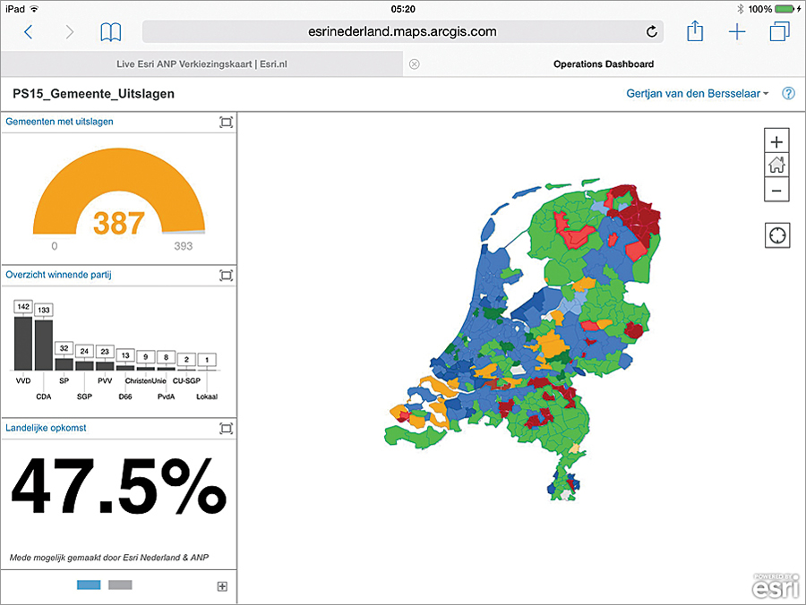
During the provincial elections in the Netherlands on March 18, 2015, there were more than one million views of Esri election-related maps in the media. The election maps were published on the BNR Nieuwsradio website and in many media outlets, including the daily newspapers Trouw and Algemeen Dagblad (AD). The maps, created using ArcGIS, were also published on the website of the Dutch television station RTL.
The media used the maps to provide election results and compare the percentage of voter turnout to that of the 2011 election. Esri Nederland teamed up with ANP, the Netherlands national news agency, to provide live election result updates, using maps that showed which parties were gaining votes and which were losing votes in each of the 12 provinces.
The map service was published on the BNR Nieuwsradiowebsite on election night and the morning after, when van Doorn gave an interview about what the maps showed about the voting trends such as the losses by the Labour Party and the gains by the Christian Democrats and the Democrats 66 party.
Esri Nederland also used Operations Dashboard for ArcGIS to provide the media with a dashboard to monitor the election results from their offices. The dashboard included a map and widgets in the form of bar charts and gauges. One gauge kept a running tab on how many municipalities were reporting election results, while a bar chart showed which parties were winning the election. Another widget indicated the percentage of voter turnout.
Digging Deeper into the Political Data
After the elections, Esri Nederland conducted several geographic analyses to determine how a spate of recent earthquakes in Groningen province affected the election results.
The number of earthquakes in Groningen province has increased in the last few years due to gas extraction in that region, van Doorn said. The people there are angry with the government, and the Labour Party, which is normally popular in that province, lost many votes in all Groningen counties, he said.
Another trend the maps revealed was that people in the Christian region (known as the Netherlands’ Bible Belt), who live in a corridor that runs from the southwest to the north in the middle of the country, vote in higher percentages than the people living in other regions. This map showed that two parties—the ChristianUnion (CU) and the Reformed Political Party (SGP)—did particularly well in the Christian region during the 2015 election.
Beyond Election Results
Esri Nederland is also mapping data for the media that pertains to topics other than the elections, including the bird flu outbreaks in the Netherlands, the economy, and even where in the country Dutch drivers are most likely to get speeding tickets.
Drivers use the Flitsmeister app to report the location of flitsers—cameras that record the speed of cars and their license plate numbers if they go over the speed limit. Esri Nederland and BNR Nieuwsradio mapped the highway locations in the Netherlands where the chances are greatest that drivers will be ticketed for speeding. This Esri Story Map Journal shows which sections of highways have the greatest density of cameras and routes where drivers are most likely to get caught for speeding.
Maps also have been used to tell sports stories. Esri Nederland used the Esri Story Map Journal template to make the On the Road to Success in Brazil story map, which last year documented the triumphs and defeats of Oranje, the national soccer team from the Netherlands.
Open Data and Privacy Concerns
Esri Nederland and BNR Nieuwsradio are also partnering on other data visualization projects related to weather and earthquake reporting.
“Society profits from having a geographic view,” said Sjors Fröhlich, editor in chief of BNR Nieuwsradio, during the Esri GIS Conference in the Netherlands in 2014. “GIS users can be generous with sharing data. You are sitting on gold—so much useful information.”
But Fröhlich knows that making data public can conflict with privacy policies that are important in the Netherlands. “But we can do beautiful and useful work with data by visualizing it and doing research on it,” Fröhlich said. “The data can clear up things and sometimes prompt the government to take needed actions. Society will benefit by making data public, I am sure.”