People craft policy to bring about change. If you are a GIS analyst or someone who manages or directs a team of mapping and GIS staff, you are in a unique position to deliver high-quality maps and information products in support of policy initiatives.
Mashing up some data onto a map is not a policy map. A map of 100,000 traffic accident locations in a year is eye-opening and may even show which intersections seem to have more accidents than others, but that is not a policy map. It’s just a map of data.
It’s a good start, though.
Putting some data on a map is always a good idea because it starts the process of thinking spatially. The first time data is shown on the map—if the map is any good—that process starts to raise questions about the nature of the data and any patterns that initially appear. The reality is that there may be many things contributing to the situation. Your job as a mapmaker or someone who directs the analysis of problems is to explore, analyze, and clearly present each contributing factor.
Steven Goldsmith, former mayor of Indianapolis and former deputy mayor of New York City, is a thought leader and a proponent of policy mapping. When I showed him a map of household incomes by neighborhood and asked him to explain the difference between my lovingly crafted map of incomes and a policy map, he summarized it nicely, “A policy map is a map where the opportunity to intervene is clear.”
Whenever we think about policy maps, we keep that objective in mind: whatever the map’s topic, make it clear where there is an opportunity to intervene. When we make policy maps, we do just three things:
- We portray a subject in a factual manner.
- We do this to reveal opportunities to intervene.
- We share any results or outcomes of ongoing interventions
Over time, we have looked at why teams and projects fail to leverage mapping and GIS to support discussions on issues and policy making. In many cases, these teams had all the data they needed, but they didn’t know how to map it, analyze it spatially, or fine-tune the map to show what’s important.
Very often, a little more effort is all that is needed to articulate the geographic nature of the problem being addressed through policy as well as how well and where that policy is having an impact.
Where Do You Start?
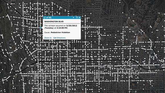
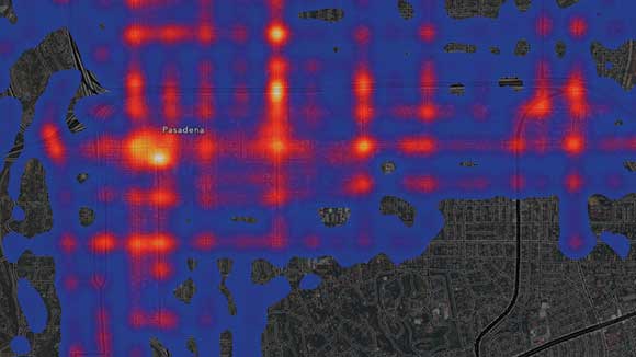
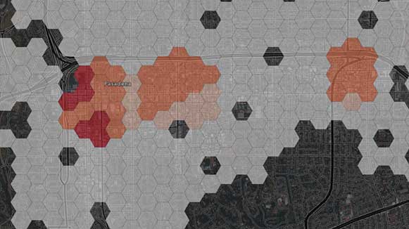
The maps in figures 1, 2, and 3 all clearly show that more accidents occur near intersections. Mapping this data helps create awareness of the need for policy changes.
After seeing any of these maps, a policy maker would ask additional questions such as:
- What’s a normal number of accidents?
- Do we have a problem, and is it with cars, bikes, or pedestrians?
- What is the effect of the infrastructure?
- What can we improve?
Normally, we start a policy map by mapping the issue that we’re trying to address. But there are additional areas that are worth investigating and bringing into your spatial thinking when creating policy maps. Let’s use the traffic accident example to walk through these areas.
Consider the effects of unclear expectations. How many accidents are considered normal and how does this city, street, or intersection compare to that expectation? It’s easier to set policy and measure success when expectations are understood or at least discussed.
Map the Symptoms
The visible symptoms of a problem are usually what get our attention first. A car accident is a very visible problem, so it’s useful to see where all accidents for a specific time period have occurred.
The map in figure 1 is a quick mashup of accident locations. The map in figure 2 shows the same data as a heat map. In figure 3, the same data is mapped overlaying an artificial grid of hex bins and symbolizing by the number of accidents per hex bin. While these maps are fine for developing interest in the subject, none can inform policy making. Why is that?
These maps are not actionable. They don’t establish a basis for comparison. With the heat and the hex bin maps, at the least we can clearly see the six areas with the highest concentration of accidents. When looking at either of these maps, it’s natural to ask why.=
Map a Meaningful Measure
Policy makers need good information to understand whether they are treating symptoms instead of treating the real problem. In addition to raw counts of problems, they need meaningful measures. How do you discover and apply more meaningful measures?
What’s missing from the maps above is a sense of how many accidents occur relative to the number of cars driving each section of road. Without that type of measure, the increase in the number of accidents might simply be caused by an increase in the number of cars for a given month or year. Existing traffic safety policy may be performing well given that growth in traffic. The key is to understand what’s expected, and create the map that depicts the right measures of the core problem (accidents per daily traffic volume in this case) so that any unexpected patterns will become apparent.
The spatial component is the key to mapping the problem. The causes of accidents that occur in the middle of a lonely stretch of highway are likely to be different from the causes of accidents that occur at intersections. Although plotting the accident locations on the map makes the intersection accidents visible, an analyst can use GIS to take the next step. By selecting all accidents geocoded near an intersection (say, within 100 meters), those accidents can be categorized as intersection-related.
Why is this so important? Because factors related to location may have an effect. New York City found that bike-car incidents have a much higher likelihood of serious injury on streets with speed limits above 25 miles per hour. Locating incidents on a map with correct street speed limit attributes showed a serious injury pattern related to speed limits. With this information, street network and bike lane plans could be better evaluated.
Map the Enabling Infrastructure
Accidents involving cars, bikes, and pedestrians don’t happen just anywhere. They happen on streets and other paths created and maintained by public and private organizations. This enabling infrastructure has characteristics that we can show on a map.
What is enabling infrastructure? In the case of the sinking of the Titanic, the ocean was the enabling infrastructure. The iceberg that caused the Titanic to sink floated on it, hiding most of the iceberg from view. Titanic was sunk, not by the visible problem above the water but by the hidden ice below the waterline.
There could be hidden causes of traffic accidents that are worth mapping and understanding. Weather is often a factor in accidents that might be overlooked. Many problems in our cities are made possible—or perhaps inevitable—by some enabling infrastructure. That could be poorly designed road intersections or railway and road intersections.
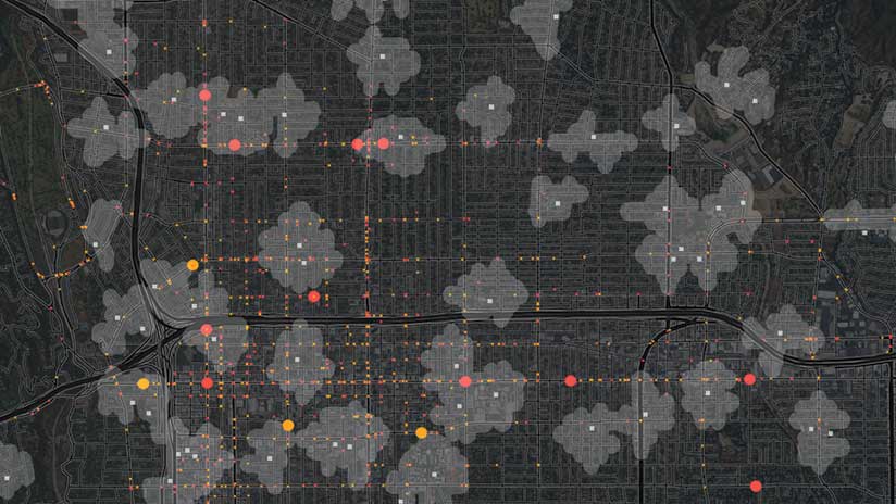
Some percentage of car accidents near schools happen as parents rush to get to and from the schools. The map in figure 4 shows the same accident location data in relation to school locations. Looking at these accidents from the perspective of a school principal or parent, these accidents are cause for alarm. Many occur within a short walk of schools and could perhaps suggest a policy initiative to drive that number down to zero, if possible.
People can make reasonable policy decisions only if they understand the enabling infrastructure involved. That infrastructure varies with the problem being addressed. It could be financial (low incomes or low mortgage rates on easy terms), structural (old bridges), or caused by human behavior (low voter turnout). Maps that provide context to policy decisions can be invaluable.
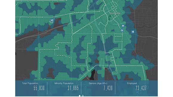
There’s a lot of open data—data that can be freely used—that is ready for analysis and interpretation in a focused map to illuminate some part of the infrastructure in question. There are lots of ready-to-use maps that can be found in the ArcGIS Living Atlas of the World that can inspire your thinking. For example, in the map in figure 5, a set of transit stop locations were turned into a map that shows who that infrastructure serves with the addition of demographic information.
When you hear citizens or policy makers talking about an issue, listen for a discussion of the enabling infrastructure. Of course, they won’t talk about it in that way—you have to listen for it.
Map the Hidden Causes
GIS is special. You can use it to map the data and analyze that data statistically and spatially to provide additional insights. You need a GIS—not just a mapping system—to understand the geographic component of the problem or its causes. GIS will help you understand what’s going on and set realistic goals that policy can help achieve.
In our example, once the map begins to suggest that intersections are more problematic in your city than normal or as compared to other cities, some root causes may suggest themselves, especially once you show that map to local traffic engineers and other city employees.
These people are subject matter experts who are likely to be good at identifying hidden causes and perhaps hidden solutions. Questions will naturally arise when these people see the right maps. What’s different about your city’s traffic control around intersections? Do the streets align to the setting sun? Do accidents increase during the weeks when the sun is blinding drivers at a certain time of day? If that is the case, showing those intersections on the map with their accident rates and counts will drive the message home.
Map the Resistance
There are always reasons not to change—the budget, the schedule, a lack of support for change, and the ever-popular “We’ve always done it this way.” When significant resistance is a factor, it’s useful to map that resistance.
Natural phenomena often resist man-made infrastructure and policy. Think about how recent floods and hurricanes disregarded the belief or disbelief local populations had in climate change. Water went where terrain and gravity said it could go.
Economic resistance is also real. Injections of capital require a long-term perspective. Every national retailer understands this when siting a new store or closing an existing one. Policies that aim to stimulate local economies need to reflect an understanding of existing economic conditions.
People can be resistant to change. Sometimes it’s worth mapping who stands to gain and lose from a change in policy, as shown in figure 5, which reveals who will benefit from the locations of public transit lines. If nothing else, this will help you evaluate how the proposed change will affect people and businesses and perhaps give you an opportunity to find better solutions.
Map the Expectations
Whether expectations are unclear or clearly stated, it’s important to map them. Good policy maps clarify expectations and track progress toward them. Doing the up-front work to move beyond mapping incidents and defining and mapping meaningful measures pay off when you can articulate a policy strategy and track progress toward stated goals.
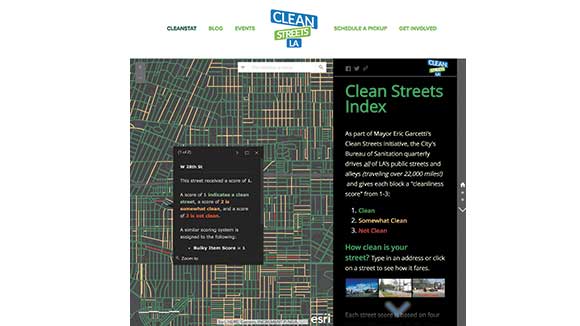
The Clean Streets LA initiative by the City of Los Angeles took the broad objective of having cleaner streets and mapped not only the initial evaluation of every Los Angeles street but also the latest updates, as shown in figure 6. This collaborative work involves citizens, city employees, and policy makers who are all invested in clarifying expectations and being accountable for progress.
What You Need for Policy Mapping
Whenever we walk through the policy-making process with someone, they are always happy to discover that they already have almost everything they need to start. They already have some issues they are interested in mapping and may have the data. When they map the symptoms of the issue, they start to see things on the map that raise questions. As they track those questions, they show the maps to subject matter experts within their organization, other stakeholders, and—at some point—the public. More questions arise. They begin thinking about the enabling infrastructure and its contribution to all or some of the symptoms. Spatial analysis often reveals significant variation, but it’s just as useful to learn there is no spatial variation, if that is the case.
As root causes and hidden causes emerge, so does the opportunity to shape policy to target specific concerns. For area-wide concerns, such as clean streets, this is a chance to communicate how the work will proceed and ensure there will be equity in response to problems. Where resistance exists, the map can inform strategies on how to handle that effectively.
Every policy with stated goals benefits from tracking progress toward those goals. Successes are valuable, and failures are warning signs that perhaps the problem was not as well understood as thought. All work done to understand and articulate the relevant issues should culminate in maps that track progress toward stated goals.


