When do you know that you are truly making a difference in the world?
How do you know that the work you are performing is not simply automating processes?
Don’t get me wrong, I see GIS helping governments—large and small—do a better job. The technology is improving processes, opening communications, streamlining workflows, and helping governments move toward digital transformation.
I worked in local government early in my career. My GIS team made maps for meetings and created public information products. As we moved the technology forward, it was truly appreciated by all who touched it, but there was a general feeling that management and elected officials didn’t get the full picture. They didn’t appreciate how transformational analysis on a map could be.
I finally saw that shift—that realization of the power of GIS—when my team had a problem that needed to be solved but could only be solved using GIS.
At the time, my city was going through one of the most comprehensive and controversial general plan updates. A massive annexation proposal meant that thousands of properties were being considered for rezoning. Major growth in the entire region was changing the land use at the city limits. Airport, freeway, and rail expansion was changing the mobility of residents. GIS was an integral part of the community meetings held to plan the updates. It let us present new ways of thinking through how the plan would reshape the community.
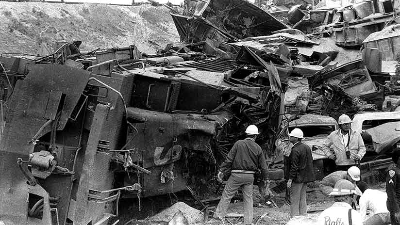
But a real turning point happened smack dab in the middle of the general plan update process, and it was caused by a major disaster that took place in the county. The rail lines that ran across the county were adjacent to a highly flammable aircraft fueling pipeline. A train derailed, crashing into homes near the track and killing the conductor, a brakeman, and two residents. Seven houses on the street that were immediately adjacent to the tracks were demolished by the wreck.
Surrounding jurisdictions began wondering if they were vulnerable and what they should do. The general plan and rezoning effort we were working on offered the perfect opportunity to intervene and to address the issue head on.
When my city’s planning director asked the GIS team if we could help, we said, what do you need? Her first request was for a map depicting the location of railroad tracks and the pipeline in relation to planned development. We envisioned her using the map in a townhall setting to figure out what to do. Frankly we were disappointed because we wanted to provide analysis before the meeting, but we were eager to highlight the value of GIS, so we said yes. We had to scramble to find data and maps of the exact location of the rail lines and, of course, the pipeline itself.
We understood that the planners were thinking of creating a policy requiring 150-foot setbacks from pipelines. Simplifying the study, we performed a quick analysis and depicted a 150-foot setback from the pipeline that showed areas where a building footprint could not be located. The results were a parcel-level land-use map with an estimate of the population located within the setback. We presented the results to the general plan committee immediately.
The committee was impressed and asked if we could perform another analysis. We told them we could do as many as they wanted. We ran four different setback analyses that resulted in a policy for lessening the impact to the public should a similar event take place in our city. That policy was integrated into the planning process.
This was a major turning point, not only in the general plan update, but also in how planners thought about how GIS could be used. Things are much different today. With the availability of data, stronger data analysis tools, and a more collaborative work environment, forums for sharing policy development work are becoming the norm.
But there is a difference between mapmaking and policy mapmaking. Just because data is available doesn’t mean we have reached a new level of data literacy. As my family and friends in the teaching profession remind me, there is a difference between reading and comprehension. It’s the same with data analysis. According to Steven Goldsmith, “A policy map is a map where the opportunity to intervene is clear.” Goldsmith, a former mayor of Indianapolis and former deputy mayor of New York City, is a proponent of policy mapping,
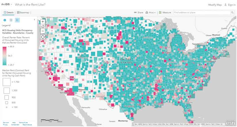
At the National League of Cities conference in November 2018, Esri president Jack Dangermond announced the launch of the Esri Maps for Public Policy site (esri.com/policymaps). Any organization can explore its hundreds of datasets, policies, best practices, and lessons that provide a greater understanding of the difference between a map and a policy map. Esri wants to give every jurisdiction the opportunity to increase its ability to perform meaningful policy research and analysis. Use this site to make policy maps that address pressing issues in your jurisdiction such as the opioid epidemic, housing affordability, or access to health care.
To learn more about policy mapping, read “Mapping the Opportunity to Intervene Clearly” in the Spring 2018 issue of ArcUser.