If you make maps, this scenario is probably familiar. You get or find data about something really interesting. Most often it is a lot of point data. If you try to display all that data on a map, those points will overwhelm the map and communicate nothing.
This is especially true if the map will be viewed online or on the small screen of a phone or other mobile device. Super busy maps that show lots of data but no patterns are confusing and boring. Maps should provide context through an organized view that shows the shape of the data.
However, before you start mapping anything, ask yourself a very important question: Does this data deserve to be mapped? Perhaps the message is so simple it doesn’t need to be mapped. What insights will mapping provide about the data? If the answer is none, stop right there.
If mapping the data is potentially valuable, you will need to ask yourself two more questions to come up with an effective solution:
- What do you want to communicate with this map?
- What aspect of the data will tell that story?
The second question is meant to encourage you to fight the urge to show all the data. Take a breath, step back, and think about the specific message you want to communicate with the map. The temptation to show all the data is often hard to resist even when only a portion of the data is relevant. This goes along with the tendency to overestimate the ability to see patterns in a sea of points.
To use just the data that will communicate that message, you will typically need to suppress extraneous data and highlight the relevant aspects of the data you show. This article will give you several quick and easy techniques that will help you accomplish this using the tools in ArcGIS Online and ArcGIS for Desktop.
Dealing with All Those Points
Before you even start mapping data, there are a couple of things you can do to make the process more efficient by making the data more manageable. Often, point data is supplied as a comma-separated value (CSV) or a Microsoft Excel file. With either format, use Excel to inspect the data. Omit any unnecessary fields and select out only the type of records you need. This will also help avoid encountering the default 1,000-record limit for ArcGIS Online hosted layers.
To make the data compliant with ArcGIS, eliminate any blank records, ensure there are no empty fields or duplicate field names, and check that field names conform to ArcGIS naming conventions. For more information on using Excel files in ArcGIS, see the article “Always and Never When Formatting Excel Tables” in the Fall 2015 issue of ArcUser and “Best Practices When Using Excel Files with ArcGIS” in the Spring 2012 issue of ArcUser.
The ArcGIS platform has lots of tools for wrangling and displaying data that enable techniques for effectively communicating the message in the data. The smart mapping tools provided by ArcGIS Online do a lot of the heavy lifting for you by providing intelligent defaults and sophisticated functionality that is easy to use.
Filtering Data
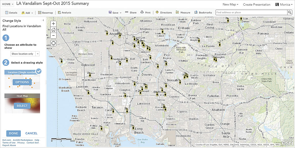
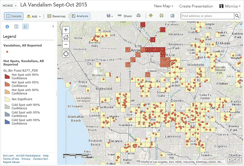
Filtering features is one of the simplest methods for eliminating clutter in a map. For example, if you were making a map to show where graffiti is a problem in Los Angeles, you might download data from the Los Angeles County Sheriff. Data for Part 1 and Part 2 crimes for specific time periods is available for download in CSV format.
After downloading this data and opening it in Microsoft Excel, you could remove records for all crimes except vandalism (the category that encompasses graffiti) before adding it to a map created using ArcGIS Online or ArcMap in ArcGIS for Desktop.
Because CSV is a basic format style, it does not contain field types for the columns of data it stores. To learn more about how to ensure CVS files are added to ArcGIS Online in the most useful format, see “Make More Useful Layers from CSV Files” in this issue.
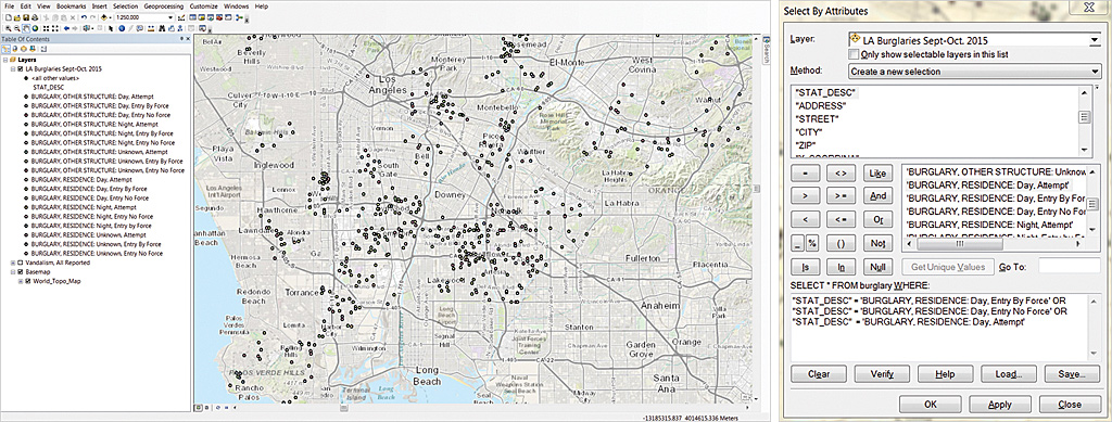
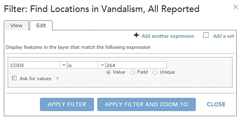
Once data for vandalism is added, just the locations related to reported graffiti can be highlighted by filtering the data. ArcGIS Online has a Filter tool available directly underneath the layer in a web map when it is in the map viewer. Clicking the Filter icon brings up an expression builder that walks you through the creation of one or more expressions that can be applied to the layer to filter data. Filtering combined with Set Visibility Range can give you greater control over the viewer’s experience.
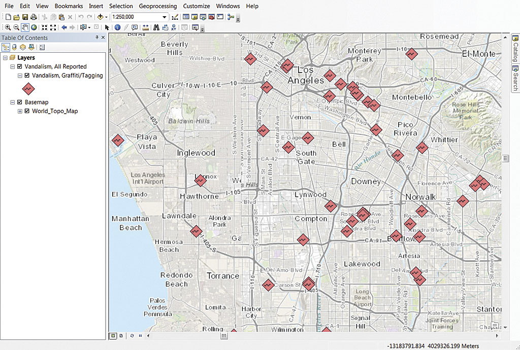
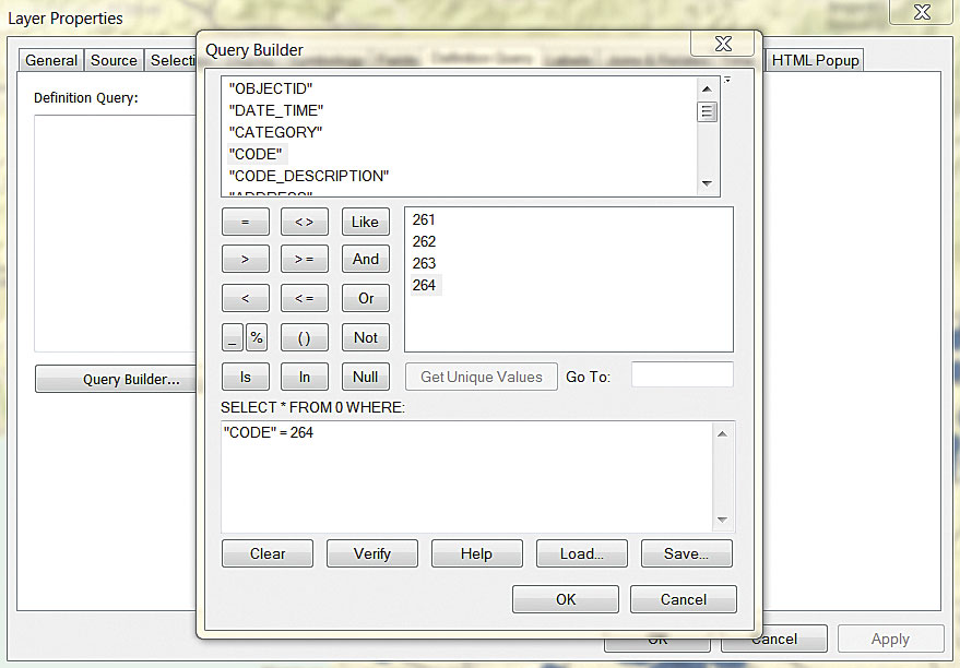
In ArcMap, you can use definition queries to filter data. Definition queries select only features that you want to display without changing the underlying data. Create a copy of a layer you want to filter and rename it with a name that indicates the characteristic used to filter it. Double-click the copy layer to bring up its Layer Properties dialog box. Click the Definition Query tab, then the Query Builder button. Use the Query Builder to create a SQL statement that selects the records you want to show. You can also export the features selected by the definition query as a feature class.
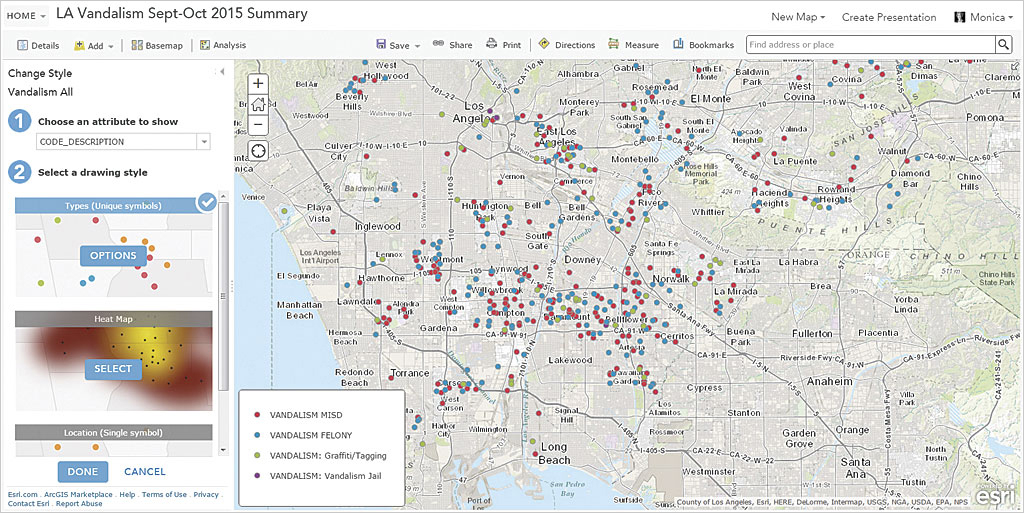
Too Many Categories
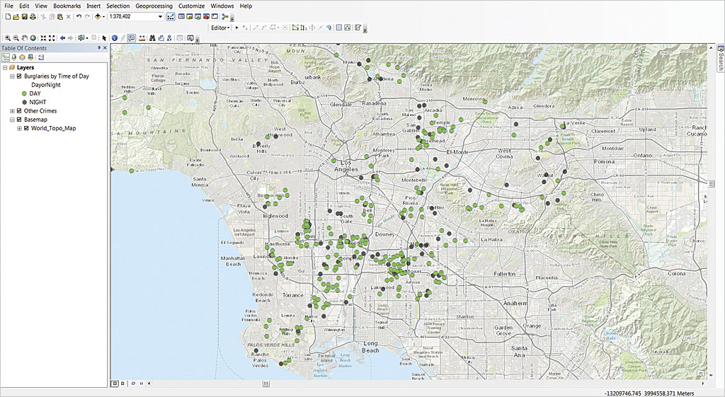
Just as your message can be lost in a mass of mapped points, it can also be lost in a map that contains too many categories even if that is how the data came to you. Although the data may be broken down into very detailed subcategories, the map’s message may rely on the comparison of just a few high-level categories of that data.
For example, if you were comparing the number of residential burglaries that occurred during the day with those that occurred at night, you could query out and consolidate the subcategories for residential burglaries (forced entry, no forced entry, unknown) by incident time and symbolize incidents in the resultant two categories (day and night), making the message clearer.
Sometimes grouping data into just two categories—all the data above and below a certain threshold—tells the story. The threshold can be one in quantity or time. If there is an important breakpoint in the data, use that to base your categories. This will communicate the most important aspect of the data at a glance.
Points Don’t Always Make the Point
Most of the time, showing the exact location of every data point is not going to tell the story. What is useful is symbolizing the points in a way that reveals patterns and structure in the distribution of those points.
Even though the data you received may have been given to you as point data, that doesn’t mean it has to stay as points. Point data may be much more effectively presented as a surface or aggregated in some fashion. Aggregation can be based on time as well as location. For example, perhaps you received hourly data on some phenomenon, but it will make more sense and tell a clearer story if it is aggregated to days or even week or months.
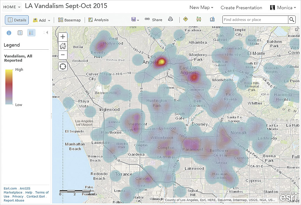
The bottom line: Points don’t have to stay points. Some easy methods for meaningfully aggregating point data include heat maps and hot spot maps. Both heat and hot spot mapping are part of the smart mapping tools in ArcGIS Online. In ArcMap, heat maps and hot spot maps can be generated using the Spatial Analyst tools that are available with the ArcGIS Spatial Analyst extension.
Heat Maps
Heat maps are one method for quickly inspecting the distribution of point data. They let you see structure that you might otherwise miss by showing where points cluster while still accounting for all the points in the data.
Hot Spot Maps
Hot spot maps, though similar in appearance to heat maps, show statistically significant spatial clustering of points in the data and can uncover unexpected hot spots (red) and cold spots (blue) of high and low values.
Getting to the Point
Your job when making a map is to clearly communicate a message that can be easily and quickly understood. This is particularly important if it is a web map that might have only a few seconds to capture the map viewer or if it will be viewed on a smartphone or other mobile device. To accomplish this, you need to understand the data, formulate the message, and take advantage of the tools in ArcGIS to provide insight into point data and get your message across.
About the author