Location analytics combines geographic data on assets, infrastructure, transportation, and the environment with data on an organization’s operations and customers to discover powerful answers to any business challenge and share those insights with the rest of the organization.
Esri Location Analytics lets you build complete information and analyses for reaching new customers, markets, and levels of success by bringing the power of ArcGIS tools and methodologies to traditional business analytics systems, like business intelligence (BI), customer relationship management (CRM), enterprise resource planning (ERP), and enterprise asset management (EAM), as well as productivity tools like Microsoft Office and collaboration tools like Microsoft SharePoint.
Organizations create, manage, and analyze vast quantities of data in business systems they use every day. Information about location is pervasive in this data. Customers and constituents have a location. Assets, whether fixed or mobile, have locations, as do staff members and suppliers. With the ubiquitous use of mobile devices and social media, location data is becoming even more pervasive.
By ignoring the location data in your business systems, your organization misses the opportunity to make the most informed decisions and create the best business outcomes. Typically, business analysts, marketing directors, operations managers, and other decision makers lack easy access to spatial tools that visualize and analyze data in a geographic context. Esri Location Analytics provides a transparent connection to GIS that works with the business systems they use every day.
Many business users are completely unaware of the value that location analytics can add even if they do use some form of mapping in these business systems. The common misconception is that mapping is just adding data as “dots on a map.”
While putting data on a map will help uncover patterns that graphs and charts won’t reveal, the value of location analytics can be much greater. The four imperatives of location analytics outlined in this article will help with those unfamiliar with GIS appreciate the full value of location analytics. For GIS professionals, these imperatives are a yardstick to measure the activities of your organization in terms of its level of sophistication and maturity in the use of location analytics.
Imperative #1—Go Beyond Basic Mapping
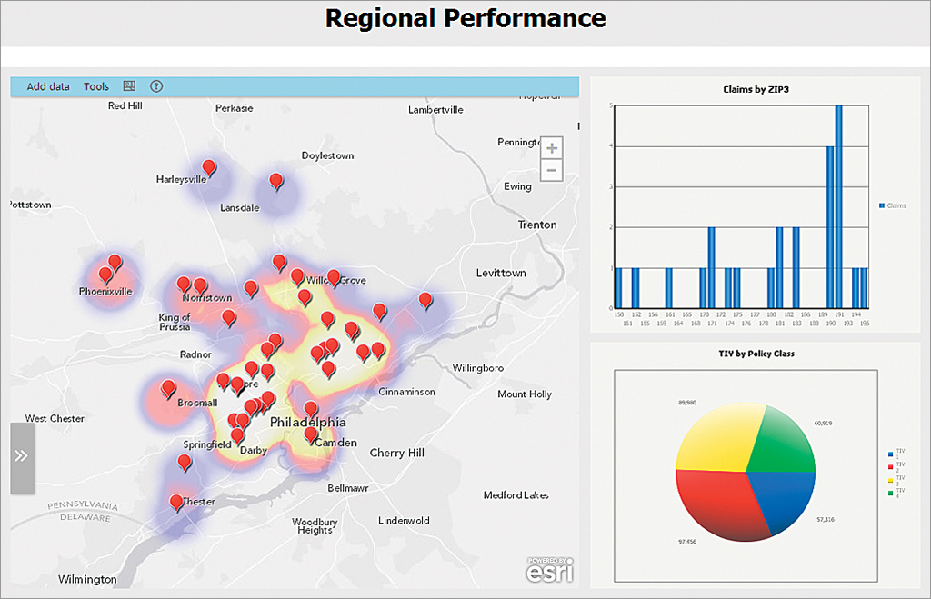
Putting your data on a map is simple and easy with many available mapping products. However, the business user dealing with a significant volume of data, say thousands, hundreds of thousands, or even millions of customers, will need the right tools to create value from location data because simply putting lots of data points on a map can quickly obscure it.
Fortunately, there are better ways to extract information about this data from the map. Not only does Esri Maps for Office make it as easy to make a map as it is to make a chart, it offers tools like automated clustering, heat mapping, data aggregation, and color coding. These strategies reveal more information from data, quickly surpassing the basic dots-on-a-map approach.
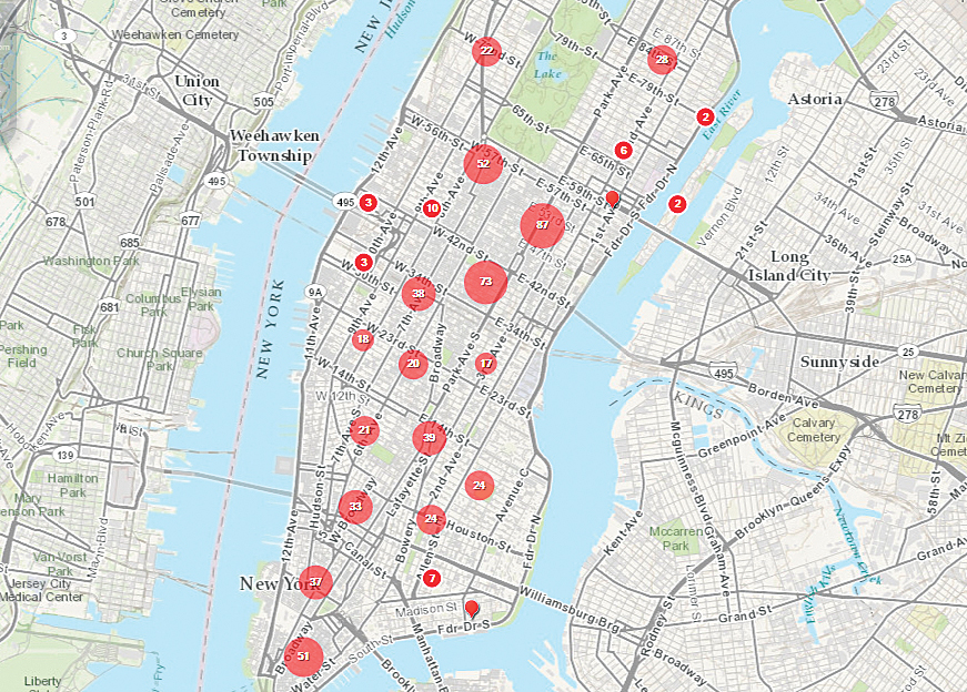
With automated clustering, the software automatically groups points that are in close proximity. Each group of points is represented by a symbol, typically a circle. The size of the circle is determined by the number of clustered points it references. A number in the center of the circle represents the number of points clustered. Automated clustering is activated based on how far the user is zoomed in to or out of the map. The circles representing the clusters break apart when the map is zoomed in and coalesce as the map is zoomed out. This is a great way to make viewing large quantities of data manageable.

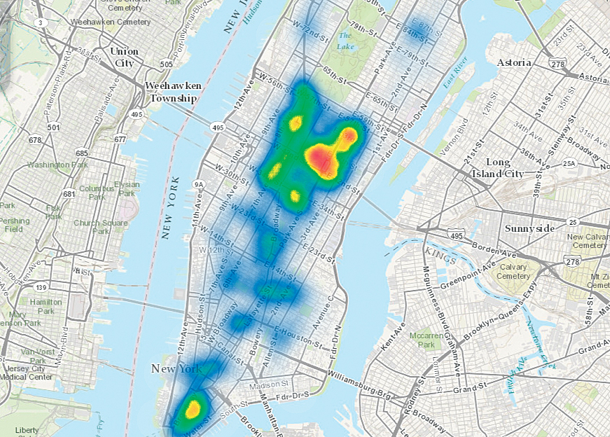
Heat maps, an increasingly common technique, provide a surface that indicates how and where points are clustered. Point density is reflected by the colors used. An area of high density might be colored red, while an area of low density would be colored blue. Although good for showing the density of points, heat maps won’t show what is statistically significant in the data.
Aggregating data based on regions and then mapping those regions can provide a much better picture of what’s going on. Aggregation can be performed outside mapping software (in an Excel pivot table, for instance) or inside mapping software. For example, sales from individual stores aggregated by postal codes can be mapped by postal code areas, and those areas can be color coded by the mapping software. In addition to well-defined boundaries like post codes, aggregated data can be mapped by organizationally specific boundaries such as sales territories.
Imperative #2—Enrich Your View
When you’re in the market to buy a house, you don’t make your decision based entirely on the information the real estate agent gives you. Your decision is based on more than just the number of bedrooms or the price. Typically, you do some additional research. What is the neighborhood like? What shops are in the area? How long would your commute to work be? All this information helps you make a better, more informed decision.
It’s the same situation when you’re making decisions about your organization. You’re not going to be able to make the most informed decision if you’re only looking at your own data. You need to enrich your view by learning more about the geographic areas in which your organization operates. What are the demographics and lifestyles of the people that live in each area? How are they expected to change? Where are competitive or complementary businesses? Is it useful to know more about the surrounding terrain? The acquisition of this information is called geoenrichment. It can add value to your data in two fundamental ways: map enrichment and data enrichment.
Map enrichment means adding new layers of information to the maps you create. These map layers could represent demographics or the locations of certain types of businesses. This data could be administrative boundaries acquired from a third party or real-time data like the path of a storm. Using these map layers with maps of your data can provide a more complete picture.
Data enrichment means adding new columns of information to your own database records so you can slice, dice, and analyze that data in new ways. Although your CRM data might reveal a lot about what products your customers buy and how often they buy them, it won’t tell you much (if anything) about the lifestyles or the life stages of those customers. If you can add these dimensions to your data, you can better determine the optimal products and services for your customers and how best to reach them.
Geoenrichment lets you do real research based on location. This is a key component of Esri Location Analytics and the ArcGIS platform. Using geonrichment, you can get to know your customers better and engage with them more effectively.
Imperative #3—Perform Map-Driven Analysis
Mapping your data can uncover many patterns and insights that graphs, charts, and tables simply won’t reveal. However, the true value of a map is realized when you can interrogate it. Then it becomes a new analytical tool. Map-driven analysis can range from simply connecting maps to your data to more complex operations using spatial queries with geoenrichment.
Connect your maps to your data so as you drill into your charts and graphs, the map updates to reflect the changes in unison or, conversely, as you drill into your map, graphs and charts update to reflect the current geographic area.
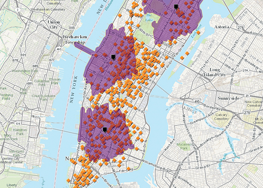
Use the map to perform spatial queries by selecting areas on the map either by drawing an area of interest or defining a specific region (for example, the area that encompasses a 10-minute drive from a specific location).
Use spatial queries with geoenrichment to understand the effects more fully. For example, by determining the path of an approaching hurricane and identifying the types of customers or facilities that may be affected, you can estimate vulnerable populations or forecast losses.
Determine statistical anomalies in your data by using hot spot analysis to identify statistical outliers to validate data quality.
Use spatial modeling to predict performance for existing or new locations. It can answer questions such as, What effect will opening a new facility in this location have on sales in existing stores?
Imperative #4—Collaborate with Maps
An enterprise operates more efficiently when everyone is on the same page. Never an easy thing to do, collaboration gets more difficult as a business gets larger. Organizational structures seem to get in the way. Use Esri Location Analytics to create and easily share maps. These maps can become the new information vehicle for breaking down barriers across your organization. Here are four ways to share maps that maximize the value of collaborating with maps:
Share dynamic maps rather than static maps. A dynamic map can be focused on the area that’s important to the topic under discussion.
Share maps across devices so anyone can use them on tablets, smartphones, or desktops and they are available everywhere. For example, a map created in your CRM and available on mobile devices could be valuable to the sales force in the field.
Share maps in presentations as dynamic rather than static maps. Maps created in your business systems can be used in your presentations to make data more comprehensible.
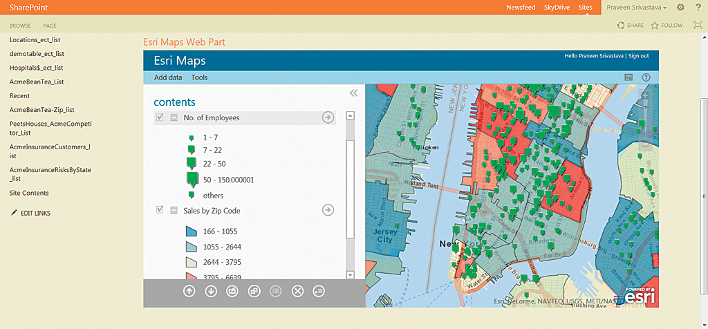
Share maps across business systems and use them as maps or map layers in other business systems. For example, a map of store locations generated in Excel can be used as a backdrop for maps of customers in your CRM.
Share maps securely by controlling who within the organization has access to maps and who can modify them.
Gain a Competitive Edge
Maximize the value of business data by following the four location analytics imperatives: go beyond basic mapping, enrich your view of the world, perform map-driven analysis, and collaborate with maps. Esri Location Analytics products and the ArcGIS platform will help you and your organization apply the four imperatives of location analytics.