Anna Riling is a geologist-turned-cartographer who owns Four Corners Mapping, based in Durango, Colorado. Her business creates custom cartography for policy advocacy campaigns and print media, designs interactive web mapping applications and ArcGIS Story Maps stories, and produces geologic and topographic trail maps. In this interview, Riling talks about her move to mapmaking, her work updating the Multimodal Transportation Plan for Durango, and the power of maps in influencing decisions that matter.

Q. How did you become a cartographer? And what do you enjoy about it?
A: I worked as a professionally licensed geologist in geotechnical engineering, oil and gas, and environmental consulting for a long time. As much as I loved fieldwork, it became harder to do after I had kids. After a slew of particularly brutal days in the field, I realized I needed a change. I wanted to do more with mapping and GIS, so I got my master’s from the University of Denver and started Four Corners Mapping as a side gig. In 2021, I went all in with my business, and it’s been one of the best career decisions I’ve made.
I’m lucky to love what I do. I get to be creative, which wasn’t a big part of being a geologist. I still love geology, but now I apply my creativity to mapping. I get to choose projects and work with awesome clients, many of whom are environmental conservation nonprofits making a big difference in protecting and conserving endangered landscapes, water resources, and Indigenous rights. It feels good to know that my maps help with such important causes.
Q. How did you get involved in creating the updated Multimodal Transportation Plan maps for Durango?
A: Durango is a small city in a valley, which limits growth. We value clean air, walking, and biking but as a mountain town with a big tourist economy, there’s also a focus on affordable housing and safe multimodal transportation. Safety is a huge concern, especially with the mix of pedestrians, cyclists, and heavy traffic. This issue is compounded by the fact that our main thoroughfare is a highway, increasing the potential for crashes and negative interactions.
Devin King, the city’s multimodal manager, hosted many public meetings on this topic and received 500 comments on what the community felt were the most important multimodal transportation needs, and the concerns around each. Since there was a major mapping component, PST Engineering, the company that won the project, subcontracted [with] me to do the maps. I then worked closely with Devin to ensure the plan reflects the community’s needs.
Q. What was your design process for the Durango map, and how did you collaborate with the city’s multimodal manager?
A: The city’s multimodal manager shared examples of maps he liked from other municipalities [that were] streamlined, simple, and consistently formatted. I then worked closely with him and the city’s designer to create a cohesive color palette and font that matched the transportation theme. We ensured a consistent color scheme across the map series; for example, yellow sidewalks and teal shared lanes appeared uniformly on all maps. For the bivariate symbology—instead of relying on default color gradients—I chose accessible colors that created a consistent look and feel. We also standardized all the maps in portrait orientation to improve readability.
Q. What was the primary message you wanted to convey with this map, and how did you approach the design to ensure it told the right story?
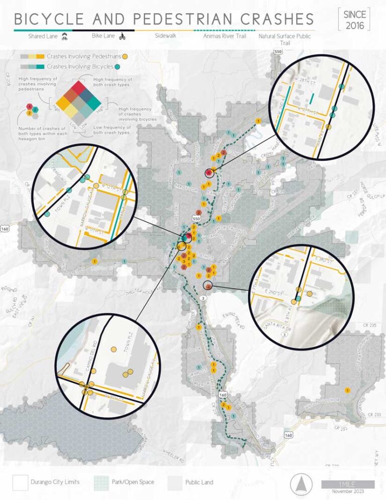
A: The city’s outreach before this update identified safety as a major concern, so I wanted this map to tell a story not just about where crashes occurred but also the frequency and types of crashes. When I first got the data, I noticed many crashes were recorded at the same location—most likely due to how the police geocoded the data. This resulted in overlapping points that didn’t clearly convey the frequency of crashes.
That’s when I decided to use bivariate symbology, a method I hadn’t tried before, and aggregated features into bins, creating a honeycomb pattern. For certain areas with frequent crashes, I used the disperse markers tool to separate coincident locations by at least 10 feet. I then drew attention to these spots using inset maps that function like magnifying glasses. This approach allows the map to show where incidents happen while also highlighting the transportation infrastructure in those areas.
I think the legend really helped because bivariate maps aren’t the easiest symbology for everyone to instantly pick up on, but the legend walks you through everything. In this case, that was crucial to making the map understandable and effective.
Q. What challenges did you encounter while creating this map, and how did you overcome them?
A: One challenge was creating a map series in ArcGIS Pro before it had support for thematic map series. I figured out a workflow that allowed precise adjustments without leaving the software, but it was cumbersome. I had to manually group all my graphic elements and features by map, and with dynamic text changing from map to map, I had to manually toggle layers and graphics for each page.
Another challenge was creating the graphic legend to explain the bivariate symbology, which took a lot of experimentation to get it just right. Finding the right size hexagonal bins was important. They had to be large enough to capture key details at intersections but not so small that they became visually overwhelming.
Q. What lessons from this project will you carry forward into your future work?
A: I learned a lot about working with legends during this project. It’s a continuous learning process, and I’ll probably try something different next time, but in this case, the dynamic legend wasn’t an option. I had to tease out the information, convert it to graphics, and ensure everything was clearly labeled and laid out. Aside from the bivariate legend, I used another legend as a separator between the title and the map. It shows the symbology for the linear and point features in the map, like the shared lanes, bike lanes, sidewalks, and trails.
Q. What has the feedback been for this project?
A: The map directly led to identifying key intersections with frequent crashes, especially along the main US 550 highway which runs through the town. The analysis showed that the highway was a barrier for pedestrian and bike crossings, resulting in proposed projects like underpasses, overpasses, and shared lanes. There were also land use development code recommendations, which will have a lasting impact on the community.
Maps have power. How we present and visualize data can significantly influence decisions. If the data isn’t clear or lacks context or just plain isn’t nice to look at, it won’t be as effective as a communication tool.
