Many maps portray statistical data. If the map is effectively executed, you will intuitively and correctly understand the statistic mapped. Judging the effectiveness of a statistical map is easier if you understand the data being mapped and the method used to map it. This article explores issues related to mapping statistical data.
Qualitative versus Quantitative
Fundamentally, maps display only two types of data: qualitative and quantitative. Qualitative data differentiates between various types of things. Quantitative data communicates a message of magnitude.
While either type of data can be expressed in a map using points, lines, polygons, and raster cells, the methods for mapping these two types of data are somewhat different. The categorical differences in qualitative data can be shown with symbols that vary by color hue (e.g., red, green, blue) and shape (e.g., circles, squares, triangles). Quantitative data can also be effectively portrayed using symbol variations such as orientation and pattern spacing, but hue, shape, lightness, and size are most often used because they are the most easily and correctly understood symbols.
A number of mapping methods have been developed that combine various map features and symbols. Choropleth mapping uses lightness to symbolize polygons. Proportional symbol maps display results as points that vary in size based on their associated values.
Because most statistical data is quantitative in nature, this article focuses on mapping quantitative data. However, to appropriately map quantitative data, you must understand it. Not all methods work for all quantitative data.
Demographic data provides an example. It shows the statistical characteristics of a population and is one of the most common types of data shown on statistical maps. Demographic data, which can include data for race, gender, age, employment status, and other factors, is tabulated over enumeration units such as counties, census tracts, ZIP Code areas, or school districts. The tabulations include the count of features, such as persons, households, housing units, or students, within those units. They can also include characteristics that describe those features, such as age, race, and income to describe people or age and type of housing unit.
Counts and characteristics can be used to derive measures that express either summarizations (e.g., mean, median) or relationships (e.g., densities, proportions). Tabulations and derived values for enumeration units are assumed to be uniform across the area and change at unit boundaries (i.e., they do not blend from one unit into another).
Landscape indicators for watersheds or subwatersheds and tax values in cadastral parcels are two examples of data collected for the unit as a whole that are assumed to be distributed uniformly across the unit and change at unit boundaries. In addition to determining whether the data being evaluated has these characteristics, there is another thing you need to know before mapping it.
Spatially Extensive versus Spatially Intensive Data
You must also consider whether the statistic being mapped depends on the size of the unit. Counts or totals and measures, such as area and perimeter, are summary statistics for the unit and are only true when they represent the unit as a whole. These statistics are said to be spatially extensive. The statistic is the sum of the properties of elements that make up the unit. For example, totals are the sum of the items counted in the unit. Perimeter is the sum of the length of line segments that make up the boundary of the unit. If you change the size of the unit, these statistics will change.
In contrast, values such as population density or cancer rates can describe any part of the unit (if the unit is assumed to be homogeneous). These statistics are spatially intensive and do not depend on the size of the unit. If you divide the unit, the value will stay the same.
Spatially intensive data can be derived from spatially extensive data. For example, dividing counts by area yields density or dividing the count for one unit by the sum of counts for all units yields a proportion.
To understand this better, look at Figure 1. Data for the five enumeration units shows the number of people, area, and population density for each unit. Recalculating the values based on an arbitrary division of the original units reveals that spatially intensive measures, such as density, are not dependent on the size of the area, whereas spatially extensive variables, such as area or count, are spatially dependent.
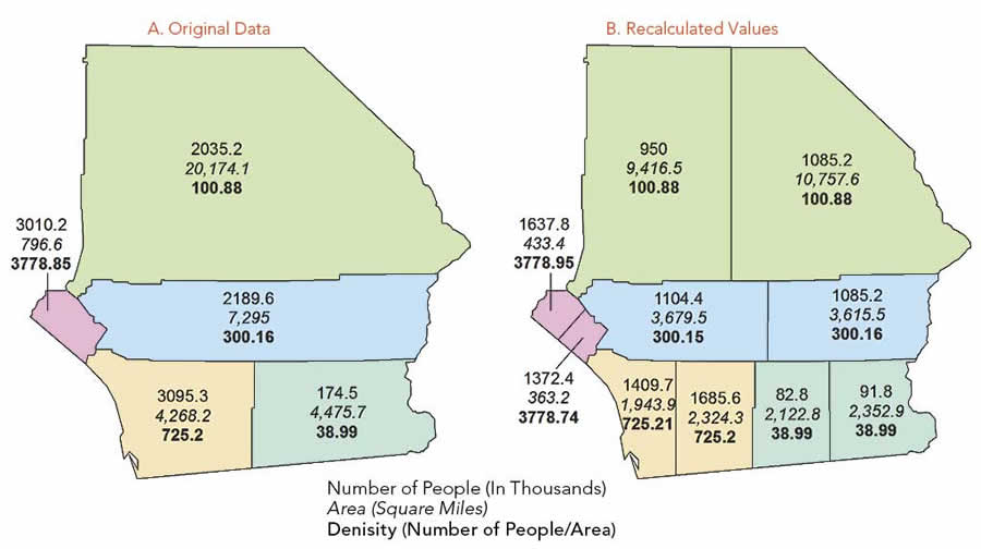
You can recalculate all the statistics if you assume the original counts to be uniform within the units, one of the assumptions of demographic data discussed earlier. The area can easily be recalculated, as can the percentage of the old area that the new area comprises (new area/old area). To calculate the new count, the old count is multiplied by the percentage of area for the new unit, resulting in a new value. This new value will only be correct if it is assumed that the number of people is evenly distributed within the unit. However, recomputing the density gives the same value as before, because the count changes in direct proportion to the area.
The maps in Figure 2 show the data mapped using the choropleth method. When counts are symbolized using lightness (noting that darker is always interpreted as more), the map of recalculated values varies greatly from the map of original values.
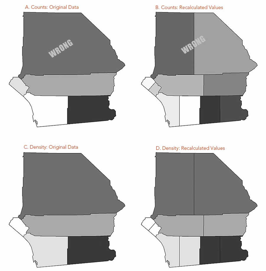
This violates the assumption that the values in enumeration units are uniform across the area. However, when density is mapped, the distributions appear exactly the same. Arbitrarily dividing the units does illustrate the properties of spatially intensive and extensive data, but it is not something you would probably ever need or want to do.
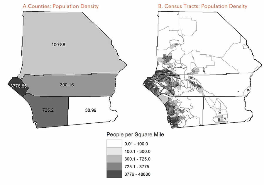
Let’s look at the actual data. The data is not evenly distributed within the unit, as is the case with most areal data. The original units (shown in Figure 3) relate to counties and are further subdivided into census tracts. Mapping population density for these tracts reveals that for the entire area, the population is concentrated in the southwest. However, mapping population by county masks this variation in distribution.
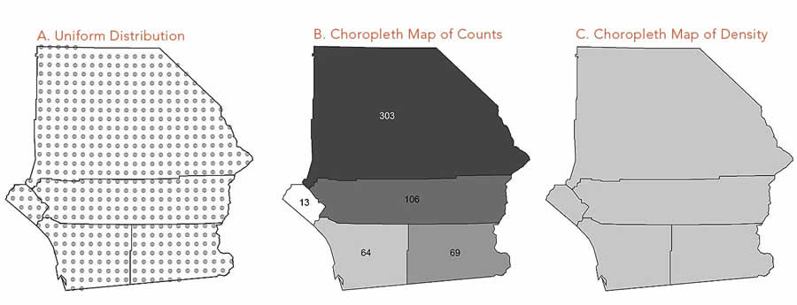
There is also another problem with mapping counts or totals and other spatially extensive data within areas using the choropleth method. Distributions that are uniform will be masked. The maps in Figure 4A, 4B, and 4C show data mapped first as a uniform distribution, then as two choropleth maps that display feature counts and feature density. The count ranges widely by area, causing a range of lightnesses on the map in Figure 4B. Although the density is the same for all areas, this variation gives a false sense of the way the features are distributed within the areas. In contrast, the map in Figure 3C has the same density for each unit. The lack of variation in lightness between units gives the correct impression of feature distribution.
Figures 2 to 4 demonstrate a very important caveat: counts or totals and other spatially extensive data should never be symbolized using the choropleth mapping method.
Why?
Because this method does not accurately represent the nature of the data. Mapping spatially extensive data using a choropleth method masks the concentration of features within the areas because it assumes the distribution is uniform as shown by the maps in Figure 2. The choropleth method also masks distributions that are uniform, as shown by the maps in Figure 4. Although this is just one example of the use of a mapping method that is not appropriate to the type of data, it is one that is grievous and all too common.
Normalizing or Standardizing the Data
Now that you understand the need to match the mapping method to the nature of the data, the next step is to learn how to work with the data so that it is in the correct form for the type of mapping method you are using.
To correct the problems caused by mapping counts using the choropleth method, you can convert the data to the correct type so it can be shown by lightness within areas. This is often necessary for data represented as points, lines, or rasters and with other mapping methods such as proportional circle.
Do this by normalizing or standardizing the data. These two terms, often used interchangeably, are slightly different. Normalizing the data scales all numerical values to a range from zero to one. Standardization transforms the data so that is has zero mean and unit variance. Both techniques have drawbacks. If the dataset has outliers, normalizing will scale the normal data to a very small interval. When using standardization, the assumption is that the data has been generated with a certain mean and standard deviation, although this may not be the case.
Methods to Derive Appropriate Measures
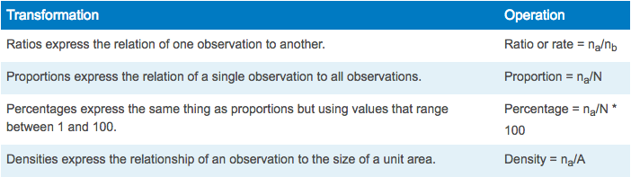
In mapping, cartographers often use the term derived data to refer to data that has been transformed through normalization or standardization so it can be compared in a meaningful way. Transformations commonly used in mapping include ratios or rates, proportions, percentages, and densities.
It is important to differentiate between spatially intensive and spatially extensive measures. Density is a spatially extensive measure. A proportion, generated by dividing the number of items in a unit by the total number of items, is spatially extensive because the number per unit has been divided by a constant (the total number of things). For derived values such as proportions, percentages and rates, the resulting numbers can only be true for the entire unit, not parts of it. For units of intrinsic importance (e.g., counties) mapping the proportion of the value allocated to each unit should not be mapped using the choropleth method. In such cases, it may be best to use graduated symbols.
Figure 5 shows maps for some types of derived data. Figure 5A shows two of the statistics in the original data that were used in the calculations—the number of students and teachers in each unit. The area of each unit can be calculated using GIS. Using the formulas in Table 1, maps were created that show the density of teachers (5B), the percentage of teachers (5C), and the ratio of students to teachers (5D) for each unit. These very different maps would be used to answer very different questions.
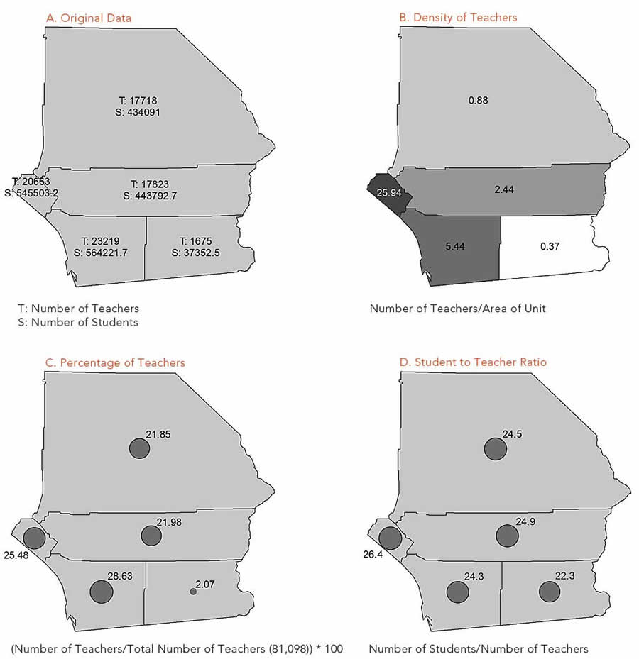
For example, knowing the density of teachers helps answer questions like, Where are a lot of teachers concentrated? This might be useful if you want to hold a meeting at a location that will minimize travel distance for most of the teachers attending. Knowing the percentage of teachers in each unit helps answer questions like, How many of all the teachers are allocated to each unit? This would be helpful for disbursing funds to teachers for school supplies.
One problem is that derived values can mask the nature of the data used in the calculations. For example, the map in Figure 3 can hide the fact that not all teachers are employed full-time. Two half-time teachers may count as two teachers but together are only one full-time equivalent (FTE). This aspect of the data is not captured unless the number of FTEs is mapped rather than the number of teachers.
Also, quantities that are not comparable should not be used to calculate ratios. For example, you would not calculate (or map) the number of teachers per school unless all the schools were roughly equal in size. For this ratio to make sense, the schools have to be comparable.
Summary
Understanding more about the nature of the statistical data used for mapping purposes will help you better understand the methods that can be used to map it. Ultimately, the goal is to match appropriate data with the most effective method so that your map can be easily, quickly, and correctly interpreted by your readers.
References
Brewer, Cynthia A. 2006. “Basic Mapping Principles for Visualizing Cancer Data Using Geographic Information Systems (GIS),” www.ajpmonline.org/article/S0749-3797%2805%2900358-2/fulltext.
Cote, Paul. Effective Cartography: Mapping with Quantitative Data.
Kimerling, A. Jon, Aileen R. Buckley, Phillip C. Muehrcke, and Juliana O. Muehrcke. 2011. Map Use: Reading, Analysis, Interpretation, Seventh Edition. Redlands, CA: Esri Press, 581 pages.
Longley, Paul A., Michael F. Goodchild, David J. Maguire, and David W. Rhind. 2011. Geographic Information Systems and Science, Third Edition, New York: Wiley, Chapter 4.
Pitzl, Gerald. 2004. Encyclopedia of Human Geography. “Choropleth maps.”
Robinson, Arthur H., Joel L. Morrison, Phillip C. Muehrcke, A. Jon Kimerling, and Stephen C. Guptill. 1995. Elements of Cartography, Fifth Edition. New York: John Wiley & Sons, Inc., 674 pages.
Saitta, Sandra. “Standardization vs. normalization,” Data Mining Research blog.
About the author