Everyone in the United States will have the opportunity to be counted as the decennial census goes into full swing this month. The US Census Bureau is asking residents a few basic questions about what their household makeup is and whether they own or rent their homes.
The data collected from the census forms—whether submitted online, through the mail, or in person to US Census Bureau enumerators—will be used to decide things such as how much federal funding communities will receive and how many representatives from each state will be sent to Congress.
Eventually the 2020 census data will be available for analysis and visualization, using the Esri ArcGIS platform. However, there’s a wealth of demographic data from around the world already available to be studied and mapped by anyone, including students who have access to ArcGIS Online and ArcGIS Living Atlas of the World.
The key components of Web GIS include ArcGIS Online and ArcGIS Living Atlas of the World. These two resources provide cloud-based tools and content that make it easy to analyze spatial demographic data. For students using this kind of technology, learning about demographics and population change can be interesting, engaging, and informative. Students can solve problems, think critically, and strengthen their reasoning and spatial analysis skills in multidisciplinary environments. Over one billion maps are served via the ArcGIS platform, which includes spatial data; maps; analysis, classification, symbology, and measurement tools; field apps; web mapping applications; and data that is shared by a community of users.
Why is using Web GIS to study demographic change so practical?
- Population patterns change over space and time, meaning 2D and 3D GIS maps can reveal important changes.
- Maps and applications can be saved, shared, and embedded into presentations and multimedia in a collaborative learning environment.
- Web-based analytic and cartographic tools can be used on any device at any time, on just a standard web browser.
- The open data movement places an array of rich, varied demographic datasets—in scales ranging from the local to global—into the hands of educators and students. This includes data from the US Census Bureau and other national statistics agencies.
You can use ArcGIS in the following 10 ways to study demographics:
- Examine world population and demographic data by country.
ArcGIS Living Atlas of the World is a curated and growing body of content covering a multitude of scales.
Population growth, ethnicity, density, cities, and other themes can be quickly accessed, combined with other layers of data, queried, and used in presentations. Many of the layers contain data that goes back in time; others contain forecasted growth and demographics.
This web map, called World Demographics Analysis, includes some Living Atlas content and opens the door to investigating population growth rates, life expectancy, birth rates, and other variables. Some of the variables can be analyzed over time by opening the table associated with the maps and by using the time animation slider bar. For additional analyses, modify the map below by clicking on it and adding other layers from the Living Atlas or from ArcGIS Online.

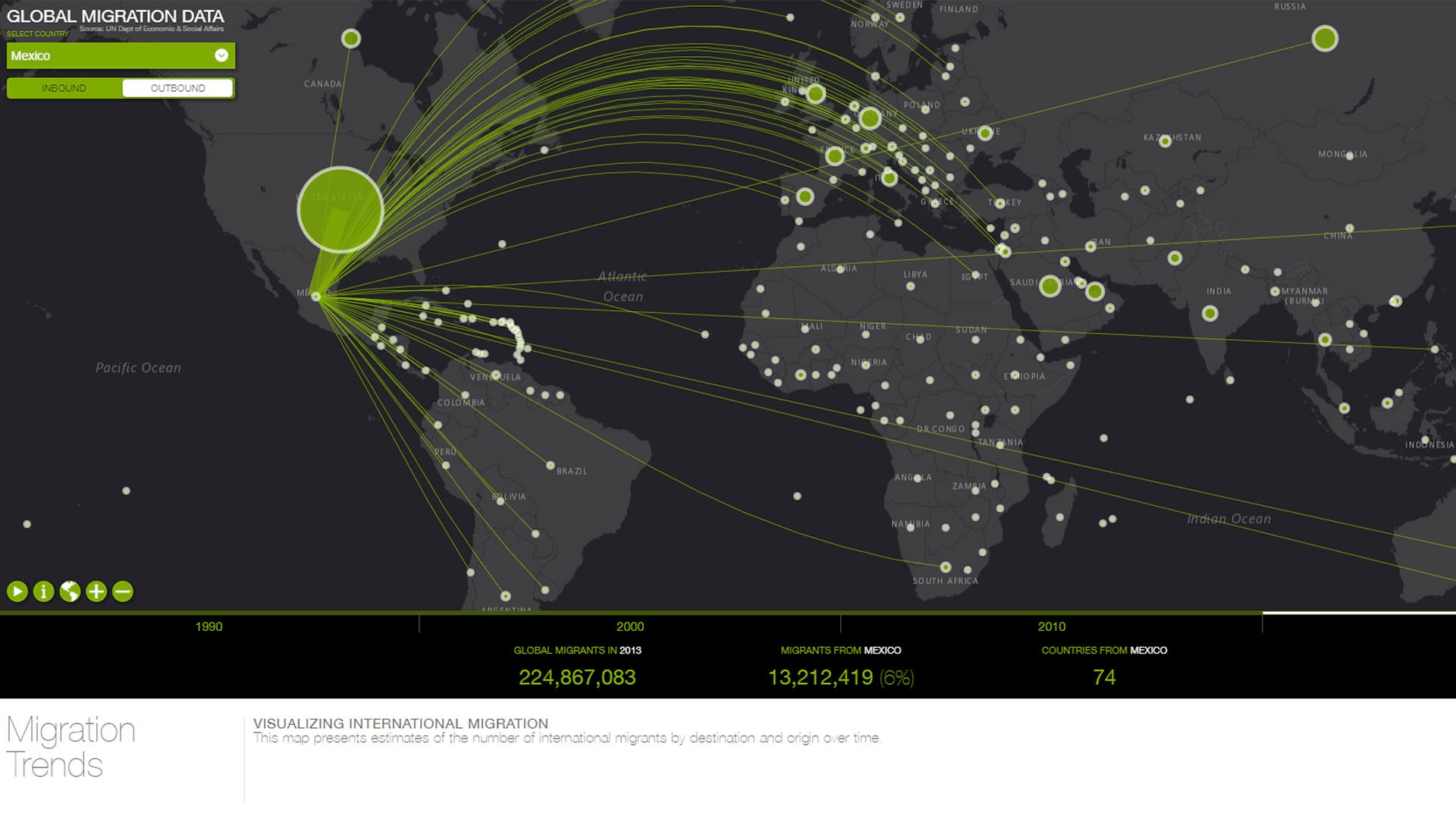
- Visualize and understand migration over space and time in 3D.
The Esri Cool Maps gallery features this 2D and 3D map visualization of incoming and outgoing migration, organized by country, for four different time periods. The map below presents estimates of the number of international migrants by destination and origin. The map uses a dataset, called Trends in International Migrant Stock, from the United Nations Department of Economic and Social Affairs.
This dataset contains a time-series of estimates and projections of the number of international migrants in 232 countries or areas for the years 1990, 2000, 2010, and 2013. You can compare one country’s change over time in terms of both numbers and the places where migrants travel to and from.
For example, you can visualize the increase in immigration from south Asia and east Asia to Australia, relative to that country’s traditional immigration patterns from western Europe. You can also see the jump in Australia’s absolute numbers of migrants.
You can use the same map to investigate immigration to the United Arab Emirates (UAE), which supports the infrastructure development there. The map also will help you to understand the continuing challenges faced by Somalia caused by emigration from that country.
Which patterns did you expect to see? Which ones surprised you? Why?

- Examine demographic patterns in select cities.
Urban Observatory is a mapping and visualization app that enables you to compare conditions—including housing density, traffic, youth population, and open space—for over 100 cities around the world.
The app is powerful and easy to use. Themes include Work (such as zoning), Movement (such as roads, transportation noise, airports, and traffic), People (such as population density and growth), Public (such as ParkScore scores and health resources), and Systems (such as current temperature and flood zones).
Click Launch App to compare the cities and themes of your choice. These will be displayed in three side-by-side interactive maps at the same scale. Because some variables are from real-time feeds, you can use Urban Observatory to teach students about commuting, time zones, and seasons.
How do the location and the physical geography of each city affect population density?

- Examine world population density versus latitude, altitude, and ecoregions.
Using “Ecoregions, Population Density, Imagery,” an interactive map in ArcGIS Online, you can study the effect of latitude and altitude on the distribution of world population density and on ecoregions.
Using the map, can you determine which ecoregions are under the greatest pressure due to high population density? Besides changing the scale, you can change the basemap to highlight landforms or infrastructure such as roads, parks, and railroads. You can use the measurement tools and adjust the transparency to see the relationships between map layers.
On the map below, for example, why is the population density much higher along the Ganges River in India than at locations a few hundred kilometers to the north?

- Examine regional change by using satellite imagery.
You can easily detect regional changes to the landscape by using a variety of Esri mapping tools, including the swipe tool in the Landsat Explorer app and the Landsat Lens web mapping application.
Using Landsat Lens (no sign-in required), you can explore any region of the planet, in several different wavelength band combinations for five different time periods. You can use this resource to study urban growth, deforestation, volcanic eruptions, glacial retreat, agricultural expansion, and other natural and human-caused changes to the earth.
You can study issues such as the expansion of the Sahara Desert southwards into the Sahel, the drying up of the Aral Sea, and the continuous activity at Kilauea volcano in Hawaii.

- Investigate local changes using historical US Geological Survey (USGS) topographic maps.
With access to 75,000 historical maps, you can use USGS Historical Topographic Map Explorer to quickly examine changes in your own community as well as others across the United States. These maps, available at a variety of scales, cover a century of geographic history.
Use the search box to find places. Transparency and timeline tools make the app easy to customize and investigate places. No sign-in is required.
You can study how your campus and the surrounding neighborhood have changed and then compare your findings to the direction and amount of growth in communities nearby or across the country. Why do some communities change rapidly while others change much more slowly? What did your community look like 60 years ago? How will your community change in the future? Can you spot evidence of deforestation or reforestation, mining and mining reclamation, or paved-over agricultural lands versus reclaimed urban greenways?
The web mapping application was updated so you can easily save these maps as web maps in your ArcGIS Online account.

- Use satellite imagery to investigate local changes.
World Imagery Wayback is an app that contains high-resolution global satellite imagery for the past year. The imagery is stored in ArcGIS Online.
The app opens with an image of Las Vegas, Nevada, where change has occurred rapidly over a short time period. You can easily see the direction and magnitude of urban sprawl.
You can use the app to examine coastal erosion in England, the construction of Three Gorges Dam in China, and the results of wildfires in Australia and California; urban sprawl, landslides, and volcanic activity; and much more, such as the construction of your own school or university buildings.
You can use the app on its own or, for additional capabilities, click the plus sign to the right of each image layer to save desired images. Next, add them to your own ArcGIS Online map, where you can then add layers such as population change, cultural features, ecoregions, and elevation.

- Study variables at state, county, and neighborhood scales.
Using the ArcGIS Online map viewer, you can investigate relationships between such variables as median age and median income, explore consumer and other types of behaviors, and study patterns of diversity. You can also examine how many of those variables change over time.
Begin with this ArcGIS Online map. It contains about 10 different layers. Where is the median age low compared to the surrounding areas? Which factors—such as a university campus or a military base—are pulling down the median age? Where does the median income increase as the median age increases, and where does that trend break down, and why? How does your community compare to others that contain roughly the same population, and why? What are the projected trends for some of these variables?
To investigate this last question, use this ArcGIS Online map, which contains 2018 Census data projected to 2023 to incorporate the temporal component. You can open this map, change the scale to the ZIP code level, and change the style to reflect how the 2018 median household income compares to that projected for 2023, as shown below.

- Examine population change in the 1930s Dust Bowl by county.
You can use this map to investigate climate, agriculture, and population change during the 1930s in the Great Plains and California.
The map is tied to this lesson. It’s part of a GeoInquiries collection, designed for brief but intensive investigations. GeoInquiries can be used across curricular areas and at many education levels and settings. In the case of the Dust Bowl map and lesson, data layers include information for each county: the percentage of land involved with agriculture; changes in population and the number of farms from 1930 to 1940; precipitation graphs; and more.

10: Explore population dynamics via the SEDAC Population Estimation Service.
The SEDAC Population Estimation Service provides useful worldwide demographic information.
The service was created by the National Aeronautics and Space Administration (NASA) Socioeconomic Data and Applications Center (SEDAC) and Center for International Earth Science Information Network (CIESIN). It offers educators, researchers, and students a valuable, easy-to-use tool to examine the distribution and demographic characteristics of the world’s population.
Population, demographics, and age pyramids can be calculated for any user-defined area, so you can easily compare regions and research why any differences exist and what the implications might be for the future.
You can use Population Estimation Service tool to compare the population growth in places with a younger population—such as northern India—to that of central Japan. You can then see the impact of population growth on natural resources, infrastructure, and city size.