One of the main challenges when starting a GIS project is finding the right data. The ArcGIS ecosystem contains thousands of data layers, many of which can be used alongside your own data to enhance analysis and visualization. In this tutorial, you’ll search for data using authoritative layers that have been shared in ArcGIS Online.
In many cities, a shortage of affordable housing is driving up costs. In this tutorial, you are an analyst studying housing access in Boston, Massachusetts, and you need to find data on affordable housing. You’ll start by exploring data from American Community Survey (ACS). Then you’ll filter the data and customize your map to only show data for your community.
Browse Data from ArcGIS Living Atlas of the World
The first step in a GIS project is deciding what data to use. Authoritative data and different types of layers shared by the GIS community are accessible in ArcGIS Online through your map, so you can explore them in one place.
To find data on housing affordability, you’ll start your search using ArcGIS Living Atlas of the World, a curated collection of geographic information from authoritative sources.
1. Open ArcGIS Online or ArcGIS Enterprise.
Note: If you don’t have an ArcGIS organizational account, you can still complete this tutorial but you won’t be able to save the map at the end.
2. Sign in to your ArcGIS organizational account or into ArcGIS Enterprise using a named user account.
If you don’t have an organizational account, see options for software access.
3. On the ribbon, click Map.

A blank map opens. First, you’ll locate Boston, your area of interest.
4. Click Search at the bottom right side of the map.
5. In the Search bar, type “Boston, MA” and press Enter.

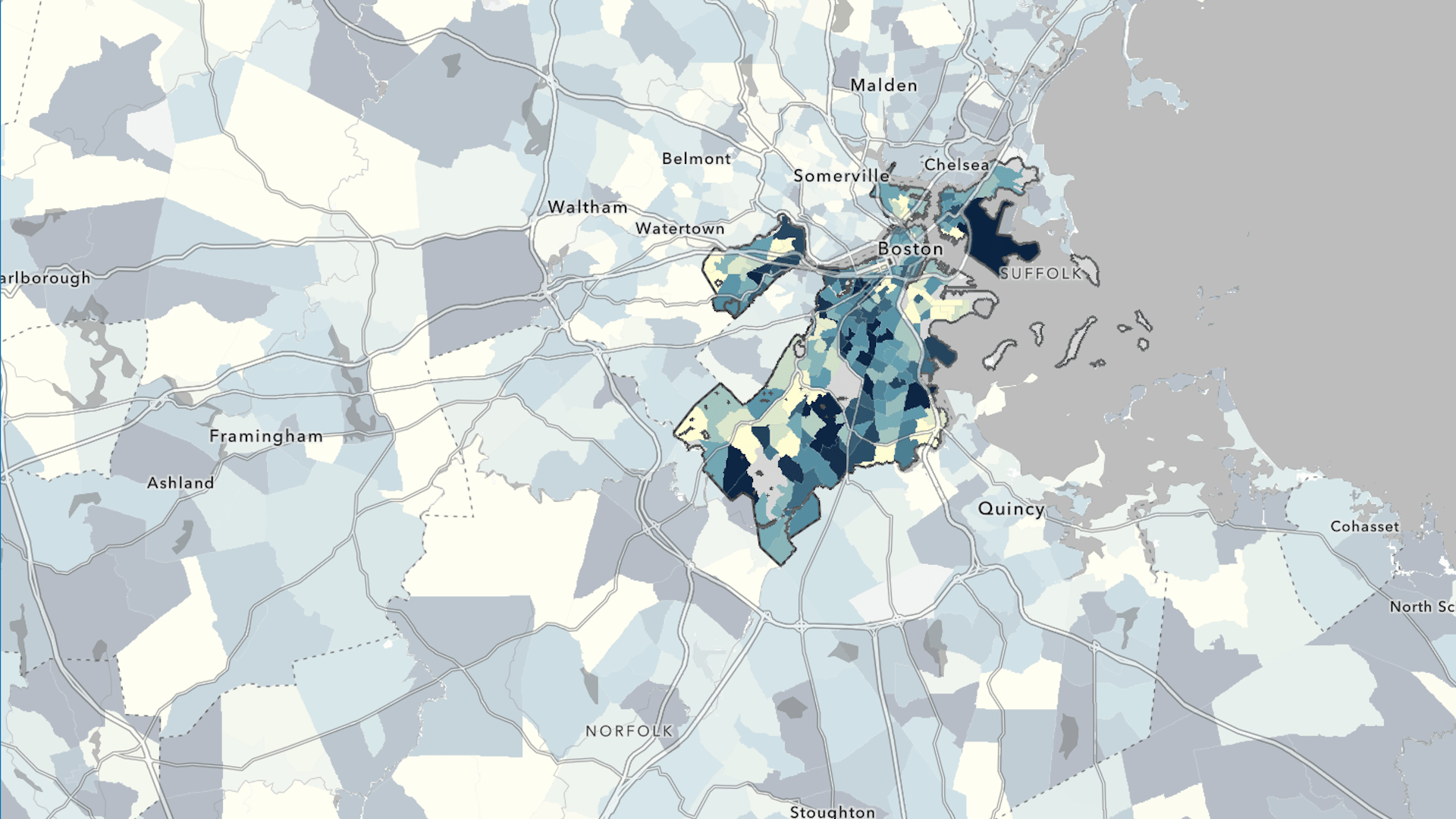
The map zooms in to Boston. Next, you’ll look for data relevant to your project on housing affordability.
6. In the Layers pane, click Add.

The Add layer pane opens. You can add data to your map from several repositories, including ArcGIS Living Atlas and ArcGIS Online. If you’re signed in to an organizational account, you can also add your own data and items that others in your organization have created.
7. If necessary, click My content and choose Living Atlas.

8. In the Search bar, type “housing burden” and press Enter.

The search returns a series of layers titled ACS Housing Costs. These layers have two badges:
- The Authoritative badge, a green check mark, indicates that the organization that owns the item has been verified as an authoritative source.
- The ArcGIS Living Atlas badge, a blue globe, indicates that Esri has curated this content.
To see if this data will be useful for your project, you’ll read more about the layers.
9. Click the ACS Housing Costs (Latest) card.

A pane appears with information about the layer, including an overview, a description, and a summary of the layers that are included. This data is from ACS, a program run by the US Census Bureau that surveys Americans annually on topics such as housing and employment.
10. Expand the Description section.
The layer description includes information about the data source and its purpose, notes on how it’s currently styled, and more. ACS layers are updated annually, so they always contain the most current five-year estimates from the US Census Bureau.

11. Expand the Layers section.
There are three sublayers included in the ACS Housing Costs (Latest) layer that aggregate the data to tract, county, and state geographies. This allows maps to show the data at different geographic scales; this is known as multiscale mapping. Each sublayer has the same attributes, so you’ll consider what geography is most applicable to your analysis.
Larger geographies, like the State layer, are more useful when you’re comparing national or regional patterns. At the local level, the Tract layer is most useful.

12. Click the Tract sublayer.

The Fields view that appears contains all the attribute fields available in the dataset. You can look at this to ensure that the dataset has the data you need. The layer contains a breakdown on what percentage of a household’s monthly income is spent on housing. ACS layers contain both an estimate and a margin of error for each attribute. The layers used are samples representative of the American population.
Margin of Error fields provided with these estimates show the potential range of values. While not precise, the sampling method that’s used to collect data for ACS layers provides important information about geographies in relation to each other and is a cost-effective way to gather data.
Using the ACS data that reflects the estimated number of households, you can still see clearly what areas are more populated than others as well as other types of patterns. Learn more about mapping with margin of error.
You’ll add this sublayer to the map. Selecting this sublayer allows you to add it to the map without adding the full group layer.
13. At the bottom of the ACS Housing Costs (Latest) layer pane, click Add to map.

Note: Because you had the Tract sublayer selected, this is the only sublayer added to the map.
14. In the Add layer pane, click the back button.
15. On the Contents (dark) toolbar, click Legend.

The Legend shows that the ACS Housing Costs (Latest)—Tract layer is styled to show the housing burden for renters. Housing burden exists when a household’s monthly housing costs exceed 30 percent of its monthly income.
Tracts where higher percentages of households experience housing burden are shown in blue, and tracts where lower percentages of households experience housing burden are shown in light yellow.
Style a Demographic Layer
ArcGIS Living Atlas layers may come with a preset style, but these can be changed to suit the needs of your map. Any of the attributes in the layer can be styled, and there are a variety of color ramps and other symbology choices to customize the layer.
1. On the Contents toolbar, click Layers. In the Layers pane, click the ACS Housing Costs (Latest) layer to select it.
The selected layer has a blue bar.

2. On the Settings (light) toolbar, click Styles.

The Styles pane opens. In the Choose attributes section, there are two options:
- The Field button allows you to select different layer attributes to style.
- The Expression button opens the ArcGIS Arcade editor. You can use ArcGIS Arcade for calculations and additional custom styling.
The layer already shows the attribute you want to style, so you’ll leave this alone.
3. For Pick a style, on the Counts and Amounts (color) card, click Style options.

The Style options pane opens. In the Data range group, a histogram shows the range of values in the attribute and their distribution. Based on this histogram, you can see that the current styling has color stops set around one standard deviation above and below the national mean percentage of renter households for which housing is a burden.
The color stops, in this case, determine where values get much darker or much lighter. This is a way of emphasizing where very high and very low percentages are. For this map, you’re more interested in emphasizing where high percentages are.

Note: Because this layer gets updated to show the latest ACS values, your values may be slightly different from the image.
4. Under Symbol style, click the color ramp. The Symbol style window opens.

5. In the Symbol style window, under Colors, click the color ramp.

6. In the Ramp window, choose the Green 6 ramp.
Tip: Point to a color ramp to see its name.

When choosing colors for a map, it’s important to consider what you’re mapping and who your audience is. Colors have different cultural connotations. For example, in the United States, green is commonly associated with money, making it a good color to show costly rent for this map.
7. If necessary, click Flip ramp color to ensure that the dark greens represent higher percentages.

The map now shows tracts with higher percentages of rent-burdened households in shades of green. It visually deemphasizes tracts with lower percentages of rent-burdened households.
8. In the Ramp window, click Done. In the Style options pane, click Done and then click Done again.
9. Select the folder icon on the Contents (dark) toolbar and click Save As. Add a title and click the Save button to save your work.
Through ArcGIS Living Atlas, Esri provides access to many spatial data layers that use US Census Bureau data. Explore resources to learn more about ACS data. To learn about ways you can share your maps, try the Share a Map tutorial.
Acknowledgements
- The ACS Housing Costs (Latest) – Tract layer is available from ArcGIS Living Atlas. It is sourced from the US Census Bureau’s ACS 2020–2024 five-year estimates, Tables B25070 and B25091.
- The City of Boston Outline Boundary (Water Excluded) and Mask_Boston layers are provided by the City of Boston.
- Topographic map sources: Esri, TomTom, Garmin, FAO, NOAA, USGS, OpenStreetMap contributors, and the GIS user community.
Visit the Esri tutorial gallery to explore additional topics and find other step-by-step workflows on a variety of products.