
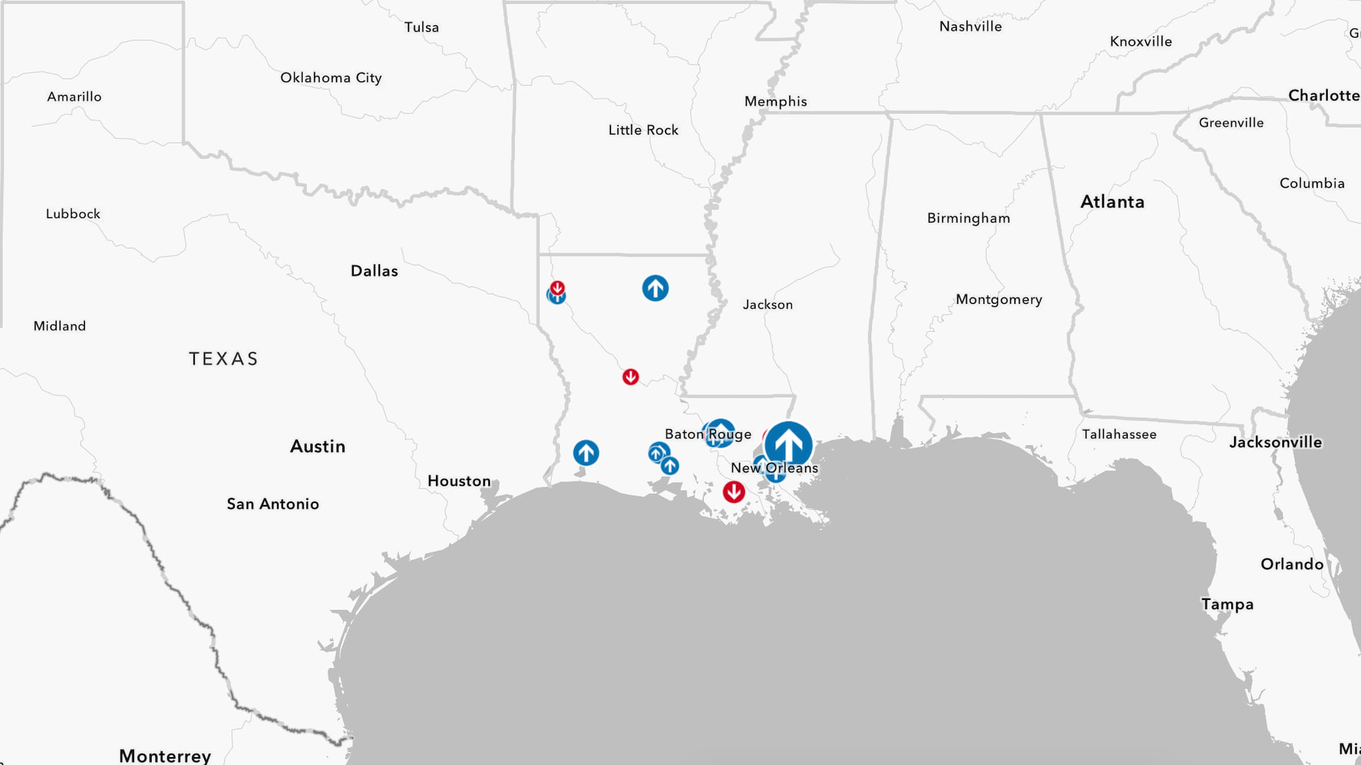
In this tutorial, you are an employee at Box Store, Inc., which is coming up on its annual planning period. To prepare, you and your colleagues in the sales department will create recommendations for strengthening sales at underperforming branches. You’ll start by exploring a map and sales data shared by your colleague. Then, you will use charts to analyze the data.
Requirements
- ArcGIS account (see options for software access)
Open a Map
Starting with a map of Box Store’s branch locations, you’ll gain an understanding of the data you have for each store.
1. Open the Box Store Locations map in ArcGIS Online.
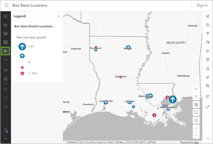
This map is styled to show each Box Store location’s year-over-year growth, or the percentage change compared to the previous year’s sales. Arrows pointing up show stores that sold more, while arrows pointing down show stores that sold less. The size of the arrow corresponds to how far above or below the average each store location performed.
This layer contains additional data that you may want to explore.
2. On the ribbon, click Sign In. Sign in to your ArcGIS organizational account.
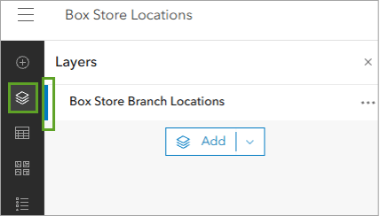
3. On the Contents (dark) toolbar, click Layers. In the Layers pane, click Box Store Branch Locations to select the layer.
4. For the Box Store Branch Locations layer, click the Options button (three dots) and choose Show table.
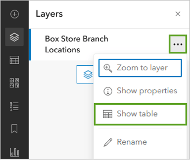
The layer’s attribute table opens. This table shows the data with the store locations. This data can be visualized on the map, like the current style that shows 2026 sales, and charted and used for deeper analysis.
5. Move left and right through the attribute table, taking note of the column headers.
The table contains sales data for different departments as well as sales data for each branch over the past five years.
6. In the table, move until you see the Sales 2025 column. Next to the Sales 2025 title, click the Menu button (three dots) and choose Information.
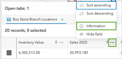
A window appears that shows information about the attribute field, including the field type, description, and statistics about the values in the field.
7. In the information window, move down until you see the Statistics section.
According to the attribute statistics, the average branch sales total for 2025 was $25,148,807.40.
8. Close the information window using the X button. Click the Sales 2025 header once to sort the table by ascending values.
The table updates to show store locations sorted in order from lowest 2025 sales to highest.
9. Check the check box next to the topmost record (the lowest sales number). On the table ribbon, click the Menu button (three dots) and choose Zoom to selection.
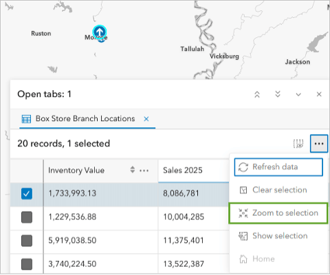
Note: The Zoom to selection option centers the point on the map. Depending on how large the attribute table is, the point may be hidden under it. Zoom in on and pan the map until you see the point.
According to the table, the lowest-earning store is located in Monroe.
10. Close the attribute table.
Review a Chart
Now that you have a better idea of the types of data stored for each location, you’ll use charts to start assessing the data. Your colleague had already created a chart before they shared the map. You can open, review, and edit this chart as needed.
1. On the Contents (dark) toolbar, click the Charts button (this may be under More).
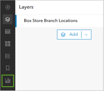
The Charts pane opens.
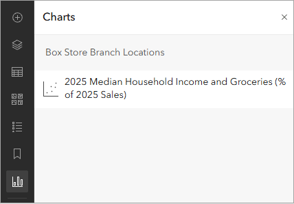
In the Charts pane, there is already a chart titled 2025 Median Household Income and Groceries (% of 2025 Sales). Charts can be saved and stored with maps and accessed by people the map is shared with.
2. In the Charts pane, click the 2025 Median Household Income and Groceries (% of 2025 Sales) chart to open it.
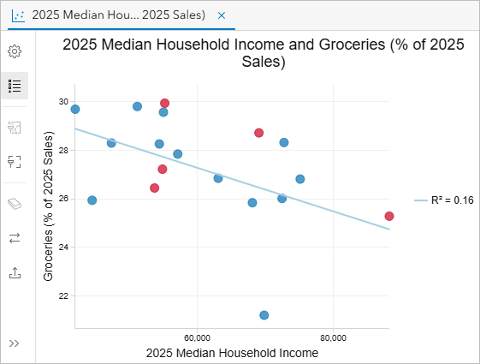
A scatterplot opens. The scatterplot shows the relationship between spending on groceries and median household income. Based on this chart, you can tell that as median household income increased, spending on groceries as a percentage of total sales decreased. This pattern suggests that in areas with higher incomes, other Box Store departments may be more profitable than the grocery department.
This is an interesting data point to get you started on your analysis, but it’s not the only one you’ll need for your presentation.
3. Close the 2025 Median Household Income and Groceries (% of 2025 Sales) chart using the X button.
Create a Chart
While the map shows branch locations’ growth, it doesn’t show overall performance. For example, while the Monroe store had the lowest sales in 2025, its sales still grew compared to 2024. These are both important metrics to consider, so you’ll create a chart that compares sales from 2024 to 2025.
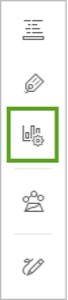
1. On the Settings (light) toolbar, click the Configure charts button.
2. In the Charts pane, click Add chart and choose Bar chart.
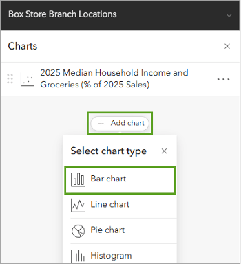
A blank Bar chart window appears and the Data pane opens. Bar charts summarize and compare categorical data using proportional bar lengths to represent values. In Map Viewer, bar charts can be driven by category, numeric fields, or both. You’ll start by adding numeric fields.
3. In the Data pane on the toolbar in the Box Store Branch Locations box, for Numeric fields, click Select numeric fields. In the Select fields window, choose Sales 2025 and Sales 2024.
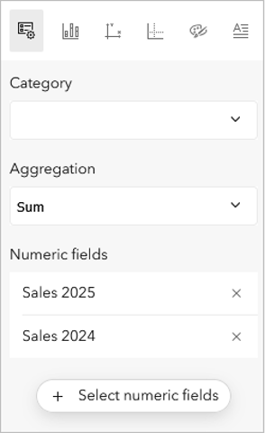
By default, the chart shows the sum of each category for aggregation, displaying the total value of sales in 2024 and 2025.
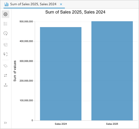
You can change this statistic. For example, using the mean would show the average sales by department for the dataset.
You can also add a Category value to sort the data by. For example, adding City as the Category value will show sales by category for each city that has Box Store locations.
4. For Category (on the right), choose Store Name.
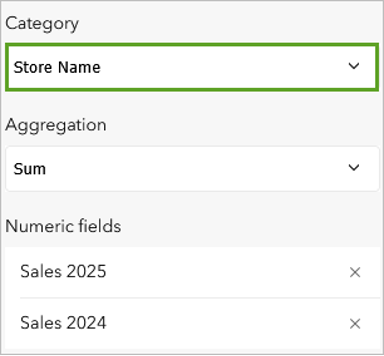
The chart redraws to show 2024 and 2025 sales by store.
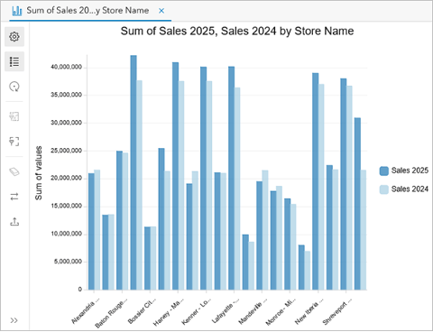
5. Move down to Sort order on the right and choose Y-axis descending.
Now the chart shows each store’s 2024 and 2025 sales in order from highest-earning location to lowest-earning. You can also add references to this chart. Earlier, you used the attribute table to find that the 2025 sales averaged $25,148,807.40. You’ll add this to the chart as a guide.
6. Click the Guides tab on the toolbar in the Box Store Branch Locations Data pane. Click Add guide.
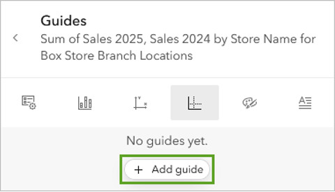
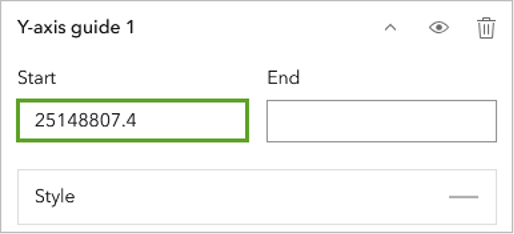
7. For Y-axis guide 1, in the Start box, delete the current text and type or copy the value “25,148,807.4”.
A guideline is added to the chart.
8. For Guide name, delete the current text and type or paste “2025 Average Sales”. For Guide label, type or copy the same text.
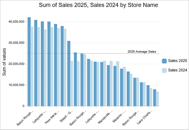
You can make more changes to the chart, including changing the color of the bars.
9. Click the Series tab. In the Series group, for the Sales 2024 field, click the color swatch and choose #cba6e3.
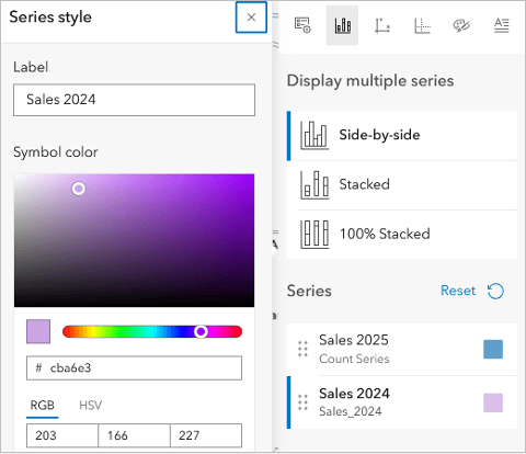
10. Close the Series style window using the X button.
The chart can be used to explore data interactively.
11. On the chart, click one of the bars for the Baton Rouge – Cortana location, the highest earning store.
The corresponding point is highlighted on the map.
Tip: If you don’t see the point on the map, you may need to zoom and pan the map until you find it. You can also resize the chart window using the Expand and Collapse buttons (the 2 arrows pointing up or down). You can point to store names in the chart to show the full name.
12. On the map, click the point for the Baton Rouge – Cortana location.
A pop-up showing details about the store appears. Using the map and chart, you can see that while the store was the top earning location, it is experiencing moderate growth compared to other locations.
Save the Map
This map is a great tool for visualizing regional patterns and can be viewed in ArcGIS applications alongside multiple charts, graphs, and indicators to help viewers get additional insight. You’ll save a copy of the chart and the map.
1. In the Configure charts pane, click the General tab on the toolbar in the Box Store Branch Locations box.
2. For Chart title, delete the current text and type or copy and paste “2024 and 2025 Sales”.
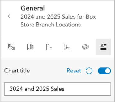
3. For Y-axis title, type “Total sales”.
The chart is now fully configured. Charts are saved with maps and can also be exported as images or tables to be used in other formats such as documents and presentations.
4. On the chart toolbar under tab 1, click Export and choose Export as Image.
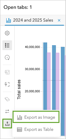
The file is saved to your computer.
5. On the Contents toolbar, click the Save and open button and choose Save as.
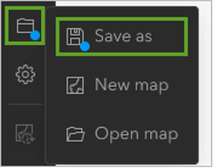
6. In the Save map window, provide the following information:
-
- For Title, type “Box Stores Performance”.
- For Tags, type “Retail, Box Store, Sales, Tutorial”.
- For Summary, type “This map shows sales data for the fictional Box Store locations in Louisiana”.
7. Click Save.
In this tutorial, you created a bar chart comparing two years’ worth of sales data for Box Store locations in Louisiana. Charts, used together with maps, can help uncover patterns and trends in data.
This tutorial is part of the series Explore maps, apps, and scenes to tell a story.
*The data in this tutorial is fictitious and was created for this demonstration.
Acknowledgements
- Human Geography Map sources: Esri, TomTom, Garmin, FAO, NOAA, USGS, OpenStreetMap contributors, and the GIS user community
Visit the Esri tutorial gallery to explore additional topics and find other step-by-step workflows on a variety of products.