Your ArcGIS Online organization’s home page is what visitors and organization members will initially see when they visit your site. How your home page looks and what information visitors find there will create first impressions—not just about your GIS) organization but also about the quality and veracity of the maps and apps on the site.
People do judge books by their cover, so it’s important to have a professional-looking, aesthetic, and well-organized home page, whether it’s only available to colleagues within your organization or to the general public.
As the administrator of your organization, you can create a compelling and attractive home page using easy-to-configure settings. And with a little bit of HTML know-how, you can do even more. In this tip, you will learn how to visually enhance your organization’s home page.
Start with the Basics
As organization administrator, you will set up the organization’s home page and have the ability to modify it at any time. You can access the home page settings after logging in. To start, click Organization.

Then click EDIT SETTINGS.

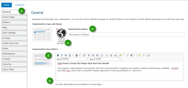
Click the General tab (a). When you set up your organization, you can enter a name (b). In this example, the organization is titled The Science of Where.
Add a logo (c), and enter a brief description (d). To display the description, check the Show description toward bottom of Home Page check box (e).
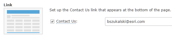
It’s also a good idea to add a contact for the page. The mailto link appears at the bottom of the home page. Scroll further down on the General tab to locate the Link section, check the Contact Us check box, and add the mailto contact information.
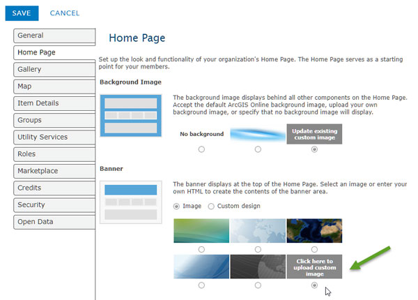
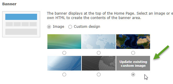
You can also choose a different graphic than the default for your home page background. Click the Home Pagetab, then scroll down to the Banner section. Choose from one of the displayed options. For this example, choose the gray banner.

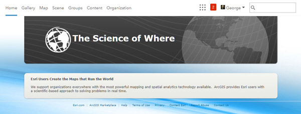
The current home page is shown below. It’s not going to win any awards, but it’s a start.
Go Beyond the Basics
To improve the look of your home page, create a custom banner using an image that’s 960 pixels wide by 180 pixels high, which is the smallest banner the home page supports. Add the custom image in the Banner section of the Home Page tab, Select the Click here to upload custom image button.
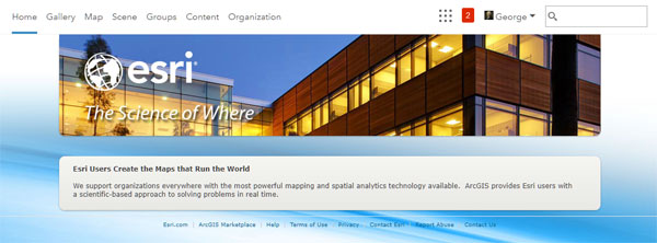
The home page looks much more appealing with a custom banner image. Note that if you use a custom image, you’ll have to add the organization name, logo, and other graphics you might want directly on top of the image.
Add a Gallery
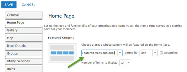
Consider adding a gallery ribbon that features interesting or useful maps and apps. To add Featured Content to your home page, create a group (for example, go to Groups and create Featured Maps and Apps, and then add the items you want to display to that group. Follow best practices to create good thumbnails for each item. For more information, see theArcGISBlog post “Put Your Best Thumbnail Forward.”
Once you’ve added the desired maps and apps to the group, select the group in the Featured Content section on the Home Page tab:
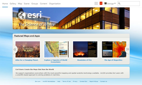
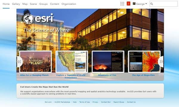
The home page, which now includes featured content, is starting to look pretty snappy!
Use Larger Background Graphics
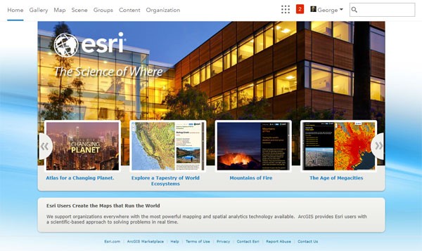
You can use a larger custom image that fits behind the featured content ribbon by changing the Banner settings on the Home Page tab. Two good size choices are 960 x 400 pixels and 960 x 470 pixels.
The first option is to use a 960 x 400 pixel image, which leaves a bit of the featured content ribbon exposed, allowing the text under the thumbnails to be clearly visible on the gray background.
Add a 960 x 400-pixel image in the same way you did above—by adding a custom image in the Banner section of the Home Page tab.
Here’s the home page after the 960 x 400 pixel graphic was added.

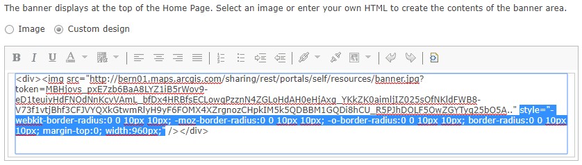
Note:The bottom corners of the image are automatically rounded when you add a custom image as described above. If you don’t want the corners rounded, you can edit the HTML code used to display the image.
In the Banner section, click Custom design, then click the View HTML Sourcebutton.
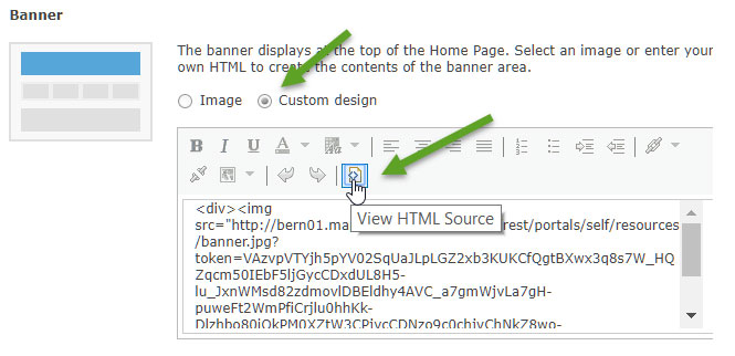
You will need to know a little about HTML to make the edits, but you can easily remove the rounded corners and square them off. Select the inline style element at the end of the HTML code (highlighted in blue), delete, and Save.
Here’s the same Home Page graphic without rounded corners. Compare it to the graphic with rounded corners shown above and decide which one you find more appealing.
A Second Option
Using a 960 x 470 pixel image will completely cover the gray background. This means the thumbnail title text, which is blue, will display on top of your image. To make the text pop, you can add a light-colored stripe or fade transition along the bottom of your banner as shown in the example below.
Add the image the same way you did above, by placing a custom image in the Banner section of the Home Page tab. The home page is shown below. Note that the corners are automatically rounded.
Learn More
You can continue to customize your organization by adding your own HTML code in the Banner section and by changing the organization description on the General tab]. For more information, seeSupported HTML and the following topics in the ArcGIS Online Help: