ArcGIS Dashboards enables users to convey information by presenting location-based analytics using intuitive and interactive data visualizations. A dashboard is a view of geographic information and data that allows you to monitor events, make decisions, inform others, and see trends. Dashboards are designed to display multiple visualizations that work together on a single screen. They offer a comprehensive view of your data and provide key insights for at-a-glance decision-making.
In this tip, you will create a simple dashboard using ArcGIS Dashboards. The dashboard uses a map of medical facilities in Los Angeles County (sample data only) and includes interactive chart and list elements.
You can view the completed dashboard and follow along by using the Los Angeles Health Facilities web map.
A dashboard is composed of several elements that work together. Each element is unique and has its own unique configuration settings. For more information, read about dashboard layouts.
The dashboard will consist of four elements: a map, a serial chart, a list, and a header. The map will be configured to interact with the chart and list, and the list will be configured to interact with the map.
Follow the steps below to create the dashboard and configure its elements.
Create a Dashboard
A map is often the centerpiece of a dashboard. Apply basic map craft such as configuring effective pop-ups and using scale dependencies. Get details about creating web maps for dashboards.
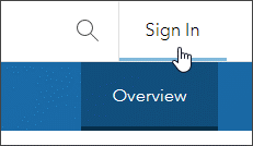
Step 1: Open the sample map item page and sign in to your account.
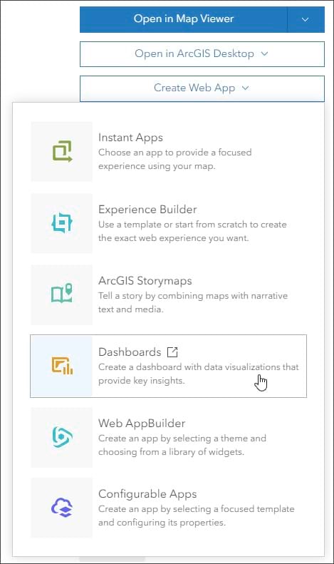
Step 2: Click Create Web App, then choose Dashboards.
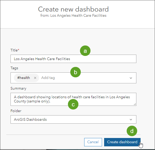
Step 3: Enter the required information.
Add a title (a), optional tags (b), and an optional summary (c). Click Create dashboard (d) when finished.
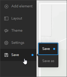
The dashboard will open after you click Create dashboard. As you continue crafting your dashboard, the Save button at the bottom of the layout panel will display a blue dot as a reminder to save. It’s always a good idea to save your work as you make changes.
The layout panel can be expanded by clicking the double angle brackets (>>) at the bottom of the panel.
Next, you will configure the map and add serial chart, list, and header elements.
Configure the Map Element
Not only do maps often provide the most effective way to display your geographic information, but their operational layers can also be used by other data visualizations in the dashboard to create interesting, intuitive, and compelling information elements.
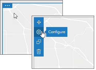
Step 1: Point to the upper left corner of the map to display a blue bar with three dots. Move your mouse over the bar to reveal the menu. You can access all of an element’s settings via this menu. Click Configure.

Step 2: On the Settings tab, choose which tools to display in the map. The sample map has configured pop-ups, bookmarks, and a legend, so those tools will be enabled.
In the settings shown below, use the slider to enable Initial view and bookmarks, Legend, and Zoom in/out.
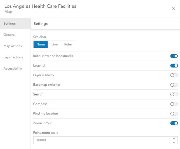
Click Done in the lower right when finished. Zoom in and zoom out buttons will display in the lower right of the map element. The upper right of the map element will display a bookmark and legend button.
Add a Serial Chart Element
A serial chart element visualizes one or more series of data points along a horizontal (x) axis and a vertical (y) axis.
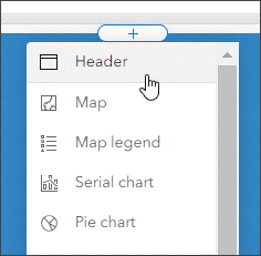
Step 1: From the dashboard toolbar, click Add element.
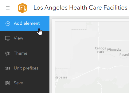
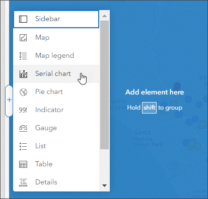
Step 2: Add element buttons (+) will appear on the edges and center of the map element. Click the Add element button at the location where you want to add your element. For this example, choose the left side. Choose the serial chart element from the drop-down list.
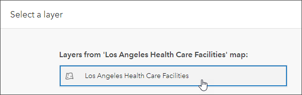
Step 3: Select Los Angeles Health Care Facilities.
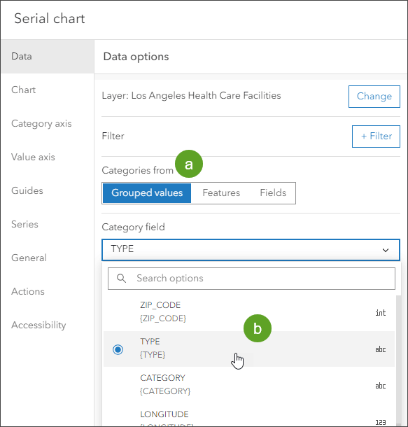
Step 4: This opens the configuration pane. You will see a series of tabs along the left side. If it is not already selected, click the Data tab on the left and set the data options.
(a) – Under Categories from, choose Grouped values.
(b) – From the Category field drop-down list, choose TYPE.
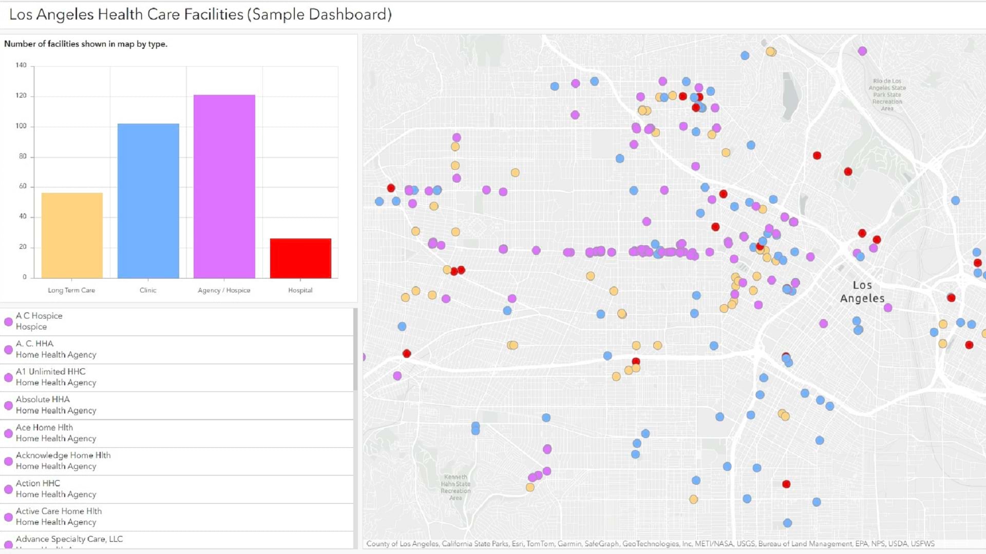
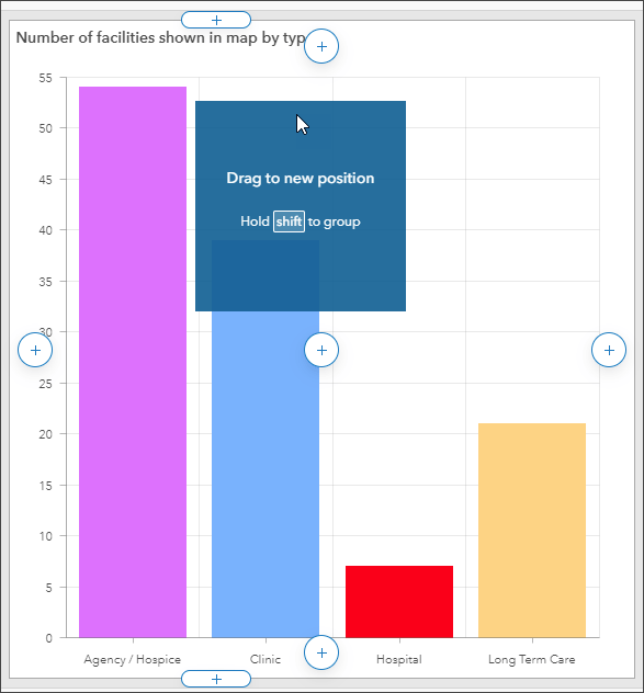
This will group all values of the TYPE attribute in the serial chart segments. TYPE is also the field by which the health-care facilities are symbolized.
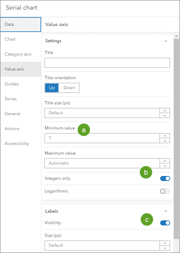
Step 5: Click the Value axis tab to set the chart axis options. The chart will display the count of various health-care facilities, so the value axis will be set for best display results.
(a) – Set Minimum value to 1.
(b) – Set the axis values to display integers only.
(c) – Enable label visibility.
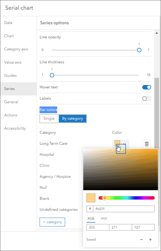
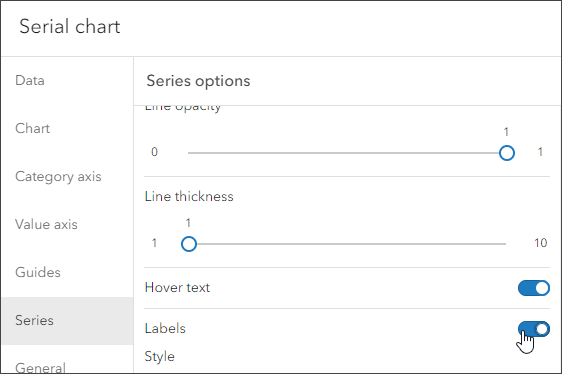
Step 6: Click the Series tab to set the series options. In the Bar Colors section, click By Category to display the current bar colors.
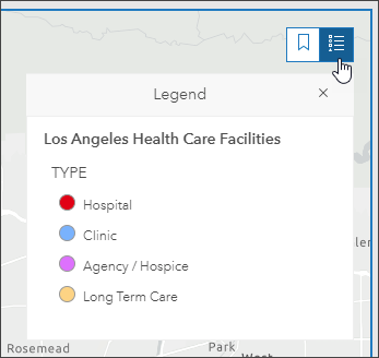
Set the bar colors to match the symbols in the web map layer.
The legend for the Los Angeles Health Care Facilities map is shown below.
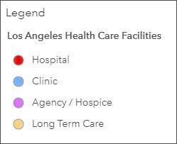
Change the color for each series column to match the color of the hospital facility symbols. Click the down arrow to use the color picker, or enter the hexadecimal color code for each symbol. The hexadecimal color codes are as follows:
- Long Term Care: #ffd37f
- Hospital: #ff0000
- Clinic: #73b2ff
- Agency/Hospice: #df73ff
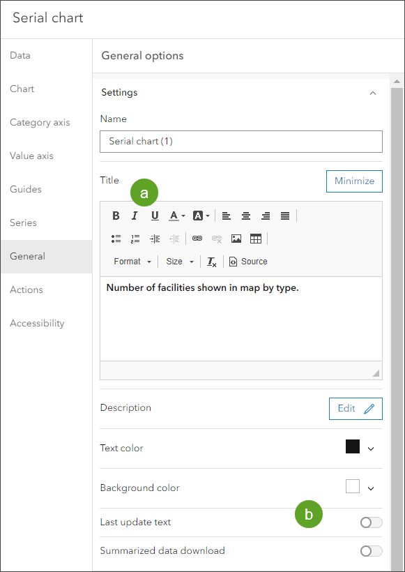
Step 7: Click the General tab to set the general options.
Click Edit in the Title options.
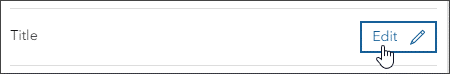
(a) – Add a Title.
(b) – Since the health-care facilities shown on the map are static, we don’t need to display the last update text. If the layer is updated regularly, Last update text should be enabled to display when the layer was last updated.
Step 8: Click Done in the lower right when finished.
Next, you will configure the map to trigger a chart update whenever the map extent changes.
Step 9: Open the map configuration options by hovering in the upper left corner of the map element on the right side of the dashboard to reveal the menu. Click the Configure icon.
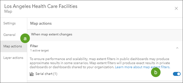
(a) – Open the Map actions tab.
(b) – In the Filter field, toggle the serial chart just configured as the target.
Click Done when you finish, then save your work.
Now that the map action has been created, when you pan and zoom the map or use the bookmarks, the series chart is updated to show the counts of each facility type. Hover over the chart bars to view the counts of each facility type.
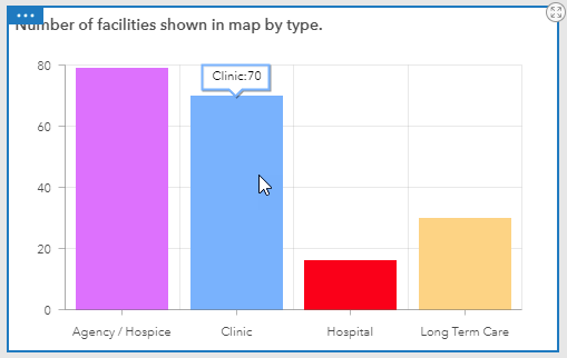
Optionally, you can show the counts without hovering by toggling Labels on in the Series options of the chart.
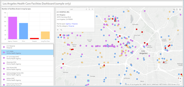
Add a List Element
A list element is used to show features or rows from a layer and can contain information from any field.
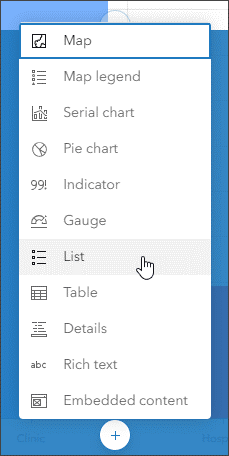
Step 1: From the dashboard toolbar, click Add element.

Step 2: Click the Add element button (+) at the location where you want to add your element. In this example, the list element will be added at the bottom of the chart element. Choose List from the drop-down list.
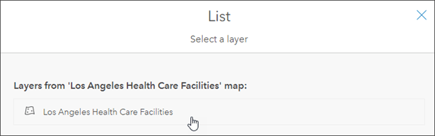
Step 3: Select Los Angeles Health Care Facilities.
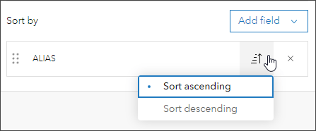
Step 4: This opens the list configuration pane. On the Data options tab open the Sort by drop-down list. Choose ALIAS from the drop-down list that says Add field.
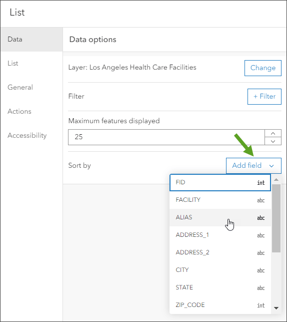
Step 5: Ensure that the sort order is set to Sort ascending. This is the default.
This will use the alphabetical ordering from the ALIAS field to sort the displayed list.
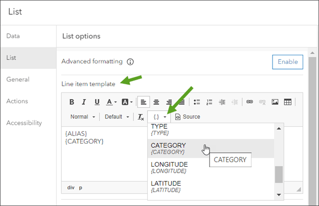
Step 6: On the List tab, find the Line item template section. Click the field list button and choose ALIAS and CATEGORY from the drop-down field list, arranging them so that they are stacked and removing any other fields if shown.
Step 7: Click the Actions tab, click Flash, and toggle Los Angeles Health Care Facilities on. This sets the layer as the target for the action.
Also click Show pop-up, selecting the Los Angeles Health Care facilities as the target.
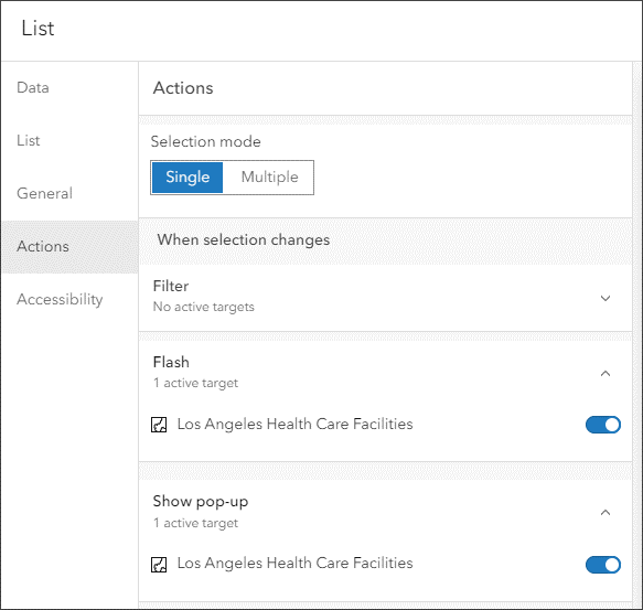
Step 8: Click Done when finished.
Now you will configure the map to update the list whenever the map extent changes.
Step 9: Open the map element configuration options by pointing to the upper left corner of the map element on the right side of the dashboard and choosing Configure.

(a) – Click the Map actions tab.
(b) – Click Filter, then toggle the List element on.
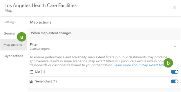
Step 10: Click Done when finished.
After completing these steps, the list will update as the map is panned or zoomed. When you click a facility in the list, the feature will be highlighted on the map and its pop-up will open.
Arrange the Dashboard Elements
Your dashboard now shows the series element above the list element, with the map element on the right. You can rearrange the elements at any time.
To arrange the elements, point to the upper left corner, then click and hold the Drag item button.
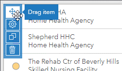
Drag the element over another to reveal the docking targets, then release it where you want it.
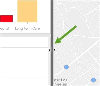
Hover over the space between dashboard elements and then click and hold, dragging the vertical or horizontal bar to the desired size. Note that the size is relative and will change with the overall size of the dashboard. Save your work when finished.
Add a Header Element
In this section you will add a header to complete your dashboard. A header element is a reserved area along the top of your dashboard that you can use to give your dashboard a title, apply corporate branding standards, and provide links to additional content.
Step 1: From the dashboard toolbar, click Add element.

Step 2: Click the Add element button (+) at the top center of your dashboard. Choose the Header element from the drop-down list.
Step 3: In the Appearance pane, you can change the title, add a subtitle, and make other changes as desired.
By default, the title that appears on the header panel is the title of the dashboard. Enter a title for your dashboard and make any other changes you like, such as a different text or background color.
When finished, click Done and save your dashboard.
More Information
For more information, see the following: