
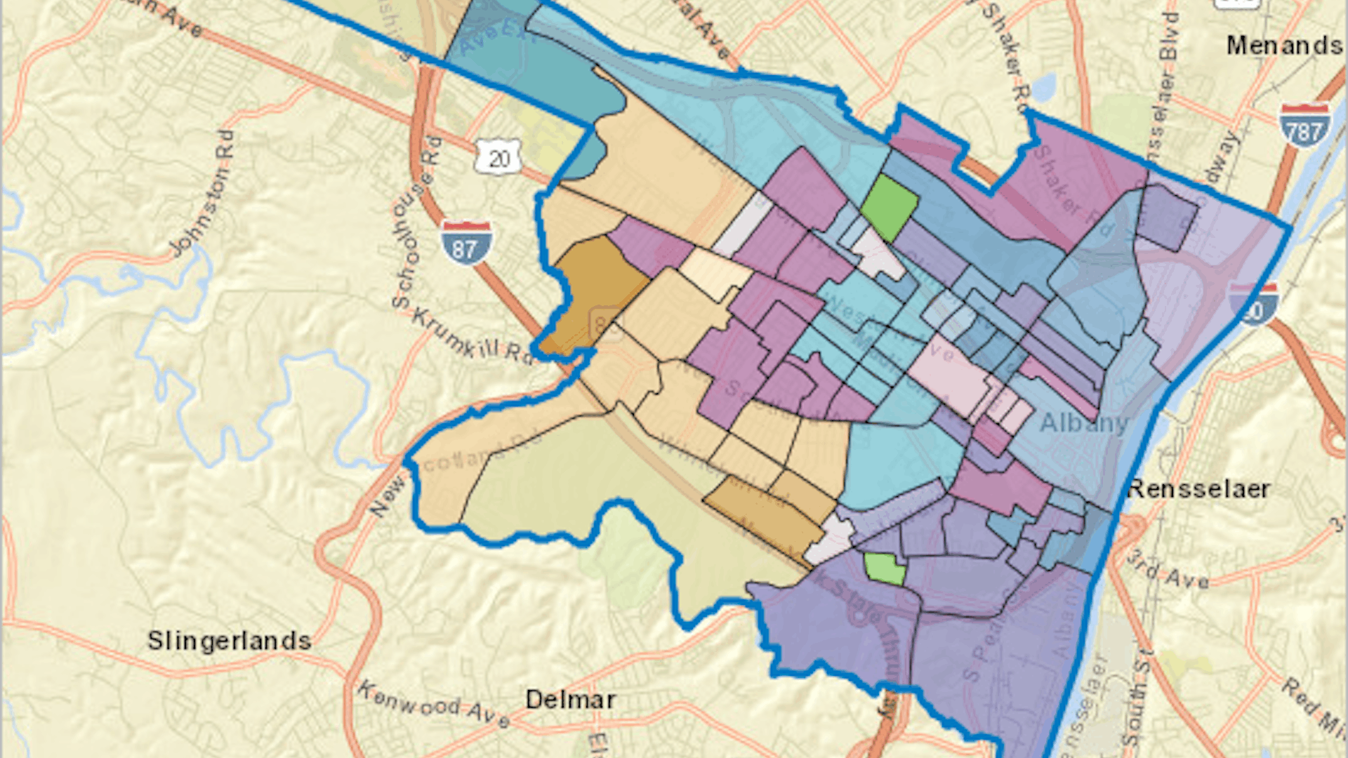
ArcGIS Tapestry is an advanced demographics dataset that groups geographic areas based on shared demographic, socioeconomic, and lifestyle characteristics. Its detailed summaries reveal patterns and provide insights about a community’s complexity that go beyond what can be seen when looking at a single statistic.
In this tutorial, you’ll use ArcGIS Tapestry data to help guide the campaign strategy of a local political candidate running for a city council seat in Albany, New York. The candidate wants to understand their voting base with US census numbers as well as detailed information about their demographic and lifestyle patterns. In ArcGIS Business Analyst Web App, you’ll map Tapestry data across the city and summarize the findings with an infographic.
Note: While this tutorial uses Business Analyst Web App, you can access Tapestry data using a variety of ArcGIS products and capabilities, including the Enrich Layer tool in ArcGIS Online and the Enrich tool in ArcGIS Pro. To learn more about Tapestry, including other examples of real-world use cases, see the ArcGIS Tapestry story.
Requirements
- ArcGIS organizational account with a Publisher, Facilitator, or Administrator role (see options for software access)
- ArcGIS Business Analyst Web App
Create a Project
First, you’ll create a project in Business Analyst Web App. Projects are collections of content such as maps, data, and reports. You can manage your work and group your content using projects.
1. Go to the ArcGIS Business Analyst web page.
2. If you are not signed in already, click Sign In. Sign in with your ArcGIS organizational account.
Note: Your account must be licensed to use Business Analyst Web App. With the Creator user type, you have access to Business Analyst Web App Standard. See Access Business Analyst for more details.
3. If necessary, close the Welcome or What’s new in Business Analyst window.
4. On the ribbon, confirm that the Home tab is selected.

5. Click New project.
6. In the Create project window, for Project name, type “Albany voter demographics” and add your name or initials.
Note: Two projects with the same name can’t exist in the same ArcGIS organization. Adding your name or initials to the project name ensures that it is unique.
7. Click Create.
A message indicates that the project is being created. When it finishes, a confirmation message appears.
8. In the confirmation message box, check Open new projects on Maps tab as soon as they are created and click OK.
Note: Alternatively, you can open your project by closing the confirmation window and finding the project under the Projects tab on the Home page. Point to the project name and click Open project to open it.
The project appears.
Before you continue, you’ll set the data source. ArcGIS Business Analyst includes multiple country-specific data sources. ArcGIS Tapestry data is exclusive to the United States, so you’ll ensure that the data source is one that uses US data.
9. On the ribbon, ensure that the Data source button is set to USA.

Note: If a different data source is displayed, click the Data source button. In the menu, search for and choose USA. If more than one data source is available, choose the one from the most recent year. For more information, see Data in Business Analyst.
Map Tapestry Data
Tapestry data is most meaningful when used at small geographic scales since its demographic profile of a community becomes more general when applied to larger populations. To help the local candidate better understand the community they represent, you’ll create a color-coded map showing Tapestry data in Albany at the census block group level.
Census block groups are small geographic areas used by the US Census Bureau that usually contain 600–3,000 people. These are the smallest geographic unit at which census data is aggregated and the smallest available area for creating a color-coded map in Business Analyst. Displaying data at this level is often restricted, however, due to confidentiality and performance limitations.
Note: See Available geographies to learn more about the distinctions between US geographic boundaries.
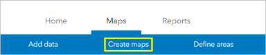
1. On the ribbon, click Create maps.
2. Choose Color-coded maps.
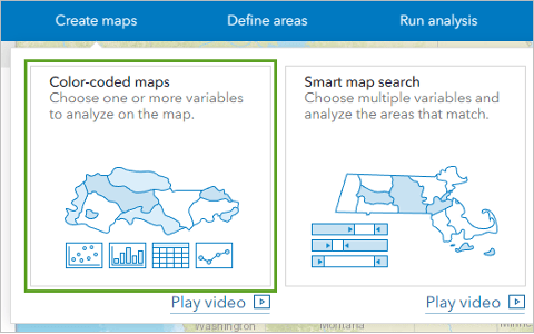
The Color-coded maps pane appears. A color-coded map shows one or more demographic variables, styled by color. By mapping with Tapestry data, you’ll see a detailed demographic profile while only needing to add a single variable.
First, you’ll choose the geography to map. You’ll select your area of interest: Albany, New York.
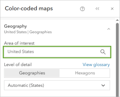
3. Expand Geography. For Area of interest, click United States.
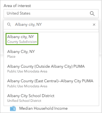
4. In the search bar, type “Albany city, NY”. In the list of results, choose Albany city, NY County Subdivision.
The map navigates to Albany, New York.
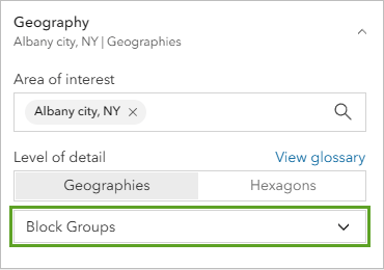
5. For Level of detail, choose Block Groups.
Now that you’ve set the area of interest, you’ll choose the data variable to map. You’ll map block groups by their dominant Tapestry segment. A segment is how Tapestry data is classified based on shared socioeconomic, demographic, and lifestyle characteristics.
6. For Variables, click Browse all variables.
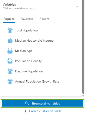
The Data browser window appears. It lists all variables available to be mapped. The variables available depend on the data source. Because you’re using the USA data source, the variables reflect US data.
7. Under Categories, click Tapestry.
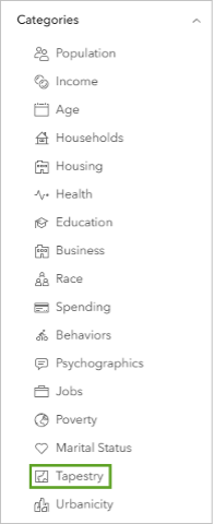
A list of available Tapestry data variables appears.
8. Under Popular variables, click 2026 Dominant Tapestry Segment (Esri).
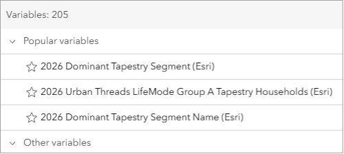
Note: If a more recent version of the variable is available, choose it instead.
A color-coded map is created, showing the 83 block groups that comprise Albany. Each block group has a color representing its dominant Tapestry segment, meaning the segment that most reflects that block group.
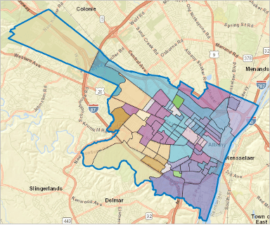
Explore the Data
You’ve mapped block groups by Tapestry segment, but what do these segments mean? What do they tell you about the community, and how could a local politician use this information to plan their campaign outreach strategy?
A Tapestry segment identifies patterns that describe who lives in an area and what matters to them. There are 60 segments across the US, and they are further organized into one of 12 LifeMode groups. These are higher-level groups based on key shared demographic characteristics such as age, income, and population density.
To better understand the Tapestry data, you’ll explore it on the map.
1. On the map, point to the most northeastern block group (360010001.001).
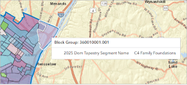
A pop-up appears, showing the name of the block group and its dominant Tapestry segment. For this block group, the dominant segment is C4 Family Foundations.
C4 means that this segment is the fourth segment in LifeMode group C. To learn more, view the legend that lists all the LifeMode groups and their segments.
2. In the Color-coded maps pane, scroll down to the Legend section. Expand C Metro Vibes.
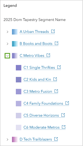
C4 Family Foundations is listed along with the other segments in LifeMode group C Metro Vibes. Each LifeMode group and segment in the legend has a link that explains more.
3. Click the link for C4 Family Foundations.
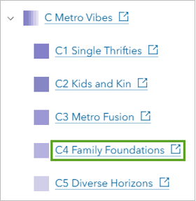
In a new browser tab, the documentation for LifeMode group C opens, showing the section for Segment C4.
The documentation begins with a paragraph describing the typical residents of this segment. For instance, they reside largely in suburbs, have a higher rate of multigenerational households, and generally earn middle-tier incomes.
Note: ArcGIS Tapestry data describes broad trends within communities rather than the traits or behaviors of specific people. For this reason, segment profiles and summaries can be used to make broad inferences about the communities that make up an area, but they should not be used to extrapolate characteristics and behaviors at an individual level.
4. Scroll down to the Key statistics section.
This section provides median demographic information for this segment. Because segments represent multiple areas across the US, these statistics may not be the exact median values for the specific census block group you looked at, but they are likely to be close.
5. Scroll down to the Housing and employment section.
This section contains information about home value, homeownership rate, and labor force participation.
With the information from the Key statistics and Housing and employment sections, the candidate can better understand who their constituents are and gain a better idea of which issues might be important to them.
For instance, 42 percent of the households in this segment are rent burdened, meaning they spend more than 35 percent of their household income on rent. A campaign that promises rent-reduction measures or the construction of new affordable housing might prove effective.
6. Scroll down to the Lifestyle patterns section.
This section provides information about typical lifestyle habits of people who live in this segment. For instance, in segment C4, households tend to have multiple TVs, opt for newspapers over digital media, and maintain a landline phone at home.
The information in this section might be useful for planning outreach efforts. For instance, phone canvassing, newspaper ads, or TV commercials might be effective.
7. Close the documentation page and return to your map in Business Analyst.
Before you continue, you’ll save the color-coded map as a layer so that it can be used in other analyses.
8. At the bottom of the Color-coded maps pane, click Save layer.
9. In the Save layer window, for Layer name, delete the existing text and type “Albany Tapestry segments”. Click OK.
The layer is saved.
Run an Infographic
Previously, you looked at the Tapestry segment for one of the 83 block groups in Albany. While you could look at all the other block groups individually, it would be more efficient to summarize the results. To accomplish this, you’ll run an infographic that shows the five Tapestry segments most represented across the city.
Infographics provide visual summaries of key information associated with a location to learn about community patterns and market trends. Paired with the segment documentation, these summaries can inform the candidate’s campaign strategy.
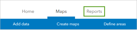
1. On the ribbon, click Reports.
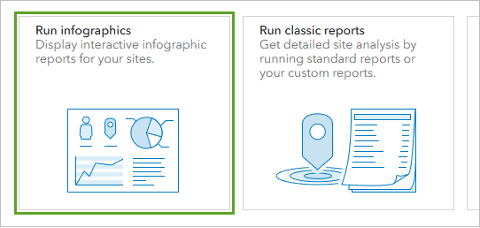
2. Click Run infographics.
3. For Add sites to report on, click Add sites.

4. In the Add sites window, click From layers. Check the box for Albany Tapestry segments.
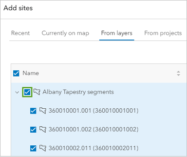
The 83 census blocks in the color-coded map layer are selected. Instead of running an infographic for each of them, you’ll select the city of Albany as a site and run an infographic for it to increase efficiency.
5. Click the Neighboring geographies tab.

6. Expand Cities and Towns (Places). Check the box for Albany City, NY.
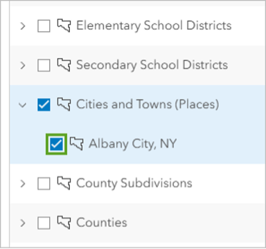
7. Click Apply.
The 83 census blocks in your color-coded map layer and the Albany city boundary are selected. Next, you’ll choose the infographic template to use. You’ll choose a template designed for Tapestry data.
Note: If the Explore gallery infographics window appears, click Dismiss.
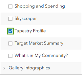
8. Expand Standard infographics. Scroll down and check the box for Tapestry Profile.
9. In the Selected infographics box, for Albany City, NY, click Run now.
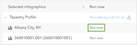
Note: You may need to scroll to find the Albany City, NY option.
The infographic is run for the city boundary.
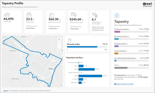
The infographic contains a map of the city boundary as well as some basic demographic information such as the total number of households, the median age and household income, and the population by race.
Note: The second part of the infographic, , shows information about the city’s unemployment rate, population by occupation, and educational attainment.
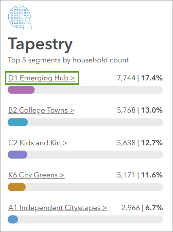
The Tapestry section shows the top five segments by household count across the city. In order, these are D1 Emerging Hub, B2 College Towns, C2 Kids and Kin, K6 City Greens, and A1 Independent Cityscapes.
None of these segments account for more than 20 percent of the city’s total households. Also, each of the top five segments comes from a different LifeMode group (the LifeMode group is represented by the letter at the start of the segment name). These results indicate that household composition throughout the city is highly varied by income, age, and lifestyle.
A campaign strategy that does not take into account the city’s diversity might not gain traction. These top segments give your candidate a place to start. You’ll learn more about the most represented segment.
10. In the Tapestry section, click D1 Emerging Hub.
A window appears, showing the general characteristics associated with the segment. Like the documentation, these characteristics reflect the distribution of this segment across the US and are not specific to households in Albany.
From this window, it seems this segment is generally populated by young, single renters living alone in dense, multiunit housing.
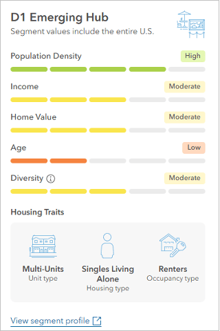
Tip: Click View segment profile to open the documentation for this segment.
11. Close the window.
12. Explore the infographic and segment documentation. See what insights you can reach regarding a potential campaign strategy for Albany.
Try finding answers to questions about how and where constituents live. Are they typically homeowners? What type of housing do they generally live in? Other important considerations are how constituents communicate and consume media, as these details can reveal the best ways for a candidate to spread information about their campaign.
You’ll export this infographic as a PDF so that you can access it outside of Business Analyst, though it will lose some interactive features.
13. On the ribbon, click the Export infographic button.

14. In the Export window, check the box for Add header and edit title. For Title, type “Tapestry Profile for Albany, New York”.
Exporting infographics in Business Analyst consumes credits. Credits are the currency used across the ArcGIS system and are consumed when performing analytics, storing features, exporting reports, and geocoding. Before performing one of these actions, it’s a good idea to check how many credits will be consumed.
15. Click Estimate credits.
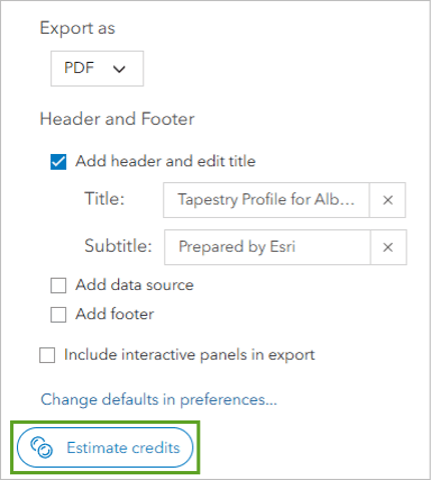
It will cost 10 credits to export the infographic. You may choose to do so or cancel the operation.
16. Optionally, if you want to export the infographic, click Create PDF to download it as a PDF to your computer. Otherwise, click Cancel.
It’s not necessary to save your project. Projects in Business Analyst Web App are saved automatically.
Tip: Alternatively, you can share an interactive version of the infographic. Close the infographic and return to the Reports page. On the ribbon, click Maps. Click Share results to view options for exporting the infographic.
Exporting to ArcGIS Dashboards or ArcGIS StoryMaps will allow you to share the infographic as well as the color-coded map. For more detailed steps on how to share an infographic as a dashboard, see the tutorial Find suitable areas for new affordable housing.
In this tutorial, you learned how to access ArcGIS Tapestry data in Business Analyst using color-coded maps and infographics. You also learned how to understand Tapestry data by using the documentation.
From your exploration, you learned that a large amount of Albany’s population uses social media and lives in a rent-burdened household. From this information, your candidate can put resources into a social media campaign that promotes their policies on affordable housing, allowing them to best reach their voting base.
Using Tapestry data enabled your candidate to reach this conclusion while only mapping a single data variable. While they may have been able to reach similar conclusions after mapping several variables, the Tapestry dataset provides this information in one place and can be used alongside other datasets and layers to add more context to the analysis.
This tutorial covered only one of the ways Tapestry data can be used. To learn about other use cases, such as disaster response planning and real estate, see the ArcGIS Tapestry story. To learn more about Tapestry segments, see the ArcGIS Tapestry Segment Infographics Dashboard.
Acknowledgements
- Esri Demographics data accessed with ArcGIS Business Analyst. (See terms of use.)
- World Street Map tile layer sources: Esri, TomTom, Garmin, FAO, NOAA, USGS, OpenStreetMap contributors, and the GIS user community
Visit the Esri tutorial gallery to explore additional topics and find other step-by-step workflows on a variety of products.