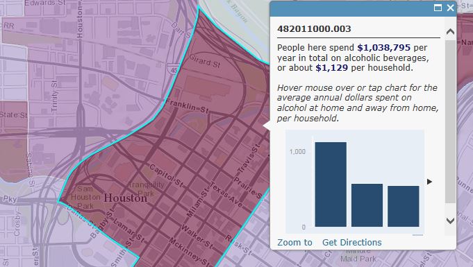
Applying transparency to symbols in a web map is a useful cartographic technique for displaying overlapping features without completely obscuring the details underneath, as this graphic of spending on alcoholic beverages in the city of Houston, Texas, illustrates.
When you create web maps in ArcGIS Online, you can use both of these two symbol transparency methods—layer transparency and color transparency. This tip explains how to use both these options so that you can choose the one that best conveys the information you want in your web map.
What is the difference between these symbol transparency methods? Layer transparency is a property of the entire map layer. It applies a specified transparency percentage to all the features in the layer uniformly. Color transparency, on the other hand, allows different transparency properties to be applied to individual feature symbols instead of the layer as a whole.
The transparency method you select for your web map layers is important. In general, color transparency will give you better rendering speed, so if drawing performance—the time it takes your layer to display in the web map—is critical to your map’s success, this could be your best choice. However, color transparency will also blend the colors of transparent symbols that overlap, resulting in symbology that is not in your legend. That may confuse or mislead your map users. So before choosing to use color transparency based on performance benefits alone, you should verify that this blending effect is cartographically appropriate for your map. Here is a quick exercise you can perform in ArcGIS Online to illustrate the cartographic differences in the two types of transparencies so you can effectively choose which one works best in your web map.
Step One: Open ArcGIS Online (arcgis.com) and click Map to open the map viewer. Click Basemap and switch the basemap to the Light Gray Canvas.
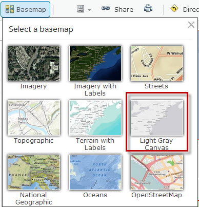
This will provide a lighter background to better contrast with the graphics you are going to add next.
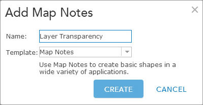
Step Two: After changing the basemap, click Add > Add Map Notes to add a new map notes layer to the map. For Name, type Layer Transparency, then click Create.

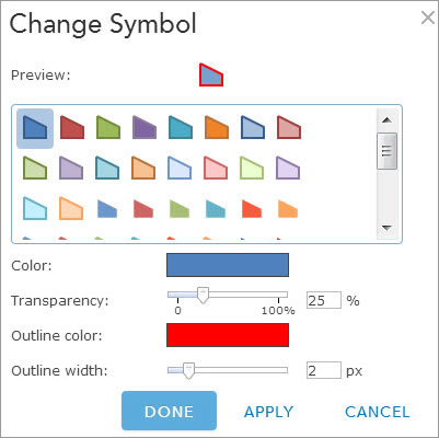
Step Three: In the Add Features menu, click the Rectangle tool![]() and then click the map to add a new rectangle. In the pop-up window, click Change Symbol and choose the first blue symbol in the palette. Also change the outline color to red (any red will do).
and then click the map to add a new rectangle. In the pop-up window, click Change Symbol and choose the first blue symbol in the palette. Also change the outline color to red (any red will do).
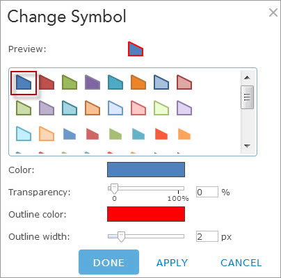
Notice that the transparency for this symbol is 0 percent, meaning that the symbol will be completely opaque. When you have modified the symbol, click Done to close the Change Symbol dialog box and click Close to close the pop-up window for your new rectangle.
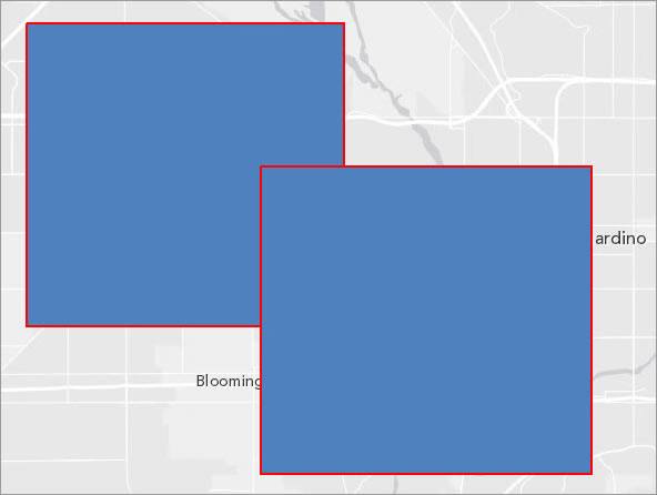
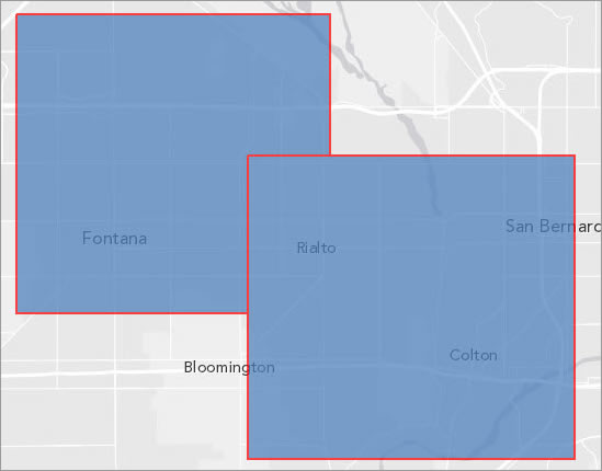
Using the same process, add another rectangle with the same symbol. Make sure that the two rectangles overlap a little, as in the graphic below.
Now that there are two features in the map notes layer, you will add some layer transparency to explore the effect on the overlapping area between the two rectangles.
Step Four: In the map viewer, click the Details button ![]() , and then click the Show Contents of Map button
, and then click the Show Contents of Map button ![]() . In the Contents window, click the down arrow for Layer Transparency and set the transparency to about 25 percent. Notice that this setting is applied to both of the rectangles uniformly, even where the two rectangles overlap. Also notice that the red border of the first rectangle is not visible where it overlaps the second rectangle. This is the effect of layer transparency on overlapping features.
. In the Contents window, click the down arrow for Layer Transparency and set the transparency to about 25 percent. Notice that this setting is applied to both of the rectangles uniformly, even where the two rectangles overlap. Also notice that the red border of the first rectangle is not visible where it overlaps the second rectangle. This is the effect of layer transparency on overlapping features.
Now that you have seen how layer transparency works, you will contrast it with color transparency.
Step Five: Click Add > Add Map Notes to add a new layer to the map. Name this one Color Transparency.
Step Six: Below the two rectangles from the first map notes layer, add a new rectangle. This time, in addition to changing the fill symbol to blue and the outline color to red, change the transparency to 25 percent as shown in the graphic below.
Once you have finished modifying the symbol, close the Change Symbol dialog box and the feature pop-up window. Now add a second rectangle with the same symbol properties, making sure that the two rectangles overlap.
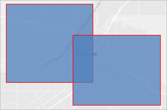
Notice that when the transparency properties are applied to the individual features, instead of the whole layer, the colors blend in the overlapping area, resulting in a unique symbol and possibly leading to misunderstanding on the map reader’s part, especially if the symbols in the layer are intended to reflect qualitative or quantitative differences between the features. The red outline of the underlying rectangle is also visible in this example, which is useful if the map reader needs to distinguish unique features.
In many cases, however, the blending effect you get from using the color transparency method does not result in cartographic problems. The map may not contain any overlapping transparent features, negating the possibility that blending will occur, or the effect may even be desirable, depending on the mapmaker’s cartographic goals.
So with the differences between these two methods in mind, consider carefully which one you use to apply transparency to your web map layers. For layers using a single symbol or for layers displayed by category, color transparency is often the best option and has the added advantage of displaying more quickly. If you are using a color ramp to show the difference in some attribute value for a group of features, layer transparency offers an alternative that will not blend transparent features in the layer, resulting in a display that accurately reflects your data. To find out more about the different effects of these transparency options, see this documentation topic in ArcGIS Resources.
About the author

