By Bern Szukalski
Unusual temperatures such as heatwaves are becoming more and more common around the world, according to the National Centers for Environmental Information. To help visualize this, ArcGIS Living Atlas of the World includes authoritative live feeds and other content that provide information about current and predicted weather conditions. To make your own severe heat map, follow these steps.
Step 1
Sign in to your ArcGIS Online account and open Map Viewer by clicking on the Map tab.
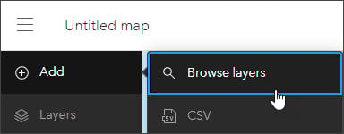
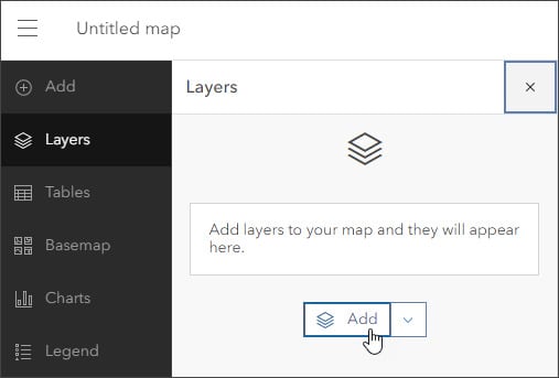
From the Contents (dark) toolbar, click Layers. Then click Add.
Step 2
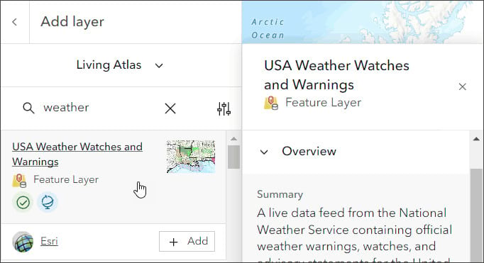
From the My content drop-down list, click Living Atlas. In the search bar, type “weather” and find the USA Weather Watches and Warnings layer. Click Add to add this layer to the map.
Step 3
Click the layer card to view this layer’s information pane. It provides quick access to the overview, description, details, and more.
For more information on this layer, click View details at the bottom of the pane.

From this page, you can see that the layer is a live data feed from the US National Weather Service that contains official weather warnings, watches, and advisory statements for the United States. The data is updated every five minutes. Now close this page.
Step 4
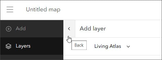
On your Map Viewer page, click the arrow to the left of Add layer. This will return you to the Layers pane in the Contents toolbar.
Step 5
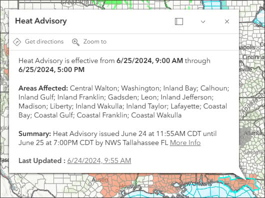
Click the map’s various features to view the layer pop-ups. These may look similar to the image below. Note that the layer is actually a group layer that contains other layers.
While the ArcGIS Living Atlas weather layer shows all types of advisories, for this map we will focus on heat advisories. These additional steps will filter for anything that is heat-related.
Step 6
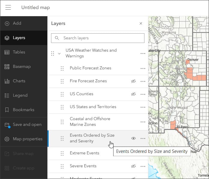
Expand the USA Weather Watches and Warnings group layer by clicking the arrow to the left of the layer name.

Step 7
From the layers list, select the Events Ordered by Size and Severity sublayer.
Step 8
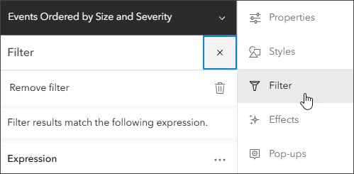
On the Settings (light) toolbar on the right, select Filter, then choose Add new.
Step 9
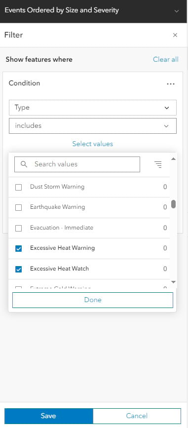
In the Filter section, select the Type field from the top dropdown menu, if it’s not selected already. Under the Type field, select includes, then click on Select values. Search for the word “heat” to limit your options. From the list below called Select values, select the following: Excessive Heat Warning, Excessive Heat Watch, and Heat Advisory. Now click Done, then click Save to save your layer filters.
Step 10
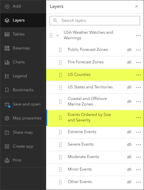
In this step, we will change the layer visibility by using the USA Weather Watches and Warnings group layer, which has 11 sublayers. In the Layers pane, you can select which of these sublayers to show and which to hide.
For our hot weather map, only two sublayers need to be visible. These are highlighted in yellow in the following image. For each of these sublayers, hover over the area to the left of the three dots on the sublayer line to make an eye icon appear. Click the eye icon for each of those two sublayers. These sublayers will now appear while the rest will remain hidden.
You can also experiment with different basemaps and layer settings. For layers such as Weather Watches and Warnings, which are superimposed over underlying features, a basemap with reference layers that draw on top of the layer (such as Physical Geography Basemap) is a good choice. (To add this basemap, scroll down to the bottom of the Basemap menu on the dark menu and click on Living Atlas.
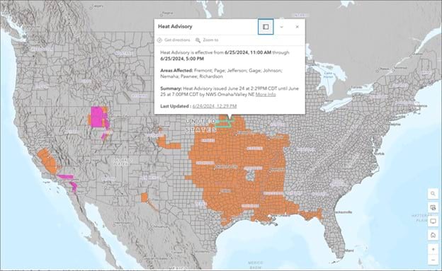
From there, type “Physical Geography Basemap” in the search bar. The Physical Geography Basemap option will appear. Click Add.) You can also change the weather layer settings to adjust colors or transparency, or to add effects to create maps such as this sample map, shown in the following image.
For other weather-related maps, apps, and layers, browse the ArcGIS Living Atlas website and explore how to use effects.
