Coral is highly sensitive to temperature, and while temperatures in the mid 80s can be the norm, surges in temperature cause coral to “bleach,” expelling symbiotic algae and turning white. While bleaching doesn’t necessarily kill coral, it does mean they are stressed and subject to increased mortality, especially as warmer-than-normal temperatures persist.
One of the first steps in solving a problem like this is by having a better understanding of where and how sea temperatures and coral bleaching interact. Fortunately, ArcGIS Living Atlas of the World includes authoritative content that helps you learn more about current sea temperature and coral bleaching.
In this tip, you will make your own sea surface temperature and coral bleaching map in a minute.
Make a Sea Surface Temperature and Coral Bleaching Map
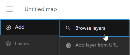
Step 1: Sign in to your ArcGIS account and open Map Viewer. There are two ways to add layers from the Content (dark) toolbar:
(1) Click Add, then Browse layers.
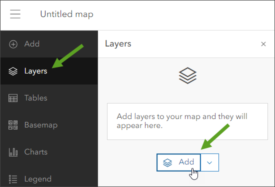
or (2) Click Layers, then Add.
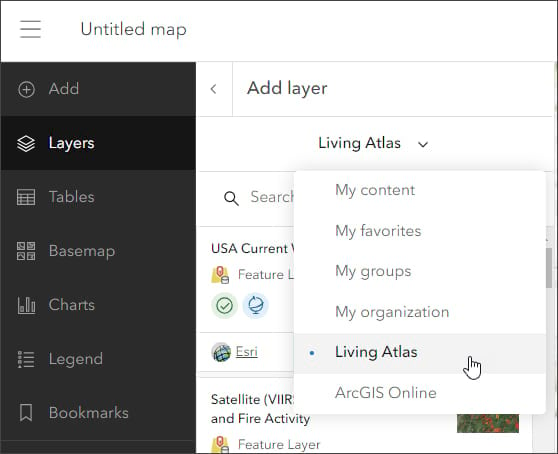
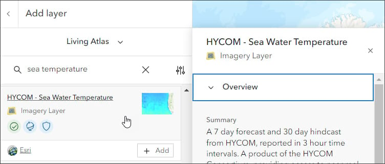
Step 2: Choose Living Atlas from the Add layer drop-down menu.
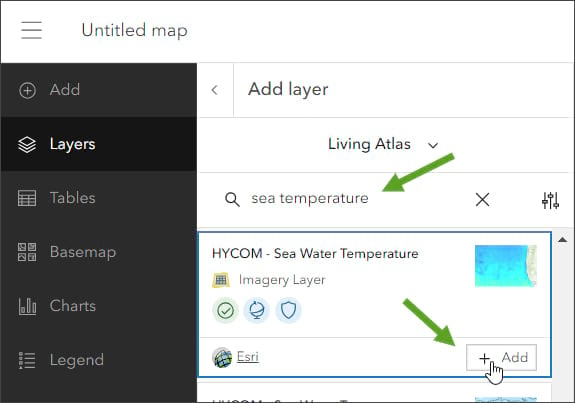
Step 3: Enter “sea temperature” in search to locate matching layers from Living Atlas. Locate the HYCOM—Sea Water Temperature layer and click [+ Add] to add it to the map.
Tip: To learn more about any layer, click the layer card to view the item information, such as overview, description, and more. Click View item at the bottom to open the full item pages.
From the HYCOM – Sea Water Temperature item details, we learn that the layer shows a seven-day forecast and 30-day hindcast from the Hybrid Coordinate Ocean Model (HYCOM). The multidimensional imagery layer provides information on a variety of variables, including temperature, temperature at specific depths, and more.
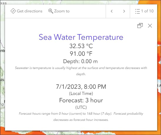
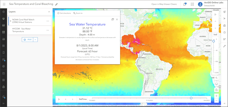
After adding the layer, a time slider will appear showing the time range encompassing the 30-day hindcast to the seven-day forecast. Click the layer to view the pop-up. By default, the layer displays the information recorded for 30 days ago (the hindcast) and the temperature at the surface.
Next, we’ll adjust the HYCOM layer settings to show the temperature for the current date, and since temperature at the surface is typically warmer than below, we’ll adjust the depth to show the temperature about 10 to 15 feet below the surface.
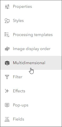
Step 4: Open the Multidimensional tool from the Settings (light) toolbar.
The pane shows the display slice variables, including (a) a time dimension slider and (b) the Z dimension slider, which in this case is depth below surface.
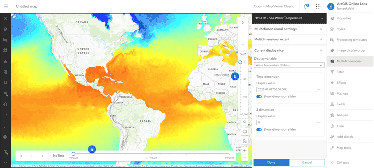
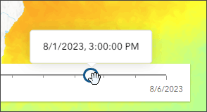
Step 5: Adjust the time slider by using the left/right arrows or grab and move the time slider control to set the current date and time.
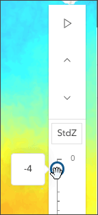
Step 6: Adjust the Z dimension (depth below surface) slider using the up/down arrows or use the slider control to set it to -4 meters, roughly 10 to 15 feet below the ocean surface where coral may be growing.
Click Done when finished. You can verify the settings you have made by opening the pop-up to show the temperature at the specified depth and current date.
In the next steps, we’ll add the coral bleaching layer.
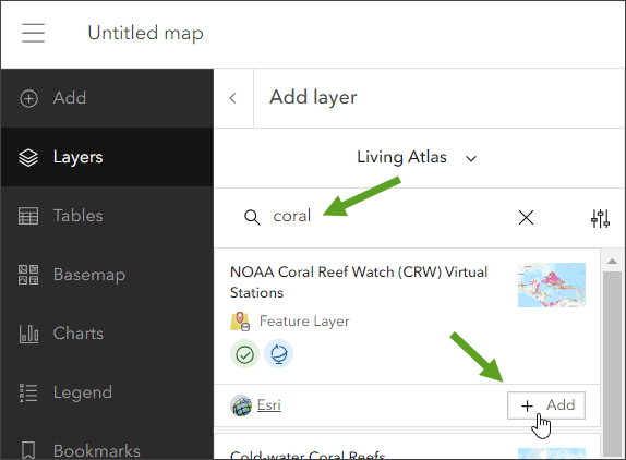
Step 7: Add another layer from Living Atlas (see Steps 1 and 2 above) and enter “coral” in search to locate matching layers from Living Atlas. Locate the NOAA Coral Reef Watch (CRW) Virtual Stations layer and click [+ Add] to add it to the map.
To learn more about the layer, click the layer card to view the item information, such as overview, description, and more. Click View item at the bottom to open the full item pages.
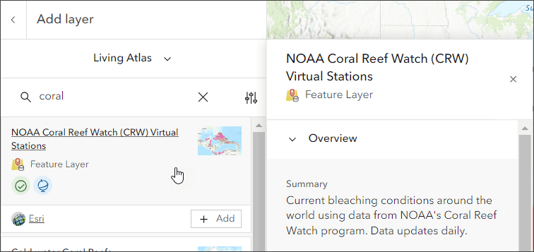
From the NOAA Coral Reef Watch (CRW) item details, we learn that the layer shows current coral bleaching conditions around the world with daily updates.
After adding the layer, save and title your map. Then click to view the pop-up information.
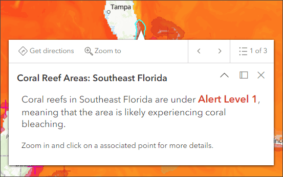
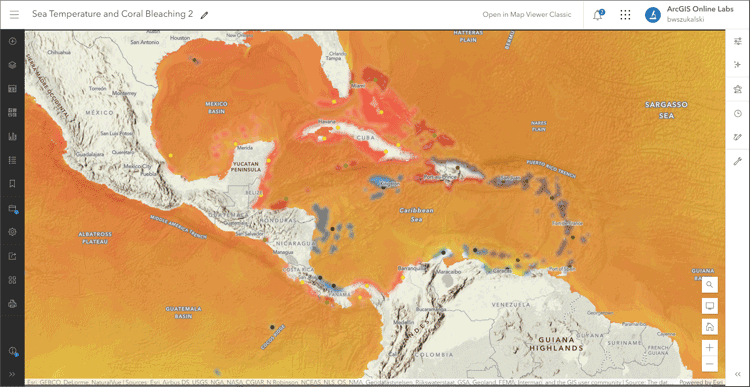
You’ve now created a map showing current temperatures beneath the ocean surface along with current coral bleaching alerts. The layer pop-ups deliver information about current sea temperature and coral bleaching alerts.
With a few additional steps, the map can be improved using styles, effects, and additional layers to make it more expressive.
Experiment with different basemaps to discover which you like best. You can alter layer transparency and symbols to emphasize the content you want, and use Effects to emphasize layers or alter their display.
The map shown below was created using the following:
- Basemap derived from the prototype Physical Geography Basemap, using layer visibility modifications and effects.
- Added transparency for sea water temperature layer.
- Changed symbols and added transparency and effects for coral reef watch stations and areas.
More Information
For more information, check out the following: