
Layer pop-ups in ArcGIS Online are essential parts of authoring a good web map and can transform an otherwise dull list of attributes into a far more meaningful display of information for your audience. Charts are one of the most important features you can include in a pop-up, providing a visual and engaging way to present numeric attribute information.
In this tip, you will learn how to add and configure bar, line, and pie charts in pop-ups. Open the completed sample map to view the configured pop-up charts. The map contains an unconfigured layer you can use to follow along in this tutorial, plus a layer configured with the charts described below. Click any feature to view the bar, line, and pie charts. The sample data focuses on crime statistics by neighborhood.
Add chart elements to pop-ups
Step 1: Open the sample map and sign in to your ArcGIS account. Save the map.
Step 2: Open the Layers pane in the Contents (dark) toolbar. Hide the Neighborhood Crime Totals (charts) layer, and show the Neighborhood Crime Totals (unconfigured) layer.
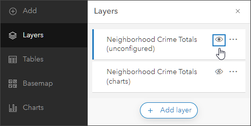
Step 3: Ensure that the unconfigured layer is selected. In the Settings (light) toolbar, click Configure pop-ups.
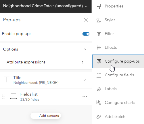
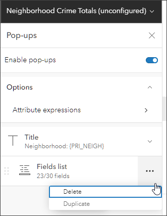
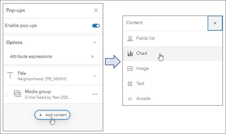
Step 4: We will not need the default Fields list element, so it can be deleted. Click options (…), then Delete.
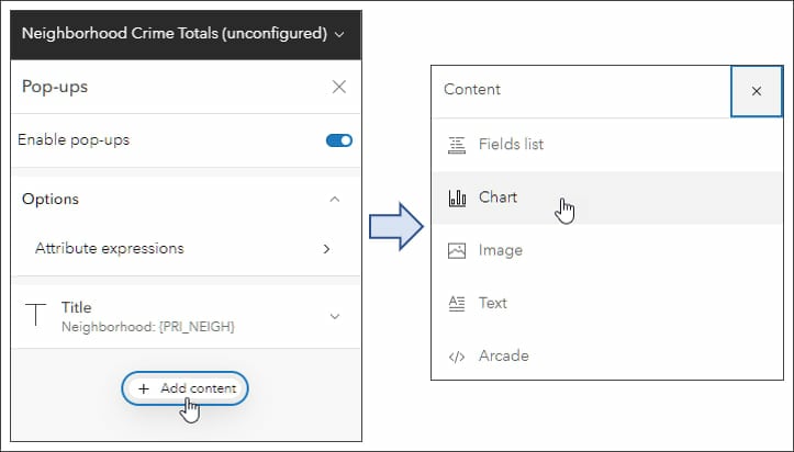
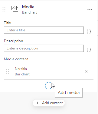
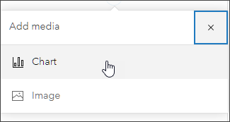
Step 5: Add a chart element. Click Add content, then choose Chart.
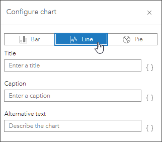
Step 6: Configure the chart.
While each chart is different, the chart configuration pane is similar for each chart type.
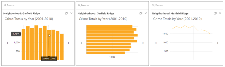
Bar charts are best used to show data in discrete categories. Spaces between the elements separate the values. Bar charts can be oriented vertically or horizontally.
Line charts can be used to show change over time. A line chart implies an inherent order, progressing from left to right.
Pie charts are effective for showing the parts of a whole. All attributes shown in the pie should add up to 100 percent.
Bar charts are the default but note that Line and Pie are also options.
For this tip, you will create a media group containing three different styles of charts (vertical bar, horizontal bar, and line) that display the same crime totals data for 2001 to 2010. Then you will add another media group with a pie chart that displays crimes by type for 2010.
a. Choose a title, caption, and alternative text for the chart (optional).
b. Click Select fields.

c. Choose the desired fields to populate the chart. In this example, we will use the yearly count fields (2001 to 2010). A check mark appears when you select a field.
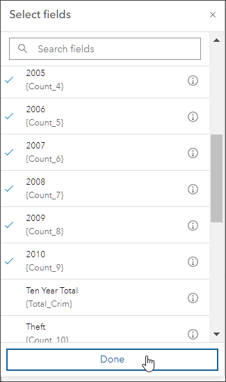
Click Done when finished selecting fields. Add the title Crime Totals by Year (2001-2010), then click Done again.
Step 7: Click the blue circle with a + sign to add a horizontal bar chart and create a media group.
Step 8: Choose Chart.
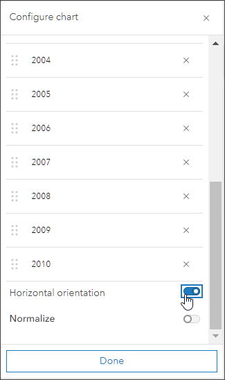
Step 9: Click Select fields and choose the same fields as you did in step 6 above. When finished, click Done then scroll to the bottom and set the orientation to Horizontal. When finished, click Done again.
Step 10: Click + and Chart. This time, select Line as the chart type.
Step 11: Complete the chart configuration using the same yearly total fields (2001–2010) and enter the title.
The media group you have just created contains three charts: a vertical bar chart, a horizontal bar chart, and a line chart. You can hover over each chart to learn more about the data. Click the arrows on the left and right sides of the media group to advance to the next chart.
Step 12: Add a pie chart below the media group you just created that will use data on crimes by type for 2010.
Click Add content, then select Chart.
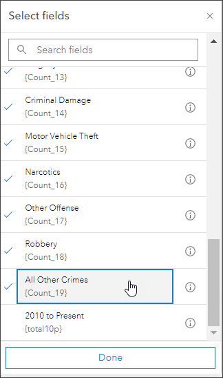
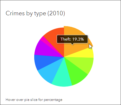
Step 13: Select Pie as the chart type, enter Crimes by Type (2010) as the title, then click Select fields.
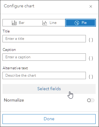
Step 14: Select the fields that total the types of crimes: Theft, Assault, Battery, Burglary, Criminal Damage, Motor Vehicle Theft, Narcotics, Other Offense, Robbery, and All Other Crimes. Make sure to select All Other Crimes. Click Done when finished.
Step 15: Complete the chart configuration by adding an optional description. Click Done when finished. Save the map.
On the map, click on a neighborhood to see the pop-up containing the bar and line charts on total crime. Scroll down to see the pie chart that shows various crime types. Hover over each pie slice to get more information about the data.
More information
For more information, see the following: