A storm surge is an abnormal rise in sea level caused by the high winds and low pressure of a storm pushing water onto land. Storm surges are usually the most devastating part of a hurricane, and when such a surge floods a dense city, the destruction can be particularly severe.
You can use elevation data to map storm surges and predict which areas will flood when a dangerous hurricane hits. This tutorial focuses on New York City as a study area, but the same workflow can be repeated for any coastal area.
Create a New Project and Obtain Elevation Data
To map any kind of flooding, you’ll need to know the elevation of the land in your study area. ArcGIS Living Atlas of the World provides the global elevation data needed to conduct your analysis. First, you’ll create a project in ArcGIS Pro and acquire elevation data.
1. Open ArcGIS Pro.
2. On the start page and under New Project, click Map. The New Project window appears.
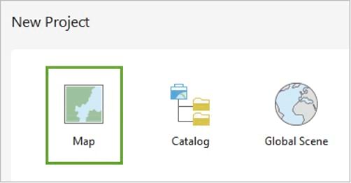
3. In the New Project window, type “StormSurge” for the NAME field click OK. The map will open.
4. On the ribbon, click the Map tab. In the Inquiry group, click the Locate button.
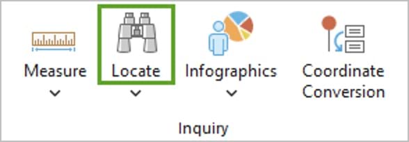
5. In the Locate pane, type “New York City” and press Enter. The map displays New York City.
The default Topographic basemap helps you identify the different areas of New York City.
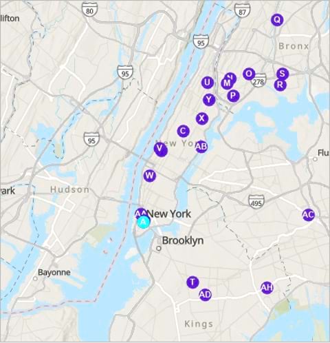
6. Close the Locate pane.

7. Zoom in to Manhattan with the mouse and pan to obtain the extent displayed in the example image.
The extent shows the island of Manhattan and other New York City boroughs like Brooklyn and Queens. Next, you’ll add the elevation data.

8. On the ribbon, click the View tab. In the Windows group, click Catalog Pane.

9. In the Catalog pane, click the Portal tab, and click the Living Atlas button.
ArcGIS Living Atlas of the World is a curated collection of geographic information, including maps, apps, and data layers.

10. In the Catalog pane, type “Terrain owner:esri” in the search box and press Enter.
The list of search results contains an imagery layer named Terrain. This layer provides elevation data for the entire world at different resolutions when zooming in and out.
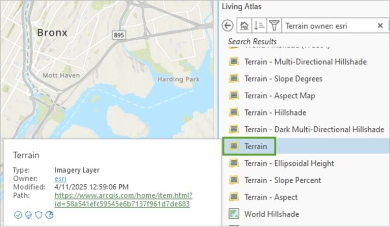
11. Right-click the Terrain layer and choose Add To Current Map.

The layer is now added to the map. The map extent changes to show the raster layer that covers the entire world.
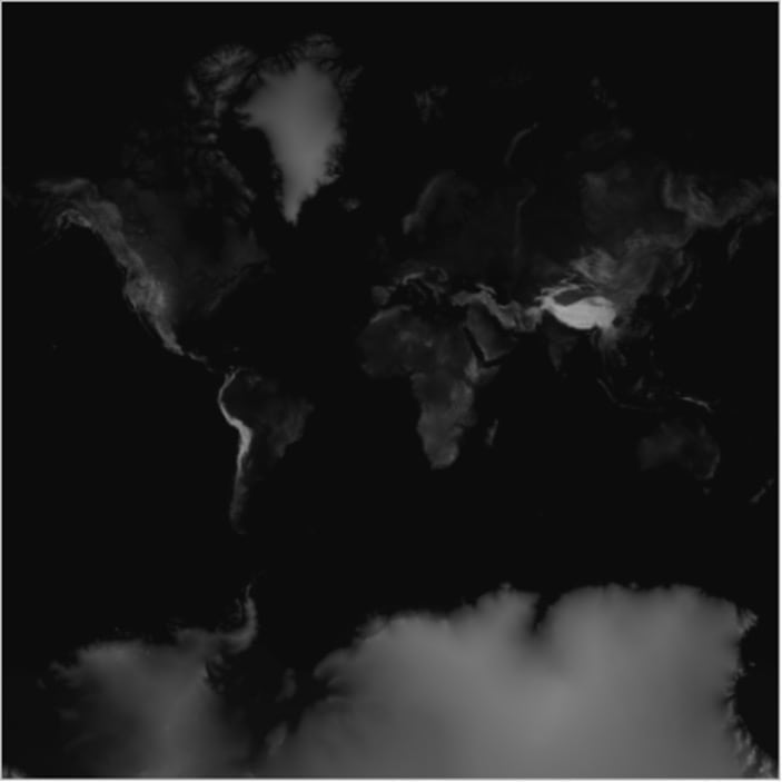
A raster layer is composed of a grid where each cell is called a pixel and has a numeric value. In the case of the Terrain layer, the value of each pixel represents elevation in meters. The pixels with the highest values appear in white. The pixels with the lowest values appear in dark gray or black.
12. On the ribbon, click the Map tab, then click Previous Extent in the Navigate group to return the map extent to New York City.
The entire map appears black. This is because the elevation of New York is generally low when compared to the rest of the entire world. You’ll change the display of the terrain layer to better see the differences in elevation in the New York City area.
13. In the Contents pane, verify that the Terrain layer is selected.
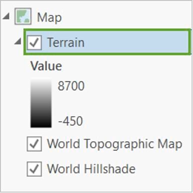
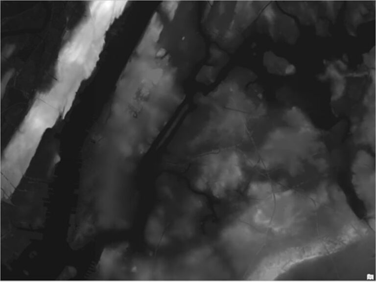
14. On the ribbon, click the Image Service Layer tab. In the Rendering group, click DRA. (DRA stands for dynamic range adjustment.) In this mode, the color tones on the map are based on the range of values in the current map extent.

After a few moments, the map is updated. You can now visually discern the local variation in elevation values.
15, On the Quick Access toolbar, click the Save Project button.

Export an Elevation Raster
Next, you’ll export a file-based raster from the Terrain imagery layer that only covers your area of interest to perform analysis with it.
1. In the Contents pane, right-click the Terrain layer, point to Data, and choose Export Raster.
The Export Raster pane appears. You do not want to export a raster of the entire world, only for New York City.

2. Make sure your map is still centered on Manhattan. In the Export Raster pane, for Clipping Geometry, choose Current Display Extent.
Under Extent, the four coordinate values update. These define the bounding box that will be used to clip the raster.
3. Under Cell Size, change both X and Y to 10. The cell size determines the resolution of the output raster.
In this case, each pixel will cover a piece of the earth that is 10 meters by 10 meters, or 100 square meters.

4. Accept all the other defaults and click Export.
After a few moments, the new raster, Terrain.tif, is added to the map. It is drawn with tones ranging from black to white using DRA rendering similar to its source, the Terrain layer.
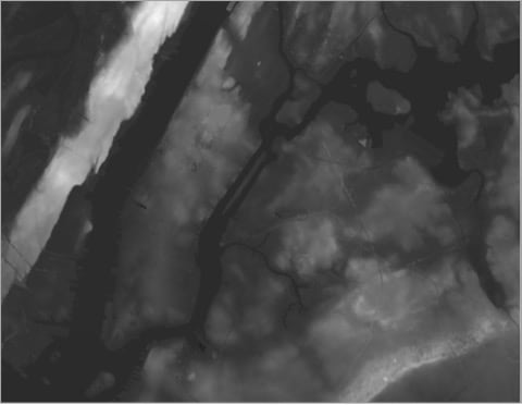
5. Close the Export Raster pane. You’ll now remove the original worldwide Terrain layer, as it’s no longer needed.
6. In the Contents pane, right-click the Terrain layer and choose Remove.
The Terrain layer disappears from the Contents pane. Next, you’ll check some of the elevation values on your map.

7. On the map, click anywhere within the Terrain.tif layer.
The Pop-up pane appears displaying the elevation value for the specific pixel you clicked—for example, 23.08 meters.
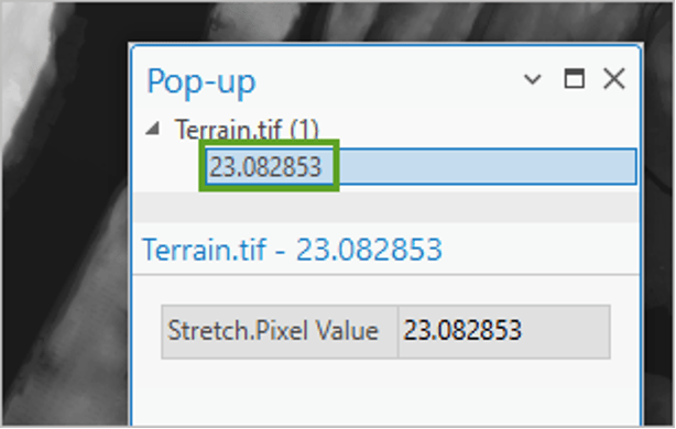
8. Click several other points to see how the elevation varies across your area of study.
9. Close the pop-up. Press Ctrl+S to save the project.
Map a Three-Meter Surge
Now that you have elevation data, you can use it to find low-lying coastal lands and predict which areas of New York City may flood when a hurricane hits. The following scenario shows when a hurricane produces a water surge of three meters (or 9.8 feet).
Considering that the water surrounding New York City sits at an elevation of zero meters, all the areas in the city that have an elevation of up to three meters would be flooded.
To find all areas with an elevation of three meters or below, you’ll use the Remap tool applied to the Terrain.tif layer.
1. On the ribbon, click the Analysis tab. In the Raster group, click Raster Functions. The Raster Functions pane appears.

2. In the Raster Functions pane, search for the Remap tool and open it. The Remap Properties pane appears. The Remap tool allows you to change or reclassify the pixel values of a raster and produce a new raster layer with the new values.

3. In the Remap Properties pane, click the Parameters tab, and for Raster, choose Terrain.tif. For Remap Definition Type, keep List.

In the Remap table, you’ll define the reclassification rules. Based on the legend for the Terrain.tif layer in the Contents pane, you can see that the lowest value possible for that layer is about -22.9 meters and the highest is about 96.5 meters.
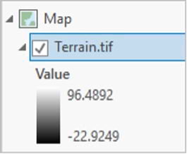
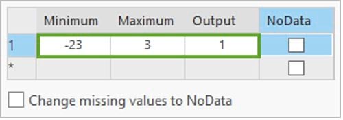
4. In the Remap Properties pane, click the Remap table’s row 1 cell for Minimum. Enter -23 (or another number lower than your minimum value) for Minimum, 3 for Maximum, and 1 for Output.
This rule means that any pixel with a value between -23 and 3 meters should get a value of 1 in the new raster. Those are the flooded areas.
5. For the second rule, click the star to create a new row. Then, in the cells of the new row, enter 3 for Minimum, and 97 (or another number higher than your maximum value) for Maximum. Leave 0 for Output and check the NoData check box.
This rule means that any pixel with a value between 3 and 97 meters should have no data. Those are the areas that are not flooded, which aren’t needed, so they won’t be represented with any data.

6. Click Create New Layer.
A new layer, Remap_Terrain.tif, symbolized in gray, is added. You’ll make some changes to the display to make the layer easier to see. First, you’ll turn off the elevation layer.
7. In the Contents pane, turn off the Terrain.tif layer by unchecking the Terrain.tif check box. You’ll rename the new layer.
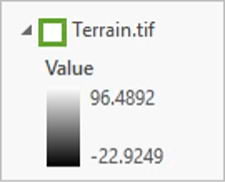
8. In the Contents pane, click the Remap_Terrain.tif layer name to select it, then click it again to enter the edit mode. Type “Storm surge 3 m” and press Enter.
Next, you’ll change the layer’s symbology.
9. Right-click the color ramp for the Storm surge 3 m layer, expand the drop-down list, and check Show Names. Scroll down the list of color ramps and choose the Red-Purple (Continuous) ramp.
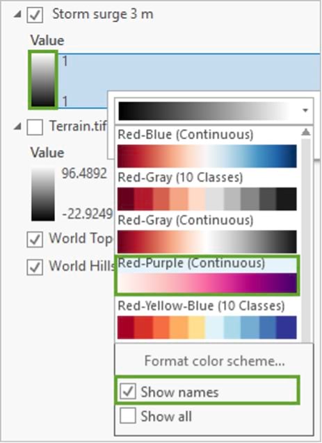
Because the only pixel value in this raster is 1, only one median color from that ramp will be used. The layer changes to a uniform pink color. Next, you’ll change the transparency.
10. In the Contents pane, ensure that the Storm surge 3 m layer is selected. On the ribbon, click the Raster Layer tab. In the Effects group, set Transparency to 40.0%.

The map now shows in light pink the areas of the city that may be flooded by a three-meter storm surge.
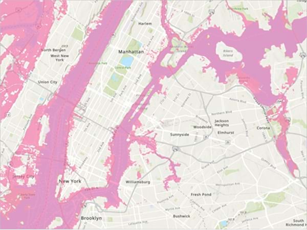
11. On the Raster Layer tab, click Swipe in the Compare group. The cursor changes to a triangle, which indicates the Swipe tool is active.

12. On the map, with the Swipe tool on, drag the map from side to side to reveal the basemap below and compare the flood areas to the preflood water boundaries.
You can also zoom in and pan to see in more detail which areas of Manhattan and surrounding neighborhoods appear flooded.
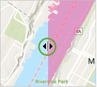
13. When you are done with your examination, go to the Map tab on the ribbon. In the Navigate group, click the Explore button to exit swipe mode. The cursor returns to its default symbol, indicating the swipe tool is no longer active.

Next, you’ll compare your three-meter storm surge map to a map of actual flooding from Hurricane Sandy, which struck the Caribbean and the coastal mid-Atlantic region of the United States in late October 2012.
14. On the Map tab, click Add Data in the Layer group. The Add Data window appears.
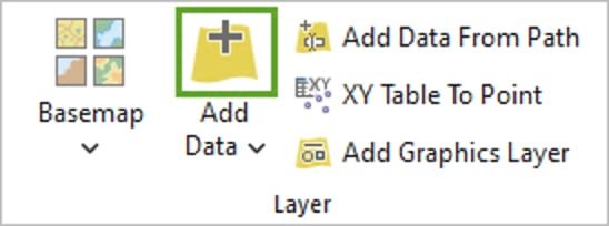
15. In the Add Data window, under Portal, click ArcGIS Online. In the search bar, type “Hurricane Sandy Inundation Zone owner: Esri_Tutorials” and press Enter. Click the feature layer Hurricane Sandy Inundation Zone.
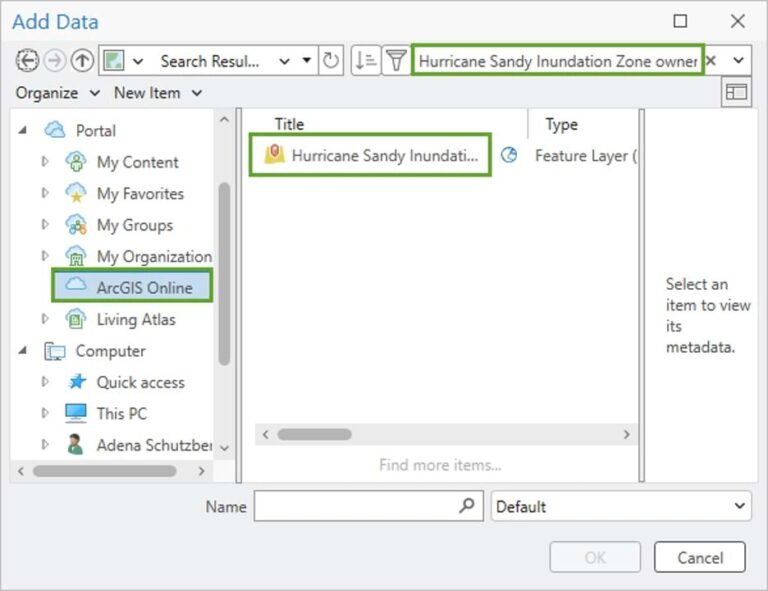
16. Click OK.
The Hurricane Sandy Inundation Zone layer appears on the map. This feature layer comes from the New York City Open Data portal and displays the areas inundated in New York City during Hurricane Sandy.
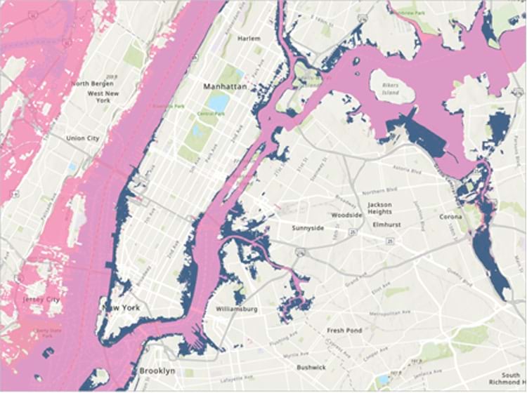
17. In the Contents pane, if necessary, click the Hurricane Sandy layer to select it. On the ribbon, click the Group Layer tab. In the Compare group, click Swipe. Explore the map with the Swipe tool.
How well does your three-meter storm surge model match the real storm surge of Hurricane Sandy? The model is fairly close, but it looks like the overall surge from Hurricane Sandy was slightly larger than three meters.
18. When you’re done, go to the Map tab on the ribbon. In the Navigate group, click the Explore button to exit swipe mode. Press Ctrl+S to save the project.
Visit the Esri tutorial gallery to explore additional topics and find other step-by-step workflows on a variety of products.
