A thorough understanding of a country, its people, and its history through GIS is at the heart of the MAPA: Digital Atlas of Ukraine program at the Harvard Ukrainian Research Institute (HURI). Using a combination of ArcGIS StoryMaps stories and web maps created with ArcGIS Web AppBuilder, HURI staff have compiled a tremendous amount of historical and survey data and analysis into a resource that is invaluable for the public and scholars alike.
Originally conceived as a physical atlas analyzing the Great Famine of Ukraine, the MAPA program quickly took advantage of a digital format. It grew to encompass a variety of topics, each with its own interactive web map, and now includes both a historical and a contemporary atlas. The MAPA team has tackled subjects as diverse as the history of the ancient federation of Kyivan Rus’, located in what is now Ukraine between the eleventh and thirteenth centuries, and the latent effects of the Chernobyl nuclear accident in 1986.
“What we found [with a digital atlas] was that we were able to do things that traditional atlases could not do,” said Serhii Plokhii, director of HURI. “One of the basic things about that kind of mapping is that you put your results on display. That creates new questions and creates initiative for new research.”
By bringing a new kind of location-based understanding to events that have already been the subject of extensive study, as well as those that had not yet been thrown into the limelight, the MAPA program is advancing Ukrainian studies from a geographic perspective, one map at a time.
Plotting the Past
The Great Famine of Ukraine—also known as the Holodomor—took place from 1932 to 1933 and has long been suspected of having been engineered by the Soviet Union. Geospatially analyzing the Holodomor was MAPA’s flagship project from the outset, and its success became a cornerstone of the program.
“That was an obvious choice for us to apply GIS technology,” said Kostyantyn Bondarenko, MAPA project manager. “Although there had been a lot of research done on [the Holodomor], the mapping component was not always part of the research. What our project allowed us to do was get a new look at the famine.”
The web map and accompanying story created with ArcGIS StoryMaps provide an ample breakdown of the variables involved in the “death by starvation,” including death rates exceeding those of prefamine years, distribution of famine relief, and ethnic composition of the affected regions.
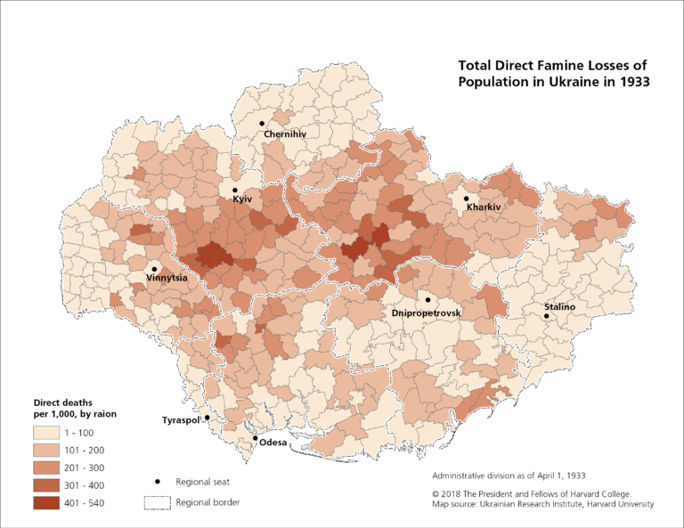
“There were some preconceptions that the famine happened in the [south], where previous famines happened,” said Bondarenko, referring to a separate event that had taken place in Ukraine a decade earlier. “What we found out was that this famine, which was much larger than the famine in the 1920s, actually happened in different areas of Ukraine.”
“When we mapped the famine on smaller administrative geographic units, we had a more fine, granular picture,” he added. “It was clear that there was a pattern, that this famine was [human-made].”
With the success of the Holodomor project, HURI researchers knew this kind of geospatial analysis could be applied just as effectively to a wide variety of other subjects.
“The famine project had a lot of interest and support coming from the Ukrainian community, but it’s almost like reducing the entire Ukrainian [historical] experience to one event,” said Plokhii. “That’s not something we wanted to do, [which is why] the name of the project from the very beginning was MAPA: Digital Atlas of Ukraine. The vision was there—the question was, ‘What should be next?’”
That Was Then, This Is Now
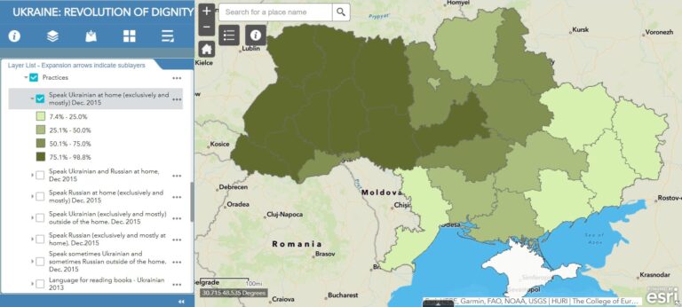
It is in the contemporary atlas that the MAPA program has gathered its most impressive collection of data: the Revolution of Dignity project.
During the Revolution of Dignity, which took place in Ukraine in February 2014, a series of protests led to the removal of the Ukrainian president. After the revolution and Russia’s annexation of Crimea that same year, the MAPA team set out to compile survey data that captured the shifting perspectives of the people of contemporary Ukraine.
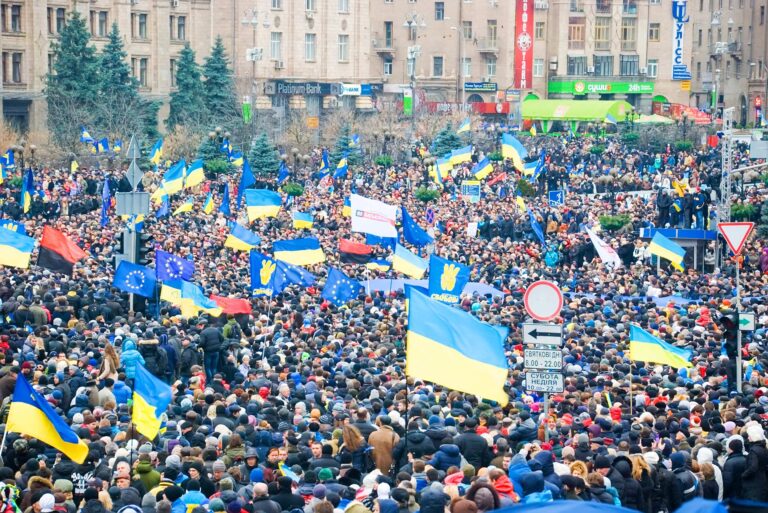
“The point was to look at what happened with Ukrainian society once the war started,” said Plokhii, referring to the subsequent armed conflict in the region of Donbas. “How did this change Ukrainian society? That was the key question we were trying to ask.”
The MAPA team gathered data collected by a variety of collaborators including the Ukrainian Institute of National Memory, the Razumkov Centre, and the University of St. Gallen in Switzerland. From 2013 to 2019, surveyors asked participants about their religion, their political affiliation, whether they supported the revolution, and whether they primarily spoke Russian or Ukrainian at home, among many other questions. The project also incorporates historical information, such as past census and electoral data, for further context.
The resultant Revolution of Dignity web map contains hundreds of layers users can toggle to find correlations between various survey datasets across Ukraine’s political landscape. This allowed HURI researchers to clearly see how Ukrainian attitudes toward various issues have changed over time.
“Before the Revolution of Dignity, Ukraine was more or less divided between east and west,” said Bondarenko. “With the revolution, the idea of the Ukrainian identity shifted more to the center. Ukraine became more consolidated as a nation—more democratic, more pro-Western.”
Although a cultural divide has always existed in the country, it is not as stark as a simple east-west split. Language, for example, proved to be less clear an indicator of political affiliation than expected; a large swath of primarily Russian-speaking responders in Ukraine also professed support for the revolution, which was largely a rejection of anti-democratic policies.
“Ukraine is a lot more interesting, a lot more nuanced and varied in its views—geographically, politically, religiously—than people think or are told that it is,” Bondarenko emphasized. “It’s not such a rigid picture as it is usually presented in the media.”
Under the Waterline
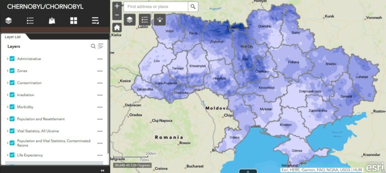
Though the Revolution of Dignity web map represents the MAPA program’s most ambitious and sprawling compilation of data to date, the MAPA team isn’t resting on its laurels. Roughly a year into creating a web map that details the lingering effects of the Chernobyl disaster, researchers have already mapped data such as exclusion zones, thyroid irradiation, uranium contamination, population resettlement, and life expectancy. However, the project is still in its early stages. Collaborators in Ukraine were well into the process of collecting further data when Russia invaded the country in February 2022.
Under the best of circumstances, it can take three to four years before a MAPA project is complete—and even then, researchers will retroactively add data to expand a given module if it becomes available.
“Projects like that start as an iceberg that is fully submerged in the sea,” said Plokhii. “You can’t see anything, then something emerges. But still, most of the work is under the waterline. Most of Chernobyl is still under the waterline.”
But what has already emerged—in the Chernobyl project and the rest of the MAPA program’s output—is a novel way of looking at issues that have long been present in Ukraine as well as those that are only just surfacing. Above all, the MAPA program is a call for understanding, a crucial resource that approaches its subject matter through a geospatial lens.
“Some names in the geographic map of Ukraine are becoming less foreign and more familiar,” said Plokhii. “Come to our resource, look at where those places are, look at their history. Look at what happened with Ukrainian society during the course of the war. Look at what nuclear energy can bring to the landscape, to people, to lands and territories. It’s an important story beyond Ukraine and beyond the war. [It’s an] important part of [the] debate about climate change and how we should approach it.”
“I hope that people keep going to this resource,” he added, “[not only to] take the knowledge that is already produced but also to produce knowledge of their own.”
Learn more about the Harvard Ukrainian Research Institute and the MAPA: Digital Atlas of Ukraine program.