The thousands of dashboards that have been created using ArcGIS Dashboards (formerly Operations Dashboard for ArcGIS), from Esri, keep organizations and the public in the know with a vast amount of valuable information daily.
Dashboards track election results, 311 citizen requests for service, bird migrations, building permit information, opioid overdoses, capital improvement and real estate development projects, and crime statistics, to name a few examples.
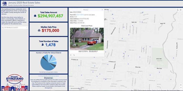
Creative thinkers always come up with new ideas for dashboards, such as the recently launched Real Estate Sales Dashboard from the Franklin County Auditor’s Office in Ohio. The dashboard, which went live last September on the auditor’s website, displays the most recent month’s data, including
- The residential real estate sales total for Franklin County and for more than 80 local municipalities, area commissions, school districts, and townships.
- The median sales price for homes in each area.
- The number of sales in each area.
- The number of sales per school district, displayed in a pie chart.
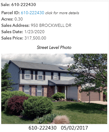
- The location of each building sold, shown on a map. Pop-ups on each feature include a photograph and the address of the building, the property’s acreage, and the parcel ID. The parcel ID links to more detailed information about the building, including the date it was sold, its owners’ names, the year the structure was built, its square footage, the current market value of the property, and the current taxable value.
The data is updated monthly.

Franklin County auditor Michael Stinziano said the Real Estate Sales Dashboard resulted from a request from neighborhood groups. The organizations wanted the auditor’s office website to provide authoritative, easily accessible, and hyperlocalized real estate sales information due to the impact the current booming real estate market is having on neighborhoods’ property values and school districts’ funding in Franklin County.
“Ohio is one of the hottest real estate markets in the country,” Stinziano said in a recent interview. Home sales in Franklin County topped $5.3 billion in 2019, an increase of 4.4 percent over 2018.
“Having such a competitive housing market means buyers, sellers, and agents are constantly reviewing properties for sale,” Stinziano said. “Our dashboard gives accessible and transparent data to help inform those choices.”

Franklin County (pop. 1.3 million) is home to Ohio’s state capital, Columbus, named by Forbes magazine in 2019 as the top real estate market in the nation. Columbus was also recently included in the Top 10 Outperforming Metro Markets Report by the National Association of REALTORS, meaning that over the next three to five years, real estate sales should be strong based on factors that make home buying more attainable. Some of those factors include housing affordability for residents new to the area, home price appreciation, and consistent job growth relative to the national average.
Realtors like the dashboard because it’s a good resource to search for comparable sales. School district officials also will find the dashboard useful because they can see, at a glance, the number of home sales in their particular districts each month, along with the total sales amount and the median sales price.
Matt Shade, the GIS manager for the auditor’s office, said this project was the first time his team had created a configurable web app using ArcGIS Dashboards and that it was easy to do.
Each month, the previous month’s real estate transfer data is plotted as points on a map. The points are queried to ensure they are valid arm’s-length transactions. Using an ArcPy script, boundaries for each area are overlaid, and summary statistics are generated to get the number of transactions, the median sales price, and the total number of sales for the month.
“We publish that through ArcGIS Online and it goes to the dashboard,” Shade said.

Once the geoprocessing script was developed, design considerations became the main focus. The GIS team kept the amount of information on the dashboard to a minimum, with only four major data points plus the map.
“We utilized Esri’s training when we [went] to share this data,” Shade said. “The recommendation from Esri is to keep it simple. You don’t want to overload people [with information].”
To find a solution for mobile viewing, the team developed a second dashboard that only displays statistics for each area and not the map. Users are redirected based on screen width. Another consideration was the basemap. The team decided to combine Esri’s World Light Gray Base map with labels from Esri’s Human Geography basemap. Developing the dashboard took the GIS team about a month from start to finish.
The GIS team used ArcGIS Dashboards for this project because it provides a seamless and efficient way to share key statistics generated in ArcGIS, according to Shade. The team plans to release an ArcGIS StoryMaps app highlighting annual sales trends by compiling monthly data from the Real Estate Sales Dashboard and perspectives from local real estate experts.

