Operations Dashboard for ArcGIS is a configurable web app that’s included with your ArcGIS Online subscription and/or ArcGIS Enterprise. This app provides location-aware data visualization and analytics for a real-time operational view of assets, people, services, and events.
From a dynamic dashboard, you can view the activities and key performance indicators most vital to meeting your organization’s objectives. A recent update to Operations Dashboard includes six new features that will make working with the app easier and improve your information feeds.
No. 1: Charts Can Trigger Actions
Dashboards are composed of elements such as maps, lists, gauges, indicators, and charts that bring your data to life. These elements keep you informed when your data changes, but you also can configure them to communicate with each other to improve interactivity through dashboard actions.
Alongside maps and selectors, charts can now be a source ofactions. Selecting a single data point or multiple data points in your pie or serial charts triggers actions in other elements like maps or lists.

No. 2: Embedded Content Element Added
The new embedded content element makes it easy to embed documents, web pages, images, and videos into you Operations Dashboard app. Embedded content can be configured as static with respect to the URL, in which case all you need to provide is the direct URL. So, if you want to display weather information, a video from YouTube, or even an app or survey form, simply enter the URL as a document to embed it.
You can also embed content by features. This means that each feature’s attribute information can be used to dynamically construct a URL at run time. This is a terrific way to display content from external web pages that are based on a common key, shared in a feature attribute (like images from closed circuit television (CCTV cameras). When configured by features, the embedded content can be the target of an action such as a selection on a map or list.
Here’s an example of a dashboard with embedded CCTV pictures and a weather report.

No. 3: Feature Mode for Gauges and Indicators
Until now, you could only configure a gauge or indicatorto use a statistic, such as an average or sum. When you selected your main layer for the element’s configuration, the value type could only be driven for the entire feature layer rather than individual attributes. With this release, you can drive the value type, as well as the minimum and maximum values, directly from attributes of a feature. This enables the user to define which attribute drives the value type set for the element.

No. 4: Share Premium Content in Dashboards
ArcGIS comes with ready-to-use map layers that require an organizational subscription account to access. Premium content such as the World Traffic Service, can be used within your organization’s dashboards to provide up-to-date and reliable data for your users. This map service presents near real-time traffic information for different regions in the world and is updated every five minutes. Other examples of premium content include the 2017 USA Crime Index and the 2017 USA Tapestry Segmentation, which provides, by county, information on median household income, median disposable income and other information. Some subscription and premium content will consume credits, so controlling access to this service is vital. You can include subscription content in your dashboard to provide seamless public access to it, and if needed, limit the number of requests it can receive to manage costs. Learn more.

No. 5: New SVG Icons
When you add an icon to your indicator or gauge elements, you will find that Operations Dashboard has over 100 new icons in the collection. Of course, you can continue to add your own custom icons as well. You can also use a scalable vector graphics (SVG) icon as a logo for the dashboard within the header element!
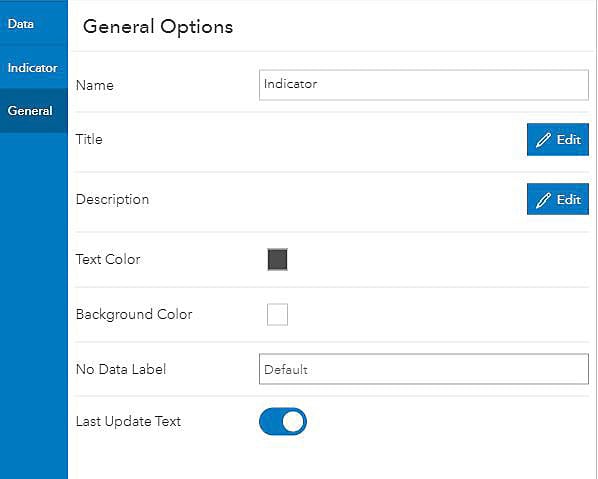
No. 6: “No Data” Label Available
At times, your visualization may not have any data to display. This happens when it is driven by an empty layer awaiting the addition of data from field apps like Collector for ArcGIS, or when the element is the destination of a selection within another element. If the element is void of any data, Operations Dashboard will fill the empty space with a “No data” label. Now you can provide your own text that makes sense to your users and potentially gives direction on how to populate the element with data.
In addition to these new features, actions are no longer triggered by a button that is separate from the rest of the configuration experience. Actions are now available in a unified configuration so that they are easier to find and manage.
The Dashboard for ArcGIS managerial tools highlighted above give you the means to control the way your dashboard looks, feels, and operates. Once your dashboard is up and running, you will get a clear common operating picture of events, assets, or whatever else it is that you need to know to make well-informed decisions.
See the full list of the web app’s new features.