
The new dot density style, available in the Map Viewer beta in ArcGIS Online, personalizes your data and story by representing, with an individual dot, a count of something or someone. Census data; vital statistics; and information on incidents and accidents, crimes, and product sales, for example, work well with dot density. The dot density style works well in any situation where multiple counts or totals are in your data and when they have a unit in common such as people, houses, incident reports, arrests, or total dollars.
The stories of real people are behind every demographic map. However, sometimes maps can remove us from an individual’s experience. Using dot density instead of polygons can help people think of—and care about—individuals when they view your map. Viewers can see themselves, or someone they know, on the map.
You can personalize your map by representing individuals, houses, or anything else that you can count, with the dot density mapping style.
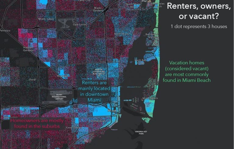
In this tip, you will create a map called Renters, Owners, or Vacant? for the city of Miami, Florida, that shows housing type patterns throughout the community. The map answers the question of which housing unit type is most common in each area of the city. On this map, every dot represents three houses. The red dots represent occupant-owned units, the blue dots represent rentals, and the green dots represent vacant units.
Follow the steps below to create your first dot density map. View a final version of the map.
Step 1: Open the new Map Viewer.
a. Click this link and sign in to ArcGIS Online.
b. Point to the top right side of the page, open the app launcher, and select Map Viewer Beta. Note: if your organization has disabled access to the Map Viewer beta, you will not be able to see it here. Ask your organization administrator about how to enable access.
Step 2: Add a layer to the map.
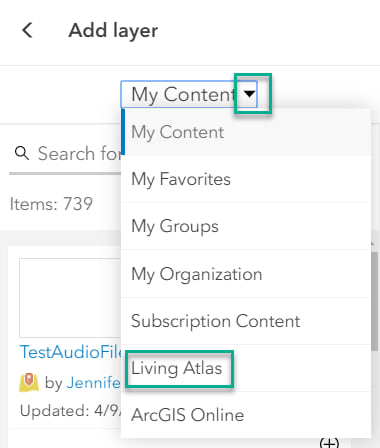
a. Point to the Layers panel that has opened and select Add Layer. Here you can add layers from places like your content and from ArcGIS Online.

b. Point to the drop-down and select Living Atlas. ArcGIS Living Atlas of the World contains thousands of trustworthy and curated layers such as demographic, environmental, and infrastructure layers.
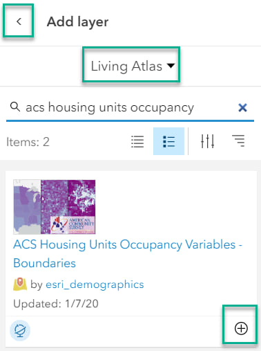
c. Go to the search box and type “acs housing units occupancy”. This is a US Census Bureau layer that is automatically updated every year. Click the Add icon (the plus sign) to add the ACS Housing Units Occupancy Variables—Boundaries layer. Click the Back button next to Add Layer to return to the Layers panel.
Three layers appear on the Layers panel: State, County, and Tract. Each layer is turned on depending on the current zoom level of the map.
d. Click on the Tract layer to activate it for use on the right panel. To save space on the page, close the Layers panel by clicking the Layers button on the top left side, and collapse the left panel by clicking Collapse, at the bottom left.

e. Click the search button on the right panel and type “Miami, Florida”.
Step 3: Style the map.
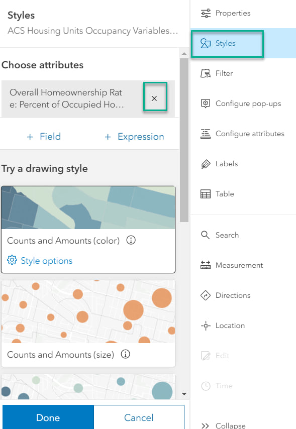
a. Click the Styles button to open the Styles panel. Currently, the map is styled using the percentage of owner-occupied houses. Click the x next to the variable name Overall Homeownership Rate: Percent of Occupied Housing Units that are Owner-Occupied.
The map turns all orange and shows only the location of the tracts. Next, you will choose three data fields to style the map.
b. Click the + Field button.

c. Type “owner-occupied housing” and select Owner-Occupied Housing Units.
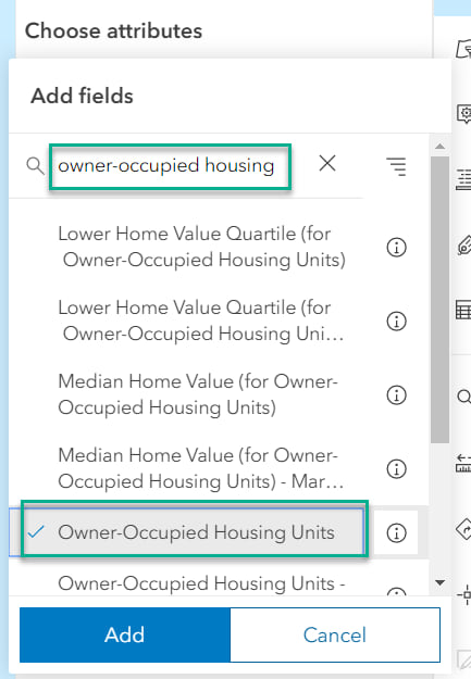
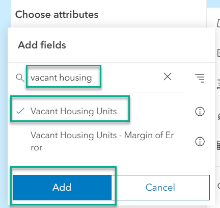
d. Change the word “owner” in the search box to “renter” and select Renter-Occupied Housing Units. Lastly, clear the search box, type “vacant housing”, and select Vacant Housing Units. Then click Add.
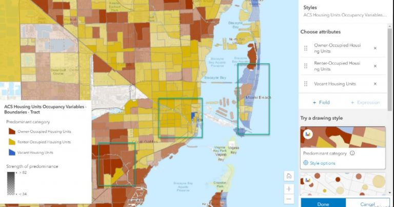
The map currently shows the predominant category (housing occupancy type) of each tract in Miami. There are mostly vacant housing units, shown in blue, on the strip near the ocean. These are where there are many vacation homes that are vacant. Renters are mainly found downtown (shown in yellow), while homeowners are mainly found in the surrounding areas, (shown in red).
e. Scroll down and select the Dot Density style option to visualize these fields as a dot density map.
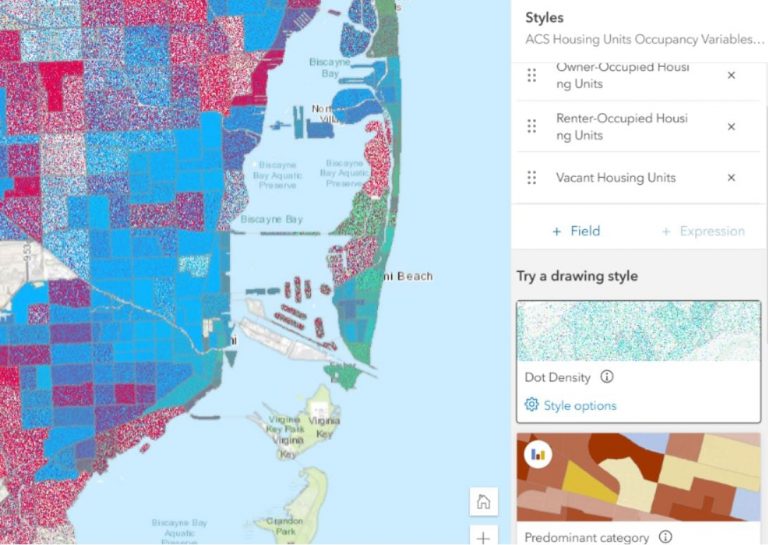
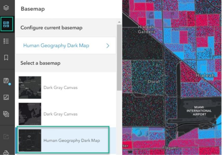
f. Use a dark background to let dot density look its best. Click the basemap button on the top left side of the page and choose a dark gray basemap. In this case, select Human Geography Dark Map. If you do not see the Human Geography Dark Map in your basemap gallery, choose Dark Gray Canvas. Close the Basemap panel.
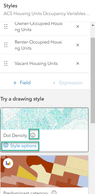
g. Point to the right side of the page on the Styles panel, then click the info button (see image below) on the Dot Density card to read more about this map style. Next, click Style options.
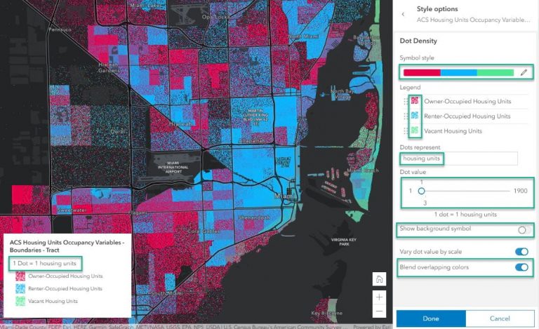
You can see how many houses each dot represents. To give the legend more meaning, type “housing units” in the Dots represent section. Notice how doing so updates the legend over the map. Move the slider to find the value you like most for your map; note that the map immediately updates. Remove the background symbol by turning off the toggle. This removes the census tract boundary outlines.
h. Change the colors of the dots by clicking the ramp under Symbol style, or by clicking on each individual color in the Legend section on the Styles panel. On the Styles panel, click Done, then click Done again. Note: the Blend Overlapping Colors option mixes the colors when there are an even number of values from two or more categories (e.g., red and blue makes purple to show areas where there are an even number of rented and owner-occupied housing units).
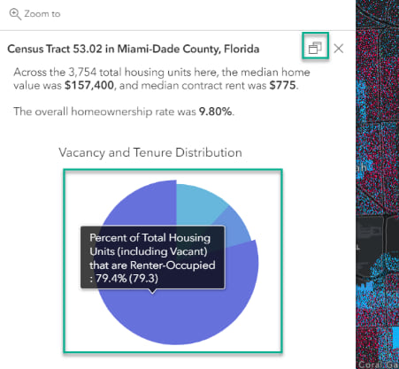
i. Click on the map to view the pop-up. The pie chart shows the count of rented, owner-occupied, and vacant housing units. Areas in the map that have a purple tint are places where there are an even number of owner- and renter-occupied housing units (owners/red + renters/blue = even number of owners and renters/purple). You can dock the pop-up by clicking the Dock button on the upper right-hand side of the pop-up.
Step 4: Save your map and share it.
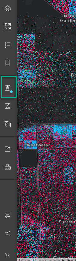
a. Point to the left panel and click the Save button.
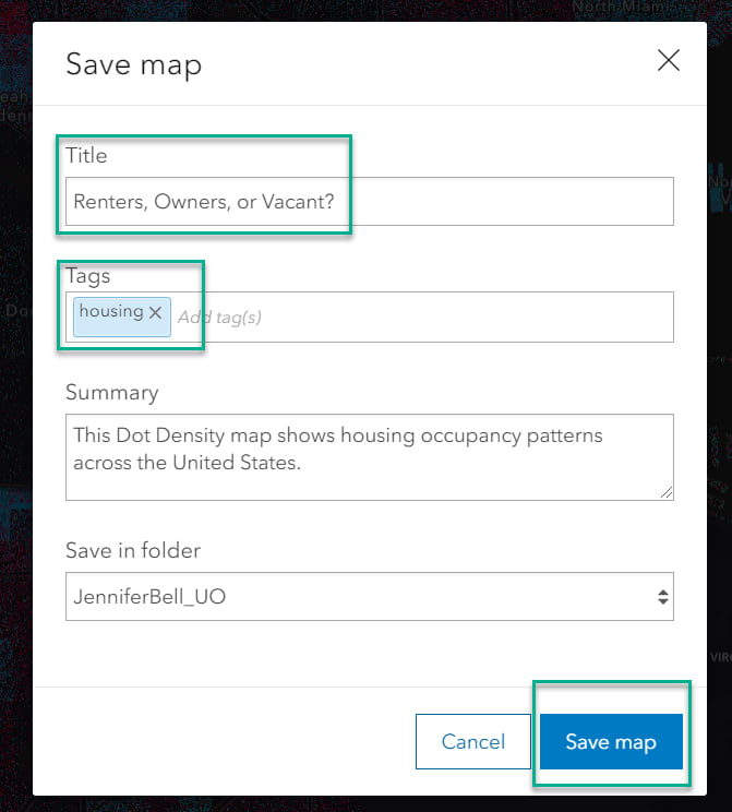
b. Give your map a title by typing “Renters, Owners, or Vacant” and give it one or more tags. Click Save Map.
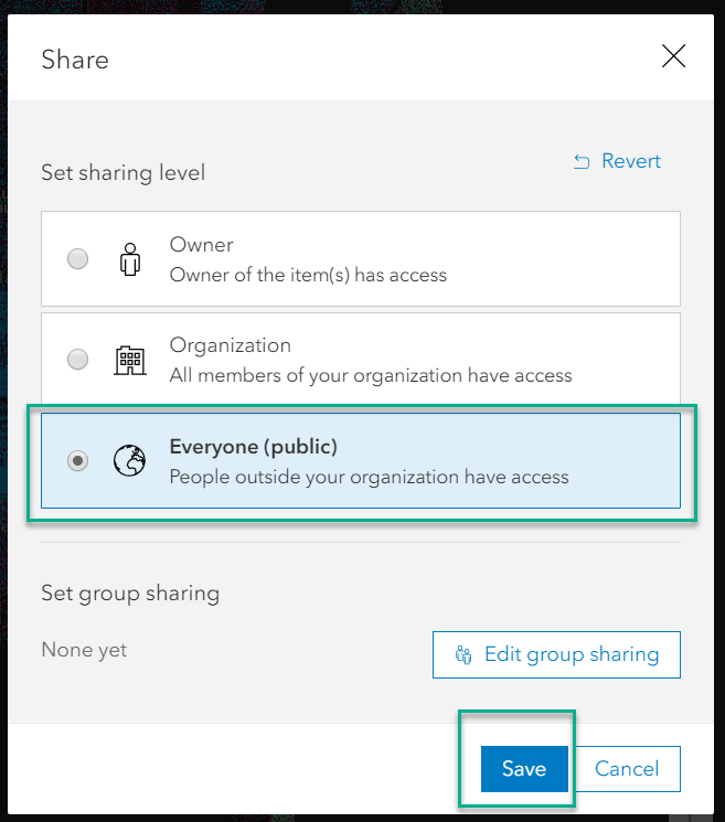
c. Click the Share button. You can choose to share the map with your organization, or (as shown below) click Everyone (public).
d. Copy and paste the URL in your web browser to share your map with the world. Here again is the final map. Search your city to learn about the patterns of owner-occupied, rented, and vacant housing units.
Dot density works well with polygon data that contains count attributes. Use this style to visualize the distribution of one attribute or compare multiple attributes. Make your maps more personal and highlight patterns with the new dot density style in Map Viewer beta.
To learn more about dot density mapping style and the new Map Viewer beta, visit the following sites: