In Part 1 of this blog, you learned how to create your first link chart using a single feature layer. In this part, you will learn about the link analysis tools available to you in ArcGIS AllSource. Link charts allow you to visualize relationships in your data; however, link analysis tools tell you how those relationships are connected. Link analysis tools are located on the Link Chart contextual tab, in the Tools group, and contain Centrality, Neighborhood, Cluster, and Path analysis tools. Each tool is designed to raise awareness of relationships inside a link chart based on given criteria.
Centrality and Neighborhood analysis tools
First, you will learn about the Centrality and Neighborhood tools. To help understand these analysis tools, you will be investigating how a fictional crime family is organized.
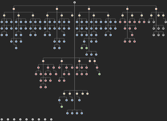
Centrality
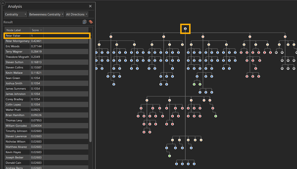
Centrality analysis focuses on finding the most connected and influential entity in a link chart using a variation of four options: betweenness, closeness, eigenvector, and PageRank. Betweenness Centrality identifies how often a node lies on the shortest path between each pair of nodes in a link chart. You can identify who or what is the most connected node between nodes. In the image below, when the All Directions option is selected, you can see that Peter Fisher is the most influential node in this regard, as he is the boss of the family.
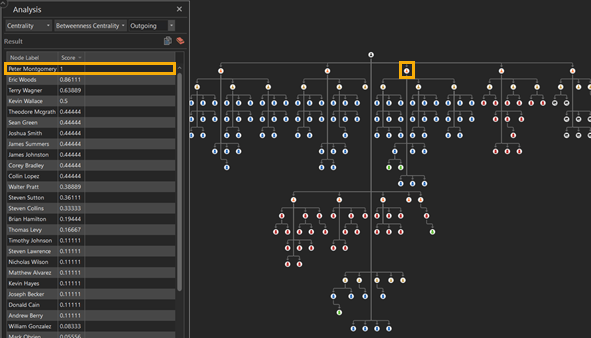
However, when you choose the option for Outgoing, Peter Montgomery, an underboss, gains the highest score as he has the most nodes under his direct command.
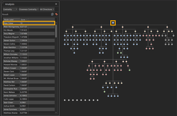
Closeness Centrality is used when determining which nodes are the most closely associated with the other nodes in a link chart. A node with the highest centrality score has the shortest path to all other nodes in the link chart, suggesting a high level of influence. Peter Fisher, being the boss of this fictional crime family, has the highest closeness centrality as he retains command over his entire organization through various underbosses and capos.
Other tools available in centrality analysis are Eigenvector Centrality and PageRank Centrality. Eigenvector Centrality focuses on finding influential nodes that are connected to other influential nodes. Using this tool allows you to quickly discover clusters of the most important nodes inside of a link chart. PageRank Centrality on the other hand, is like Eigenvector Centrality as it also measures influence but will take directionality into account when analyzing the link chart.
Neighborhood
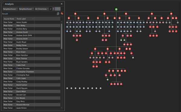
Neighborhood analysis examines the connection from a target node to other nodes in a link chart. When using the Neighborhood tool, you’ll need to determine the degree of connection you want to see from a specific node. For instance, choosing 1 shows you the target node’s first neighbor and immediate connection; however, this degree can go all the way up to 5. Showing us the neighbors of our neighbors. Neighborhood analysis tools aid in understanding who may be the most important people to investigate in a criminal organization.
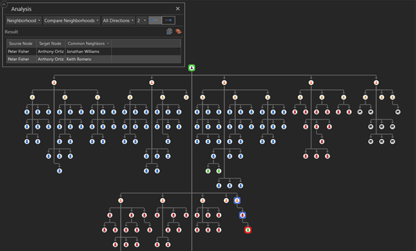
Additionally, the Compare Neighborhoods tool searches for common neighbors between two different target nodes. Using this tool allows you to understand the connections between specific nodes and their immediate common neighbors in a link chart as opposed to its entirety.
Cluster and Path analysis tools
Now, you will continue to learn about Cluster and Path analysis.
Cluster
Clustering analysis measures the overall connection in a link chart and how individual nodes gather. A cluster tends to be a group of highly connected nodes that share neighbors and are clustered together on a link chart. You can use Biconnected Components to analyze these clusters. This tool divides the network into clusters by analyzing and identifying the biconnected components of the link chart. A biconnected component is a subgraph that is connected and non-separable from the graph, meaning that if a single node is removed, the component is still connected by another node.
Using Edge Betweenness partitions the network into clusters by removing the edge with the highest betweenness centrality. Iterations occur to remove the most influential node in a link chart to find clusters; the iteration ends if there are no more edges to remove and returns the clustering with the best quality.
However, you must find the most influential and connected clusters. The Hierarchical clustering analysis tool takes the bottom-up approach, in which clusters are paired and merged as one moves up in hierarchy. Through this, you can understand the hierarchy of the data by continuously merging individual elements to find the highest cluster. In addition, you could use K-means to partition the network into K clusters based on their position so that the node’s distance to the cluster’s mean is minimized.
Path
Path analysis reveals the route between nodes in your link chart. Using paths allows you to identify the route that relates one node to another and all the nodes in between. Using All Paths will return every possible path between nodes; however, to visualize the minimal path between nodes, choose Shortest Path.
Conclusion
Link charts offer more besides visualizing data. By using the link analysis tools available to you in ArcGIS AllSource, you can see how infections spread, understand the hierarchy of a crime family, or figure out the shortest path between a manufacturer and a seller. Link charts enable you to visualize relational data; however, it is the link analysis tools that tell us how that data relates.
Resources
Visit the ArcGIS AllSource website.
For more help on the topic, read the link analysis help documentation.
Banner photo by Hunter Haley on Unsplash

Article Discussion: