In this blog, we’re going to be cooking up a multi-INT analysis centered around drug trafficking activities in Peru.
While sometimes we might think of “Intel Analysts” as unique to the Defense and Intelligence or Public Safety industries, the truth is that they aren’t. If you gather, analyze, and interpret data to drive better decision-making in your organization—you’re doing intelligence analysis. So even if your job title doesn’t include “Intel Analyst,” there’s a good chance “intelligence analysis” is relevant to what you do every day.
This happens to be a very National Security-related problem set—which puts it squarely in that Defense/Intelligence/Public Safety industry realm—but just like any recipe, the steps and tools used here can be applied to the flavor of industry that you work in.
For readers who attended the Esri FedGIS 2025 Plenary session, you’ve sampled this multi-INT analysis dish before, as a part of the Supporting National Security Spatial Workflows presentation.
Now that you’ve seen the story, let’s take a closer look behind the scenes with some tips and tricks to spice things up.
INGREDIENTS
The data and tools we’re going to use were sourced from the Esri Partner Network (EPN) and the ArcGIS System. The three primary datasets for the analysis come from Janes, Maxar, and Spire, who are data provider partners in the EPN.
- Open-source intelligence data from Janes
Janes is a trusted source of information relevant to government, military, and industry customers. Janes collects analysis and open-source information for defense equipment, organization, capability, and market intelligence, providing timely and accurate foundational, current, and strategic military and national security information. We’re going to be using their Events data for our analysis.
- Satellite imagery from Maxar
Maxar is a space technology and intelligence company. Maxar provides comprehensive space solutions and secure, precise geospatial intelligence to help governments and businesses solve problems. For this workflow, we’re going to leverage their high-resolution optical satellite imagery.
- AIS (Automatic Identification System) data from Spire
Spire is a data and analytics company that collects data from space with its global constellation of RF listening satellites to solve problems. Spire identifies, tracks, and predicts the movement of the world’s maritime vessels, aircraft, and weather systems. This particular analysis calls for their AIS ship tracking data. Spire Maritime has since been acquired by Kpler.
- Boundary data from ArcGIS Living Atlas of the World
ArcGIS Living Atlas of the World is a curated, authoritative collection of geographic information from Esri, Esri Partners, and the global GIS user community. It includes ready-to-use maps, apps, layers, and deep learning packages that you can incorporate into your own projects and workflows. We’re going to be using World Countries, World Administrative Divisions, World Exclusive Economic Zones, and the Amazon Ecoregion to provide context for our analysis.
- ArcGIS AllSource from Esri
Esri’s desktop software that’s designed specifically for intelligence professionals across the public and private sectors. It is structured to streamline intelligence workflows and help you extract insights from information to make more timely and informed decisions.
INSTRUCTIONS
- Prep ingredients: Ingest data from all types of intelligence sources.
- Temporal analysis: Plot time-enabled data in sequence on a timeline.
- Imagery analysis: Extract insights from imagery by combining GeoAI and foundational GIS geoprocessing tools in a custom ModelBuilder tool.
- Movement analysis: Analyze point track data to identify patterns and infer relationships based on space-time proximity with dedicated geoprocessing tools.
- Link analysis: Evaluate the most influential nodes (entities) in a network structure based on their relationships (links) using native link analysis tools.
- Serve and share: Disseminate intelligence products throughout the organization.
STEP 1: Prep Ingredients
ArcGIS AllSource is able to synthesize information from all different types of intelligence sources, in all different formats, so we brought in the open-source (Janes), geospatial imagery (Maxar), and signals (Spire) data provided by our data provider partners. These datasets are all relevant for monitoring and combatting various aspects of drug trafficking in Peru and in SOUTHCOM at large.

STEP 2: Temporal Analysis
We kicked off our analysis with the open-source intelligence event data from Janes. Timelines were developed specifically for ArcGIS AllSource to plot time-enabled data based on a single timestamp or on a timespan range. The events dataset has a time field for each event, so we can visualize the data along a timeline’s temporal axis. To more clearly see where in time different types of events (Serious & Organized Crime, Terrorism & Insurgency, Government & Political, Protests & Riots, and Military) fell, we set the “Category” attribute field as the Timeline Layer category field in the Timeline Layer Properties. That way, when we expanded the timeline with the Enable Lanes command, it separated our data by the event type.

Timelines link to the map’s spatial extent, which makes it easy to focus on events happening in a specific area. Drug traffickers have been known to operate in the Peruvian Amazon, particularly in the area between the Ucayali River and the Andes Mountains, where they grow coca plants and process cocaine. By combining temporal and spatial attributes, we isolated 23 events in that area of interest to focus our attention on—down from the original 2,100 events across Peru. The most recent stands out after a two-month quiet period: the seizure of cocaine and other precursors from a drug laboratory in the region.
Tip: If your dataset has fields for both a start and end date, you can visualize the full timespan for each feature by adjusting the Time settings in the Layer Properties to “Each feature has start and end time fields” before you add the layer to a timeline.
It’s possible to add more than one layer from the same map to a timeline, which lets us compare multiple aspects of data along the same temporal axis. Features on a timeline honor their map symbology, so adding the time-enabled Maxar Imagery Collections layer to our existing timeline lets us easily visualize when satellite imagery collections were completed relative to the drug lab seizure. If we’re interested in imagery collected before—or maybe after—a specific event, a timeline is a quick way to compare temporal datasets.

STEP 3: Imagery Analysis
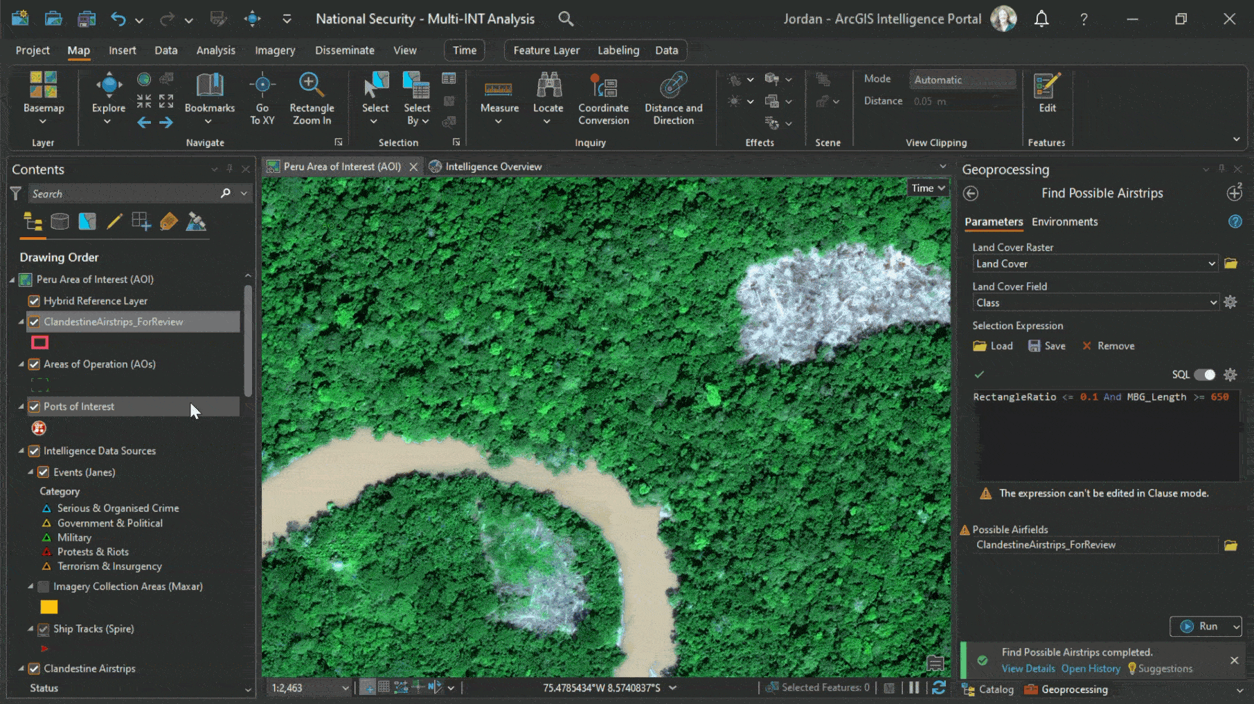
Drug traffickers will cut illegal airstrips into the Amazon rainforest to move processed cocaine out of Peru. Several of these airstrips have been previously found and destroyed roughly 35 miles north of the drug laboratory seizure; if traffickers have used this area in the past, it’s possible that they’ll use it again in the future.

Monitoring the rainforest for any new airstrips requires processing imagery quickly and at scale over a large area. We combined newer GeoAI tools with more traditional GIS tools to automate an imagery exploitation workflow. The Maxar satellite imagery collections gave us a high-resolution, bird’s eye view of the Amazon that we used as the foundation for discovering possible airstrips.

In the Deep Learning toolset of the Image Analyst toolbox, there’s a Classify Pixels Using Deep Learning tool which runs a trained deep learning model on an input raster to produce a classified raster.
Tip: If you don’t have access to either a pretrained model that detects for a specific object or to enough imagery to fine tune an existing model or fully train a new model, it may be possible to repurpose an existing pretrained model, particularly if the objects you want to detect have specific characteristics you can use to narrow down your base outputs. You can also look at using a general-purpose foundation model, like Text SAM, GroundingDINO, or Prompt Based Segmentation.
For our workflow, we started with the pretrained High Resolution Land Cover Classification – USA deep learning model, available through ArcGIS Living Atlas of the World. This model uses 8-bit, 3-band, high-resolution imagery as the input raster and creates an output raster of pixels classified into 9 land cover classes: water, wetlands, tree canopy, shrubland, low vegetation, barren, structures, impervious surfaces, and impervious roads.
Tip: When preparing for deep learning, you may find that your imagery doesn’t match the bit depth or the band count of the imagery that the model was trained for, which could mean less accurate outputs. To adjust the bit depth of your image, try the Copy Raster tool in the Data Management toolbox. To limit the number of bands in your image, try the Extract Bands or Subset Bands functions in the Raster Functions pane.

While none of these classes in and of themselves will specifically pick out clandestine airstrips from our imagery, the benefit of working with AI outputs in a GIS is that we can combine them with additional geoprocessing tools to refine the results.

The ModelBuilder tool consists of five common geoprocessing tasks linked together in a custom geoprocessing model. The first step for the model is to convert the GeoAI output raster to a polygon based on the land cover “Class” field. For drug traffickers to use land as an airstrip, they need to clear out the rainforest vegetation, so the second step selects all the features that were classified as “Low Vegetation” by the deep learning model. Once the low vegetation areas are selected (~1.5k polygons in total), the model creates a minimum bounding rectangle for each area and calculates the ratio between the rectangle’s width and the length. To narrow down areas that meet the requirements for an airstrip, the model selects all minimum bounding rectangles where the ratio is less than or equal to 0.1 (i.e. areas that are very long and skinny) and the longest side is at least 650m (i.e. areas that are long enough for a plane to take off or land) and exports them to a new feature class for an analyst to review and confirm the presence of an illegal airstrip.
Tip: You can create models based on completed, successful tool runs by adding them to ModelBuilder from your Geoprocessing History pane (right click + Add to Model). You can then use the Find and Replace functionality in the ModelBuilder Report to adjust or rename the parameters and tools if you want to generalize your model for reuse.
STEP 4: Movement Analysis
Peru is also fighting drug trafficking at several of its ports on the Amazon River and along its Pacific coast. Movement data, like Spire AIS ship tracks, could contain valuable insights about known or suspected bad actors in the maritime realm; real-time vessel data can be used to monitor sanctioned vessels and historical data can be summarized to expose common shipping routes in large amounts of data (the ship tracks feature class includes almost 1M features).

To take our analysis a step further, we turned to the AllSource Tools toolbox, which targets intelligence workflows and includes a toolset dedicated to processing movement data. The Find Frequented Locations tool from the Movement toolset pinpoints areas where movement tracks have loitered based on user-defined parameters. In the two-month span of vessel tracks, we found 50 locations outside of the Exclusive Economic Zone—neither at an anchorage nor at a dock, areas we would expect to register as frequented locations—where ships met our identified dwell parameters. Of those 50, five areas registered more than one dwell period, or more than one day where a vessel hung around in that area for more than 12 hours (our defined minimum length to qualify as a frequented location).

Tip: Naming your definition queries in the Layer Properties makes it easy and intuitive to switch back and forth between the full dataset and different query subsets in the layer’s contextual Data tab.
Comparing different movement tool outputs to the original, raw dataset illuminates patterns of life and highlights anomalies. It can help to pinpoint areas or objects that may need monitoring in the future.
STEP 5: Link Analysis
Some movement tools create outputs that include not only the features themselves, but also their relationships to each other. The Find Cotravelers tool, also found in the Movement toolset, extracts unique identifiers that are moving together in both time and space within the dataset. Vessels that are identified as traveling with each other create a network that we can visualize with native link charts in ArcGIS AllSource.
These link charts are map-based, and we used the original ship tracks dataset and the cotraveler tool output from our map to create two types of entities (nodes) and two types of relationships (links) in our link chart: Vessels, Countries, Traveled with (between vessel and vessel), and Flagged (between vessel and country).

Link analysis tools provide a better understanding of how data is connected within a network. Here we focused on Centrality metrics, which helped us pin down the most important or most influential nodes in our cotraveling link chart. Degree Centrality allows us to find the answer to the question “which nodes are the largest influencers” or “which nodes are connected to the most number of other nodes” while Betweenness Centrality answers “which nodes are the connecting nodes in the network.” Changing the type of centrality metric changes how importance is evaluated and provides multiple lenses for us to view the network through.

Illegal, unregulated, and unreported (IUU) fishing is a known problem off the coast of Peru in the Pacific Ocean, and IUU fleet vessels have been linked with drug trafficking activities in the past. The Find Cotravelers tool made spatial and temporal analysis of the ship tracks dataset possible, while link analysis centrality metrics allowed us to get a more thorough understanding of influence in the cotraveling vessels network.
STEP 6: Serve and Share
We started with disconnected data from Esri partners: open-source intelligence data from Janes, geospatial imagery from Maxar, and AIS signals data from Spire. We analyzed and connected that information with ArcGIS AllSource, creating actionable intelligence to support better, more informed decision-making. With our analysis complete, the final step is to serve out our insights to our organization, and the Disseminate tab makes that a smooth process by providing access to a variety of sharing options.

While this blog happened to be focused on datasets related to monitoring drug trafficking operations in Peru, the tools we explored—timelines, the combination of GeoAI and GIS tools, the movement toolset, and link analysis centrality metrics—are relevant to and can be applied to datasets across any industry.


Article Discussion: