Indexes are commonly used across government programs, epidemiology, and socioeconomic research to measure and compare complex phenomena such as economic distress, social inequality, or quality of life.
How does an index work? Indexes condense multiple variables into a single indicator. This simplification allows researchers to compare and analyze data systematically and help policymakers communicate complex information in a more accessible manner.
Suppose a policymaker or an analyst wants to identify the underlying causes contributing to economic distress in specific communities and target interventions in these communities. There is a wide array of economic factors to consider—but how to present all that data in a single map? They can achieve this by developing an index that integrates multiple economic factors and use this index as a diagnostic tool to identify the areas with the greatest economic disadvantage. By quantifying and ranking the level of distress across different areas, policymakers can prioritize interventions and target support where it is most needed.
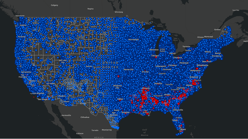
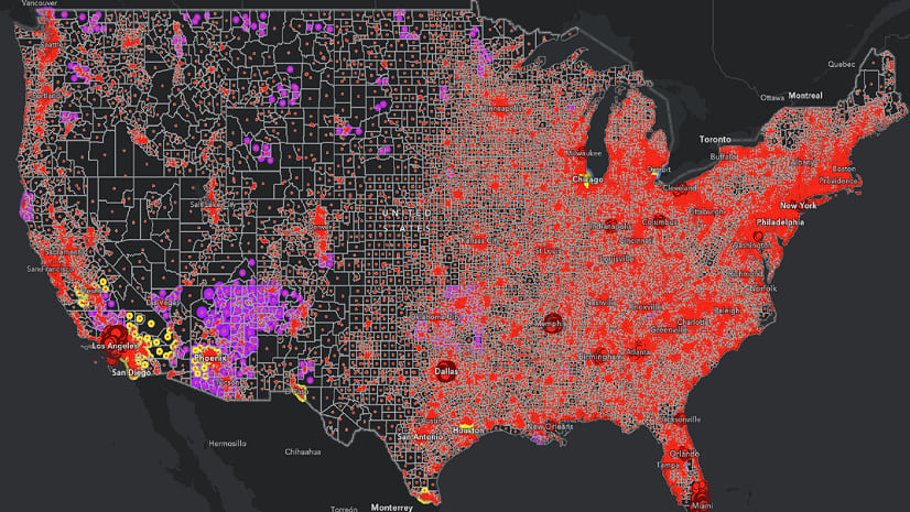
For example, using an economic distress index, the map presented below highlights the US census tracts that fall within the top 10 percentile, which exhibit higher levels of economic distress in comparison to the remaining 90 percent.

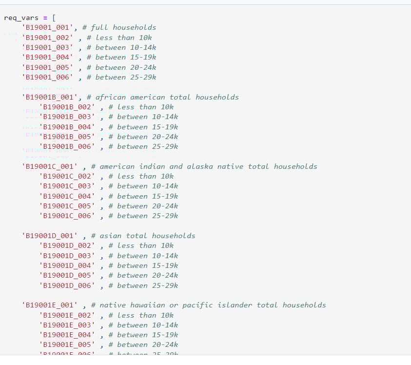
In this blog article, we will guide you through creating an economic distress index at the county level using data from the U.S. Census Bureau’s most recent American Community Survey (ACS) 5-Year Estimates (2017-2021). Based on the commonly used economic risk factors, the six components of our index include:
- Percent population with less than a high school degree for population 25 years and over
- Percent population living below poverty in the past 12 months
- Percent unemployed for the population 16 years and over
- Percent households with cash public assistance or food stamps/SNAP
- Percent households with Supplemental Security Income (SSI)
- Percent households with $30,000 or less income
To create the index, we will follow a five-step process:
- Retrieve Census data
- Calculate composite index components
- Calculate the economic distress index
- Add geometry to the data and create a feature layer
- Share your feature layer to ArcGIS Online for mapping
Use Python to streamline this workflow
Although it is possible to manually complete the above steps in ArcGIS Pro, the Python programming language allows you to automate these tasks more efficiently and with greater ease. If you have never used the ArcGIS API for Python before, read the getting started guide to see how you can leverage the Python API for GIS visualization and analysis, spatial data management, and GIS system administration.
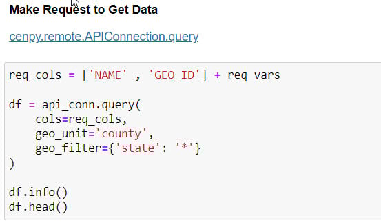
1.Retrieve Census data
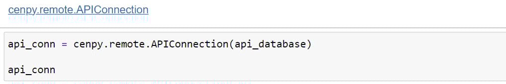
Our first step is retrieving the pertinent data from the U.S. Census Bureau. We use the cenpy Python library to access the Census API and retrieve data.

The APIConnection object is the way we interrogate and retrieve data from the U.S. Census Bureau.
Once we have access to the Census API, we are ready to get started with retrieving all the required data to use later for calculating our composite index.
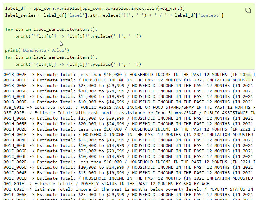
One of the nice things about the cenpy package is the ability to retrieve intelligible descriptions of the coded variables available. Here, we can retrieve the descriptions associated with the variables we are retrieving for reference.
2. Calculate composite index components
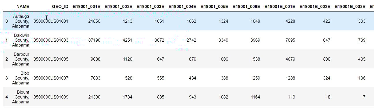
To calculate composite index components, we will first create a data frame that incorporates all the retrieved data at the county level.
Here are the first five rows of the resulting data frame:
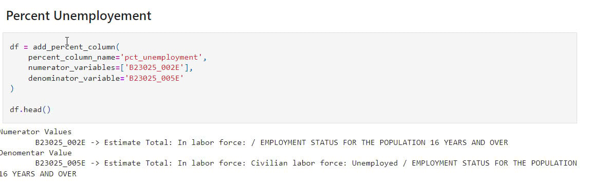
Now, we are ready to generate new variables for each index component that we want to incorporate into our economic distress index. Below, we present the calculation of the percent unemployed variable using the retrieved data. For information on the calculation of each index component, please refer to the accompanying Python notebook.
3. Calculate the economic distress index
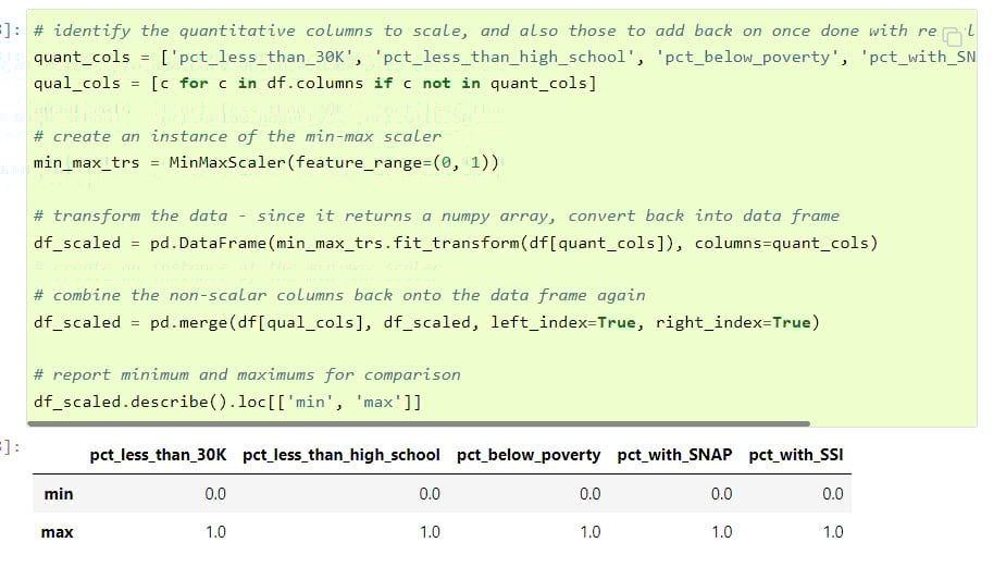
With the percentage columns added, now we can prepare the data and calculate our composite index.
First, we will ensure that the factors are equally scaled. In the percentage columns calculated earlier, the respective ranges vary. To calculate our composite index, we are going to need to rescale these columns. In this case, we are keeping it simple by using the MinMaxScaler from SciKit-Learn. Depending on the characteristics of the data you are using, there are a large variety of other ways to scale data.
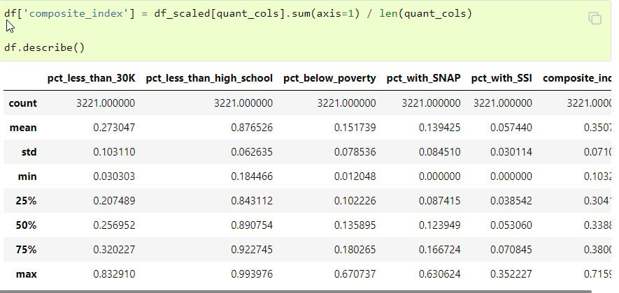
Now we can calculate the composite index by averaging the scaled and weighted percentage columns.
4. Make the data geographic by adding geometry
Now that we have created a data frame, the next step is to add geographic information to our data and convert it into a feature layer in order to view the data on a map. This can be easily accomplished by accessing the USA county boundaries from Esri’s feature layer collection and adding them to the data created above.
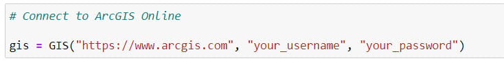
First, we connect to our ArcGIS profile and then access the County Boundaries item.
Items reference resources you can use through ArcGIS Online. In this case, we are taking advantage of an administrative boundaries dataset made available through ArcGIS Living Atlas.
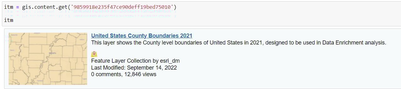
This item references the variety of feature layers we can use. In our case, we need Counties, the layer referenced by the 2 index.
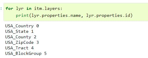
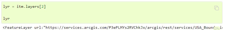
Using the correct index, we can retrieve Counties as a FeatureLayer:
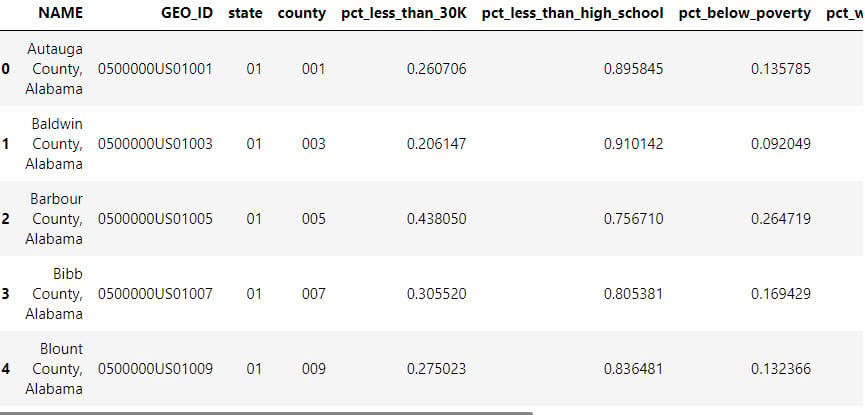
By performing a join, we can now combine our custom data with the percent columns and the composite index describing economic distress with the geometries retrieved above to create a new spatially enabled DataFrame.
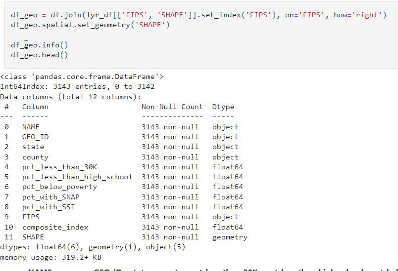
The resulting feature layer includes state and county information, as well as all six components comprising the index and the calculated composite index score. Below is a snapshot of the new spatially enabled DataFrame.
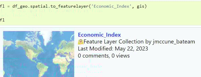
5. Share your feature layer to ArcGIS Online for mapping
To enable further exploration and sharing, we now can share this to our organization on ArcGIS Online, where we can take advantage of Smart Mapping, Instant Apps and ArcGIS Dashboards to share insights derived from this data.
You are now ready to publish the newly created feature layer to ArcGIS Online. Here is a code snippet that illustrates how to connect to your ArcGIS Online using your Python account and publish the layer:
Publishing the layer enables us to visualize it as a map and allows us to configure various visual settings such as symbology, labels, and other elements as desired. Additionally, it allows others to view and interact with the map.
If, however, you want to save the data locally to use with ArcGIS Pro for further analysis, you can also easily convert this spatially enabled data frame to a feature class using the to_featureclass method.
For a thorough understanding of the step-by-step process involved in this workflow, we invite you to explore our comprehensive Python notebook available at this link.
Once transformed into maps, indexes serve as valuable tools for analysts and policymakers, enabling them to identify at-risk areas. This, in turn, provides a foundation for policy formulation and informed decision-making. Governments and NGOs can use the economic distress index to identify areas that need attention, prioritize resource allocation, and contribute to the design of interventions that promote equitable and sustainable development.


Hi guys, thank you for the informative blog so, I have one question, what are the equivalent tools in ArcGIS Pro 3.1 for steps 2 and 3?
Hi Saadullah,
The equivalent tool for calculating an index in ArcGIS Pro 3.1 is using the Calculate Composite Index tool in the Spatial Statistics toolbox. Here is a blog article detailing how to use the tool: Explore the New Calculate Composite Index Tool in ArcGIS Pro 3.1
What is the best and safest way to load the cenpy module into ArcGIS (particularly version 2.9.x)?
Charles, you need a Python environment to work with. An instance of Conda, an application for creating and managing Python environments, is included when installing ArcGIS Pro. To install CenPy, you need to clone the default Conda environment named arcgispro-py3, and install CenPy into your newly created environment. This blog article, The All New Package & Environment Manager for ArcGIS Pro, does a good job of detailing the different aspects of Python environment creation and management in ArcGIS Pro. All you need to do to have CenPy available is create a new environment, activate your new environment, and add CenPy to this new environment. Please feel free to respond if you have difficulty with any of these steps.