Exciting Updates in ArcGIS Dashboards: June 2025 Release
Esri customers, prepare for an enhanced experience with the June 2025 update of ArcGIS Dashboards!
This update introduces a range of improvements, including new feature enhancements and bug fixes designed to optimize your data visualization capabilities.
Let’s explore the highlights of this update.
____________
Theme Improvements
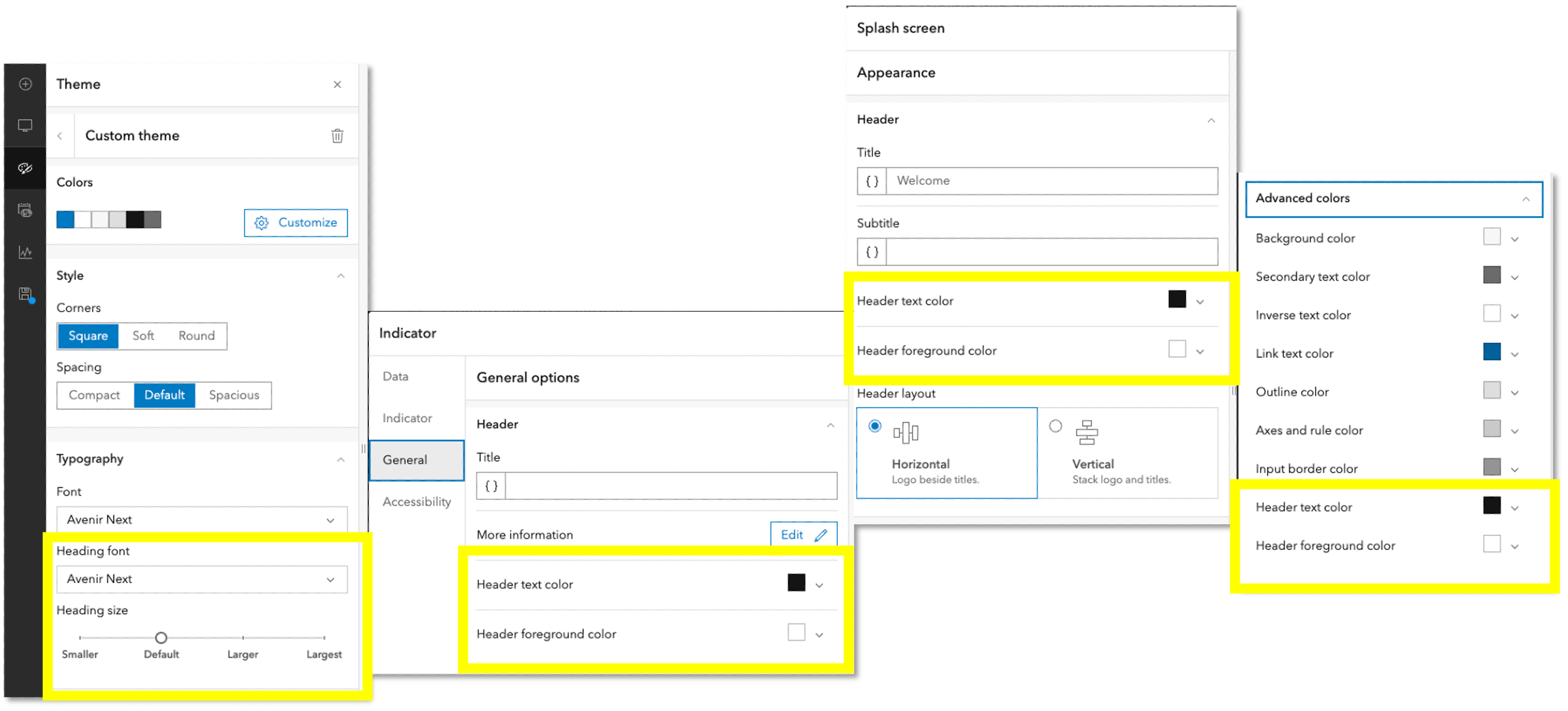
Header Styling
As a dashboard author, your goal is to create compelling, intuitive, and visually appealing dashboards. Headings play a crucial role in ensuring a clear understanding of data visualizations, and effective dashboard design allows this information to stand out from the main content.
With the June 2025 update, you can now customize the color, font, and text size of headers in the dashboard theme settings. By selecting complementary or contrasting colors, distinctive fonts, and larger text sizes, you can enhance clarity and consistency across all dashboard elements.
You can also customize the header text color and foreground color for individual dashboard areas or elements directly in the general settings. These new options are available for all headers, including the header panel, sidebar, data visualization elements, splash screen, and information windows.
____________
Support For New Temporal Field Types
ArcGIS Dashboards has received a significant upgrade in its handling of time, making your data storytelling more precise, intuitive, and globally aware.
We are thrilled to introduce native support for three new field types:
- Date-only (e.g., 2025-06-06): Ideal for calendar-based tracking without the distraction of time-of-day details.
- Time-only (e.g., 14:30:00): Useful for analyzing time-of-day trends across different dates.
- Timestamp with offset (e.g., 2025-06-06T14:30:00-04:00): Enables precise, time zone-aware event tracking.
The new Temporal Field Types can be effectively utilized across various industries to enhance data analysis and reporting. Here are a few key examples:
- Public Safety: Track incident reports by date, regardless of time.
- Utilities: Monitor equipment usage by time of day.
- Transportation: Analyze delivery times across time zones.
- Healthcare: Visualize patient admissions by date.
- Retail: Compare daily sales trends without time clutter.
____________
Final Thoughts and Recommendations
We encourage you to explore these updates and consider how they can be seamlessly incorporated into your existing and new dashboards. Embrace the potential of these tools to not only improve your current workflows but also to inspire innovative approaches to data visualization.
The journey towards more effective dashboards begins now—dive in and discover how these enhancements can transform your dashboarding experience!

Article Discussion: