Past work has shown the more accessible an urban area, the more walking and public transit use is promoted, whilst car journeys and traffic speeds are reduced. What makes an area accessible and how do we determine if an area is indeed accessible? One factor we can consider is intersection density which has shown to be a valuable measure in determining such accessibility (Ewing and Cervero, 2010) and correlates strongly with encouraging people to get out of their cars and cycle, walk, or take public transportation to work. All this suggests that good land planning and urban design could help reduce car use and, therefore, any related social and environmental costs. GIS analysis has a key role to play in shaping our towns and cities and our future environments. This blog entry shows how I used geoprocessing and spatial analysis in ArcGIS to gain an understanding of spatial patterns of urban accessibility using the USA road network as a case study.
The current statistics on commuting to work in the USA show a picture of car dependency with 86% of workers traveling by car (and only 10% carpooling), 5% using public transportation and only 3.5% either cycling or walking to work (ACS 2009). These figures, however, do not show spatial variations across the country which is important for local planning. Within the country there are some very interesting differences in commuting patterns.
The American Community Survey 2009 report (McKenzie and Rapino 2011, McKenzie 2010) shows the percentage of workers who commuted by public transport in 2009 at metropolitan and micropolitan statistical areas (metro and micro areas). These are areas used for data collection and publication by Federal statistical agencies. At this scale, public transit use is as high as 30% in the New York-Northern New Jersey-Long Island metro area to as low as 2% in the Louisville/Jefferson County metro area. But how does this compare to the accessibility of these areas?
The first step in performing this analysis involves collating appropriate data. I needed to find out the number and density of road intersections in metro and micro-metro areas, so I needed a street dataset and a feature class of Core Based Statistical Areas CBSA, http://www.census.gov/population/metro/). CBSAs are comprised of both metro areas that contain a core urban area of 50,000 or more population, and micro areas that contain an urban core of at least 10,000 (but less than 50,000) population. Each metro or micro area includes at least the county that contains the core urban area plus any adjacent counties that have a high degree of social and economic integration (as measured by commuting to work) with the urban core.
To calculate the number of intersections, in each metropolitan area, I developed a custom geoprocessing script tool named Create Junction Connectivity Features which you can download from the Model and Script tool gallery. This Python script tool counts the number of lines connected to each vertex in a line feature class. The only input to the tool is a line feature class (Figure 1).
 Figure 1. Create Junction and Connectivity Features tool
For each vertex in the dataset, the count of intersecting lines is attributed and an output point feature class generated (Figure 2). Checking “Ignore junctions with only two connecting lines” means that only junctions with three or more connecting streets (intersections) are output, as used in this analysis.
In order to restrict the analysis to metro and micro areas I used the Intersect tool with the road feature class and the metro and micro areas. This output of Intersect is only those roads that are within CBSA which linear feature class provides the input for the Junction Count tool. A Spatial Join can be used to find intersections by CBSA and then using Dissolve I calculated the total number of intersections by CBSA. Finally, to calculate the intersection density by area, I used the Add Field tool and then calculated density as (intersection count/CBSA area)*100. All these steps can easily be automated using ModelBuilder (figure 3) . Note that custom tools, such as the Create Junction Connectivity Features tool, can be used in models.
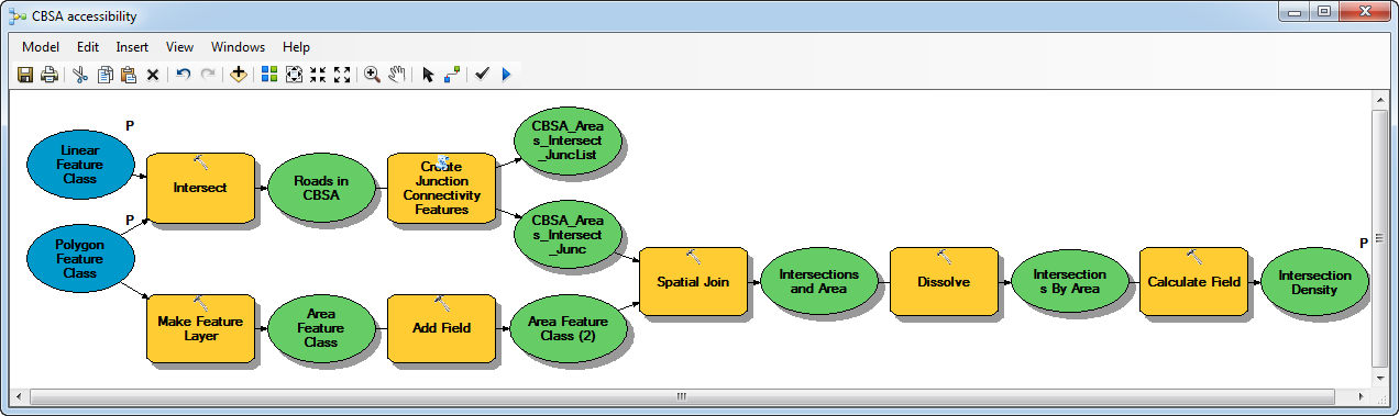 Figure 2: CBSA accessibility model
Analyzing the Results

Figure 3. Road intersection density for the USA at CBSA level
If we look at the results of this case study, we can see some interesting patterns emerge. As would be expected from conurbations such as New York and Washington DC, transport usage is high (30.5% and 14.1% respectively) and intersection density is high (1.14 and 0.53). However, if we plot the results on a graph we see the analysis throws up some interesting anomalies which are worth further consideration.

Figure 4: Intersection density and percentage of commuters using public transportation
This graph, created in EXCEL, allowed me to plot the data together using two Y-axis; one for intersection density and one for the percentage of commuters using public transportation. This method allowed me to graph the two related variables together, although they use very different measures. In this example, we can easily see where the two measures show a different pattern. The graph bars were colored using the same RGB colors as the choropleth map for ease of comparison.
By calculating the percentage difference (a unit-less measure), we can statistically compare the difference between the intersection density and transportation usage. Although the actual values are very different we expect the differences between the two to show a similar relationship for all metro areas. Plotting these, together with the mean, in ArcGIS allows us to clearly see the pattern. We can see any selections made on the graph reflected in our map (Figure 5).

Figure 5.Intersection density and transportation usage percentage difference.
We would expect areas with a high intersection density to show high public transportation usage. Using one standard deviation from the mean (calculated using the Statistics dialog box on our attribute table) we can see which areas do not follow this pattern.

From this analysis, we can pick out eight metro areas that significantly differ from what we would expect.
- Riverside-San Bernardino-Ontario (CA), Portland-Vancouver-Hillsboro (OR-WA) and Salt Lake City (UT) all report higher public transportation usage than their intersection density would suggest, although, in all three cases intersection density is relatively low.
- Conversely, Tampa-St. Petersburg-Clearwater (FL), Detroit-Warren-Livonia (MI), Raleigh-Cary (NC), Oklahoma City (OK), and Dallas-Fort Worth-Arlington (TX) show low public transportation usage in contrast to their intersection density
- In the cases of Detroit-Warren-Livonia (MI) and Dallas-Fort Worth-Arlington (TX) their intersection densities are high (0.59 and 0.56 respectively).
- Oklahoma City (OK) has a low intersection density but, very low estimated transportation usage with the percentage difference being more than 2 standard deviations from the mean.
This analysis suggests that there is some relationship between intersection density and public transportation usage in the US with the percentage difference between these two variables normally falling within one standard deviation of the mean. Clearly, a good transit infrastructure is needed to allow people to stop using their cars but there must be easy access to mass transit at both ends of the journey. Large conurbation areas with high traffic volumes will encourage transit use but if the journey time to the transit station takes too long, the benefit to time saving rapidly diminishes.
Intersection density, it of course, just one factor we can analyze and as with most single variable analysis the results will more than likely throw up anomalies to the general pattern. This is what makes analysis fascinating because although we can model general patterns and processes we also like to explain where we find differences to our expectation. Clearly, there are other factors in the urban morphology and infrastructure that mediate people’s behavior and in this case, we might improve the analysis by removing no through roads, traffic flow and speed could also be incorporated, perhaps even temporally, to better take into account the reality of varying daily and hourly traffic flow. Finally, we could include social environmental factors such as safety, aesthetics, socio-economic status etc. These extensions will invariably improve the model and the custom Create Junction Connectivity Features tool gives you a new way of easily incorporating one aspect into your own analyses.
References
American Community Survey, 2009, US Census Bureau, www.census.gov/acs/
Ewing R, Cervero R, 2010, Travel and the Built Environment, Journal of the American Planning Association, Volume 76, Issue 3
McKenzie B, 2010, Public transportation Usage Among U.S. Workers: 2008 an 2009, American Community Survey Reports, http://www.census.gov/prod/2010pubs/acsbr09-5.pdf
McKenzie B, Rapino M, 2011, Commuting in the United States: 2009, American Community Survey Reports, http://www.census.gov/prod/2011pubs/acs-15.pdf

Commenting is not enabled for this article.