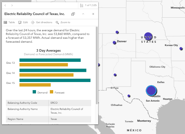
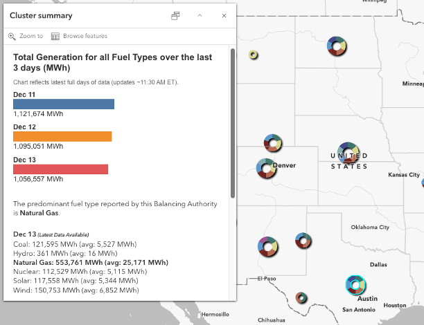
New feature layers that contain near-real time electricity data from the U.S. Energy Information Administration (EIA) are now available in ArcGIS Living Atlas of the World. These layers provide timely electricity data from EIA’s Hourly Electric Grid Monitor dashboard.
What data is available?
Data driving these datasets are collected by EIA from the electricity balancing authorities that operate the energy grid across the country and accessed via EIA’s Open Data API.
Energy Demand and Demand Forecast
The first layer, Electricity Demand and Forecasted Demand, contains demand values (the amount of electricity load within a balancing authority’s system) and the forecasted demand values (predicted demand value). This data is updated hourly, populating values reported from the previous hour.

Net Generation by Fuel Type
The second layer, Hourly Net Generation by Fuel Type, contains values that represent the output of electric generation units in a balancing authority’s system. This data updates once daily with the hourly breakdown of electricity generation by reported fuel sources (ex. Natural gas or coal) for the previous day.

Both topics are now available as hosted feature layers with multiple weeks of hourly data. The data are represented as points, indicating the central location of the balancing authority territories.
To make data exploration easier, two additional view layers provide subsets of the data in different time windows. Users can access the latest 3 hours of demand and forecasted demand data as well as the last 3 days of generation data.
Why this matters?
Access to several weeks of hourly energy data can unlock powerful insights. It allows users to observe daily and weekly patterns, identify peak demand periods, and understand how generation varies by fuel type depending on region across the country. Visualizing this data spatially supports forecasting and grid reliability planning.
Potential Use Cases
These datasets can be integrated into operational dashboards, used for short-term trend analysis, and combined with other spatial datasets to improve situational awareness.
Get started with these layers and maps below:
- Electricity Demand and Forecasted Demand
- Electricity Demand and Forecasted Demand – Last 3 Hours
- Hourly Net Generation by Fuel Type
- Hourly Net Generation by Fuel Type – Last 3 Days
- What is the highest electricity demand reported in the last 3 days?
- What is the predominant fuel type reported for net generation over the last 3 days?

Article Discussion: