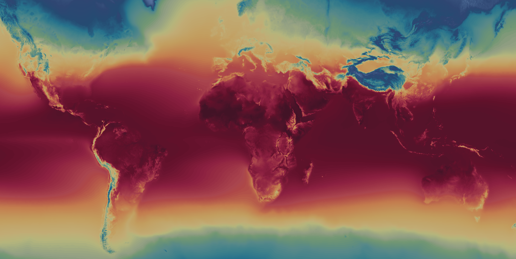
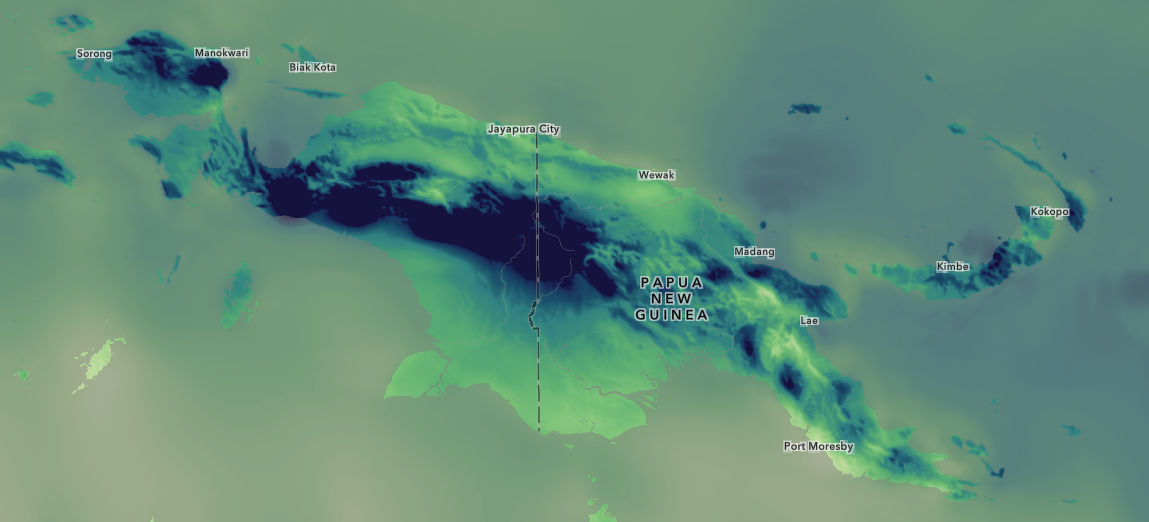
A new and improved collection of global bioclimate projection layers is now available in the Living Atlas! The new CHELSA Bioclimate Projections collection will replace the WorldClim bioclimate projection layers in the Living Atlas, providing enhanced accuracy and resolution for all your long-term climate applications in agriculture, forestry, and more.

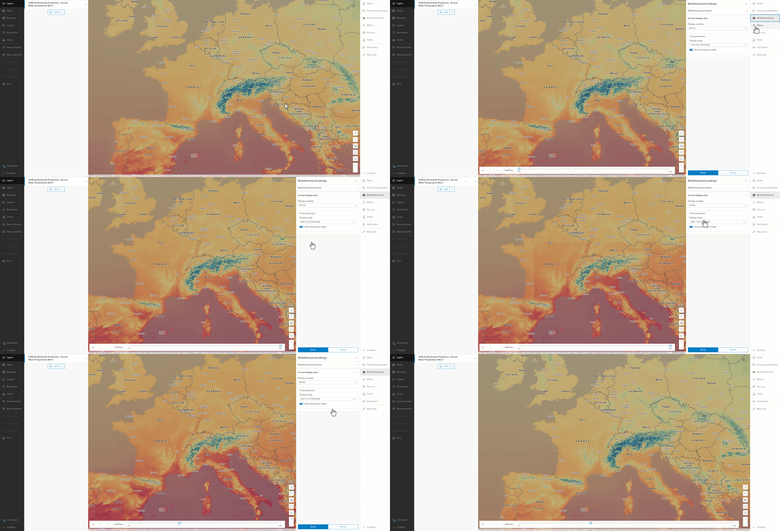
The CHELSA collection contains 19 temperature and precipitation layers derived from state-of-the-art climate models. The layers include projections until the end of the century following several greenhouse gas scenarios (SSPs). The video below shows how to visualize this multidimensional information in ArcGIS Online and Map Viewer. The high resolution (~1 km) is essential for your analyses and resilience-planning in regions with small spatial features, such as mountain ranges, coasts, and forests. Access to the newest and highest quality bioclimate projections is crucial for conservationists, suitability modelers, and others like you as climate change continues to impact Earth’s ecosystems and biodiversity. Make sure to check out the CHELSA item descriptions if you are into the nitty-gritty nerdy details.
The CHELSA collection is optimized for bioclimate applications in the natural world, such as for agriculture and ecosystems, and may not be as suitable for applications in urban or engineering settings. Use this data collection conscientiously, it is derived from climate model output which inherently has spatial and temporal biases.

The Science of Where
Load the CHELSA bioclimate projections in ArcGIS Pro to analyze spatial and temporal trends and patterns. Analyze the data on a global scale or use the Pairwise Clip tool to focus on your desired country or region. Or use CHELSA to model how species distributions evolve throughout the rest of the century as a result of climate change. Use the Download Species Occurrence Points tool to import observations of any species from the Global Biodiversity Information Facility (GBIF) and use the Sample tool to gather CHELSA temperature and precipitation information at these locations.
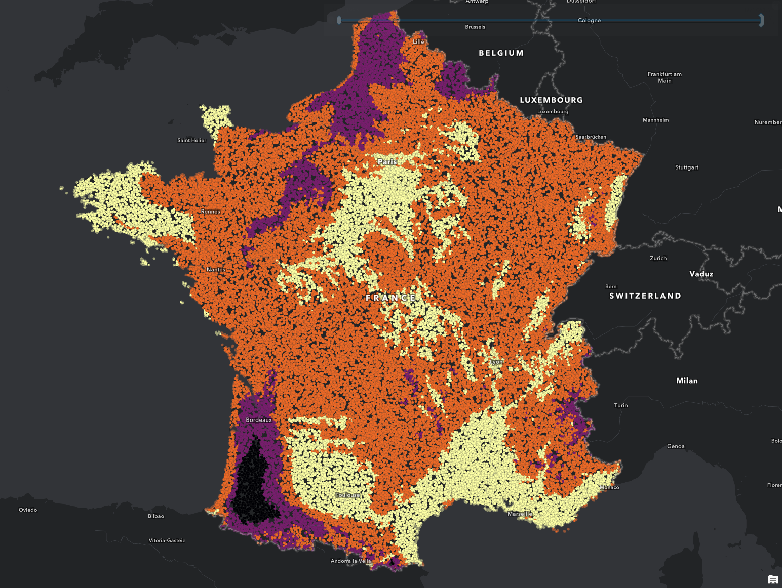
For example, you can model how the habitat range of European honey bees (Apis mellifera) could change due to climate change. The image below shows the modeled probability of honey bees being found in France for the end of the century under a high-emission scenario. Yellow colors indicate a probability of >75% that honey bees will be present. Black colors indicate a <25% chance of presence. These estimates are modeled using the Presence-only Prediction (MaxEnt) tool, a sophisticated machine learning model readily available in ArcGIS Pro.
Explore the CHELSA data today and boost your climate analysis! Let’s work together towards a more sustainable and resilient future.

Out with WorldClim, in with CHELSA
Note that the collection of WorldClim bioclimate projections is in mature support as of now. The CHELSA collection will replace each bioclimate projection one-to-one as follows:
WorldClim (old) CHELSA (new)
Please update your maps and apps accordingly. The WorldClim collection will be retired in December 2026.

More Information
Join the Esri Community of experts and get inspired by others or get answers to your questions.

The Download Species Occurrence Points tool is deprecated.
Thank you for flagging this! The tool has been updated.