Esri’s World Transit layers in ArcGIS Living Atlas transform raw GTFS into ready-to-use, freely available feature services for stops and routes, removing the need to download, extract, or preprocess transit data yourself. When paired with demographic, business, and administrative datasets in ArcGIS Online, ArcGIS Business Analyst, and ArcGIS Pro, these layers form a powerful foundation for smarter planning, more equitable access, and sustainable development. This article reviews ten impactful ways you can put transit data to work.
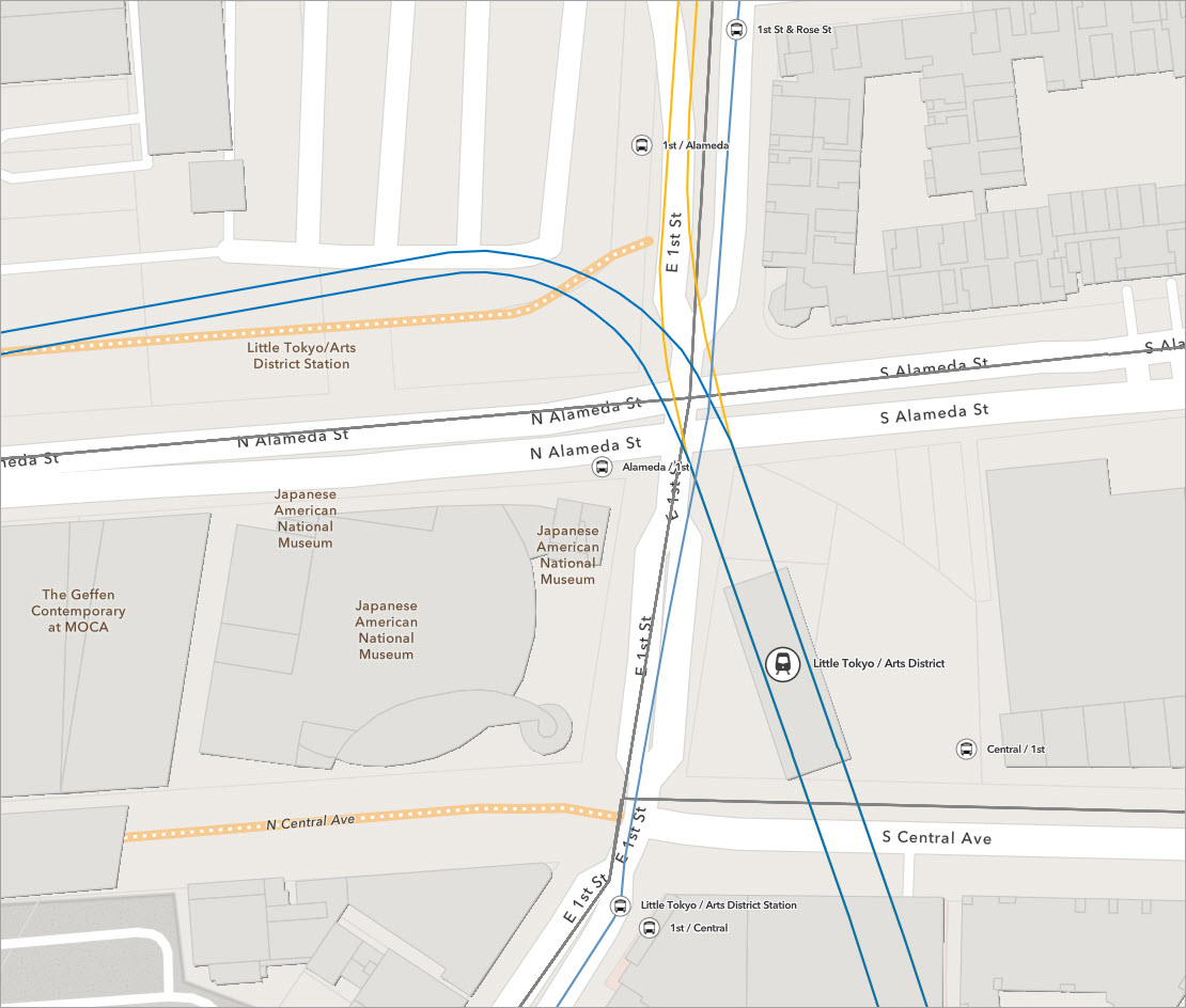
1. Bring global transit data straight into your maps
Start by finding and using the transit layers themselves: World Transit Stops and related layers (including transit routes) in ArcGIS Living Atlas. Esri converts contributed GTFS feeds into hosted feature services, so you can just search, add, and go.
What you can do
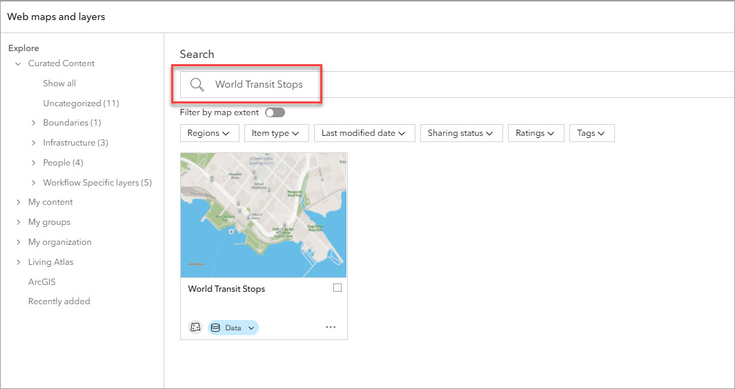
- In ArcGIS Online or ArcGIS Business Analyst Web App, use the Add web maps and layers workflow to search Living Atlas for “World Transit Stops” and add it to your map.
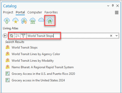
- In ArcGIS Pro, use the Catalog pane > Portal tab > Living Atlas tab to bring in the same layers to a Pro project.
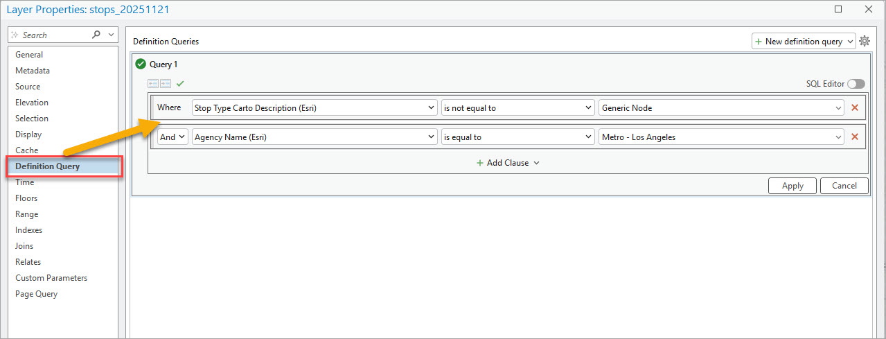
- Optionally, in ArcGIS Pro you can filter by operator, city, or region so you’re only working with transit in your study area (e.g., esri_contributor = ‘LA Metro’).
Why it matters
This is the on-ramp: you can start using transit data without downloading GTFS, unzipping files, or running conversion scripts.
2. Tell the story with infographics, dashboards, and stories
Turn your analysis into clear communication tools that non-GIS audiences can understand.
What you can do
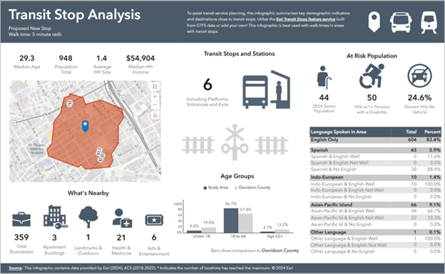
- In BA Web App, build infographics showing:
-
- Number of stops and lines, and in an area of interest.
- Demographic information for areas within X minutes of transit such as total population, percent of households without vehicles, and spoken languages.
- Design custom infographic templates that pull in:
-
- Transit counts.
- Nearby businesses and other points of interest Demographic breakdowns.
- Use ArcGIS Dashboards or ArcGIS StoryMaps to show before/after scenarios, proposed changes, and impacts.
Why it matters
Decision-makers, community members, and boards don’t want GTFS tables—they want a clear picture. Infographics and dashboards make transit data actionable and persuasive.
Resources
- Learn about infographics in ArcGIS Business Analyst (blog article)
- Create custom infographics in ArcGIS Business Analyst (tutorial)
- Share your results from Business Analyst Web App in ArcGIS Dashboards (video)
3. Build a transit accessibility index
Turn raw stops and routes into a simple Transit Accessibility Index that scores how easy it is to reach transit in each neighborhood.
What you can do
- Use Network Analyst in ArcGIS Pro to create walk-time service areas (e.g. 5–10 minute walk) around each transit stop.
- For each polygon / hexagon / block group, calculate:
-
- Distance to nearest stop.
- Number of stops within X minutes.
- Optional: service frequency if available.
- Normalize those components and combine into an index (e.g. 0–100 scale).
- Map the index as a choropleth, or use it in ArcGIS Pro, BA Web App, or ArcGIS Online for deeper analysis.
Why it matters
A transit accessibility index enables qualitative, comparative assessment. Instead of saying “there are 12 stops,” you can say “this neighborhood has excellent transit access while this one is underserved,” which stakeholders can understand. Transit agencies can use this information to plan additional routes, change or extend existing routes, or add new stops. Economic development can promote leasable land/building space by highlighting ease of access to public transportation.
Resources
Software and data requirements
- Network Analyst extension (software).
- Street network feature dataset (data).
4. Use transit data in Business Analyst suitability analysis
Treat transit accessibility as a suitability factor when choosing locations for offices, retail, clinics, schools, etc.
What you can do
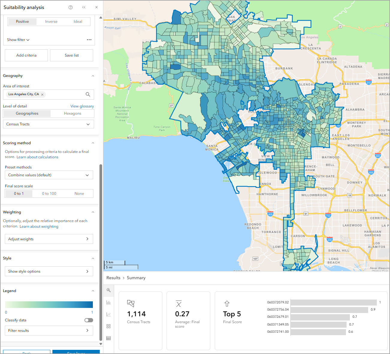
- In BA Web App, include transit access variables in a suitability analysis:
-
- Distance to nearest transit stop.
- Number of stops or lines within X minutes.
- Transit Accessibility Index score.
- Combine transit with other factors like demographics, competition, or income.
- Rank candidate locations or trade areas using weighted criteria.
Why it matters
You can say “employees and customers can realistically reach this site using public transportation, which is one of the reasons why we selected this location.”
Resources
- Perform a suitability analysis in ArcGIS Pro
- Perform a suitability analysis in ArcGIS Online Business Analyst Web App
5. Map transit coverage and see where service is missing
Use stops and routes to create an at-a-glance view of where transit service exists—and where it doesn’t.
What you can do
- Overlay World Transit Stops with:
-
- Census / ACS layers (e.g., population, no-car households).
- H3 hexagons or other tessellations you generate in ArcGIS Pro (Generate Tessellation).
- Aggregate counts of stops, trips, or headways per hexagon / block group.
- Symbolize by: “stops per sq km” or “stops per 1,000 residents.”
Why it matters
This is the basic “where do we have transit, and who lives there?” view that drives everything from network planning to equity analysis.
6. Support at-risk populations
Use transit data to ensure that changes to service don’t disproportionately harm low-income or minority communities and that at-risk groups can reach essential services.
What you can do
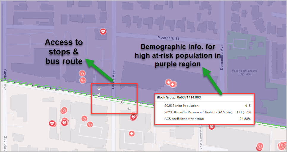
- Overlay transit stops/routes with:
-
- Minority and low-income population indicators (for Title VI style analysis).
- Age (elderly populations), disability, and health-care access variables.
- Identify hospitals, clinics, and pharmacies that are hard to reach by transit.
- Use masking or spatial queries to highlight areas that need transit but don’t have adequate coverage (similar to Esri’s “Assess Access to Public Transit” recipe).
Why it matters
This connects public transportation data directly to questions of fairness, social justice, and access to essential services.
Resources
7. Optimize transit network planning and identify new routes
Use transit layers plus demographic data to understand where service is needed, where gaps exist, and where new routes or stops would have the biggest impact.
What you can do
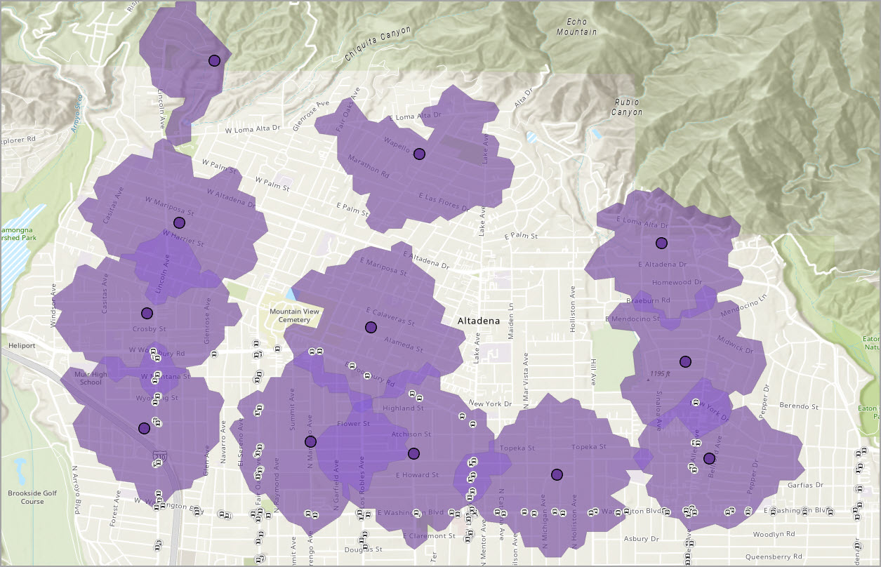
- Overlay bus/rail stops with:
-
- Population, poverty, car ownership, age, disability, etc. (ACS / other Living Atlas layers).
- Use Service Area analysis in ArcGIS Pro to see who lives within X minutes of transit and who does not.
- Highlight “high-need but low-service” areas (e.g., many zero-car households but few stops).
- Use this as a basis for sketching possible new routes or stop locations.
Why it matters
This type of analysis helps planners answer: “If we can only improve service in three places, where will it make the biggest difference?”
Software and data requirements
- Network Analyst extension (software).
- Street network feature dataset (data).
8. Analyze walkability and event access
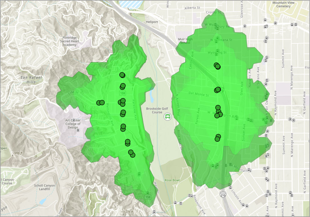
Combine transit stops with walk-time analysis to understand how people will actually get to big events or key venues.
What you can do
- Create a layer of event venues (SafeGraph POIs, custom points, etc.).
- Use World Transit Stops + Network Analyst to:
-
- Compute 5–10 minute walk-time polygons around each stop.
- Identify which venues fall inside those polygons.
- Spot venues that rely heavily on private cars (no transit within walking distance).
- Support decisions like shuttle routes, temporary service boosts, or crowd management plans.
Why it matters
Cities can plan for Olympics, concerts, or game days with data instead of guesswork, and show how transit supports crowd movement.
Software and data requirements
- Network Analyst extension (software).
- Street network feature dataset (data).
9. Integrate transit into climate and sustainability planning
Use transit data to support mode shifts (car → transit), emissions reduction, and climate adaptation strategies.
What you can do
- Overlay transit coverage and accessibility index with:
-
- Commuter patterns (where people live vs. where they work).
- Emissions or traffic congestion hot-spots.
- Identify corridors where improving transit could significantly reduce car trips.
- Use scenario maps to compare:
-
- “Current transit” versus “Expanded transit” in terms of number of people reachable within a 30–45 minute transit commute.
Why it matters
Connect transit directly to climate goals: reduced vehicle miles traveled (VMT), cleaner air, and more sustainable urban form.
10. Strengthen advertising site selection
Use Esri’s transit data to target and strengthen advertising site selection.
What you can do
- Leverage stops information to understand frequency of visits on a weekly basis to a given stop along a route.
- Understand the number of routes passing through transit corridors.
- Estimate the capacity of ridership for different modes of transportation using route mode type (e.g. buses have a capacity to carry 50 riders on a bus route).
- Use demographic data to understand target markets and the transit available in those regions to advertise on specific bus and rail routes.
Why it matters
Transit information can support marketing and advertising agencies to improve the number of individuals experiencing an advertisement and target specific groups using public transportation in target markets.
Data to get started
- Business Analyst Web App demographic and socio-economic data.
- Demographic data for Business Analyst in ArcGIS Pro.
(Optional Bonus) Contribute your own GTFS to Living Atlas
If you want one extra “bonus” idea:
Close the loop by contributing your agency’s GTFS data through the Esri Community Maps program so it becomes part of the global World Transit layers.
What you can do
- Package your GTFS files into a ZIP file.
- Submit through the Community Maps Contributor app.
- Let Esri handle conversion into World Transit Stops/Routes layers.
Why it matters
The more agencies contribute, the better the global transit picture becomes for everyone.
Conclusion
The Esri world transit stops and routes layers offer valuable information for organizations to better view and share public transportation infrastructure, plan and improve access to transit, support site selection for community and economic development, and improve emergency management and climate resiliency. Esri’s transit data provides valuable insight when paired with existing data from ArcGIS Living Atlas and data curated from your organization.
If you are interested in exploring the expansive world transit dataset, Esri has developed a World Transit View Instant Application to view the public transportation data available in ArcGIS Living Atlas.


Article Discussion: