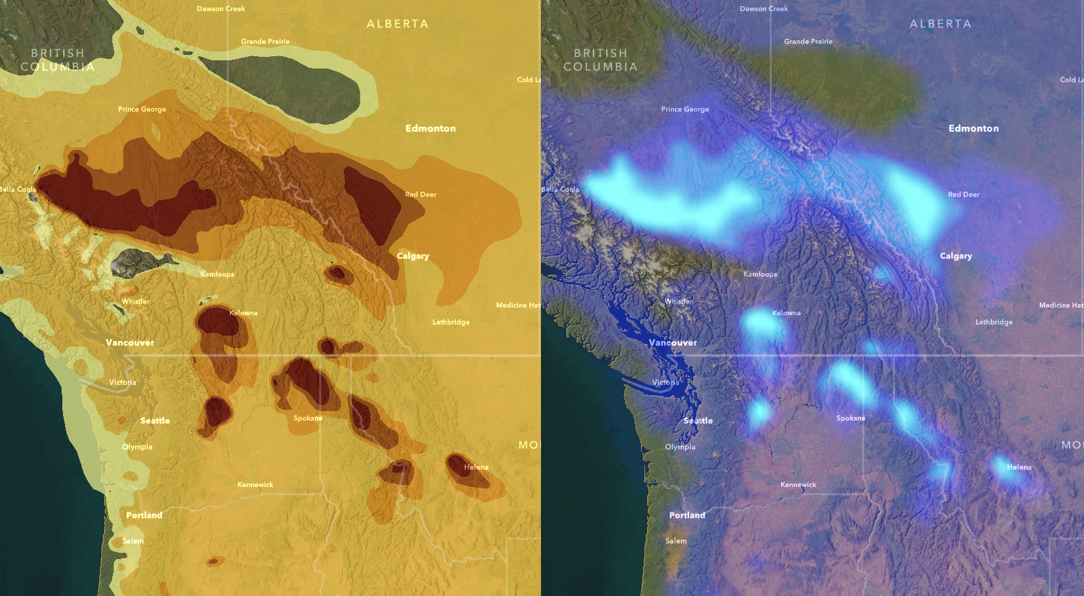
The vector data format is unbelievably useful, but one artifact of the format is discrete boundaries. Vector has to draw a line somewhere, but the visual result can imply more certainty or discrete solidity than is really going on, in this case smoke concentration in the air. How can we benefit from the utility of discrete vector polygons but visualize them more as the continuous wispy phenomenon that they really are? Here’s how to get the best of both worlds, using effects in the ArcGIS Online Map Viewer.

Here we go, let’s brew some uncertainty!
0:00 Alluring before-after introduction.
0:11 Pulling in the trusty ol Imagery Basemap Ready for Data from Living Atlas.
0:29 Adding the amazing Smoke Forecast live feed, fed from National Weather Service predictions.
0:43 The discrete nature of vector data vs the wispy nature of a continuous phenomenon (smoke).
1:12 Changing the colors to suit a dark basemap (and cheating by using the invert effect!).
1:32 Blur!! Blur is such a powerful visualization tool for cartography. We’ll use it to introduce uncertainty and softness to the smoke boundaries.
2:06 Adding data labels to regain a bit of what we lost with the blurring.
2:55 Another eggsample of how to end an instructional video.
Well there you go! That’s one way to tackle the issue of visualizing a continuous phenomenon that happens to be delivered to you via a vector data model. Best of both worlds. Now go forth and visualize uncertainty and blurred borders while benefitting from the speed and utility of discrete polygons!
Uncertainly, John

Hi John – I really like this visualization and your success at showing smoke looking smoky. And sort of spooky. However, it is important to note that the data you are visualizing is a model forecast, not actual smoke detected by satellite. All models have uncertainty and the use of them is improved if the model uncertainty (e.g. +/- 5 km (spatial) and/or +/- 10 µg/m3 (concentration)) is visualized along with the forecasted values. A more appropriate dataset to apply your smoky visualization would be the NOAA HMS Smoke Detection (https://services2.arcgis.com/C8EMgrsFcRFL6LrL/arcgis/rest/services/NOAA_Satellite_Smoke_Detection_(v1)/FeatureServer), which is a vector representation of smoke identified visually from true color satellite images.