Did you ever wake up with a start from a fitful sleep and say to yourself in a moment of nocturnal lucidity, “instead of using a color gradient for making thematic maps, what if I painted it in with an imagery gradient?” I’m sure you have, because we all have the intro segment of Bob Ross’ Joy of Painting burned into our collective conscious. It was just a matter of time, really.
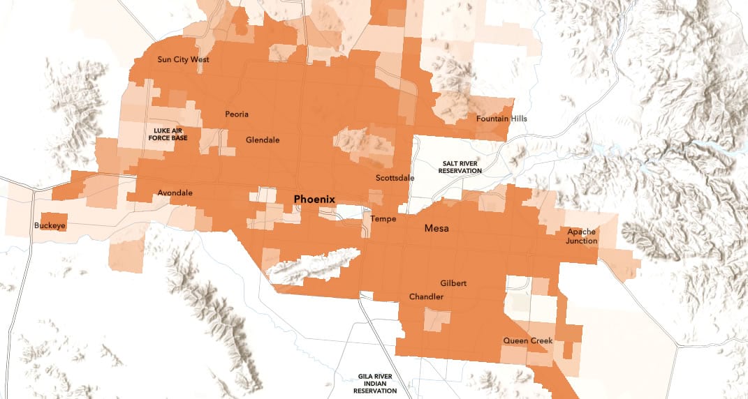
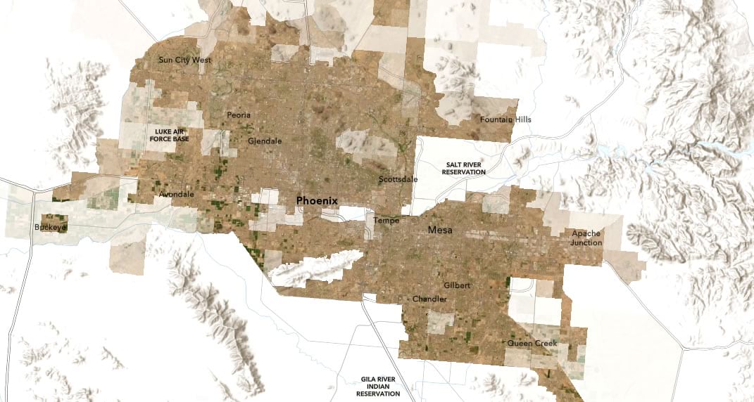
Thank you for coming back to this blog post after watching that full episode of The Joy of Painting. Time to pop on our x-ray glasses and start scratching in data-driven amounts of imagery atop a map. Sound confusing? We’re going to be turning this…

…into this…

…via this short video:
0:00 Bizarrely upbeat into.
0:09 Adding a U.S. census tract population density feature layer from Living Atlas.
1:00 Just making all the tracts the same color….
1:22 “Transparency by attribute” is what we’re really after! So high-population areas are more opaque, low-population areas are more transparent.
2:11 Adding the World Imagery map tiles as a layer.
2:42 Quick map inventory: imagery, population-opacity tract polygons, and a basemap.
2:56 Create a new group and add the two layers (imagery and tracts) to it. This ensures that the next step is only applied to these layers and not the basemap.
3:11 Give the tract layer a “destination atop” blend mode, which is like a cookie-cutter, but it honors the transparency.
3:30 The big reveal.
If you’d like to see the resulting map, check it out here.
And that’s where we can end it. Unless, of course, you are feeling dangerous.
…
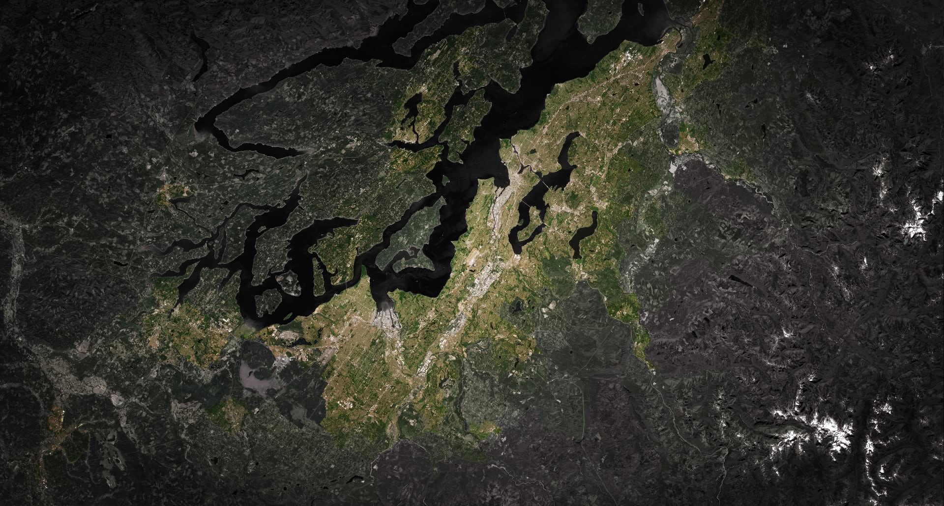
This x-ray vision into imagery is fun…but what if we do a weird thing where we make the basemap black and white imagery? The result is a grayscale world where higher population density brings more color to the imagery. Like this…

Here’s how:
0:00 Unnecessary re-cap.
0:22 Playing around with other basemaps.
0:39 What about an imagery basemap? Oh right, now we can’t really see the data-driven imagery layer anymore because they all blend together. Wait a second what if we…
0:50 …give the map a black background color…
1:00 …and apply a “luminosity” blend mode to the imagery basemap so it becomes grayscale.
1:07 Now we’re painting with saturation!
And that is how you can make an x-ray vision sort of map that uses color saturation to represent data. You can play with the map made above, here. Try it out on all sorts of feature layers and basemaps. It’s a blast. It also works in ArcGIS Pro if that’s where you are doing your diabolical experimentation.
Happy saturating!
Love,
John

Article Discussion: