Click here to launch Esri’s Drought Aware application
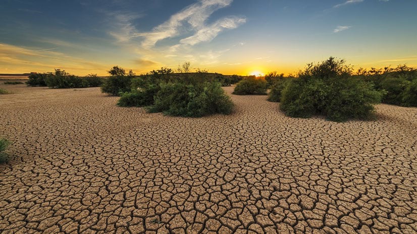
The progression and intensification of drought across the U.S. has been one of the top news stories this year. Multi-year deficits in precipitation and extreme temperatures are causing widespread forest fires, record-low water levels in Lake Mead and the Colorado River, and water restrictions in many communities across the Western U.S.
Leveraging data and information made available to the GIS community from NOAA, US Dept. of Agriculture, and the US Census Bureau, Esri has released an update to its long-lived Drought Tracker application: Drought Aware.

Like the other apps in the Aware series, Drought Aware examines the phenomenon from multiple angles: What are the drought conditions now, in the past, and in the future? Who will be affected? What kind of impact will drought have on communities?
When developing Air Quality Aware, we wanted to highlight groups particularly sensitive to poor air quality (young, elderly, asthmatics, outdoor occupations, and minorities). With Drought Aware, we focused on agriculture since it’s a country-wide industry connected to so many aspects of life.
Integrated Drought Information
For decades, the University of Nebraska at Lincoln, NOAA, and USDA have partnered on developing the US Drought Monitor (USDM) – the official weekly analysis of drought in the US. Not only does it give us a snapshot of overall drought intensity, but it is also the benchmark for policies such as agricultural disaster declarations. The USDM has been available in ArcGIS Living Atlas as a Live Feed for many years and was recently upgraded.
Additionally, several other authoritative layers are available in Living Atlas that can help support understanding drought now and in the future:
- Seasonal and monthly drought outlooks from NOAA’s Climate Prediction Center
- County-level estimates of agricultural production from USDA’s Census of Agriculture
- County-level population totals from the Census Bureau’s American Community Survey
Using Drought Aware
Drought Aware is configured to work on desktop, tablet, and mobile, but the best experience is on desktop. With any piece of technology, its always best to start by reading the instruction manual…which can be found in in the title box.

Let’s start with the map. When the app loads, you’ll see the current US Drought Monitor layer along with faint scaled circles indicating total agriculture sales for the county. These circles are just a visual cue to help identify areas with potential significant impacts from drought conditions. In the top left, you can select any of the predefined location bookmarks for Alaska, Puerto Rico, and Hawaii, or select Home to return to the contiguous 48.
Click on any area in the U.S. and a statistics panel will appear (in mobile, a modal window will pop-up). There are four major sections: historic drought data, the current drought status, drought outlooks and agricultural impacts. Each of these can be displayed as summaries by county (default) or state. Let’s break it down…
Historic Drought Data
This interactive chart provides a history of drought conditions since 2000. You can hover over any time period and get the percentages of each drought category impacting the county/state. Zoom with your mouse (pinch on trackpad/mobile) and the graph’s x-axis will zoom in, making it easier to select specific dates. Click another date and the USDM for that time will appear in the map.

Let’s take a look at Clark County, NV – home to Lake Mead and the Hoover Dam. We can see in the timeseries that the county has never experienced drought of this intensity in the past 21 years.

Present and Future Drought Conditions
The next panels summarize the USDM and drought outlooks. We can see that Merced County, CA (one of the Central Valley’s agricultural powerhouses) is experiencing Exceptional Drought, the most intense category. It’s also had 19 weeks of Severe Drought (or worse) conditions, making it eligible for a USDA disaster declaration and federal support.

And conditions are not expected to improve (as of publication date). NOAA’s Climate Prediction Center expects the drought to persist for several more months, based on their monthly and seasonal outlooks. Over to the right we can see the potential impact this drought may have on the economy. The last Ag Census estimates that agriculture is responsible for almost 16,000 jobs and $3 billion in sales each year. There are some additional break downs for crops that are especially drought sensitive.
These values are only available when the app is on the current week since they do not apply to historical data.
Extending Drought Aware
This application provides a way to quickly assess some aspects of drought across the U.S., but there are many more. The NIDIS and Monthly/Seasonal Outlook websites provide additional information, including data and summaries for specific causes and impacts. A wealth of other GIS-ready layers in Living Atlas can support a more in-depth analysis of drought impacts, whether it is examining other population variables, the connection to unemployment, or summarizing by watershed.
You can also access other apps in the Aware series to explore other topics.
Thanks to the development team of Chris Mahlke, Emily Meriam, and Caitlin Scopel.


Article Discussion: